Yuen Daita
branding + visual identity
Yuen Daita
2020 / Tokyo
branding
logo & visual identity
brand guideline
art direction
graphic design
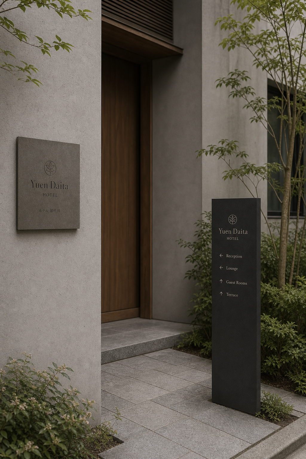
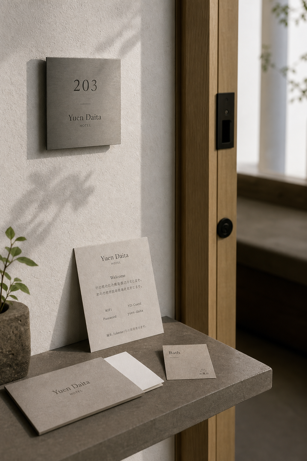
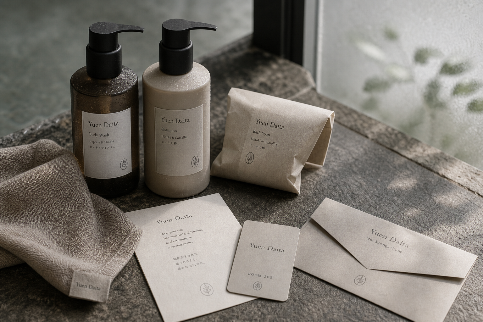
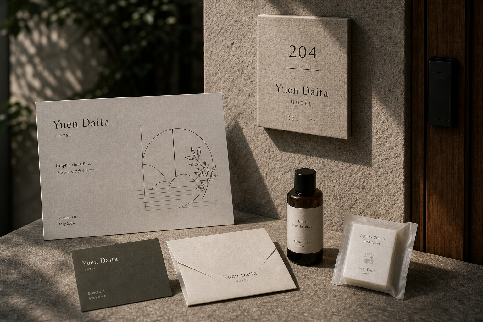
Yuen Daita 是為 Yuen Daita 建立的 branding + visual identity 專案。作品內容以 branding、logo & visual identity、brand guideline 為核心,將品牌名稱、應用物件、版面規則與影像語氣整合成一套可延展的作品集案例。
攝影主題以 hotel entrance、room signage、guest card、bath item 為主。畫面應保留自然光、低飽和色彩、安靜陰影與可閱讀的材質細節,讓照片同時承擔品牌證據、包裝質感與空間情緒。
設計概念從「空間標示、導視與現場尺度」出發,使用乾淨 grotesk 字體、克制色票、細緻比例與少量資訊層級,讓品牌看起來像被整理過的文化檔案,而不是一般商業宣傳頁。
計劃上先完成品牌語氣與核心識別,再建立 Hotel logo、Room signage、Guest card 等交付物,最後以照片序列、品牌應用與網站作品頁整理成完整案例。
Hotel logo / Room signage / Guest card / Bath label / Graphic guideline
Editorial review
English edition
English edition
Yuen Daita understands hospitality as a transition from urban pace into physical and mental rest. Courtyard, pale stone, timber, room light, and bathing goods form a calm background; signs, room numbers, key cards, welcome notes, and bath guides enter at a low volume, building trust through proportion and service detail.
Ivory, sand grey, and deep olive-grey papers echo stone, plaster, and linen. Warm cards and guides invite close reading, while dark key cards add recognition and weight. Labels remain coherent across amber and pale bottles, and room signs translate the paper palette into stone or metal.
A central axis and generous spacing establish calm. Plant mark, name, and HOTEL lead at the entrance; direction columns sequence reception, lounge, rooms, and terrace. Enlarged room numbers come first, followed by rule, name, and braille; cards and amenity labels retain the same measured information rhythm.
A refined serif gives Yuen Daita a gentle presence on stone and paper. Widely spaced small capitals identify HOTEL, tall numerals serve distance, and secondary notes recede. A circular sprout can suggest courtyard growth, water surface, or steam, returning across entry, card, bottle, and soap.
Identity is placed inside real service. Guests see direction, confirm a room, read welcome information, and use matching bath amenities without disrupting the quiet of the environment. Plant shadows moving over wall, card, and bottle allow materials to express time.
Visual identity helps guests slow down. Clear numbers remove navigation effort, soft paper reduces information pressure, consistent amenities complete bathing, and the plant mark carries the garden indoors. What remains is not only a logo, but light, touch, and the memory of being carefully looked after.
日本語版
Yuen Daita は宿泊を、都市の速度から心身の休息へ移る過程として捉えます。庭、淡い石壁、木、客室の光、浴用品を背景に、標識、客室番号、カード、案内が低い声量で入り、比率とサービスの細部から信頼を築きます。
象牙、砂灰、深いオリーブ灰の紙が石、灰泥、リネンへ響きます。暖色のカードと浴場案内は近くで読みやすく、濃色の房卡は認識と重さを加えます。琥珀色や乳白の瓶でもラベルは同じ家族を保ちます。
中央軸と広い間隔が平静をつくります。入口では植物印、名称、HOTEL、導視柱では受付、ラウンジ、客室、テラスが順に並びます。大きな客室番号の下に線、名称、点字が続き、各サイズで同じ速度を保ちます。
上品なセリフ体は石と紙に柔らかな存在を持ちます。字間を広げた HOTEL、遠くから読める細長い数字、小さく控える説明が階層をつくります。円形の芽は庭、水面、湯気を思わせ、入口から石鹸まで続きます。
ゲストは入口で方向を知り、部屋を確認し、案内を読み、同じ印の浴用品を使います。識別は環境の静けさを損なわず、植物の影が壁、カード、瓶を移動することで素材に時間を与えます。
明快な番号は迷いを減らし、柔らかな紙色は情報の圧力を下げ、統一された用品は入浴を整えます。記憶に残るのは印だけではなく、光、触感、丁寧に迎えられた感覚です。
繁體中文版
Yuen Daita 的識別把旅宿理解為一段從城市節奏轉入身心休息的過程。入口庭院、淺色石牆、木門、客房光影與沐浴用品共同構成安定背景,標誌、房號牌、房卡、迎賓卡和浴場指南則以極低聲量融入其中。品牌沒有依賴華麗符號塑造高級感,而是透過材料、比例與服務細節建立信任,使賓客從抵達、入住到沐浴,都能感受到一致而細心的照顧。
紙材以象牙白、沙灰與深橄欖灰為主,細微纖維和霧面表面呼應石材、灰泥與亞麻織物。迎賓卡、信封和浴場指南使用輕柔暖色,閱讀時具有親近感;深色房卡則增加辨識與攜帶時的重量。洗髮、沐浴與香皂標籤延續同一紙色,貼在琥珀、乳白瓶器和紙包上仍保持完整系列感。客房牌轉換為淺色石質或金屬面板,使紙本色彩進入空間,讓觸摸門牌、拿起卡片與使用備品都屬於同一材料體驗。
編排以中央軸線和寬裕間距建立平靜。入口牌先呈現植物標誌、名稱與 HOTEL,導視柱則把接待、休息區、客房與露台依方向排列。房號以放大數字成為第一層資訊,短線、名稱和點字依次向下,兼顧辨識與使用需求。迎賓卡將品牌、問候、網路資訊分成清楚段落;備品標籤則依名稱、香氣內容和圖形逐層展開。不同尺寸都維持相同節奏,使旅館營運資訊看來從容而有秩序。
字型使用比例優雅的襯線體建立主聲音。Yuen Daita 的字母筆畫纖細,名稱在石牆與紙面上都有柔和存在感;HOTEL 採小型大寫與拉開字距,提供明確類別又不打斷安靜氣氛。房號數字修長而清楚,適合遠距閱讀,輔助說明則以較小字級退居其後。圓框植物標誌由枝葉和簡潔線條構成,既像庭院中的新芽,也像浴場水面與蒸氣,能在入口、房卡、瓶標和香皂包裝上持續提示休息與生長。
品牌特色在於把識別真正放進旅宿服務。賓客在入口看見導視,於房門確認號碼,進房後閱讀迎賓資訊,再於浴場使用帶有相同標誌的備品;每個環節都有足夠資訊,也不會干擾空間的安定。攝影讓植物影子落在牆面、卡片與瓶器上,石材、木材和織物因此呈現時間變化。Yuen Daita 的個性不是表面的奢華,而是一種重視安靜、潔淨、地方感與日常恢復的款待方式。
Yuen Daita 的設計理念,是讓視覺識別成為賓客放慢速度的輔助。清楚房號減少尋路負擔,柔和紙色降低資訊壓力,統一備品讓沐浴過程更完整,植物標誌則把庭院氣息帶進室內。這些細節不需要被刻意注意,卻會在使用中累積對旅館的信任。當賓客離開房間、收起房卡或再次看到品牌名稱時,記住的不只是標誌,而是光線、觸感與被妥善照顧的感受,形成耐久而溫和的旅宿記憶。
- branding: hermetic design
- sign design: hermetic design
- photography: studio archive
- client: yuen daita