Tou Nishino
brand visual design
Tou Nishino
2020 / Kyoto
concept making & naming
logo & visual identity
brand guide
art direction
photo direction
Tou Nishino 是為 Tou Nishino 建立的 brand visual design 專案。作品內容以 concept making & naming、logo & visual identity、brand guide 為核心,將品牌名稱、應用物件、版面規則與影像語氣整合成一套可延展的作品集案例。
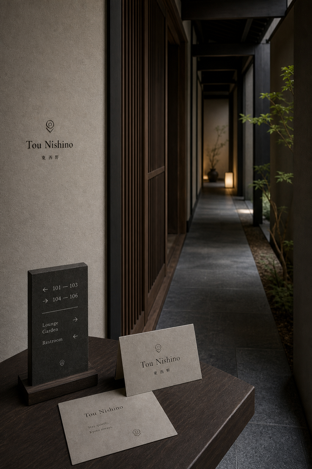
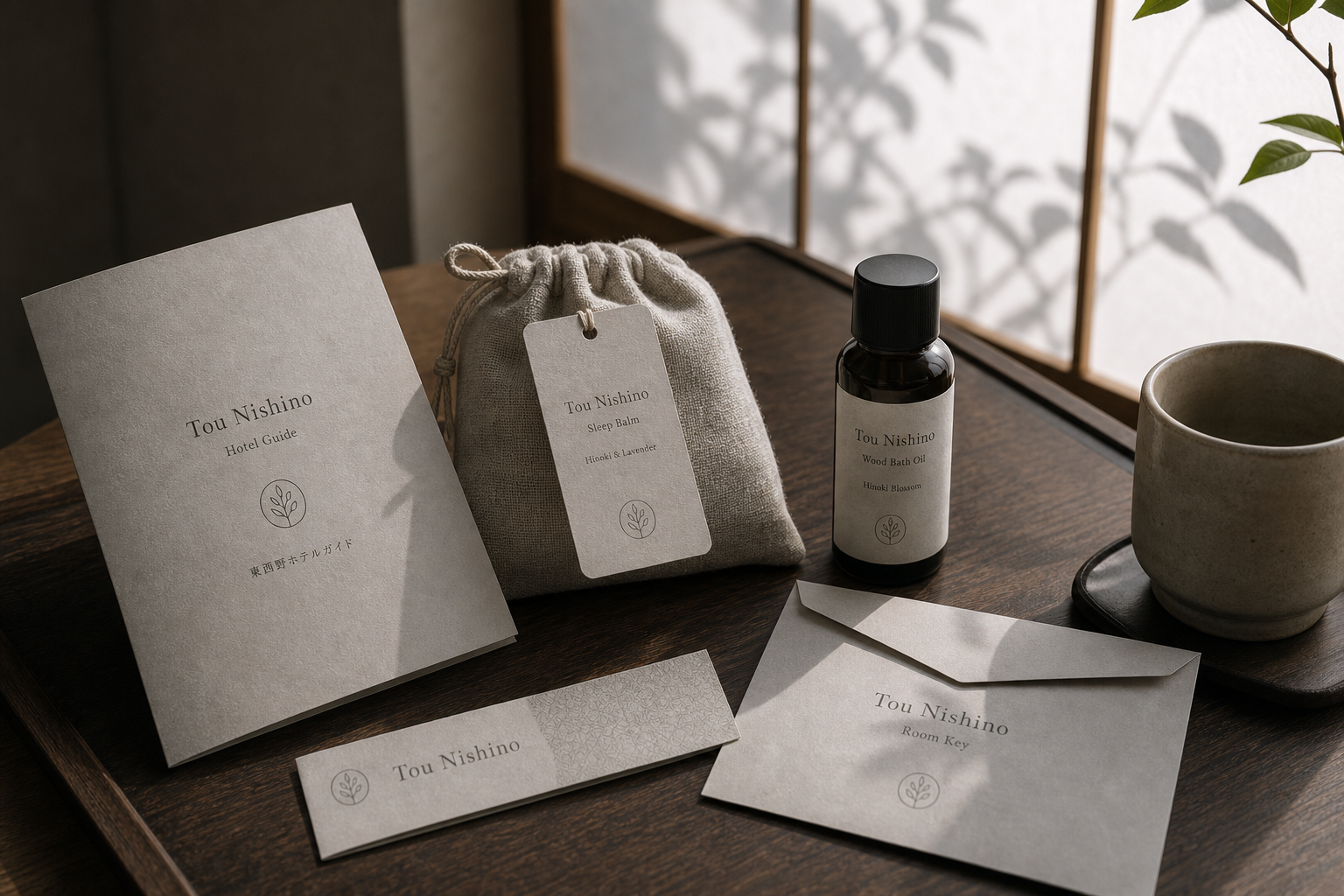
攝影主題以 hotel corridor、amenity item、room sign、lobby detail 為主。畫面應保留自然光、低飽和色彩、安靜陰影與可閱讀的材質細節,讓照片同時承擔品牌證據、包裝質感與空間情緒。
設計概念從「空間標示、導視與現場尺度」出發,使用乾淨 grotesk 字體、克制色票、細緻比例與少量資訊層級,讓品牌看起來像被整理過的文化檔案,而不是一般商業宣傳頁。
計劃上先完成品牌語氣與核心識別,再建立 Naming system、Hotel logo、Signage 等交付物,最後以照片序列、品牌應用與網站作品頁整理成完整案例。
Naming system / Hotel logo / Signage / Hotel item / Photo direction
Editorial review
English edition
English edition
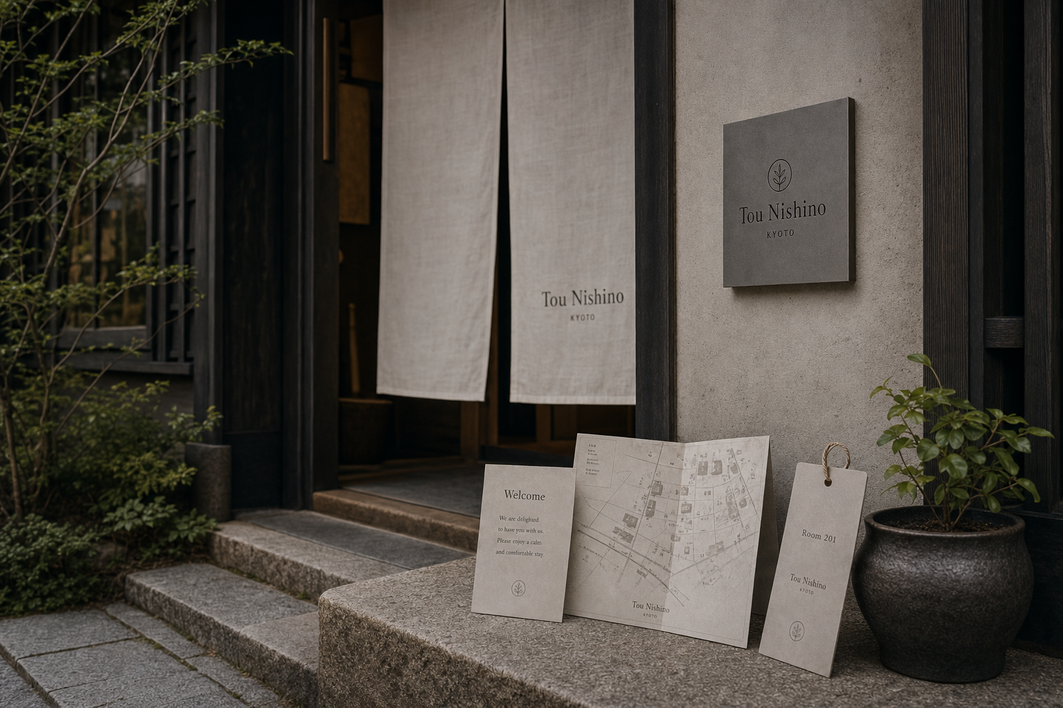
Tou Nishino turns a hotel name into spatial language that can be seen, touched, and walked through. Exterior sign, entrance curtain, corridor direction, and room plaque use restrained scales; guide, card, fragrance, and amenity bag continue the same voice inside, describing a quiet stay with Kyoto's sense of time.
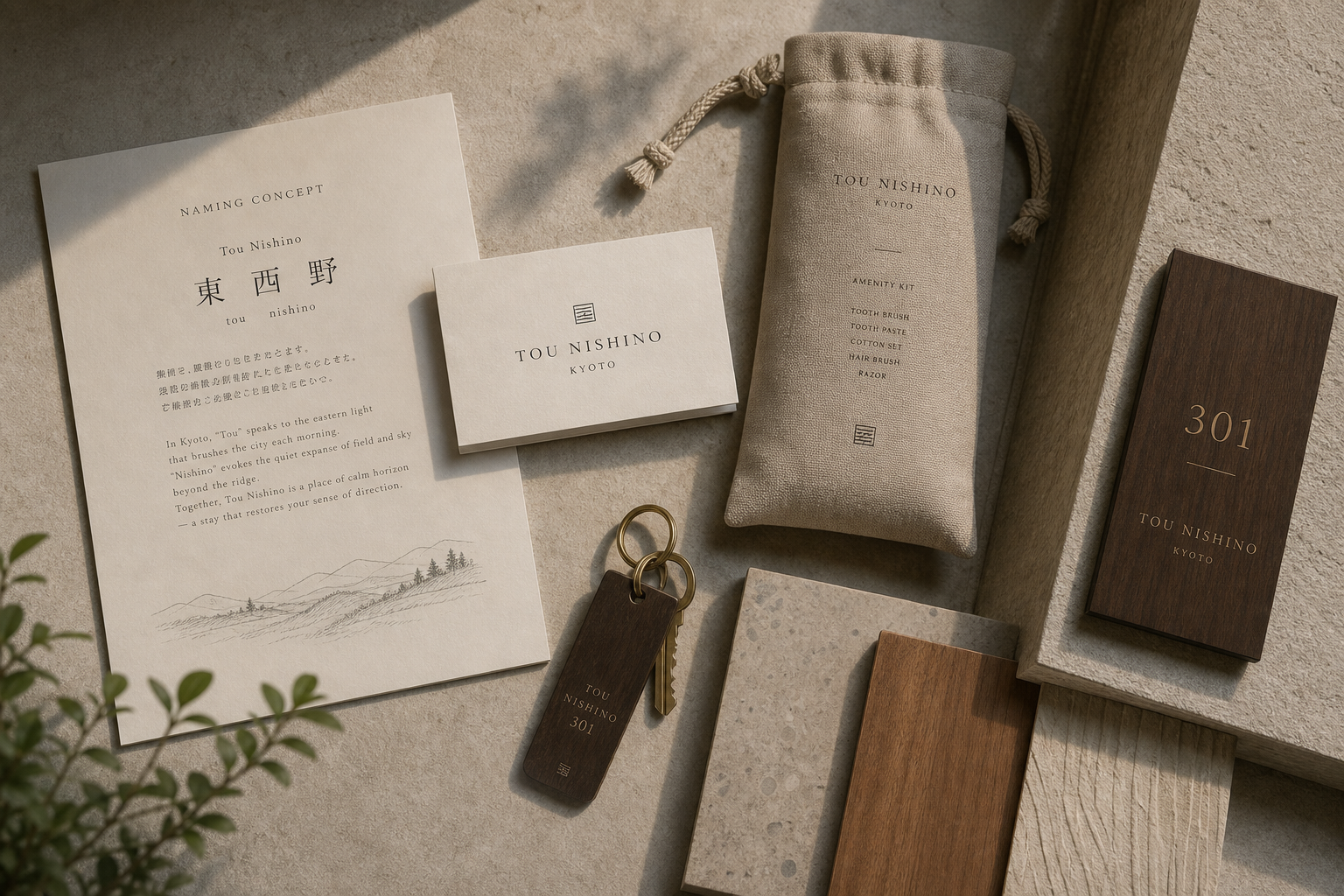
Warm grey, off-white, dark timber, and charcoal create depth. Textured card echoes plaster, stone, and lattice; soft drawstring fabric makes amenities feel close to the body; timber plaques retain warmth, with gold-toned figures as small highlights. Paper, cloth, wood, and stone stay tactile within one muted atmosphere.
Central axes and ample space allow information to move unhurriedly. Entrance mark, name, and place descend vertically; room numbers lead before rules and wordmarks. Guides, welcome cards, sleeves, and tags remain sparse, while maps and corridor signs add only the lines, ranges, arrows, and destinations needed.
A fine serif gives Tou Nishino a restrained written quality. Widely spaced small capitals handle KYOTO and amenity names; the characters 東西野 retain their own structure beside English. Location, leaf, and square-line symbols act as light punctuation linking place, nature, and room.
Local identity is carried through direction and daily use rather than applied historical decoration. Coordinates, neighbourhood map, room numbers, and arrows lead from city to room; curtain, plant shadow, cups, timber trays, scent, and bath oil extend the brand into sight, smell, and touch.
Naming establishes a coordinate, and crafted details give that coordinate emotion. Scale and tactility change along the guest path while space lets materials speak. The repeated name across wall, paper, textile, and wood connects arrival, recognition, rest, and departure into one memorable stay.
日本語版
Tou Nishino は宿の名称を、見て、触れて、歩ける空間言語へ変えます。外壁、暖簾、廊下、客室札では抑えた尺度を使い、室内では案内、カード、香り、備品袋が同じ声を引き継ぎ、京都の時間を感じる滞在を描きます。
暖灰、生成り、濃木、炭色が深さをつくります。紙の質感は灰泥、石、格子に応え、柔らかな巾着は備品を身体に近づけ、木の札には温かな色と小さな金色数字が残ります。紙、布、木、石が低彩度の中で触感を保ちます。
中央軸と十分な余白が情報をゆっくり進めます。入口では図形、名称、地名、客室札では大数字、短線、字標が続きます。案内とカードは少量の内容に絞り、地図と廊下板は必要な線、範囲、矢印だけを加えます。
細いセリフ体には節度ある書写性があります。字間を広げた KYOTO と用品名が階層を支え、東西野の文字は英文と並んでも骨格を保ちます。位置、葉、方形線の印が軽い句読点として場所と自然を結びます。
座標、街区地図、客室番号、矢印が都市から客室へ導きます。暖簾、植栽影、陶杯、木盆、睡眠香、浴油が、地方性を表面の古典装飾ではなく、方向と日常使用の中に置きます。
名称が座標をつくり、工芸的な細部が感情を与えます。動線に応じて尺度と触感を変え、素材が語る余地を残します。壁、紙、布、木に現れる名称が、到着、確認、休息、出発を一つの記憶へ結びます。
繁體中文版
Tou Nishino 的識別把旅宿命名轉化為一套可被看見、觸摸與行走的空間語言。從外牆招牌、入口暖簾、走廊導視到房門牌,名稱始終以克制的尺度出現;進入客房後,住房指南、房卡、香氛用品與備品袋再接續同一語氣。設計因此不只回答「這間旅館叫什麼」,更以連續的接觸點描繪一種安靜、細緻且帶有京都時間感的停留方式。
材料設定以暖灰、米白、深木色和炭黑形成沉靜層次。卡紙可見細緻而自然的表面紋理,與灰泥牆、石階和木格柵彼此呼應;束口織物袋的柔軟肌理,則讓備品從功能物件提升為貼近身體的款待細節。木質房牌與鑰匙牌保留溫潤色澤,金色數字在其上形成含蓄亮點。紙、布、木、石並置後,各自保有觸感,又共同維持低彩度的完整氣氛。
編排採取清楚的中央軸線與充分留白,讓資訊像旅館裡的步伐一樣從容。入口牌由圖形、名稱與地名垂直展開,房門牌則把放大的房號置於上方,短線和字標依序承接。住房指南、迎賓卡、房卡套與吊牌皆以少量內容建立層級,不以裝飾填滿版面。地圖加入細線與淡色街區,在保持實用性的同時延續紙面的安靜;走廊導視以方向箭頭、房號區間及設施名稱分組,使辨識直接而優雅。
字型設計以纖細襯線體作為主要聲音。Tou Nishino 的大小寫比例端正,筆畫收尾帶有書寫般的節制,放在粗糙牆面、暖灰卡紙或木牌上,都能顯出清晰而不張揚的輪廓。拉開字距的小型大寫用於 KYOTO、用品名稱與說明層級,為不同媒介建立穩定秩序。中文「東西野」以較寬鬆的字距呈現,與英文名稱並列時保留東方文字的骨架;定位符號、葉片圖形與方形線紋則像一組輕巧標點,串起位置、自然和房間識別。
品牌最鮮明的特色,是把地方感放在方向與日常之中,而非變成表面的古典裝飾。名稱中的方位感,透過定位圖形、街區地圖、門牌數字和廊道箭頭自然展開,使賓客從城市抵達入口,再尋至自己的房間。暖簾、植栽影子、陶杯、木托盤及柔和光線,讓識別與建築情境共同呼吸;睡眠香氛、沐浴油和客房用品則把品牌延伸至嗅覺、觸覺與使用時刻,形成完整而親密的住宿個性。
Tou Nishino 的設計理念,是以命名建立座標,再以工藝般的細節賦予座標情感。每一項媒介都保留足夠空白,讓材料本身成為訊息;每一個符號都具有指引作用,同時維持品牌的詩意。賓客看到的並非重複貼上的標誌,而是一套隨動線改變尺度、隨情境調整觸感的識別系統。當名字依次出現在牆面、紙張、織物與木材上,旅館便獲得一致的聲音,也把抵達、辨認、休息與離開連成一段值得記住的體驗。
- concept making: hermetic design
- visual design: hermetic design
- photography: studio archive
- client: tou nishino