Tomora Aromatique Studio
branding + visual identity
Tomora Aromatique Studio
2025 / Kyoto
brand design
logo + visual identity
brand guide
web design
package design
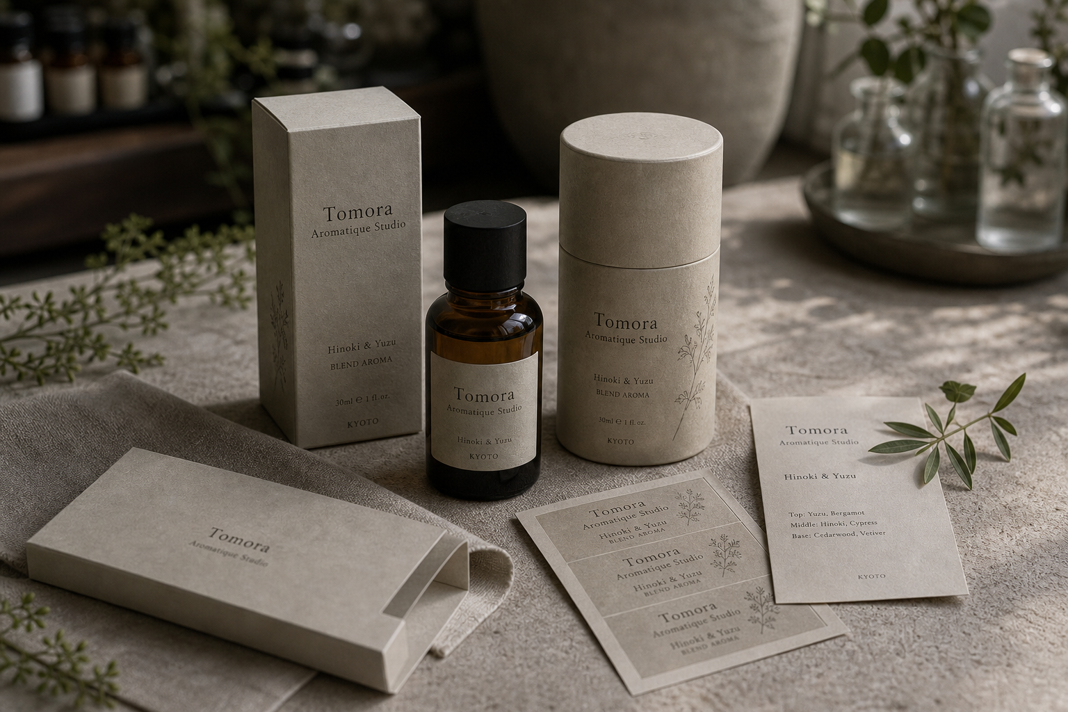

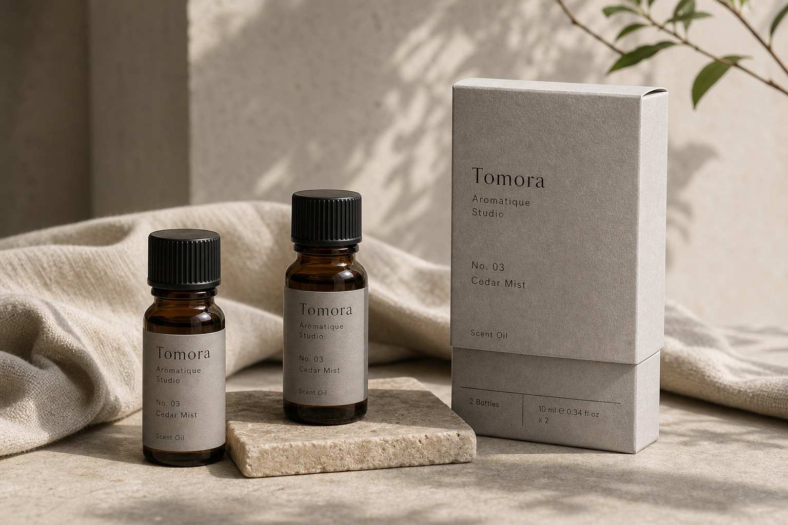
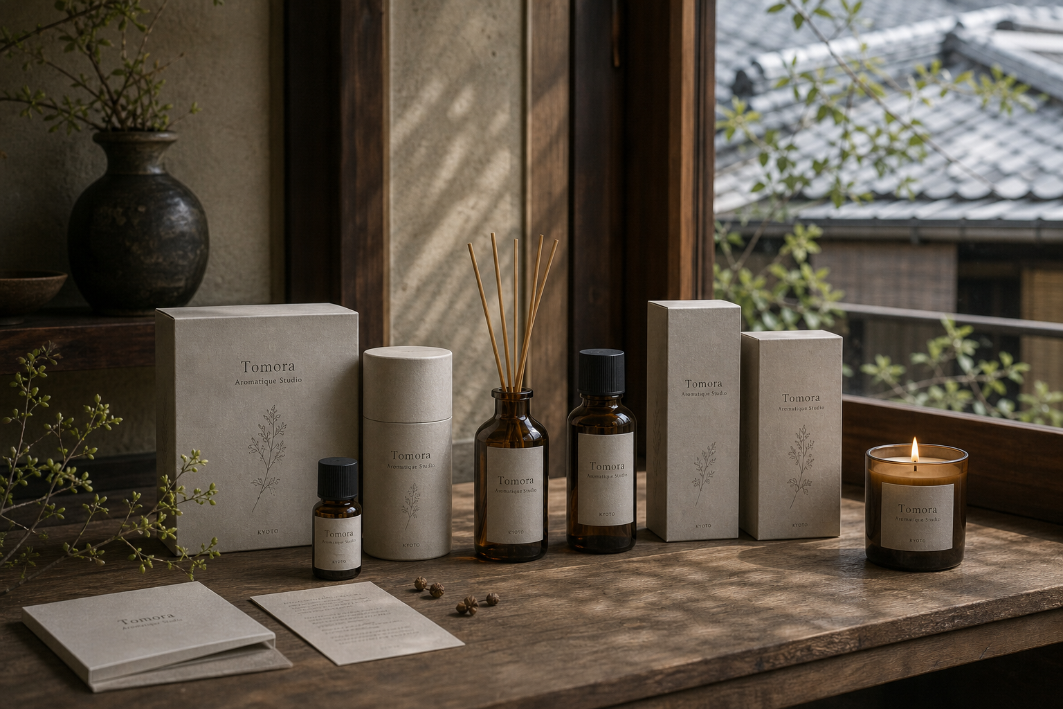
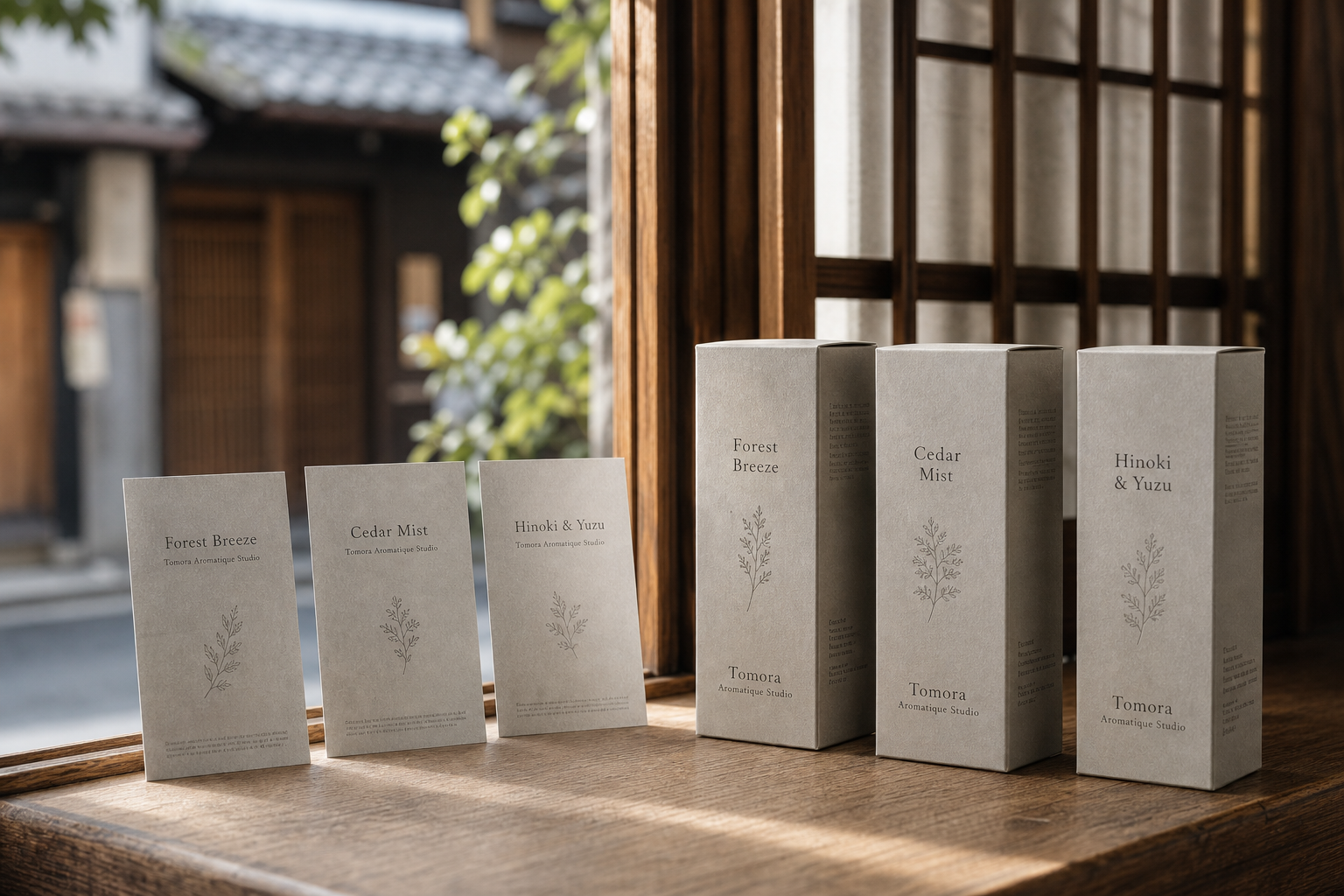
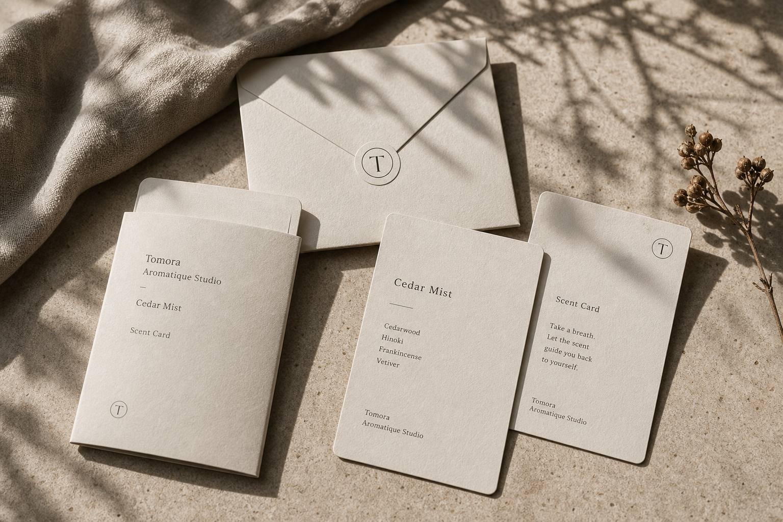
Tomora Aromatique Studio 是為 Tomora Aromatique Studio 建立的 branding + visual identity 專案。作品內容以 brand design、logo + visual identity、brand guide 為核心,將品牌名稱、應用物件、版面規則與影像語氣整合成一套可延展的作品集案例。
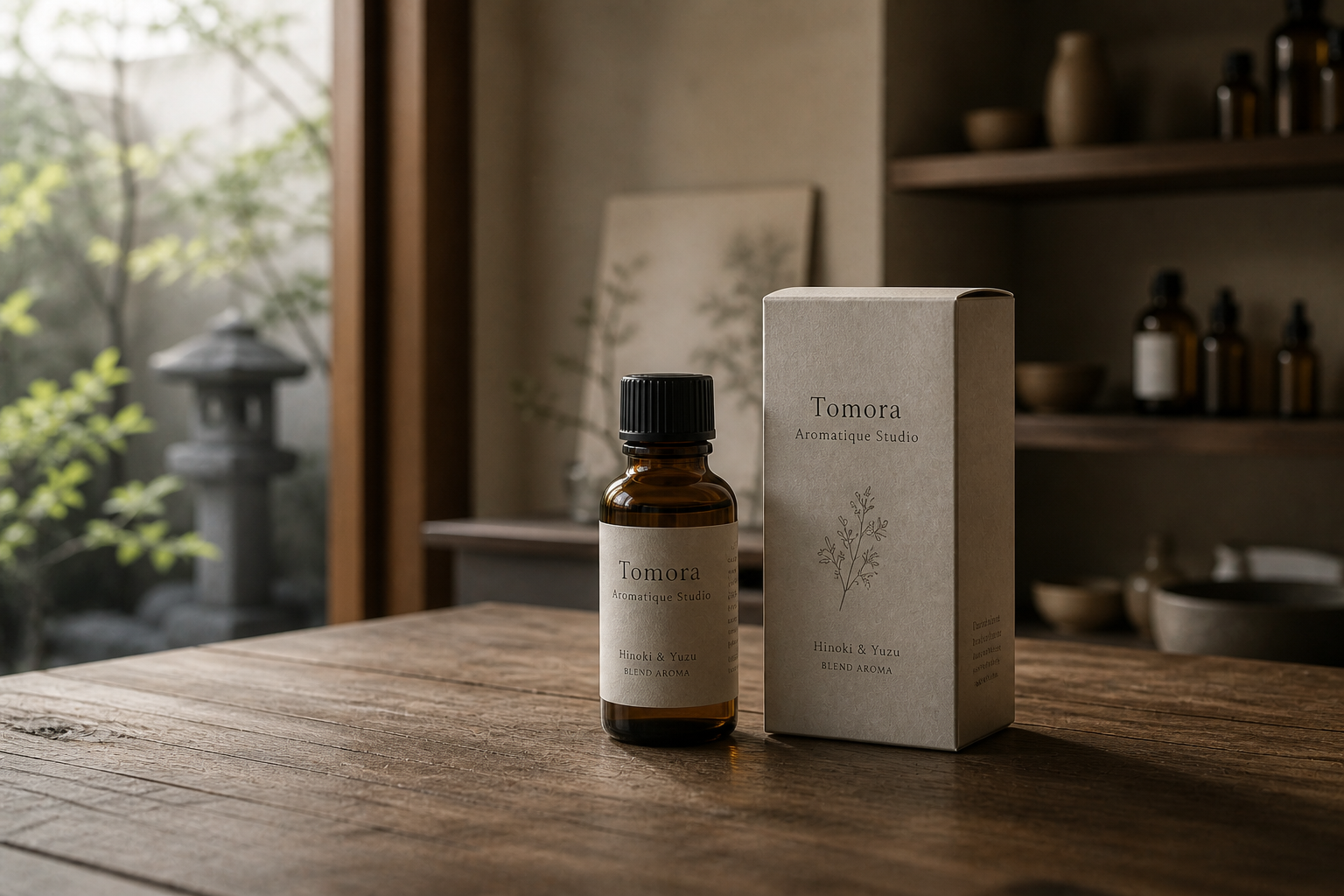
攝影主題以 aroma bottle、scent card、package sleeve、studio still life 為主。畫面應保留自然光、低飽和色彩、安靜陰影與可閱讀的材質細節,讓照片同時承擔品牌證據、包裝質感與空間情緒。
設計概念從「包裝、標籤與紙材的觸感」出發,使用乾淨 grotesk 字體、克制色票、細緻比例與少量資訊層級,讓品牌看起來像被整理過的文化檔案,而不是一般商業宣傳頁。
計劃上先完成品牌語氣與核心識別,再建立 Bottle label、Scent card、Package sleeve 等交付物,最後以照片序列、品牌應用與網站作品頁整理成完整案例。
Bottle label / Scent card / Package sleeve / Stationery / Web design
Editorial review
English edition
English edition
Tomora Aromatique Studio addresses an elegant problem: scent cannot be seen, yet the brand must suggest temperature, strength, and rhythm before a bottle is opened. Amber glass, mineral-grey paper, botanical line drawings, and unhurried typography create a world between fragrance laboratory and living space.
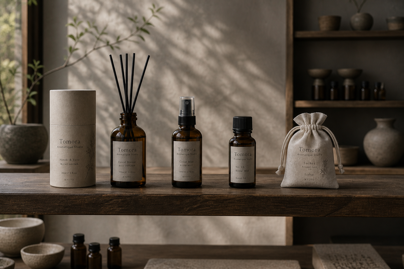
Warm grey labels, cartons, and cylinders retain visible fibres that soften industrial containers. Ivory scent cards and envelopes feel lighter at close range, while dry paper and matte black caps contrast with luminous brown glass. A consistent colour field keeps single bottles, pairs, and gift sets within one family.
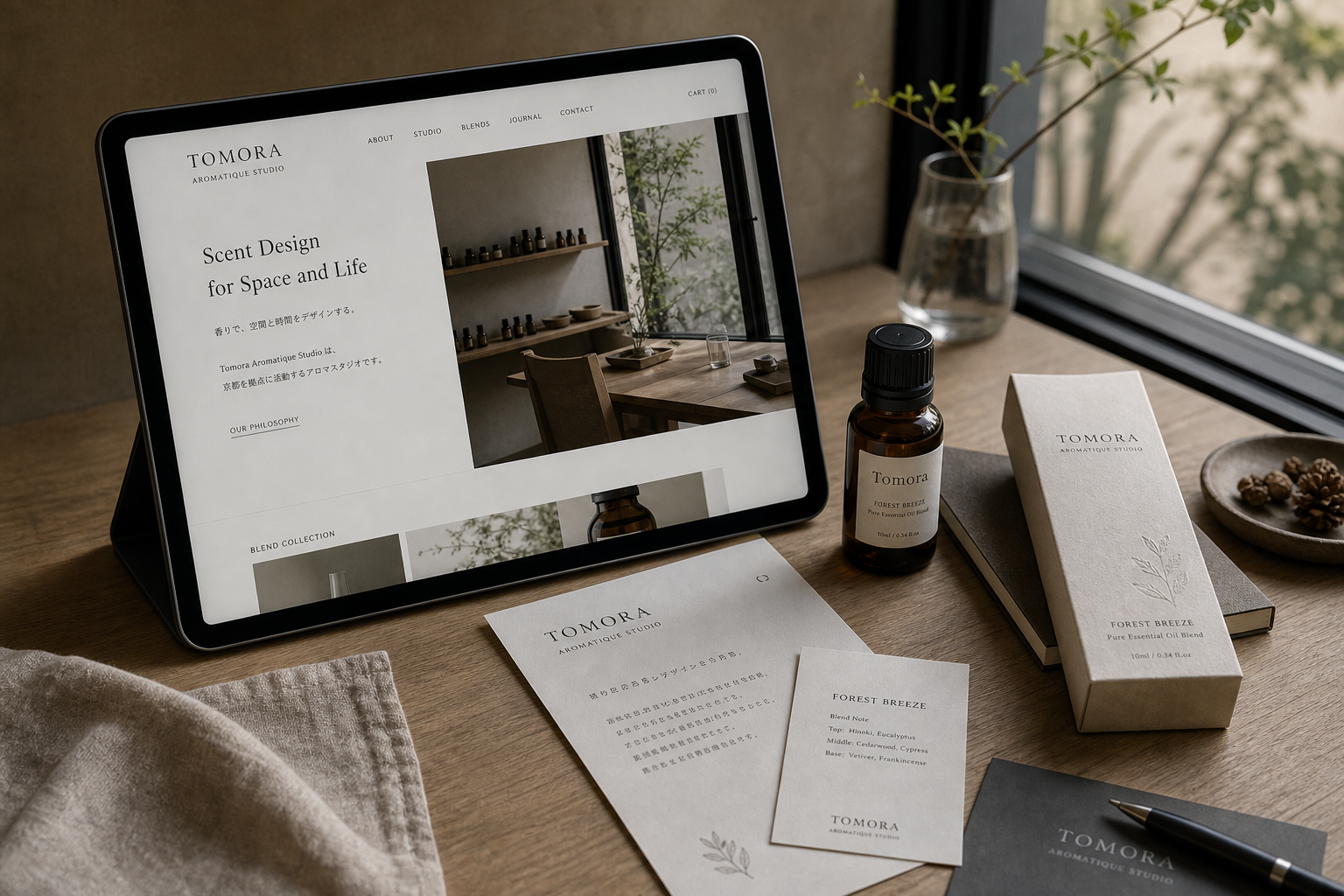
Information follows a vertical sequence: brand, scent, number, volume, and category descend through clear divisions. Scent cards centre names such as Cedar Mist, then support them with smaller notes and use phrases. The website repeats this order through brand text, spatial imagery, and product series.
A slender serif gives Tomora lightness and clarity at label scale. Aromatique Studio recedes as a refined secondary line, while numbers and volume use simpler forms. The circular T resembles both a wax seal and the centre of a scent dispersing, balancing precise type with soft botanical drawing.
The brand presents fragrance as design rather than display. Hinoki & Yuzu, Cedar Mist, and Forest Breeze connect scent to timber, citrus, mist, and woodland; branches, glass, wood, stone, and textiles make those associations visible without fixing them too literally.
Tomora builds a path from sight into smell. Name, scent card, opened bottle, website, and correspondence each control their information volume so material, language, and fragrance retain space. The invisible becomes a brand language that can be read, carried, and remembered.
日本語版
Tomora Aromatique Studio は、目に見えない香りを、開栓前から温度、濃淡、リズムとして感じさせる課題に応えています。琥珀色のガラス、鉱物のような灰色紙、植物線画、ゆったりした文字が、香りの研究室と生活空間の間に世界をつくります。
暖灰のラベル、箱、円筒には繊維が見え、工業的な容器を柔らげます。象牙色の香りカードと封筒は軽く、乾いた紙と黒い蓋が光を透かす褐色ガラスと対比します。単品、二本組、ギフトも同じ色域で家族になります。
情報はブランド、香り名、番号、容量、種類の順に垂直へ並びます。Cedar Mist などの名称をカード中央へ置き、小さな文字で香調と使用の言葉を添えます。ウェブサイトも説明、空間写真、シリーズへ同じ秩序を続けます。
細身のセリフ体は小さなラベルでも軽やかで明確です。Aromatique Studio は副線として控え、番号と容量は簡潔な字形が担います。円枠の T は封蝋と香りの拡散中心を思わせ、精密な文字と柔らかな植物画を均衡させます。
Hinoki & Yuzu、Cedar Mist、Forest Breeze は香りを木、柑橘、霧、森へ結びます。枝、ガラス、木、石、布の写真がそれを環境へ変え、低彩度の画面が嗅覚の想像を残します。
Tomora は視覚から嗅覚へ入る道筋をつくります。名称、カード、瓶、ウェブ、手紙の情報量を整え、素材、文字、香りにそれぞれの場所を与えます。見えないものを、読み、持ち運び、記憶できるブランド言語へ変えています。
繁體中文版
Tomora Aromatique Studio 面對的是一項精巧的設計課題:氣味無法被直接看見,品牌卻必須在開瓶以前,先讓人感受到它的溫度、濃淡與節奏。這套識別以琥珀色玻璃、礦物般的米灰紙面、植物線描與從容文字,建立一個介於香氣工作室和生活空間之間的世界。包裝、香氣卡、信封、標籤與網站不只是統一外觀,更像一組感官提示,引導人從視覺進入嗅覺。
紙材與容器的搭配形成作品最突出的觸覺層次。瓶身標籤、長方盒與圓筒包裝採用暖灰色紙面,可見的纖維顆粒降低了工業容器的冰冷感;象牙白香氣卡和信封則更輕,適合近距離拿取與閱讀。紙盒與霧黑瓶蓋提供乾燥、沉著的觸感,琥珀玻璃在光線下呈現透亮棕色,兩者共同傳達香材的深度。不同包裝形態保持一致色域,使單瓶、雙瓶組合與贈禮套裝並列時仍像完整系列。
編排以垂直資訊序列維持清楚閱讀。品牌名稱位於包裝上段,香氣名稱、編號、容量與品類依次向下展開;細線和區塊切分讓資訊量增加時仍然整齊。香氣卡將 Cedar Mist 等名稱置於視覺中心,再以較小字級列出氣味內容與使用語句,圓角讓卡片顯得適合握持。網站首頁也延續這套秩序,以左側品牌敘述、右側空間影像和下方系列內容構成安定路徑,讓產品理解與品牌氣氛同步發生。
字型系統選擇了帶有細長比例的襯線體,Tomora 的字母筆畫輕盈,字距舒展,在小瓶標籤上仍保有清楚輪廓。Aromatique Studio 以較小尺度承接名稱,形成近似香水標籤的精緻層級;產品編號與容量則採更簡潔的字形,提供理性而準確的資訊骨架。圓框 T 字標誌像封蠟印記,也像氣味擴散時的中心點,適合出現在信封、香氣卡和小尺寸紙品。文字的精確與植物插畫的柔軟彼此平衡,使品牌既專業也富有感受力。
品牌特色建立在「香氣設計」而不只是商品陳列。Hinoki & Yuzu、Cedar Mist、Forest Breeze 等名稱把氣味連接到木材、柑橘、霧氣與森林想像;空間攝影中的枝葉、玻璃器皿、木桌、石材和織物,則把這些語彙轉化為可見環境。低彩度畫面讓嗅覺保有想像空間,瓶器和紙品在日光下呈現細微陰影,使 Tomora 具有沉靜、研究感與生活品味並存的性格。
Tomora Aromatique Studio 的設計理念,是以視覺替氣味建立一條進入生活的路徑。使用者先從盒面的名字辨認香調,再透過香氣卡理解內容,打開瓶身感受氣味,最後在網站與信件中延續對工作室的認識。每個接觸點都控制資訊聲量,讓材質、文字和香氣各自保有位置。這套作品因此不僅完成包裝識別,也把看不見的氣味轉譯成一種能被閱讀、攜帶並留在記憶中的品牌語言。
- creative direction: hermetic design
- package design: hermetic design
- photography: studio archive
- client: tomora aromatique studio