Chaya Ba
branding + visual identity
Chaya Ba
2025 / Taipei
brand design
logo + visual identity
brand guide
stationery design
package design
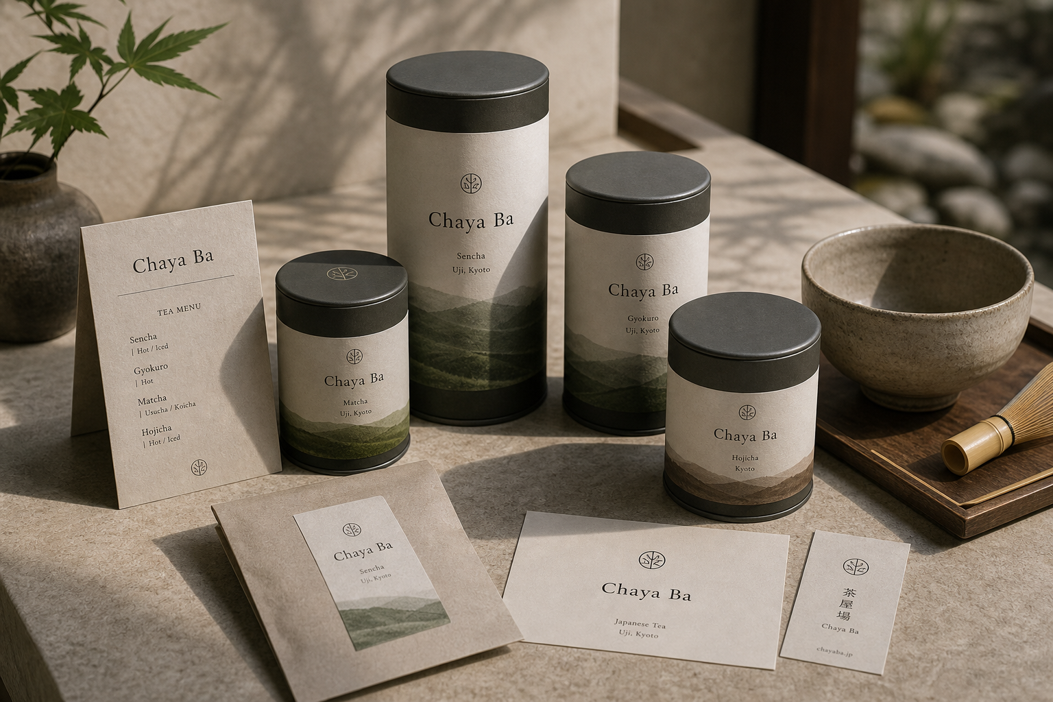
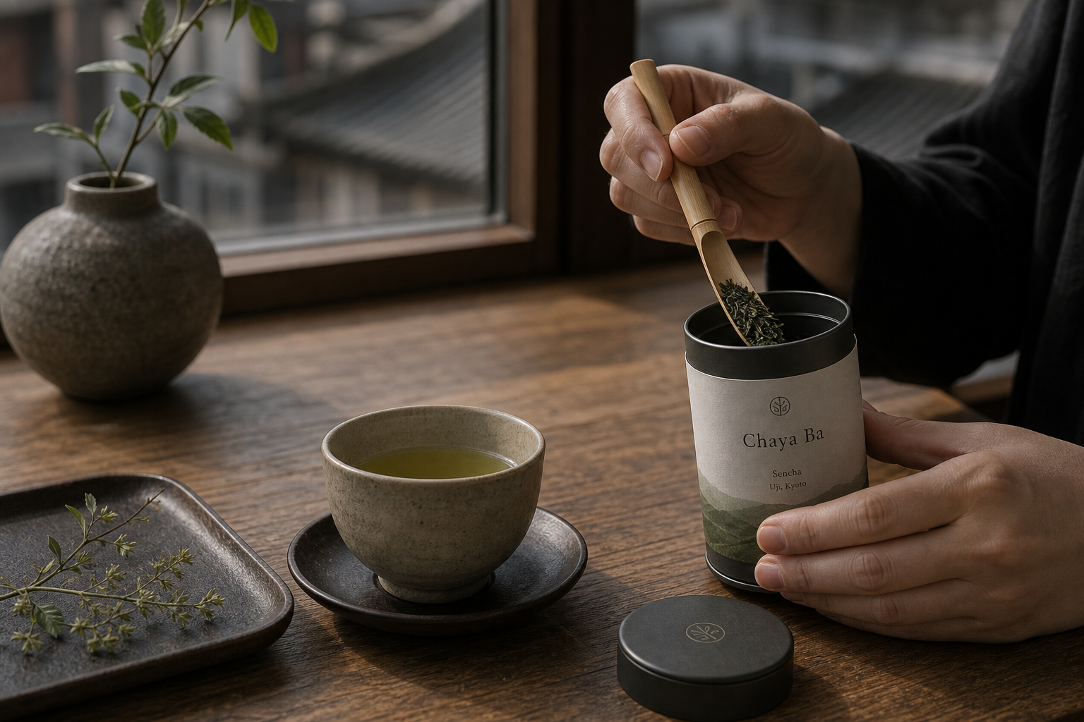
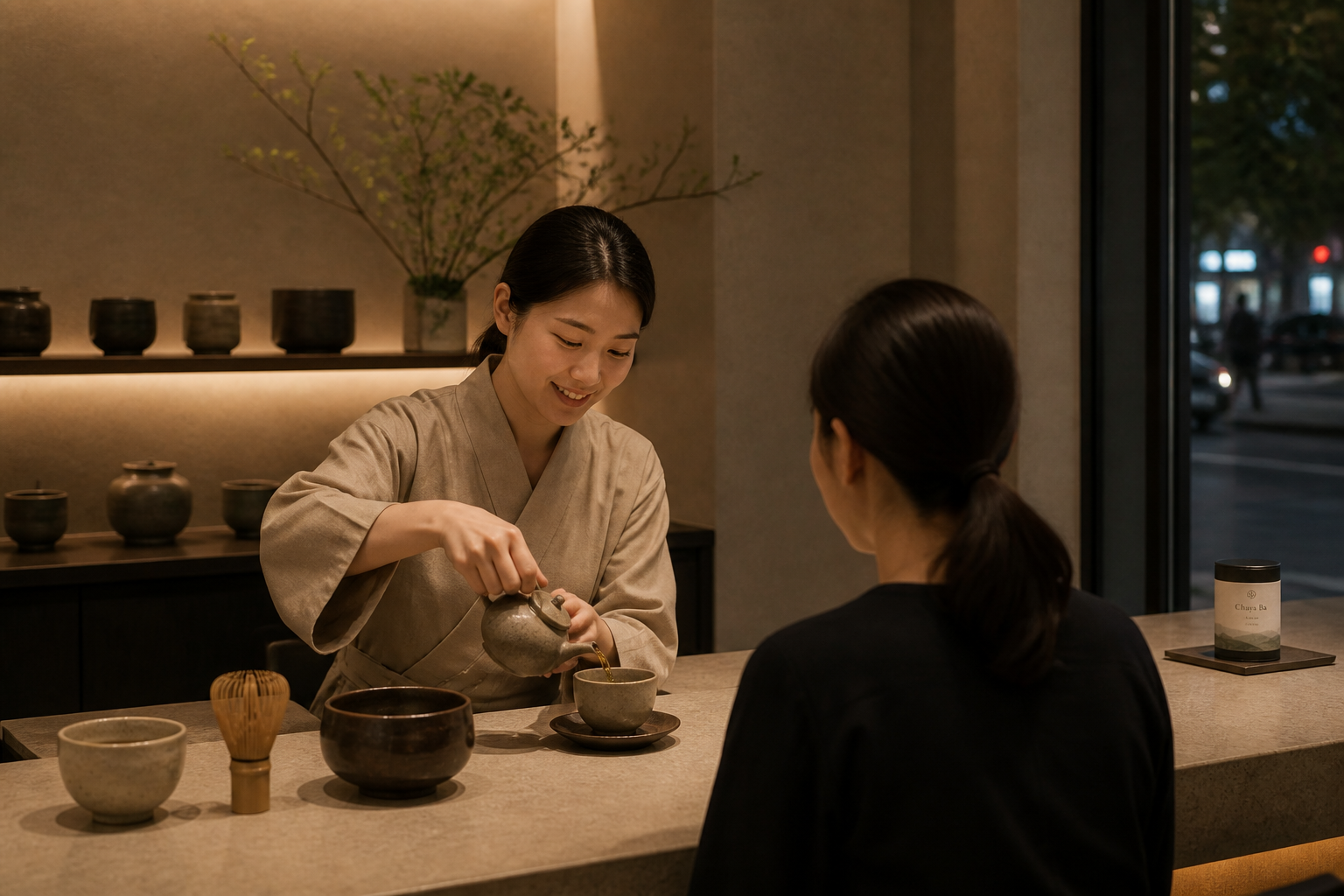
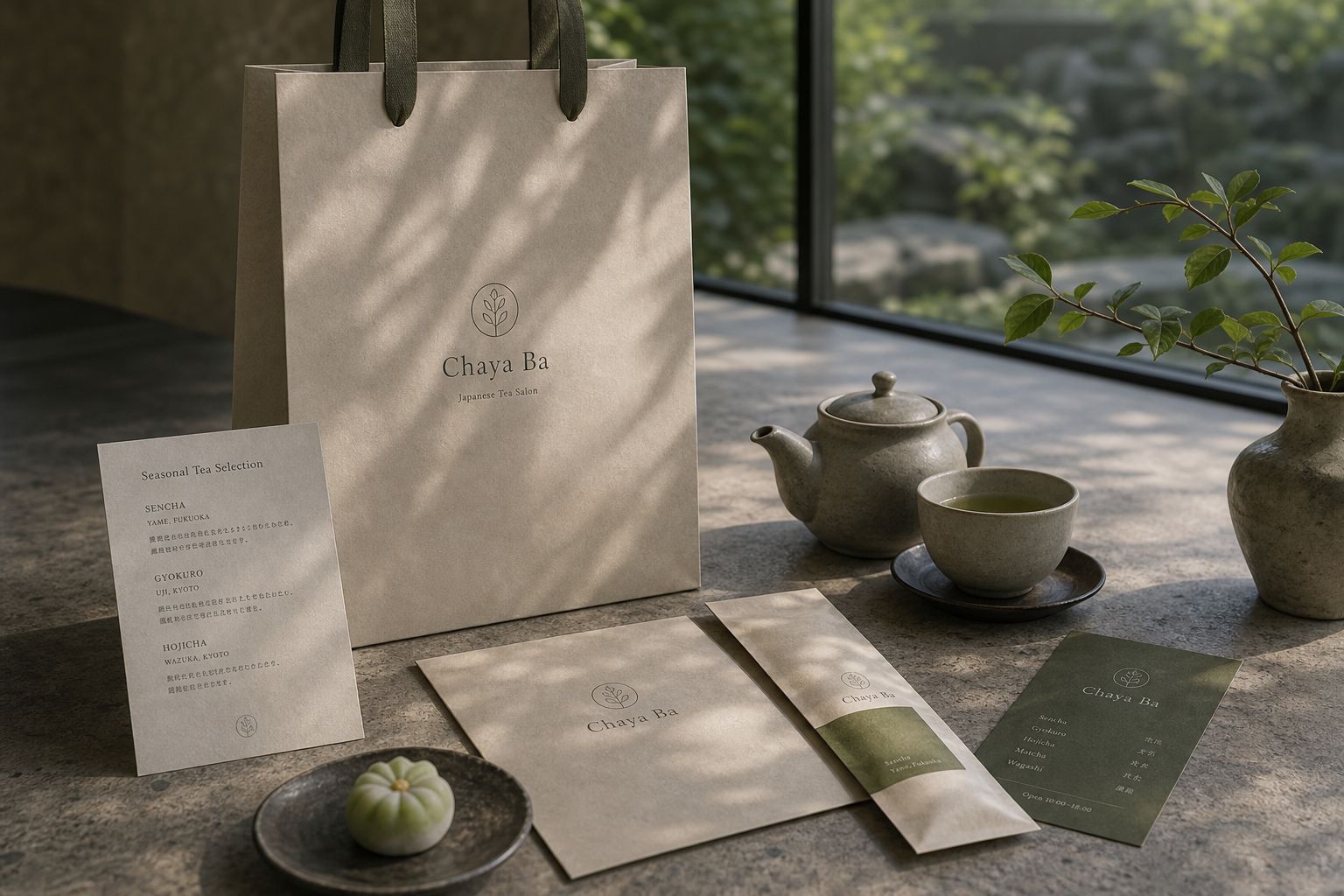
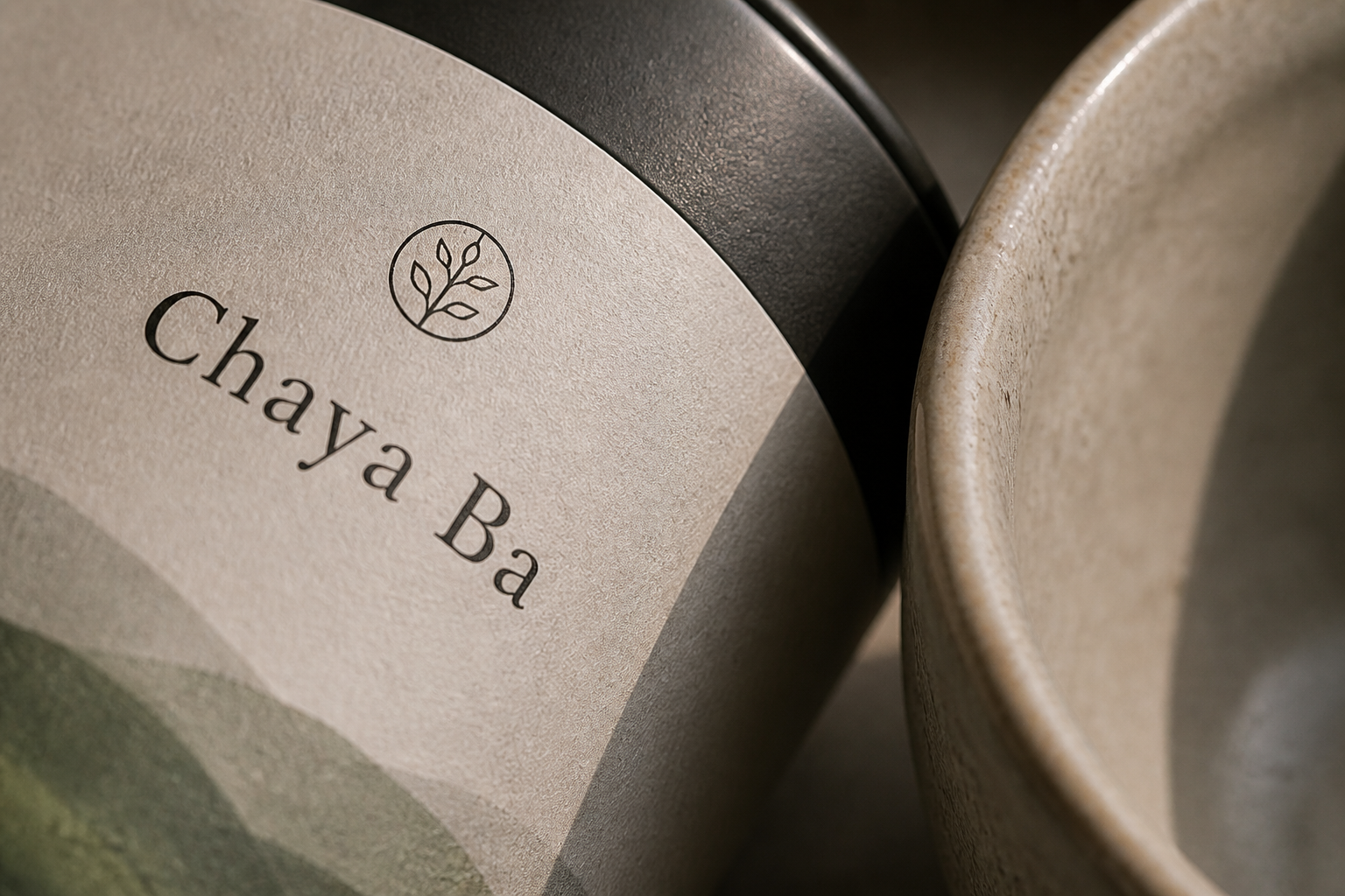
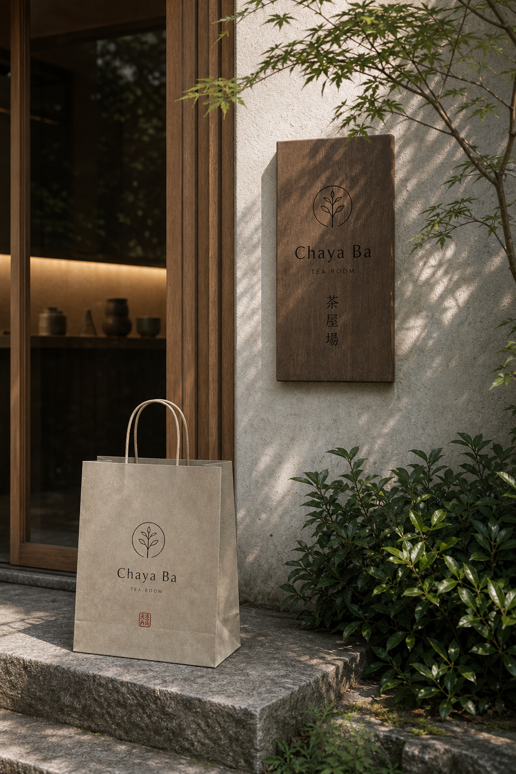
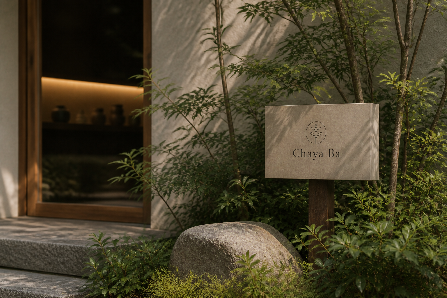
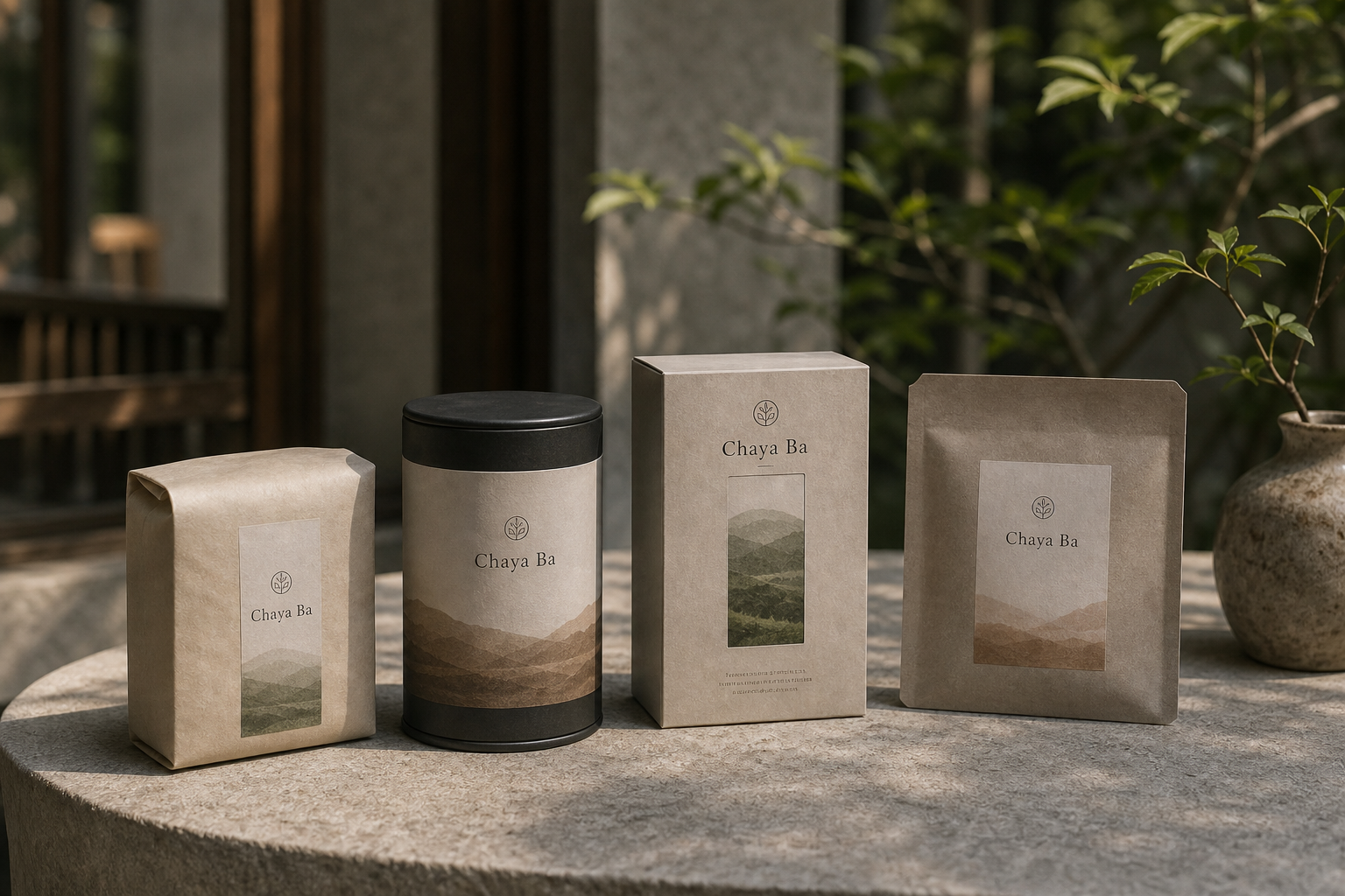
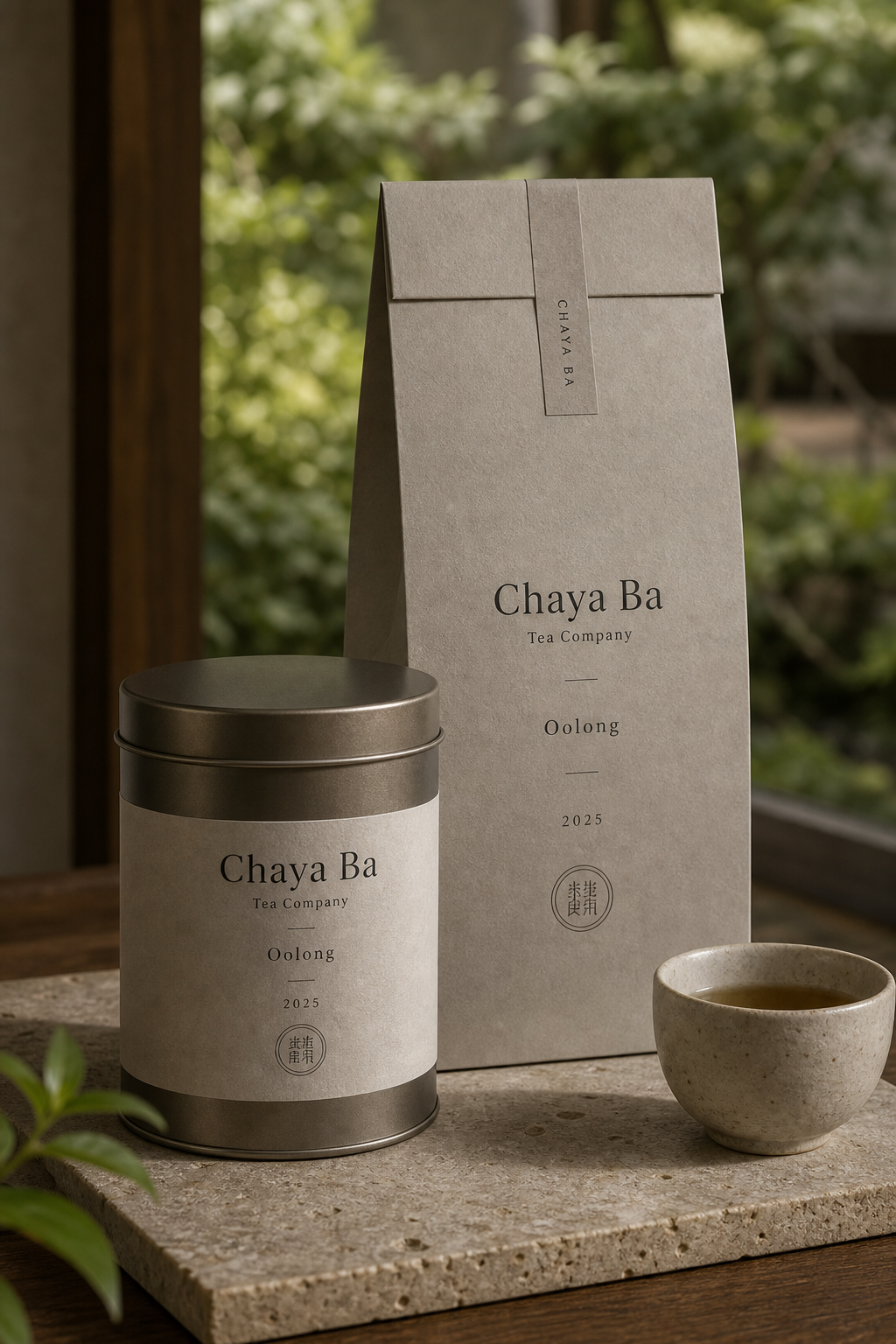
Chaya Ba 是為 Chaya Ba 建立的 branding + visual identity 專案。作品內容以 brand design、logo + visual identity、brand guide 為核心,將品牌名稱、應用物件、版面規則與影像語氣整合成一套可延展的作品集案例。
攝影主題以 tea tin、paper bag、store sign、ceramic table 為主。畫面應保留自然光、低飽和色彩、安靜陰影與可閱讀的材質細節,讓照片同時承擔品牌證據、包裝質感與空間情緒。
設計概念從「包裝、標籤與紙材的觸感」出發,使用乾淨 grotesk 字體、克制色票、細緻比例與少量資訊層級,讓品牌看起來像被整理過的文化檔案,而不是一般商業宣傳頁。
計劃上先完成品牌語氣與核心識別,再建立 Tea label、Paper bag、Shop sign 等交付物,最後以照片序列、品牌應用與網站作品頁整理成完整案例。
Tea label / Paper bag / Shop sign / Stationery / Menu card
Editorial review
English edition
English edition
Chaya Ba gathers the origin, vessels, and ritual of tea into a composed and fresh identity. A circular leaf, layered mountains, ceramics, timber, and muted green connect plantation to tea table, preserving cultural etiquette while offering the clarity of a contemporary retail brand.
Dark grey tins with warm labels sit calmly beside clay cups and stone. Bags, envelopes, and menus use fibrous beige paper, while deep green cards highlight seasonal information. Paper seals cross package folds so opening becomes a small ritual, uniting metal, earth, paper, and timber.
Packaging centres the name, followed by tea type, origin, year, and weight. Tins of different heights share one framework, while mountain silhouettes distinguish Sencha, Gyokuro, Matcha, and Hojicha as a continuous shelf landscape. Menus, bags, and signs scale the same logic from table to storefront.
A composed serif gives Chaya Ba a book-like calm. Small capitals and figures organise variety, vintage, and hours, while vertical characters create a rhythmic bilingual relationship. The circular sprout recalls tea leaf, family crest, and seal, remaining clear on lids, cards, and closures.
The most distinctive move is turning tea landscape into product structure. Mountain tones and heights change by variety, while real leaves, garden light, and ceramics return the graphics to an actual drinking environment. Tradition, provenance, and minimal packaging stay in balance.
The identity accompanies tea from selection through brewing. Landscape and colour identify the variety, labels explain it, seals mark the opening, and menus and space express welcome. The tin continues to live at home, allowing brand memory to grow with every brew.
日本語版
Chaya Ba は、茶の産地、器、飲む儀式を落ち着いた新鮮な識別へまとめます。円形の若葉、重なる山、陶器、木、低彩度の緑が茶園と茶席を結び、伝統の礼序と現代店舗の明快さを両立します。
濃灰の茶缶と暖灰のラベルは陶杯や石と穏やかに並びます。袋、封筒、茶単には繊維のある米色紙を使い、深緑のカードが季節情報の焦点になります。封緘紙が折り目を越え、開ける動作に小さな儀式を加えます。
包装は名称を中心に、茶種、産地、年、容量を順に置きます。高さの異なる缶は同じ骨格を共有し、山の濃淡が煎茶、玉露、抹茶、焙じ茶を連続する景色として分類します。同じ論理が卓上から店頭まで伸びます。
端正なセリフ体は書物のような静けさを与えます。小型大文字と数字が種類や年を整理し、縦書きの漢字が英文との二言語リズムをつくります。円枠の芽は茶葉、家紋、印を思わせ、蓋やカードにも明確です。
山景を商品システムへ変えた点が特徴です。品目ごとに色と高さを変える山並みに、実際の枝葉、庭の光、陶器の写真が応えます。伝統記号、産地情報、簡潔な包装が均衡します。
Chaya Ba は選ぶことから淹れることまで識別を伴わせます。景色と色が茶を示し、ラベルが説明し、封緘が開封を印象づけ、空間が歓迎を伝えます。持ち帰った茶缶とともに、記憶も日々の抽出へ残ります。
繁體中文版
Chaya Ba 的品牌識別把茶的來源、器物與飲用儀式收進一套沉著而清新的視覺系統。圓形嫩葉標誌、層疊山景、陶器、木質空間和低彩度綠色,共同建立茶園與茶席之間的連結。設計既保留傳統茶文化的禮序,也具備當代零售品牌所需的清楚辨識;從茶罐、紙袋、菜單、信封到店外招牌,每件物品都讓顧客感受到同一種安定、講究而容易親近的待客態度。
紙材與容器的選擇讓茶品具有溫厚觸感。茶罐以深灰金屬搭配暖灰標籤,霧面質地和陶杯、石桌並置時顯得平穩;提袋、信封與茶單使用帶有細微纖維的米色紙面,深綠卡片則成為季節茶款與店務資訊的視覺重點。封口紙條跨過包裝摺線,讓開啟動作多了一層儀式。紙張、金屬與陶土各自呈現不同觸感,卻由灰、褐、墨綠的共同色域整合成完整茶席景象。
包裝編排以品牌名稱為中心,再依序安排茶種、產地、年份與容量,使顧客能迅速掌握產品差異。不同高度的圓罐沿用相同結構,標籤下緣以深淺山巒區分 Sencha、Gyokuro、Matcha 與 Hojicha 等品項,陳列時形成連續地景。菜單採左對齊的垂直閱讀,以短線分隔名稱與飲用方式;紙袋和招牌則放大標誌與名稱,確保遠距辨識。這套尺度轉換流暢地連接桌面、貨架與店面。
字型設計以端正襯線體作為核心,Chaya Ba 的字母比例寬裕,筆畫帶有書冊般的沉靜質感,在茶罐與木牌上都顯得穩重。較小的大寫字與數字負責茶類、年份和營業資訊,清楚建立產品層級。直排漢字出現在名片與店招上,與英文橫排形成富有節奏的雙語關係。圓框嫩葉圖形兼具茶芽、家紋與印章的聯想,線條簡潔,縮小後仍能出現在罐蓋、卡片和包裝封口上,成為統整各種媒介的識別核心。
品牌特色最精彩之處,是把茶園景觀轉化為產品系統。標籤上的山巒並非單張風景插圖,而是能隨品項改變色階與高度的分類語言;實際枝葉、庭園光影與陶器攝影又把圖像帶回具體飲茶環境。門口木牌使用深色木紋承接室內器物,米色紙袋則在綠意之間保持明亮。傳統符號、產地資訊和簡約包裝由此形成平衡,使 Chaya Ba 同時具有文化根基、專業選茶感與現代生活氣質。
Chaya Ba 的設計理念,是讓識別陪伴一杯茶從選擇到品飲的完整過程。顧客先透過山景與色階辨認茶款,從標籤讀取必要資訊,開啟封口、取出茶葉,再在菜單與空間中理解品牌的待客方式。設計沒有取代茶香和器物,而是用恰當的紙色、字級與圖形為它們建立秩序。當包裝被帶回家後,茶罐仍能保存於日常空間,品牌記憶也隨一次次沖泡持續累積,呈現出耐看、可信且富有人情味的茶文化形象。
- branding: hermetic design
- package design: hermetic design
- photography: studio archive
- client: chaya ba