Takami Hospitality Holdings
branding + visual identity
Takami Hospitality Holdings
2013 / Kyoto
visual identity
brand direction
logo design
key visual design
stationery design
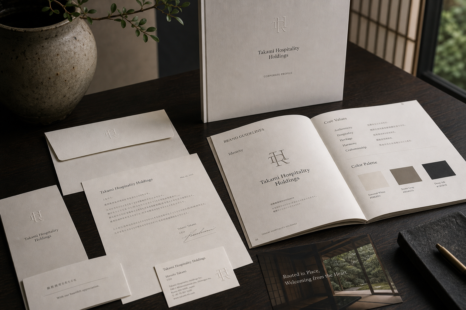
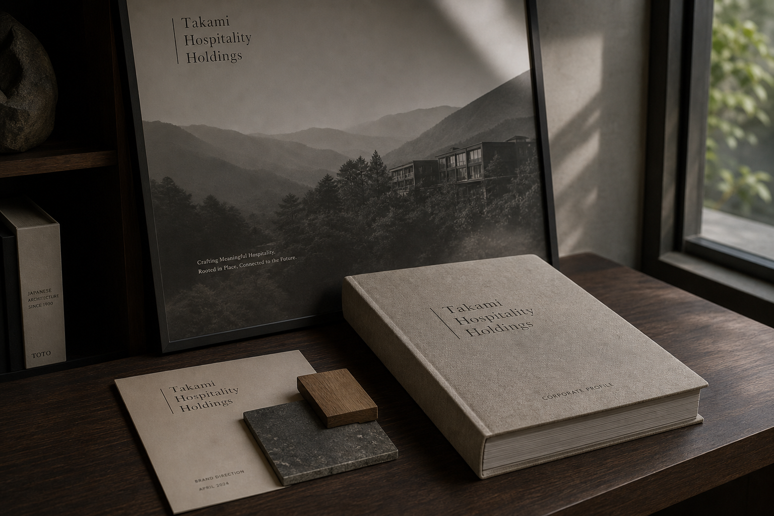
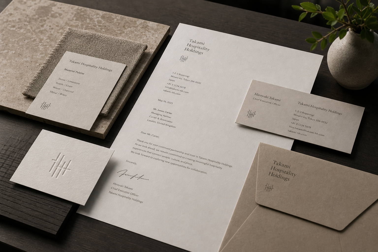
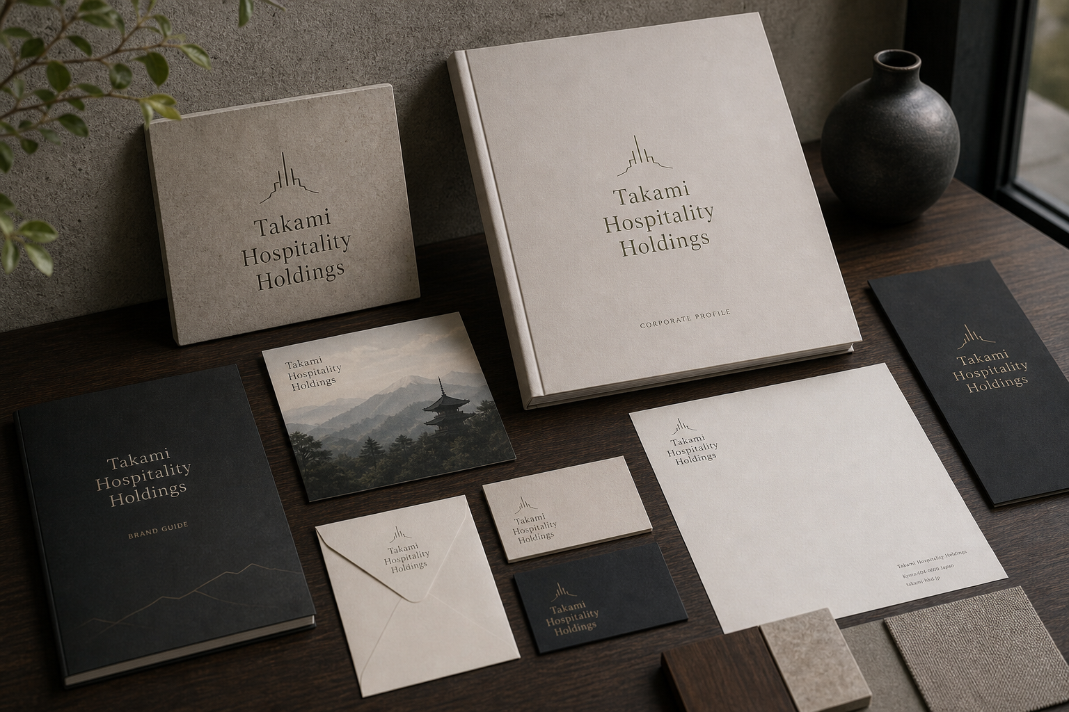
Takami Hospitality Holdings 是為 Takami Hospitality Holdings 建立的 branding + visual identity 專案。作品內容以 visual identity、brand direction、logo design 為核心,將品牌名稱、應用物件、版面規則與影像語氣整合成一套可延展的作品集案例。
攝影主題以 corporate stationery、key visual、profile book、material detail 為主。畫面應保留自然光、低飽和色彩、安靜陰影與可閱讀的材質細節,讓照片同時承擔品牌證據、包裝質感與空間情緒。
設計概念從「空間標示、導視與現場尺度」出發,使用乾淨 grotesk 字體、克制色票、細緻比例與少量資訊層級,讓品牌看起來像被整理過的文化檔案,而不是一般商業宣傳頁。
計劃上先完成品牌語氣與核心識別,再建立 Holding logo、Key visual、Brand guide 等交付物,最後以照片序列、品牌應用與網站作品頁整理成完整案例。
Holding logo / Key visual / Brand guide / Stationery / Corporate profile
Editorial review
English edition
English edition
Takami Hospitality Holdings establishes a careful balance between the scale of a corporate group and the spirit of hospitality. The name carries a clear, formal authority, while visual motifs drawn from mountain ridges, interwoven initials, and fine linear grids bring the landscapes of Kyoto, architectural order, and human connection into the identity. Rather than declaring authority through an aggressive corporate voice, the brand explains how place, service, culture, and long-term stewardship belong to one direction through its profile, guidelines, stationery, cards, and imagery.
The material palette is built from seasonal white, stone grey, warm neutral tones, deep ink, and small metallic accents, arranged alongside dark timber, stone samples, linen, and ceramics. The corporate profile uses a substantial cloth-bound cover; the brand guide and envelopes retain a soft paper grain; business cards and smaller pieces shift through several values of grey according to use. Pale surfaces bring openness and light, dark books create weight, and fine emblems become restrained focal points when raised or rendered in a brighter tone. The result is suitable for executive communication while retaining the tactile welcome expected of hospitality.
The compositions use vertical axes, generous margins, and a precise grid to create order. Takami, Hospitality, and Holdings are set over three lines, giving the long name a recognisable silhouette. The corporate profile centres the mark near the top, while correspondence aligns the name, contact information, and body copy to a disciplined left column. Brand-guideline spreads organise values, colours, and identity rules; key visuals allow the mountain landscape to occupy most of the frame, leaving the name and a short statement at the edge. Information density changes with the medium, yet the same restraint remains present from an executive letter to an image poster.
A humanist serif carries the company name, bringing historical character through slender strokes and open counters while giving the word Hospitality a softer presence. Supporting information uses a clean sans serif and small capitals suited to addresses, titles, dates, and guideline headings. Interwoven letters, ridge contours, parallel lines, and tally-like grids suggest a corporate monogram, regional landscape, and connected relationships. These motifs can contract into a small business-card signature or expand into the organising structure of a book cover and brand image.
The identity's strength lies in turning the abstract role of a holding company into a set of readable communication tools. The corporate profile frames the group's direction and businesses; the guideline aligns different teams; stationery supports daily partnerships; and landscape and architectural photography keep place, people, and service visible behind the organisational system. Authenticity, Hospitality, Heritage, Harmony, and Craftsmanship provide the stated value framework. Paper, typography, and imagery then give those words a tangible presence, linking corporate governance with the guest experience.
The larger idea behind Takami Hospitality Holdings is to give a group spanning multiple services a clear sense of roots. The mountain form suggests place and a long horizon, interwoven lines imply organisational collaboration, warm grey materials carry cultural memory, and open space lets each message unfold with composure. Whether a partner receives a letter, reads the company profile, consults the guidelines, or encounters a key image, the same attitude remains legible: respect for locality, care in welcoming people, and consistent standards directed toward the future. The identity becomes a stable platform connecting history, organisation, and hospitality experience.
日本語版
Takami Hospitality Holdings のアイデンティティは、企業グループとしてのスケールと、ホスピタリティの精神との間に繊細な均衡を築いています。名称そのものが明快で端正な企業性を担い、山並み、組み合わされたイニシャル、細い格子線といった視覚的モチーフが、京都の風景、建築的な秩序、人と人とのつながりをそこへ導きます。強い企業表現で権威を示すのではなく、会社案内、ブランドガイド、レターヘッド、名刺、写真を通して、土地、サービス、文化、長期的な経営が一つの方向へ結ばれていることを丁寧に伝えています。
マテリアルと色彩は、生成り、石灰色、温かみのあるグレー、深い墨色、そしてごく少量の金属色から構成され、濃色の木材、石のサンプル、リネン、陶器と並置されています。会社案内には存在感のある布張りの表紙が用いられ、ブランドガイドや封筒には柔らかな紙の表情が残り、名刺や小型のカードは用途に応じて異なるグレーの階調をまといます。明るい面は親しみと光を、濃色の冊子は安定した重みを生み、細線のシンボルは浮き上がる表現や明るい色調によって控えめな焦点となります。エグゼクティブな対外文書にふさわしい品位と、宿泊空間に求められる触覚的な親密さが共存しています。
レイアウトは、垂直軸、広い余白、精密なグリッドによって秩序をつくります。Takami、Hospitality、Holdings を三行に分けることで、長い名称にも認識しやすい輪郭が与えられています。会社案内ではシンボルを上部中央に置き、書簡では名称、連絡先、本文を左側の列に沿って整然と配置します。ブランドガイドは見開きで価値観、色彩、使用規則を整理し、キービジュアルでは山の風景を大きく扱い、名称と短い言葉だけを画面の端に残します。媒体ごとに情報量を変えながら、経営者の書簡からイメージポスターまで同じ節度が保たれています。
書名には人間味のあるプロポーションを持つセリフ体が用いられ、細いストロークと開かれた字形が歴史性を伝えると同時に、Hospitality という中心語に柔らかな響きを与えています。補助情報には簡潔なサンセリフ体とスモールキャップを使い、住所、役職、日付、ガイドラインの見出しを明確に整理しています。組み合わされた文字、山稜の輪郭、平行線、集積を思わせる格子は、企業の略号、地域の景観、関係性の連なりをそれぞれ想起させます。名刺上の小さな印から、書籍表紙やブランドイメージ全体の構造まで、柔軟に展開できる視覚的な母体です。
このブランドの特徴は、持株会社という抽象的な役割を、読み取ることのできる具体的なコミュニケーションへ変換している点にあります。会社案内はグループの方針と事業を整理し、ブランドガイドは異なるチームの共通言語を支え、レターヘッドと名刺は日々の協働を形づくります。山や建築の写真は、組織制度の背後に土地、人、サービスが存在することを伝えます。Authenticity、Hospitality、Heritage、Harmony、Craftsmanship という価値の枠組みを、紙、文字、写真が具体的な質感へ変え、企業運営とゲスト体験を結んでいます。
Takami Hospitality Holdings のデザイン思想は、複数のサービスを束ねるグループに、明快な根を与えることにあります。山の形は土地と長期的な視野を、交差する線は組織の協働を、温かなグレーの素材は文化の記憶を表し、余白は内容が落ち着いて展開するための場となります。パートナーが書簡を受け取り、会社案内を読み、ブランド規定を確認し、キービジュアルに触れるとき、地域への敬意、人を迎える姿勢、未来へ向けた一貫した基準が同じ態度として伝わります。このアイデンティティは、歴史、組織、ホスピタリティ体験を結ぶ安定した基盤となっています。
繁體中文版
Takami Hospitality Holdings 的識別在集團規模與款待精神之間建立平衡。名稱本身具有正式而清楚的企業份量,搭配山稜、交織字母與細線格紋等視覺母題,則把京都的地景、建築秩序和人際連結帶入其中。品牌不以強烈商業語氣宣示權威,而是透過公司簡介、品牌指南、信紙、名片與影像,一層層說明集團如何由場所出發,將服務、文化與長期經營連成共同方向。
材料色彩由米白、石灰、暖灰、深墨與少量金屬色構成,並與深色木桌、石材樣本、亞麻織物和陶器並置。公司簡介採厚實布面封套,品牌指南與信封保留柔和紙紋,名片和小卡則以不同灰階區分使用情境。淺色表面帶出親和與光線,深色冊本提供穩定份量,細線符號在壓紋或亮色呈現時形成含蓄焦點。這組材料既適合高階商務往來,也保有旅宿空間應有的觸覺親近感。
編排以垂直軸線、大片邊界和精準網格建立秩序。Takami、Hospitality、Holdings 分成三行,長名稱因此獲得容易辨認的輪廓;公司簡介將標誌置於上方中央,文件類則把名稱、聯絡資訊和正文依左側欄位排列。品牌指南用跨頁結構說明核心價值、色票與識別規則,關鍵影像則讓山景占據大部分畫面,只在角落保留名稱與短句。資訊密度隨媒介調整,從董事信函到形象海報都維持同一份節制。
字型系統以具有人文比例的襯線體承擔品牌名稱,細長筆畫與開放字腔傳達歷史感,也讓 Hospitality 這個核心詞獲得柔和語氣。輔助資訊使用簡潔無襯線體與小型大寫,適合地址、職稱、日期及規範標題。字母交織、山稜輪廓、平行細線和計數般的格紋,分別提供企業縮寫、地方地景與連結關係的聯想;這些符號能縮小成名片記號,也能放大為書冊封面或形象畫面的結構。
品牌特色是把控股公司的抽象角色轉化為可閱讀的溝通工具。企業簡介整理集團願景與事業內容,品牌指南確保不同團隊共享語言,信紙和名片支援日常合作,山景與建築攝影則讓制度背後仍看得見場所、人物和服務情境。文件中的 Authenticity、Hospitality、Heritage、Harmony 與 Craftsmanship 形成價值框架,紙品、文字與影像再把這些詞落到具體質感,使企業治理與旅客感受彼此連接。
Takami Hospitality Holdings 的設計理念,是讓一個橫跨多項服務的集團仍保有清楚根系。山形代表所在地與長期視野,交織線條象徵組織協作,暖灰材料承接文化記憶,而留出的空間則讓內容沉著展開。合作夥伴收到信件、閱讀公司簡介、查閱品牌規範或觀看形象影像時,都能辨認相同態度:尊重地方、重視人與人之間的迎接,也以一致標準面向未來。這套識別因此成為連結歷史、組織和款待體驗的穩固平台。
- visual identity: hermetic design
- brand direction: hermetic design
- photography: studio archive
- client: takami hospitality holdings