Nerva Bathworks
branding + visual identity
Nerva Bathworks
2026 / Tokyo
brand design
logo + visual identity
brand guide
graphic design
web design
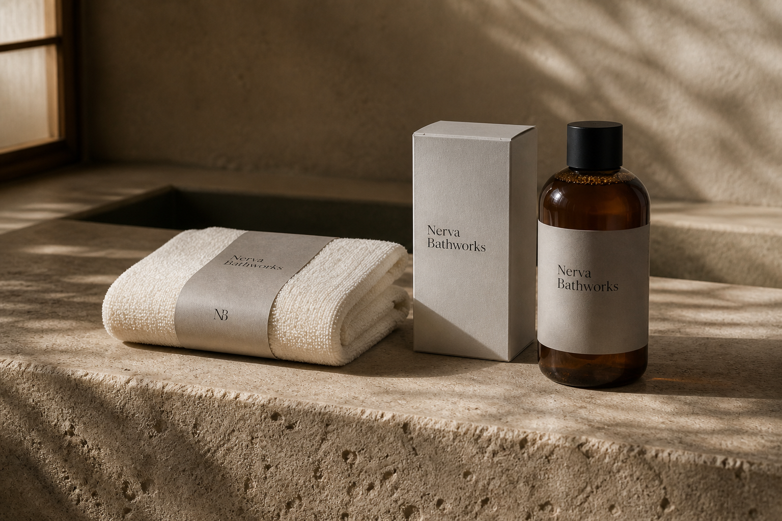
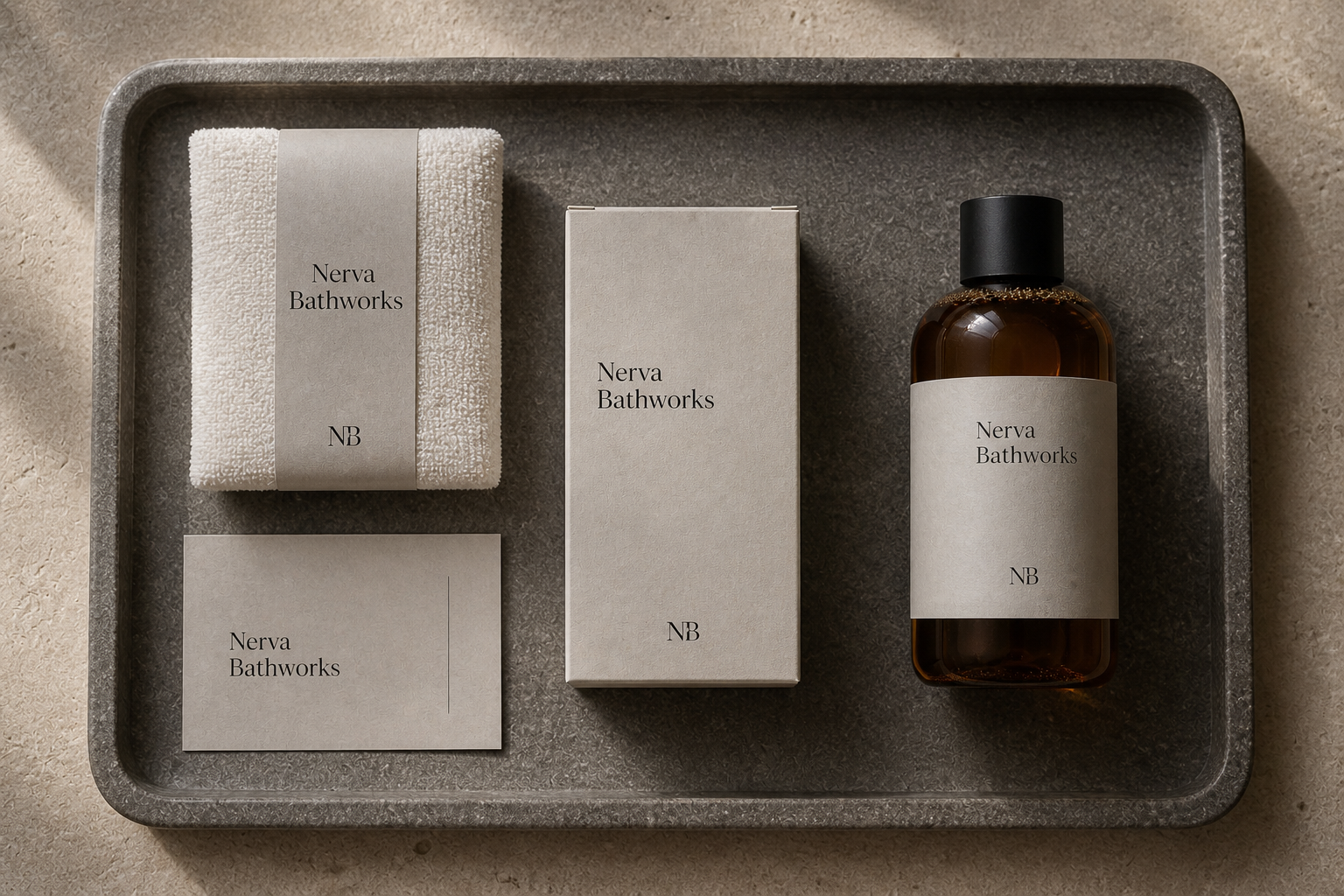
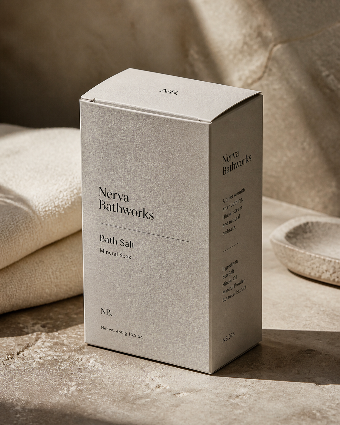
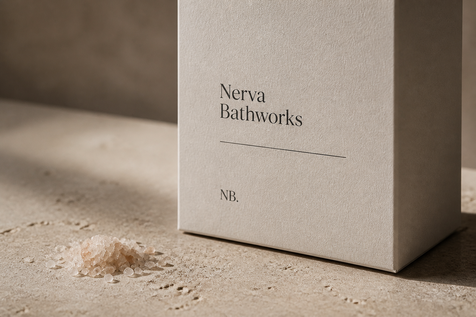
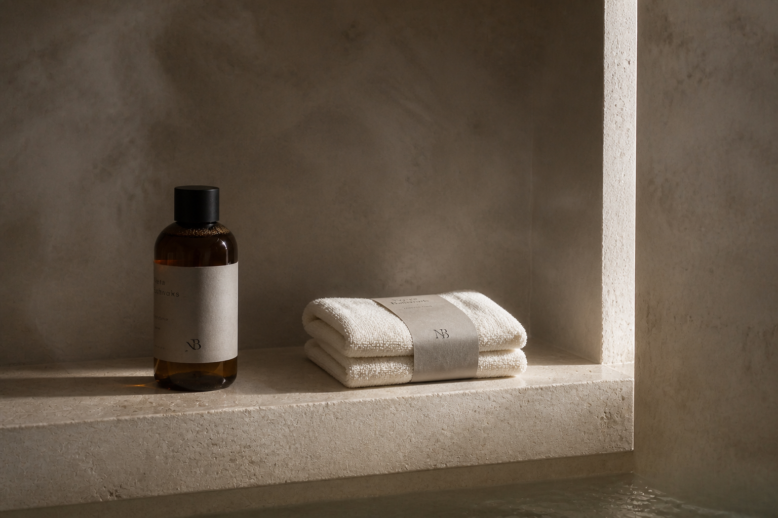
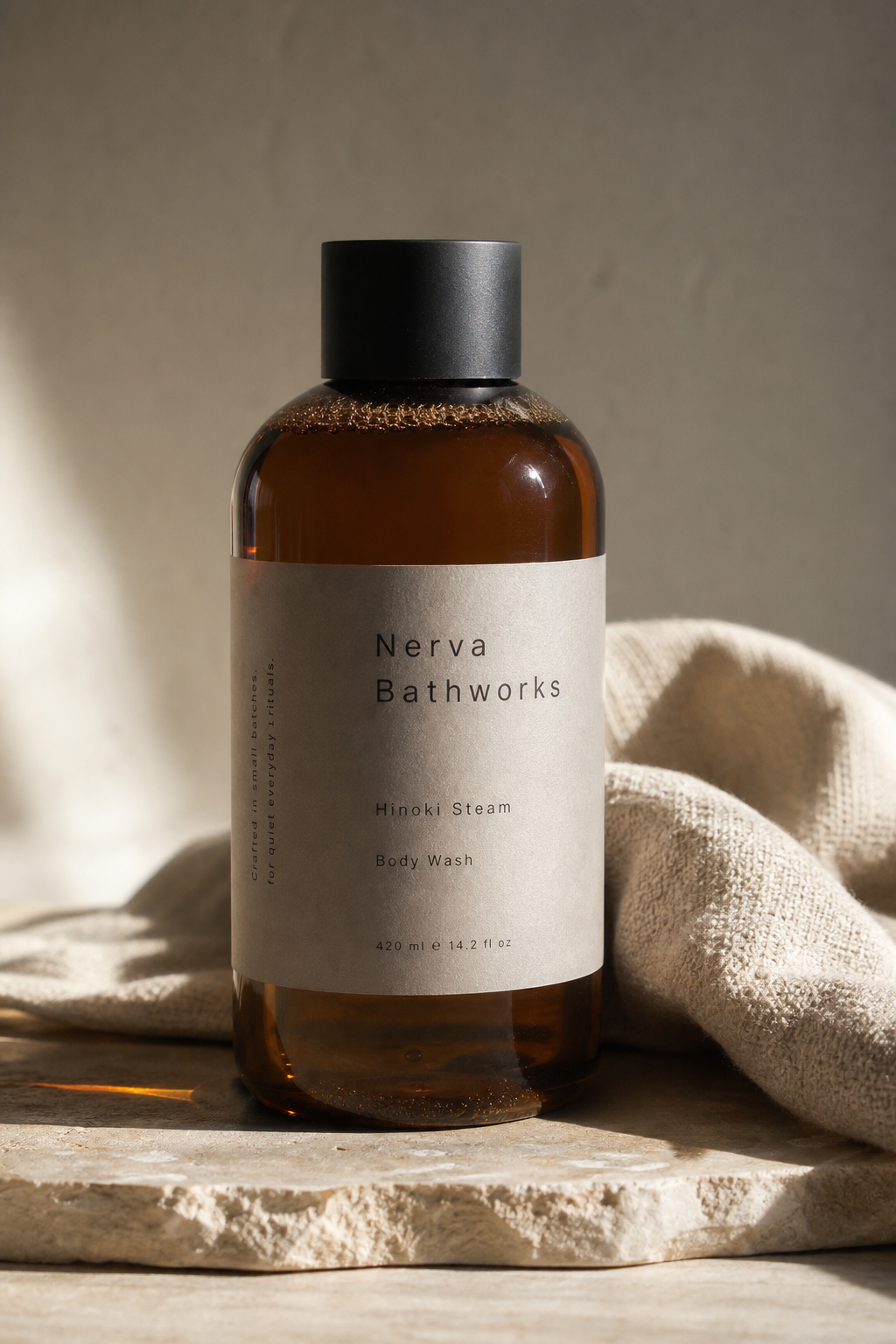
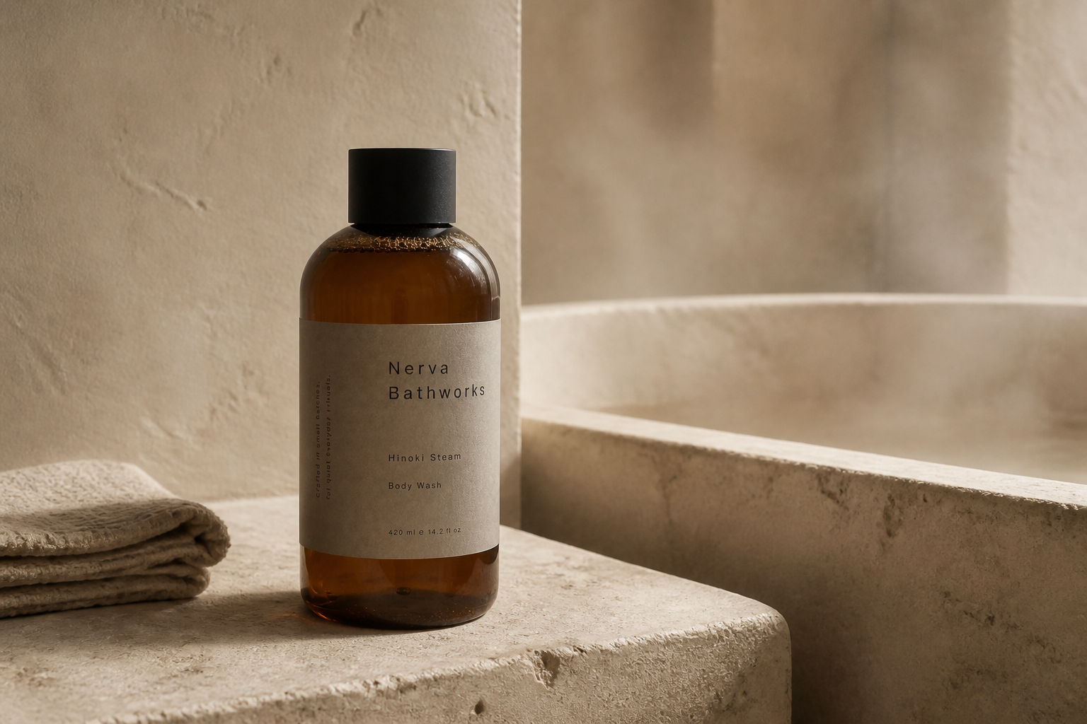
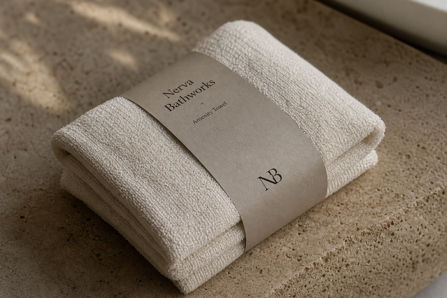
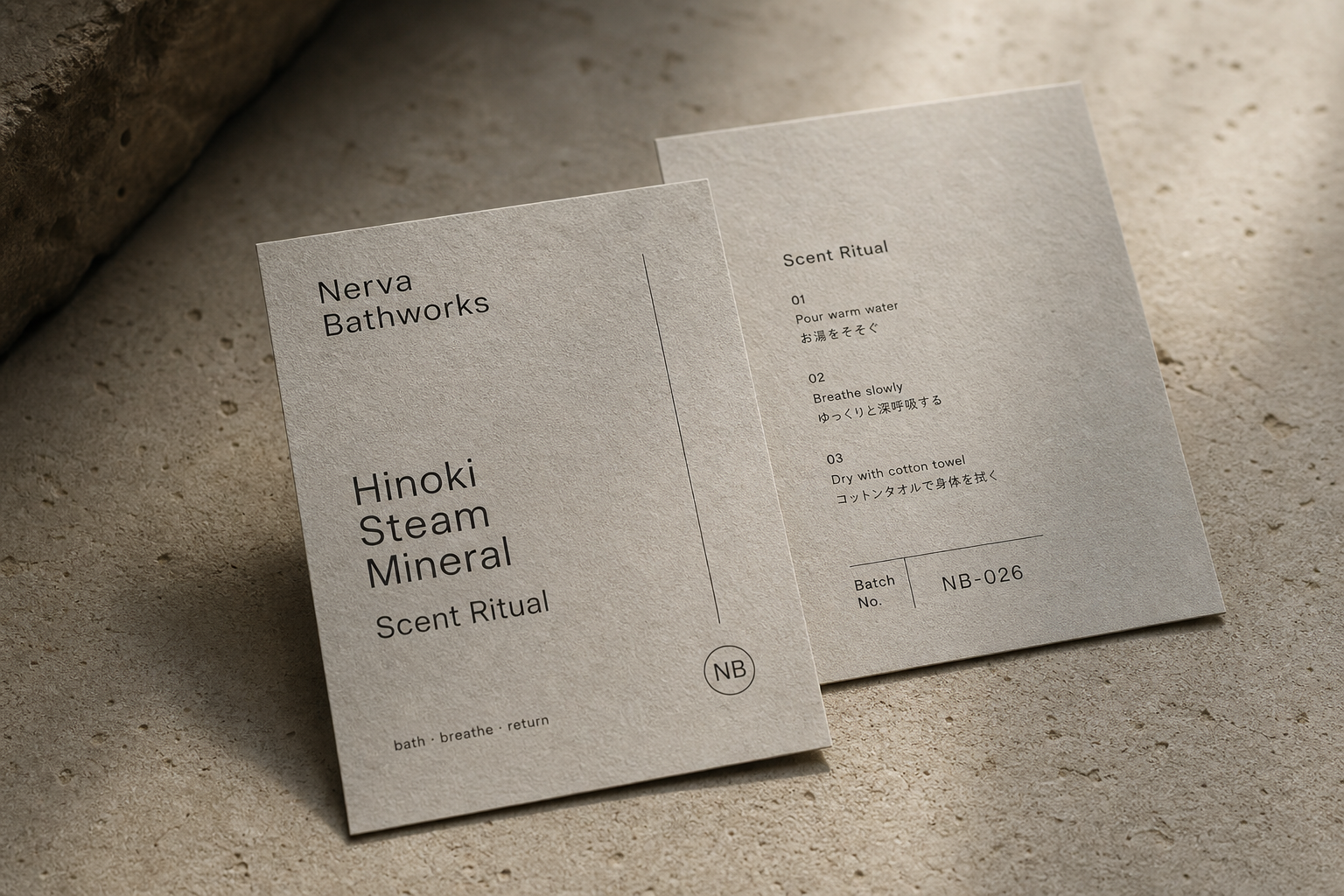
Nerva Bathworks 是為 Nerva Bathworks 建立的 branding + visual identity 專案。作品內容以 brand design、logo + visual identity、brand guide 為核心,將品牌名稱、應用物件、版面規則與影像語氣整合成一套可延展的作品集案例。
攝影主題以 bath product hero、logotype construction、package label、towel and amenity scene 為主。畫面應保留自然光、低飽和色彩、安靜陰影與可閱讀的材質細節,讓照片同時承擔品牌證據、包裝質感與空間情緒。
設計概念從「包裝、標籤與紙材的觸感」出發,使用乾淨 grotesk 字體、克制色票、細緻比例與少量資訊層級,讓品牌看起來像被整理過的文化檔案,而不是一般商業宣傳頁。
計劃上先完成品牌語氣與核心識別,再建立 Logotype、Brand guide、Package label 等交付物,最後以照片序列、品牌應用與網站作品頁整理成完整案例。
Logotype / Brand guide / Package label / Web design / Brand movie direction
Editorial review
English edition
English edition
Nerva Bathworks is most compelling when it treats bathing not as simple cleansing, but as a quiet daily ritual composed of water, scent, warmth, and breath. Its sense of refinement comes from tactile paper, measured typography, object proportions, and warm light, creating an imagined bodily experience before the products are even used.
Paper is the foundation of the system. Bath-salt cartons, towel bands, bottle labels, and ritual cards share warm grey and off-white tones with gently irregular textures. Against cotton towels, mineral stone, and amber glass, the materials create a dialogue of softness, dryness, and warmth; the restrained towel band also turns wrapping and preparation into part of the bathing ritual.
The layouts follow a clear vertical order. Product name, type, capacity, and instructions occupy distinct levels, while fine rules create pauses rather than decoration. Generous margins slow the reader down, and the bilingual 01, 02, 03 sequence on the ritual card turns graphic hierarchy into an actual sequence of pouring, breathing, and drying.
Typography is carefully assigned to each medium. Serif lettering on cartons and towel bands evokes books, craft, and traditional bath culture, while the lighter sans serif on bottles and ritual cards feels precise and contemporary. The compact NB monogram returns as a low-volume signature that quietly binds the collection together.
Photography carries the same idea into light. Warm illumination passes through amber glass and leaves soft shadows on stone and cloth, while ample distance between objects allows paper edges, curved bottles, and textile fibres to remain visible. The result feels intimate and sensory rather than loudly luxurious.
Everything in Nerva Bathworks returns to the phrase bath, breathe, return. Identity, material, instructions, and pace form one coherent experience, showing that luxury can come from exact choices rather than excess. The brand gives an ordinary routine enough attention to become a restorative ritual.
日本語版
Nerva Bathworks の魅力は、入浴を単なる洗浄ではなく、水、香り、温度、呼吸から成る静かな日常の儀式として捉えている点にあります。紙の触感、文字のリズム、器の比率、温かな光が、使用前から身体感覚を想起させます。
このシステムの基礎は紙です。バスソルトの箱、タオルバンド、ボトルラベル、リチュアルカードには、暖かなグレーと生成り、穏やかに不均一な質感が共通して使われています。綿、鉱物感のある石、琥珀色のガラスと響き合い、包む行為そのものを入浴の準備へ変えています。
レイアウトは明快な垂直秩序を持ちます。名称、品目、容量、説明が異なる高さに置かれ、細線は装飾ではなく読むための間をつくります。広い余白が速度を落とし、カード上の 01、02、03 の二言語手順が、注ぐ、呼吸する、拭うという体験を導きます。
媒体ごとの書体の役割も精密です。箱とタオルバンドのセリフ体は書物や伝統的な浴場文化を思わせ、ボトルとカードの軽いサンセリフ体は現代的な清潔感を与えます。小さな NB モノグラムは、シリーズ全体を静かに結ぶ署名です。
写真も同じ思想を光へ置き換えています。暖色の光が琥珀色の瓶を通り、石と布に柔らかな影を残し、物の間の距離が紙の端、瓶の曲面、繊維を主役にします。華美ではなく、親密で感覚的な質が生まれています。
Nerva Bathworks は bath, breathe, return という言葉へ一貫して戻ります。識別、素材、使用手順、時間の流れが一つの体験となり、豊かさが量ではなく選択の正確さから生まれることを示しています。日常の動作を回復の儀式へ変える設計です。
繁體中文版
Nerva Bathworks 最動人的地方,在於它沒有把「沐浴」處理成單純的清潔用品,而是把水、氣味、溫度與呼吸重新組織成一套安靜而完整的日常儀式。整體識別不靠繁複裝飾建立高級感,而是以紙材的觸覺、文字的節奏、器物的比例與光線的溫度,讓品牌在觀看之前,先產生一種可以被想像的身體感受。
紙材是這套設計非常重要的基礎。浴鹽紙盒、毛巾紙環、瓶身標籤與香氣儀式卡都採用暖灰、米白之間的中性色調,表面可見細緻而不規則的紋理。這種紙面與棉質毛巾、礦物感石材、琥珀色瓶器放在一起時,形成柔軟、乾燥與溫潤的材質對話。尤其毛巾紙環並沒有把商品完全包覆,而是以一道克制的紙帶收束蓬鬆織物;紙與布的差異被保留下來,也讓包裝本身成為「整理、包覆、準備沐浴」這個動作的一部分。浴鹽紙盒則以大面積留白承接紙張質地,使包裝即使資訊完整,仍維持沉靜而有呼吸感的外觀。
編排上,設計採取非常清楚的垂直秩序。品牌名稱、品項、容量與說明分布在不同高度,細線既是分隔,也是視線停頓的節點。資訊沒有被壓縮成密集標籤,而是透過寬裕邊界、字級差與段落距離,讓閱讀速度自然放慢。香氣儀式卡的正反面尤其出色:正面以放大的 Hinoki Steam Mineral 建立氣味印象,背面再以 01、02、03 的雙語步驟引導使用者完成注水、呼吸與擦拭。這使平面編排不只是資訊整理,也直接參與了產品體驗。
字型系統在不同載體之間展現出細膩的角色分配。紙盒與毛巾紙環上的襯線字帶有人文、書籍與傳統浴場的氣質;瓶身與儀式卡上的無襯線字則更輕、更疏朗,呼應當代保養品牌的精準與潔淨。兩者並置並不衝突,反而建立了品牌的雙重性格:一方面尊重沐浴文化所累積的儀式感,另一方面以現代語言回應日常生活。簡潔的 NB 字母組合在包裝頂部、紙環下方與卡片角落反覆出現,像一枚低聲量的印記,讓整個系列具有一致而容易辨識的收束力量。
攝影延續了同樣的設計理念。暖色側光穿過琥珀玻璃,在石面與毛巾上留下柔和陰影;物件之間保持足夠距離,使紙張邊緣、瓶身曲面與織物纖維都能成為視覺主角。這些畫面沒有把產品推向喧鬧的奢華,而是塑造一種內斂、可親近的感官品質。
從品牌名稱到包裝、從文字到使用步驟,Nerva Bathworks 始終圍繞「bath・breathe・return」展開:沐浴、呼吸,最後回到自身。這是一套把品牌識別、物質觸感與生活節奏真正整合在一起的設計,也讓人相信,最有力量的奢華往往不是更多,而是每一個選擇都恰如其分。
- branding: hermetic design
- package design: hermetic design
- photography: studio archive
- client: nerva bathworks