Seven C Winery
branding + visual identity
Seven C Winery
2024 / Yamanashi
brand design
logo + visual identity
brand guide
web design
wine package design
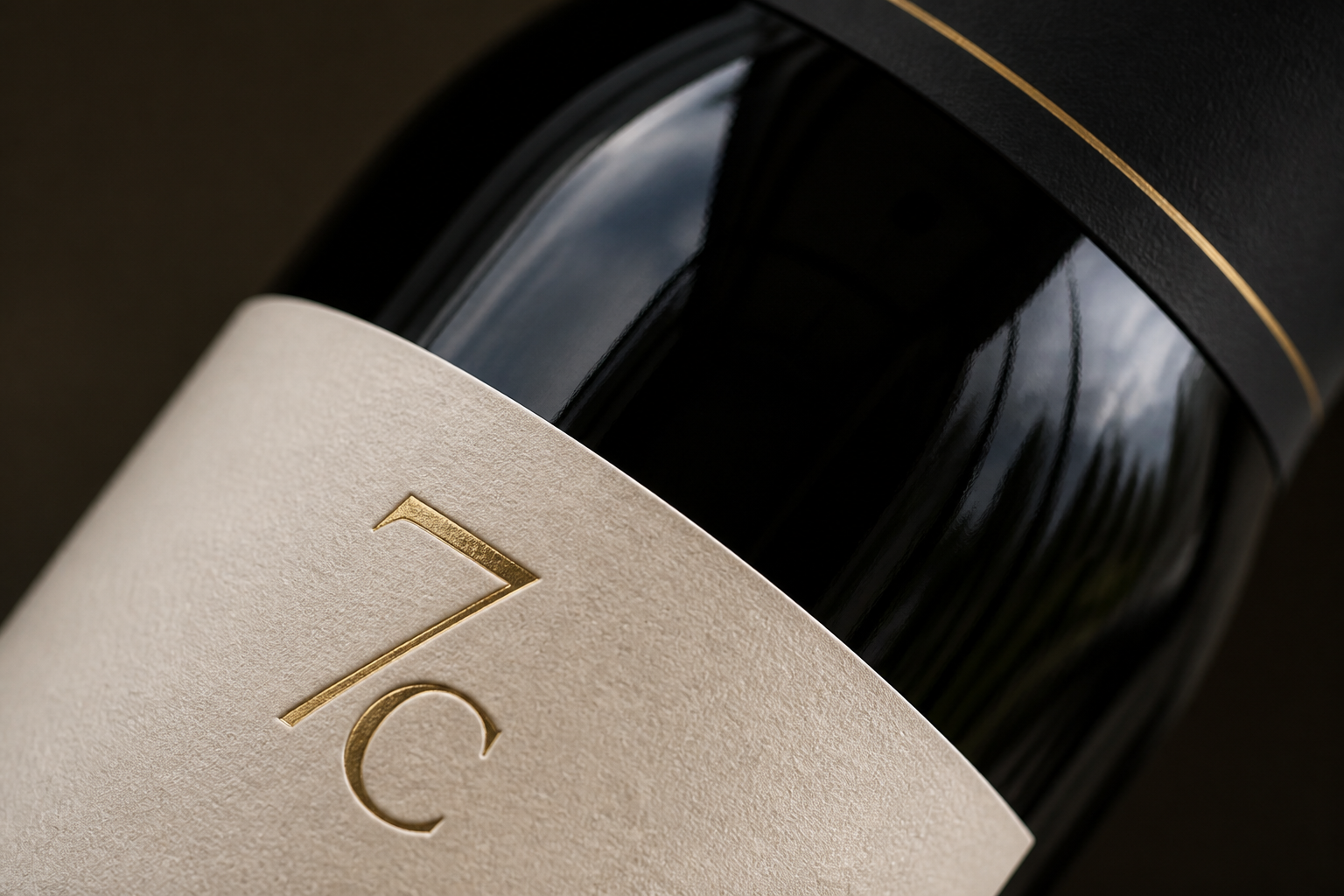
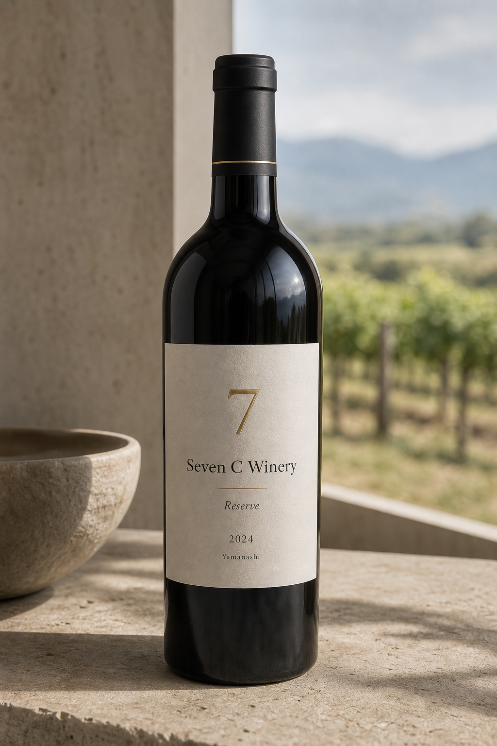
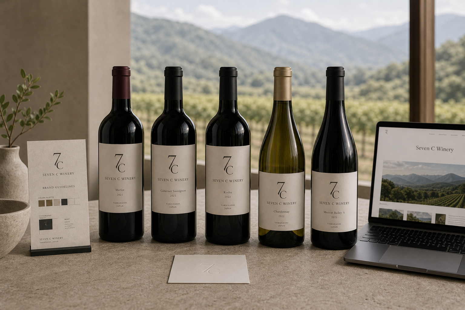
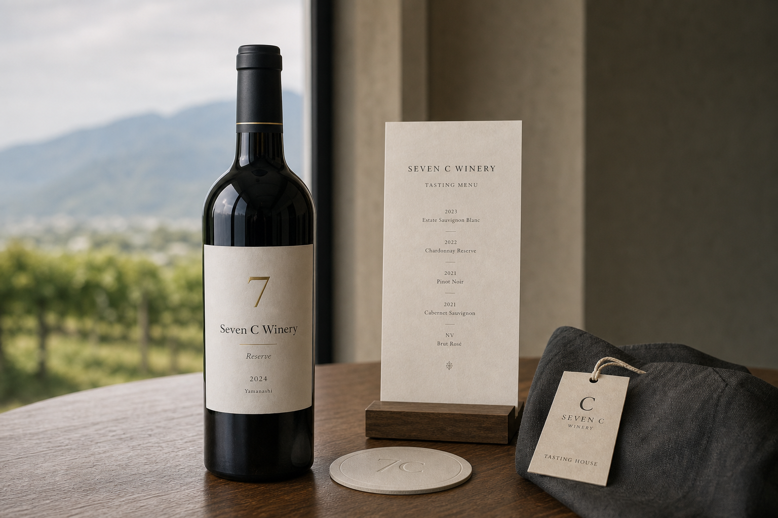
Seven C Winery 是為 Seven C Winery 建立的 branding + visual identity 專案。作品內容以 brand design、logo + visual identity、brand guide 為核心,將品牌名稱、應用物件、版面規則與影像語氣整合成一套可延展的作品集案例。
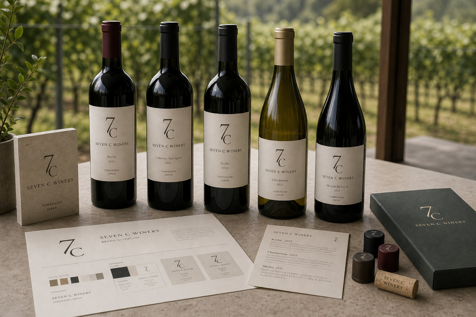
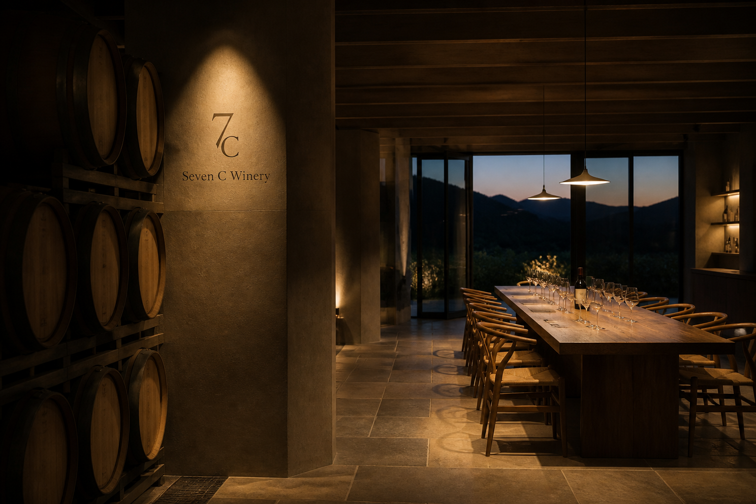
攝影主題以 bottle lineup、wine label、lounge item、tasting table 為主。畫面應保留自然光、低飽和色彩、安靜陰影與可閱讀的材質細節,讓照片同時承擔品牌證據、包裝質感與空間情緒。
設計概念從「包裝、標籤與紙材的觸感」出發,使用乾淨 grotesk 字體、克制色票、細緻比例與少量資訊層級,讓品牌看起來像被整理過的文化檔案,而不是一般商業宣傳頁。
計劃上先完成品牌語氣與核心識別,再建立 Wine label、Bottle family、Uniform tag 等交付物,最後以照片序列、品牌應用與網站作品頁整理成完整案例。
Wine label / Bottle family / Uniform tag / Lounge menu / Web design
Editorial review
English edition
English edition
Seven C Winery centres its identity on vineyard time, organising vintage, grape, origin, and tasting into one recognisable system. Dark bottles, ivory labels, forest-green boxes, burgundy and golden-brown foils create a mature palette that remains connected to rows of vines outside.
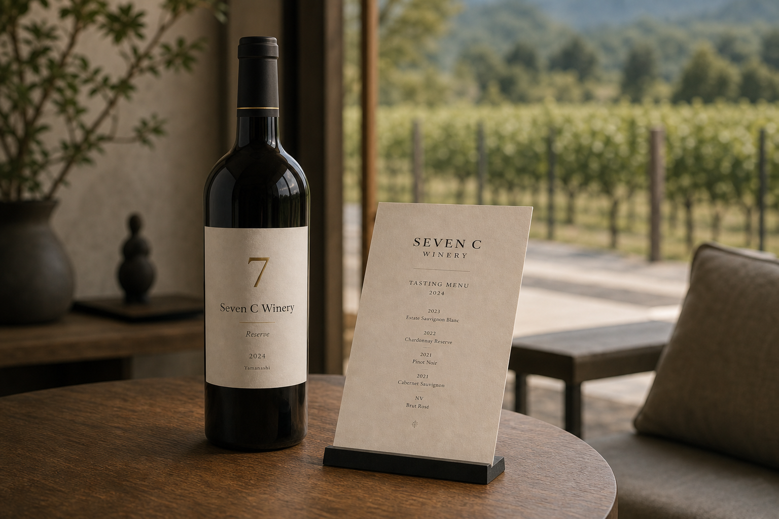
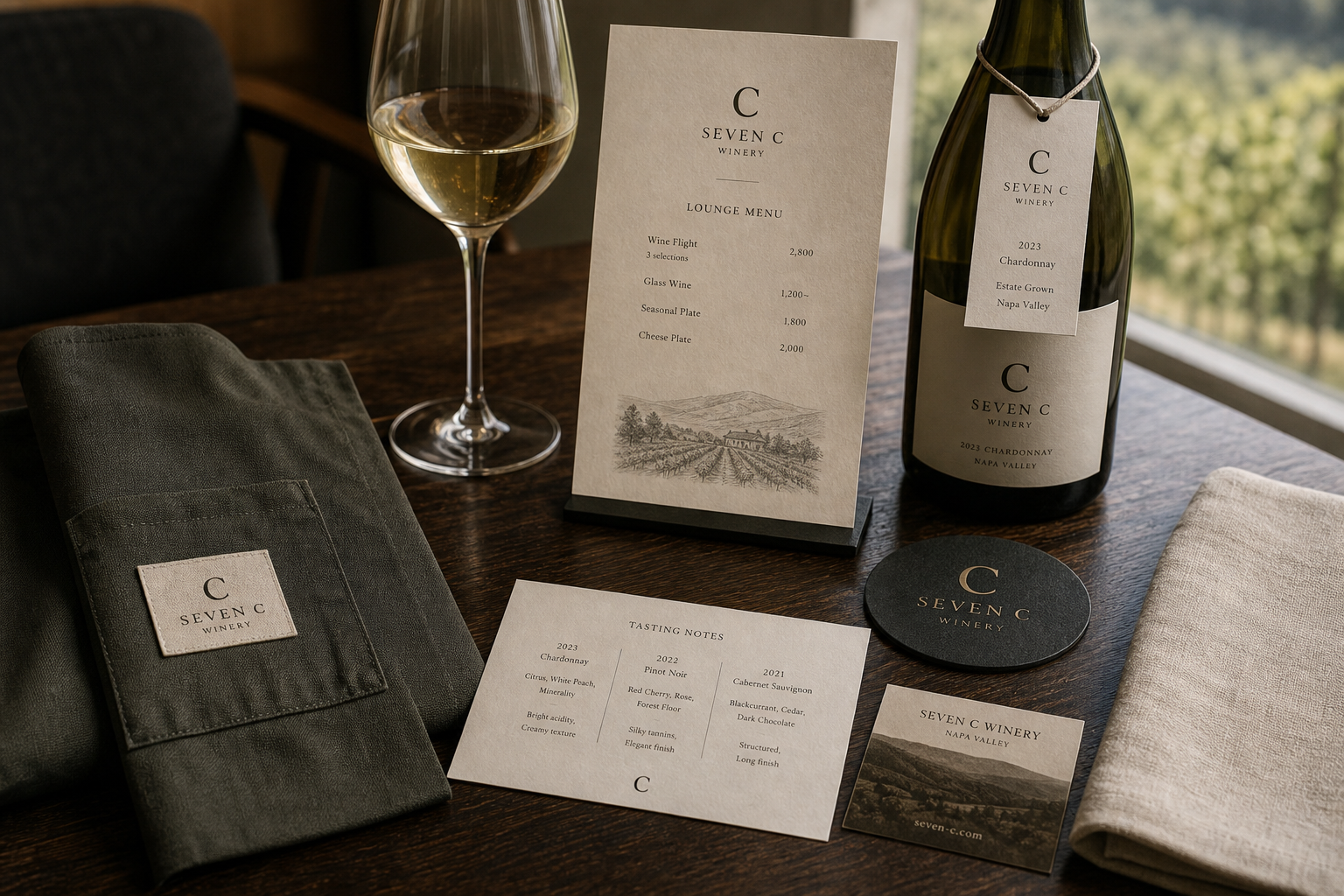
Warm white labels carry fine grain against deep green and brown-black glass. Reserve wines add gold-toned numerals and wider spacing, while closures distinguish varieties without changing the main paper language. Boxes, coasters, aprons, tasting cards, glass, and timber form one material environment.
A central axis gives the label stability: the enlarged 7C mark leads, followed by winery, grape, vintage, and origin. Each wine shares the framework, while reserve editions increase ceremony. Tasting menus and notes align vintages, aromas, and palate information for comparison, purchase, and collection.
An elegant serif and open capitals establish the main voice. The overlapping 7 and C remain individually legible while forming a continuous curve reminiscent of wine in a glass. A single C works at smaller scale on textiles, tags, and coasters.
The brand controls both family resemblance and vintage difference. Merlot, Cabernet Sauvignon, Koshu, and Chardonnay retain distinction through bottle, wine colour, closure, and copy, while vineyard illustration and real vines connect product to place. Hospitality extends through glassware, linen, timber, and uniforms.
Every bottle can express its own character while belonging to a clear family. Shelf recognition, label reading, tasting comparison, and service are joined through one pace. Land, product, and welcome become a continuous experience that feels refined, dependable, and collectible.
日本語版
Seven C Winery は葡萄畑の時間を中心に、年、品種、産地、試飲を一つの認識しやすいシステムへ整理します。濃色瓶、象牙色ラベル、深緑箱、葡萄色と金褐色の封が成熟した色譜をつくり、外の葡萄列と結びつきます。
細かな粒子のある暖白ラベルは、深緑と黒褐色のガラスに明確です。Reserve は金色の数字と広い間隔で儀式性を高め、封色が品目を区別します。箱、コースター、エプロン、カード、グラス、木卓が一つの素材環境になります。
中央軸の上に大きな 7C、名称、品種、年、産地が続きます。各酒は同じ骨格を共有し、Reserve は余白で格を上げます。試飲メニューとノートは年、香り、味を比較しやすく整理します。
優雅なセリフ体と広い大文字字間が主声をつくります。重なる 7 と C は個別に読めながら、杯中の酒のような連続曲線になります。単独の C は布標、タグ、コースターなど小さな用途に適します。
Merlot、Cabernet Sauvignon、Koshu、Chardonnay は同じ家族構造を持ち、瓶、酒色、封、文章で違いを保ちます。葡萄畑の図と実景が商品を土地へ戻し、器、布、木、制服が接待文化を広げます。
棚で印を見つけ、ラベルを読み、試飲で比べ、サービスを受ける流れが一つのリズムで結ばれます。土地、商品、歓迎を連続させ、各瓶の個性と長く収集できる家族性を両立した識別です。
繁體中文版
Seven C Winery 的識別以葡萄園的時間感為核心,把年份、品種、產地與品飲空間整理成一套優雅而容易辨認的系統。深色酒瓶、象牙白標籤、墨綠禮盒、酒紅與金棕瓶封共同構成成熟色譜,窗外成排葡萄藤則讓包裝始終與土地保持聯繫。從單瓶標籤到品飲菜單、杯墊、制服布標與接待用品,每個媒介都延續同一種節制語氣,使品牌兼具酒莊的專業可信度與款待賓客的溫暖。
標籤紙採帶有細微纖維與顆粒的暖白材質,柔和表面能承接日光,也與深綠、棕黑玻璃形成清楚對比。Reserve 酒款以金色數字和細線增加光澤,系列包裝則利用瓶封色彩區分品項,而不改變主要紙色。墨綠盒面、深色圓形杯墊與工作圍裙提供較厚重的觸感,米白品飲卡和桌上菜單則維持輕盈。紙張、玻璃、織物與木桌彼此銜接,讓酒標不只是瓶上的資訊,也成為整個品飲環境的材質基準。
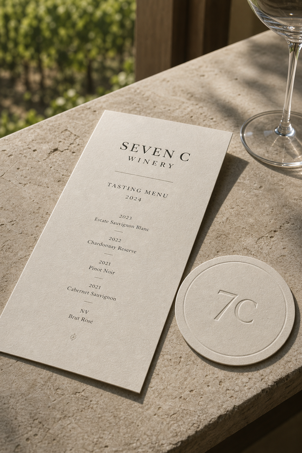
編排以中央軸線建立酒標的安定感。放大的 7C 標誌位於上方,品牌名稱、葡萄品種、年份與產地依序向下排列,資訊層級即使縮小到瓶身仍然清楚。不同酒款沿用同一框架,陳列時形成整齊家族;Reserve 版本則藉由更寬裕的間距和金色重點提高儀式感。品飲菜單把年份與酒款垂直展開,Tasting Notes 以欄位並列香氣及口感內容,桌面使用時能快速比較。這種結構同時服務購買、收藏與現場品飲。
字型系統以高雅襯線體和舒展大寫字距建立主聲音。數字 7 與字母 C 交疊成鮮明標誌,兩個字符既可被獨立辨識,又像酒液在杯中形成的連續曲線。SEVEN C WINERY 以較小的大寫字承接標誌,呈現經典酒標的莊重比例;品種、年份和產地使用更克制的字級,保持閱讀精度。單一 C 標誌則適合制服布標、掛牌與杯墊,使識別在較小尺度中仍有清楚存在感。
品牌特色來自對「系列」與「年份」的成熟掌握。Merlot、Cabernet Sauvignon、Koshu、Chardonnay 等酒款共享一致結構,又透過瓶型、酒色、瓶封與文字內容保有差異。葡萄園插畫出現在桌上菜單,實景藤蔓則成為攝影背景,讓產地印象從圖像延伸到空間。酒杯、亞麻布、木桌和深色制服營造安定的接待場景,使 Seven C 不只像一組零售包裝,更像一間具備完整品飲文化的酒莊品牌。
Seven C Winery 的設計理念,是讓每瓶酒在獨立表達風味時,仍屬於清楚可辨的共同家族。顧客從瓶架辨認標誌與年份,閱讀標籤選擇酒款,在品飲空間透過菜單和筆記卡理解差異,服務人員的制服與桌面用品則延續同一品牌節奏。設計把土地、產品與款待串成連續體驗,讓視覺識別陪伴一瓶酒從選購、開瓶到分享。這份一致而不單調的控制,使品牌呈現穩健、精緻並值得長期收藏的性格。
- branding: hermetic design
- wine package design: hermetic design
- photography: studio archive
- client: seven c winery