Atelier Flats
branding + visual identity
Atelier Flats
2024 / Tokyo
brand design
logo + visual identity
brand guide
stationery design
editorial design
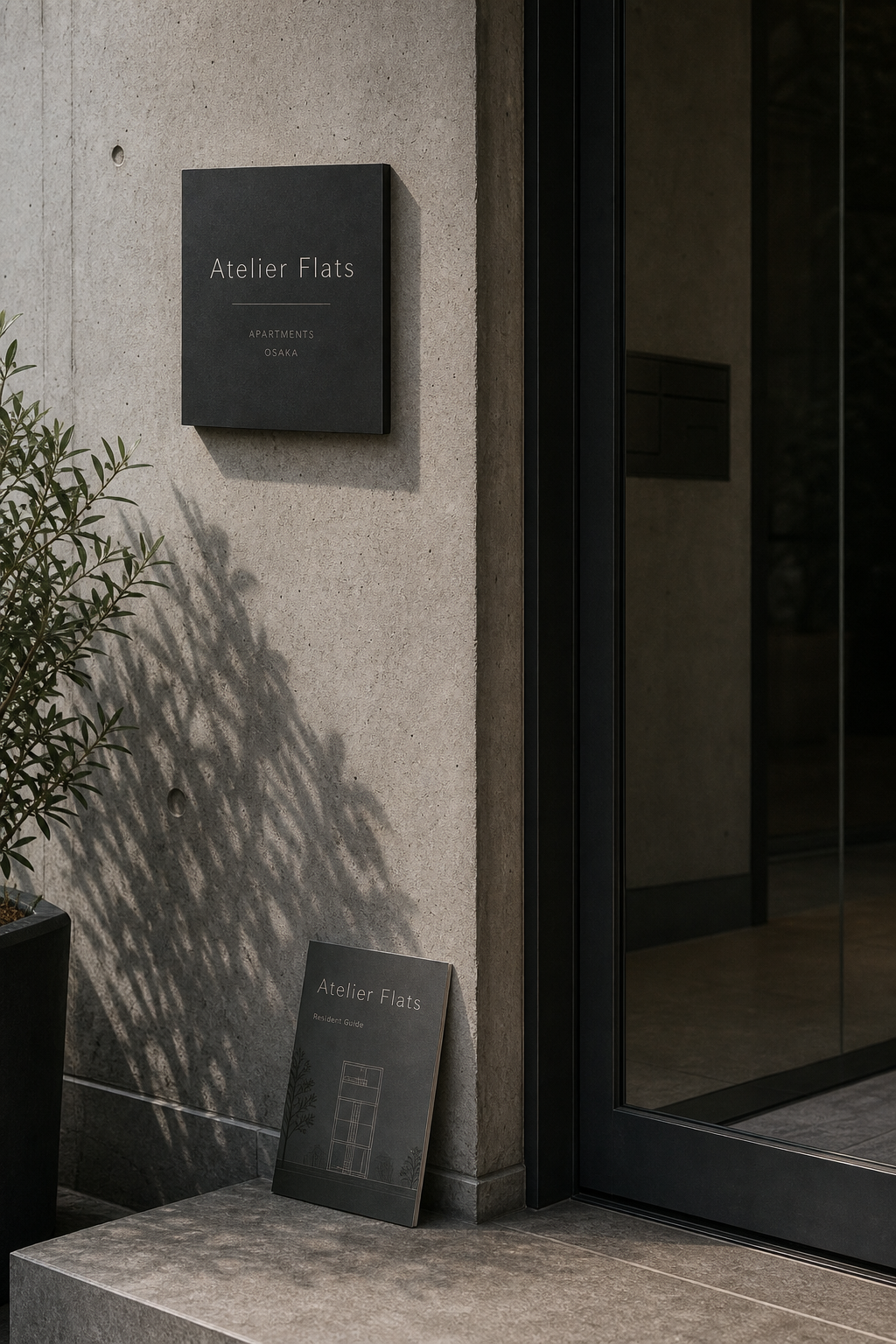
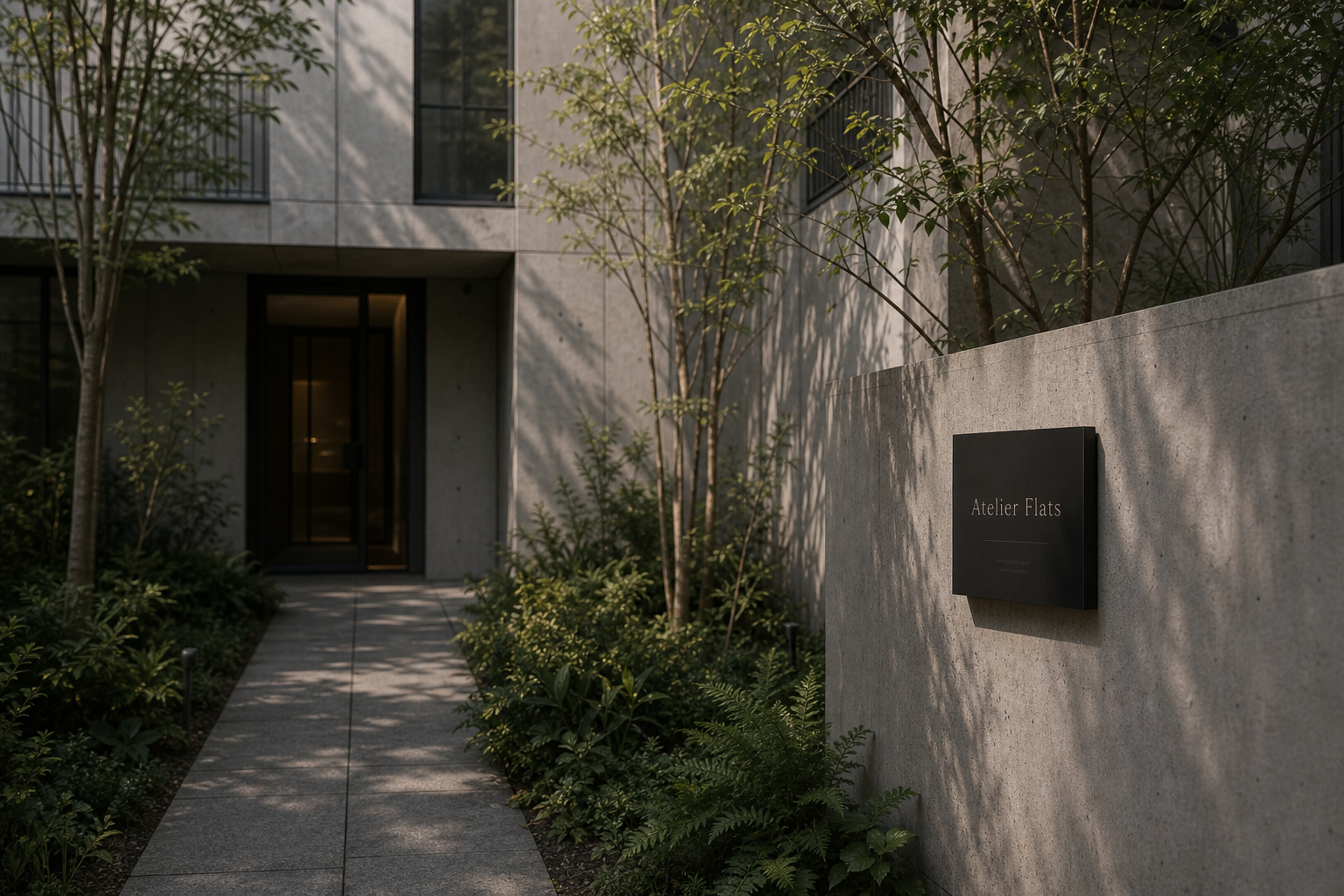
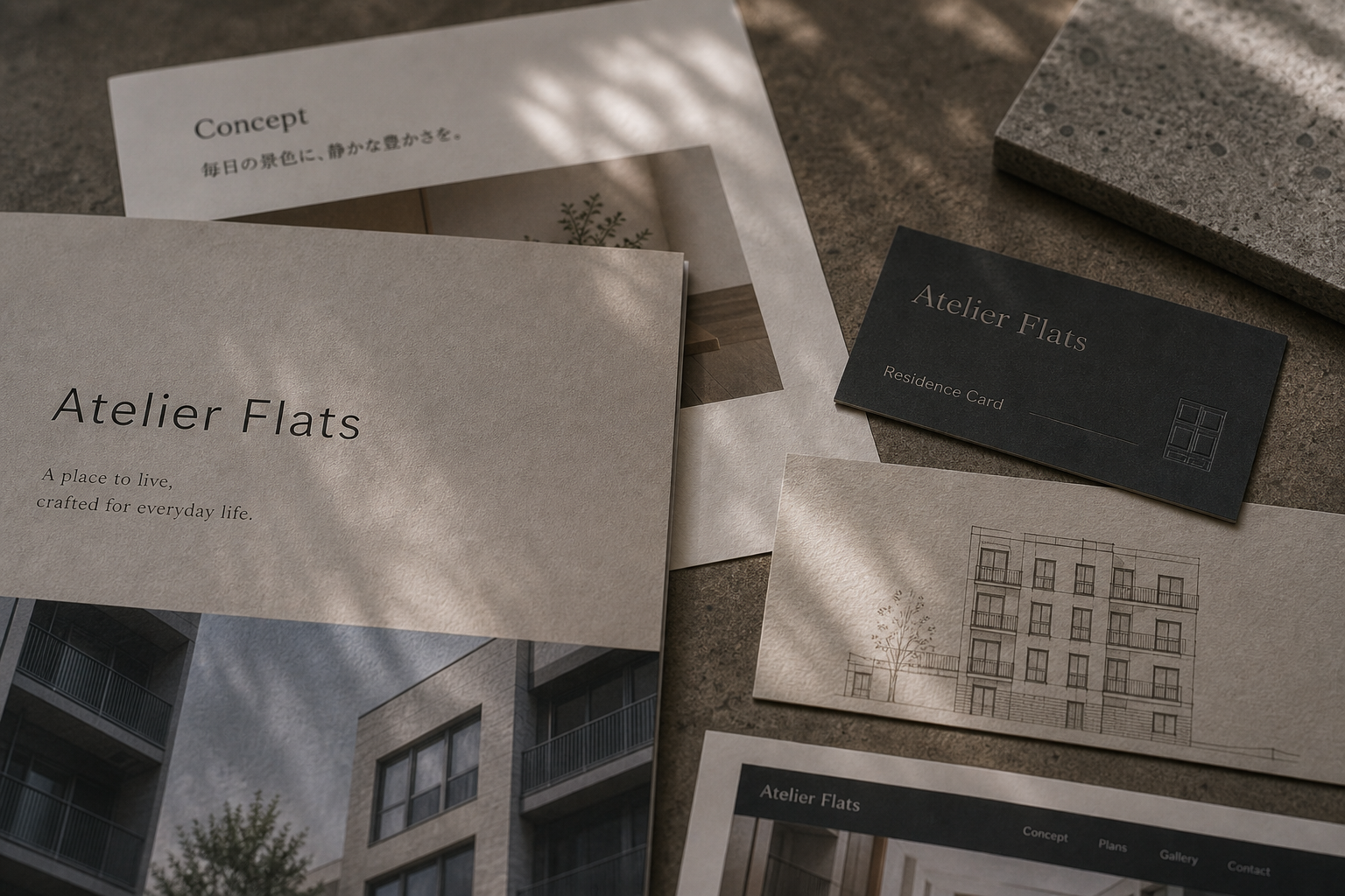
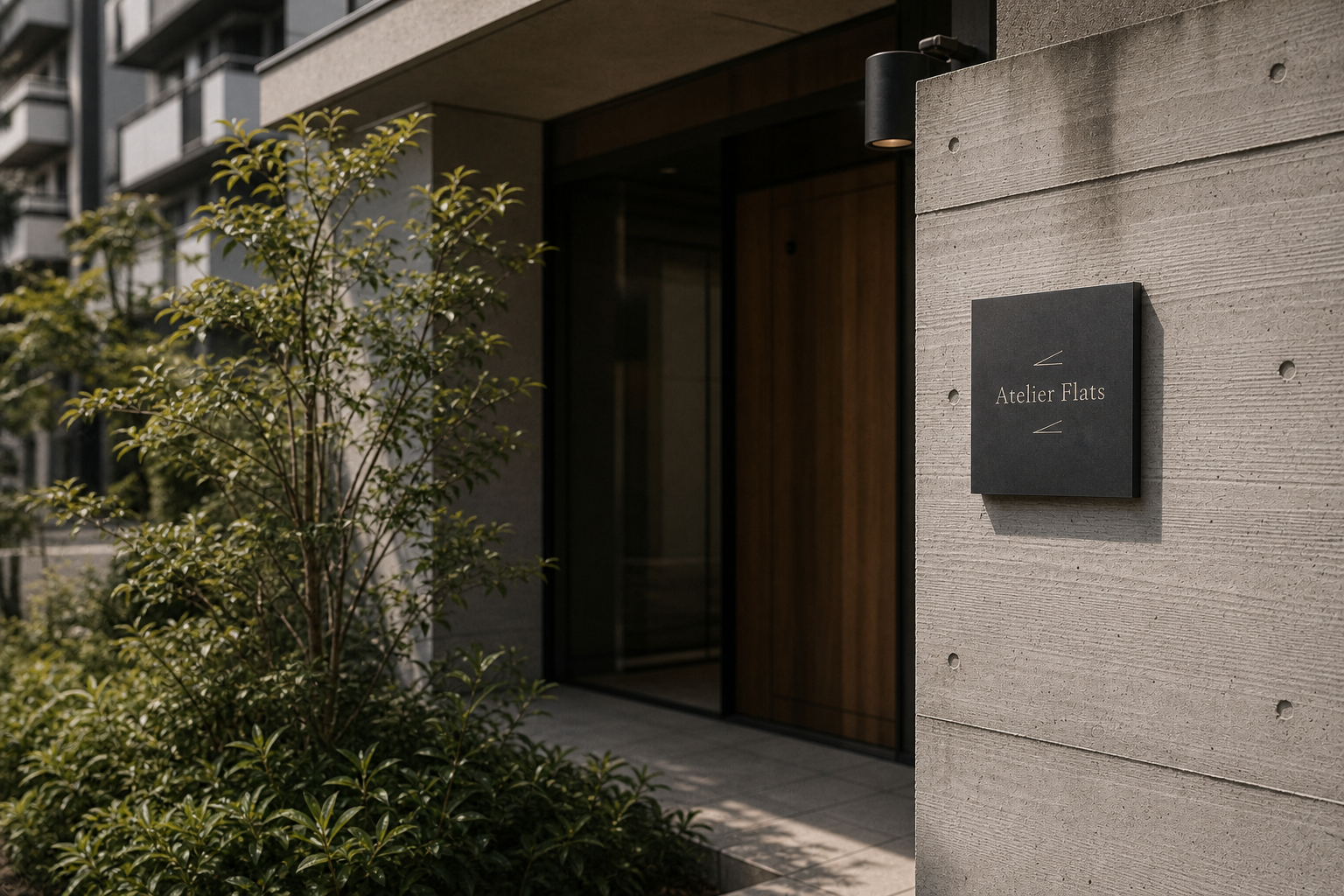
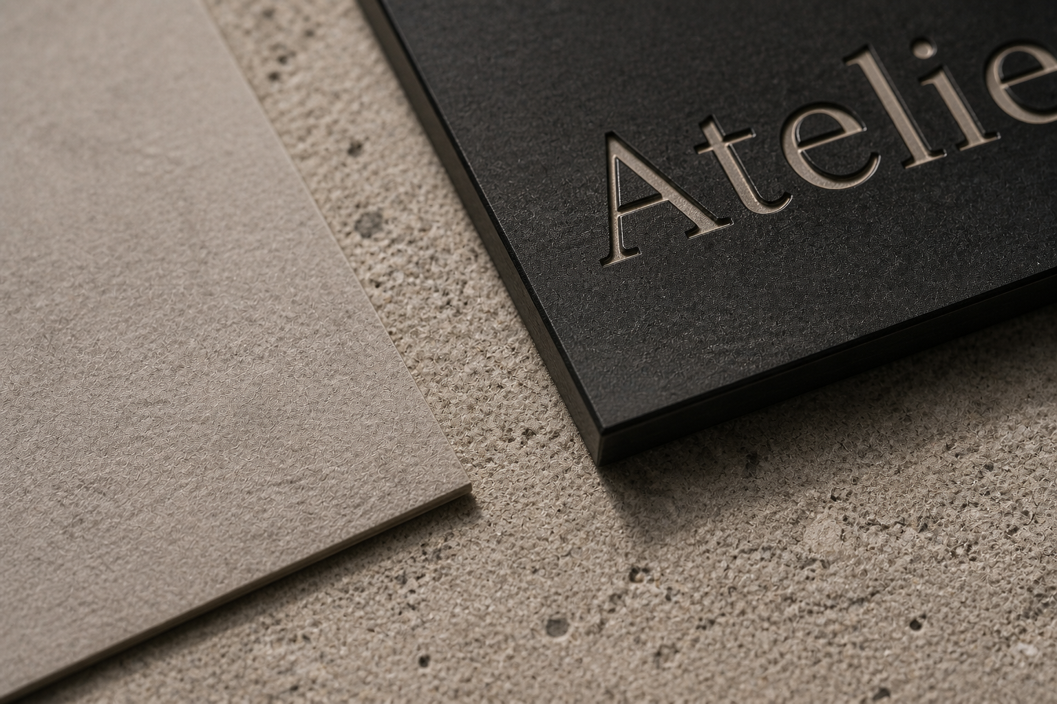
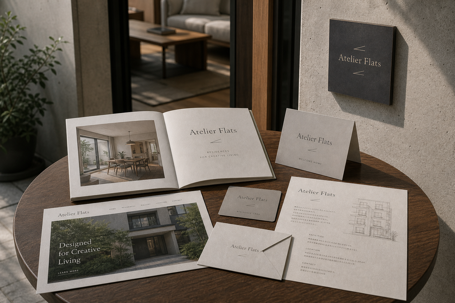
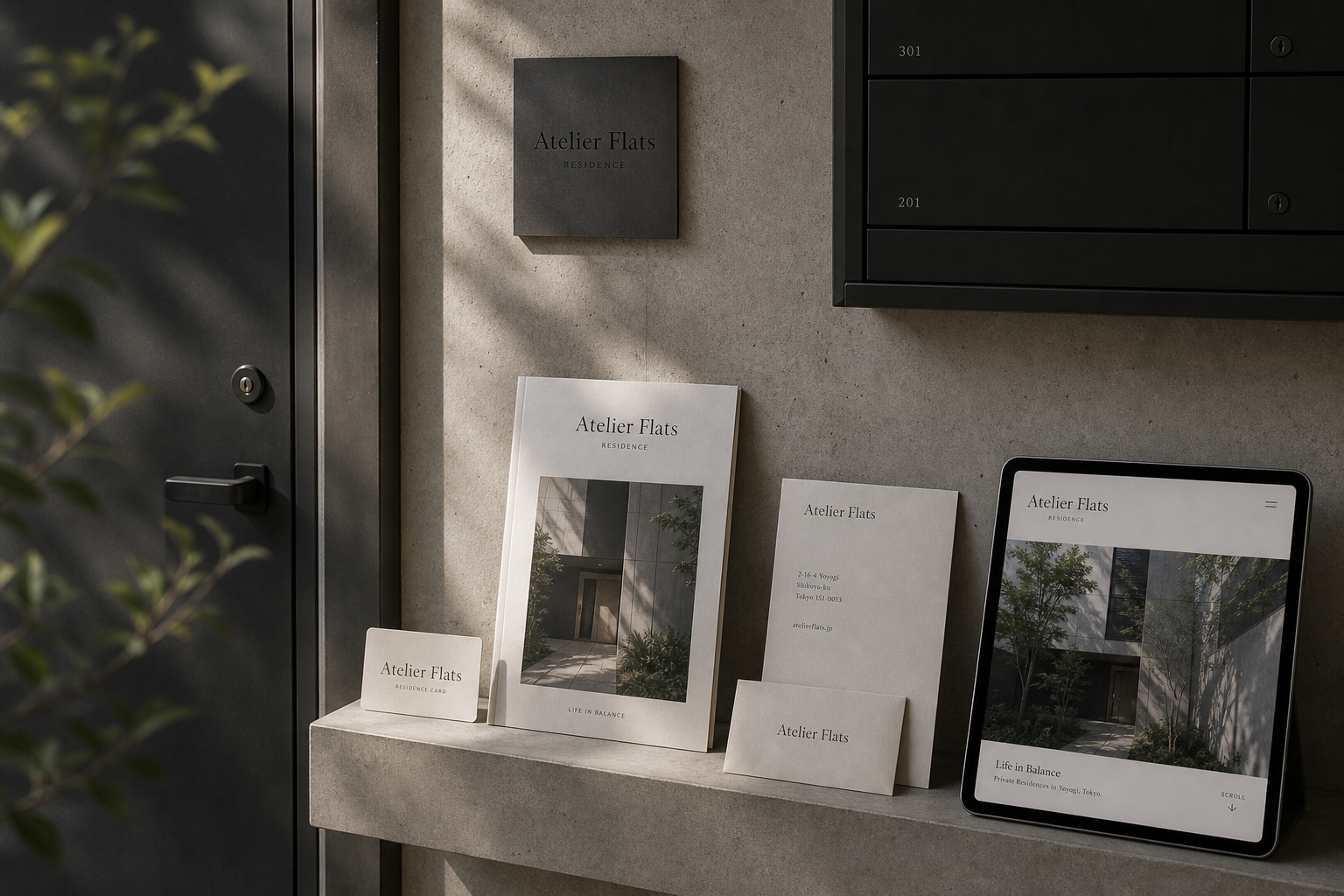
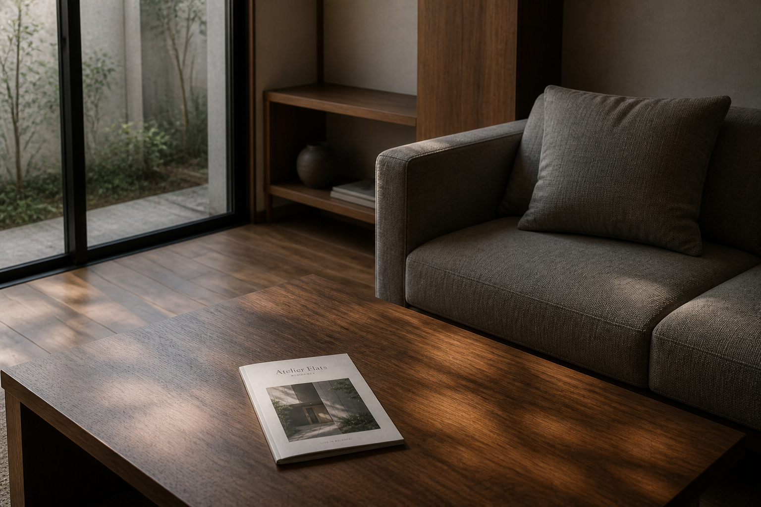
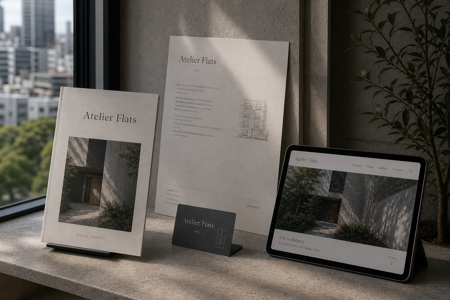
Atelier Flats 是為 Atelier Flats 建立的 branding + visual identity 專案。作品內容以 brand design、logo + visual identity、brand guide 為核心,將品牌名稱、應用物件、版面規則與影像語氣整合成一套可延展的作品集案例。
攝影主題以 residence exterior、brochure spread、stationery、interior threshold 為主。畫面應保留自然光、低飽和色彩、安靜陰影與可閱讀的材質細節,讓照片同時承擔品牌證據、包裝質感與空間情緒。
設計概念從「空間標示、導視與現場尺度」出發,使用乾淨 grotesk 字體、克制色票、細緻比例與少量資訊層級,讓品牌看起來像被整理過的文化檔案,而不是一般商業宣傳頁。
計劃上先完成品牌語氣與核心識別,再建立 Logo、Editorial brochure、Stationery 等交付物,最後以照片序列、品牌應用與網站作品頁整理成完整案例。
Logo / Editorial brochure / Stationery / Web design / Residence card
Editorial review
English edition
English edition
Atelier Flats positions urban residence as a meeting point of life and creative work. Concrete, dark metal, warm timber, planting, and daylight set the tone, while brochures, resident cards, correspondence, website, and signs bring a studio-like concentration to a home that still feels soft and open.
Warm grey and ivory papers echo mineral building surfaces. Charcoal cards and entrance plaques add contrast, while pale brochure pages keep timber and plant photography close to the temperature of the real interior. Paper, concrete, metal, and glass remain one continuous material order from prospectus to lobby.
Composition borrows from doorframes and openings. Covers divide large names, short statements, and architectural photographs; inside, imagery, elevations, amenities, and location occupy stable fields. The website lets the entrance image lead, while cards retain only essential information and directional marks.
Two typographic voices complement each other. A slender serif gives Atelier editorial and creative character in books and digital pages, while a narrow sans serif stays crisp on signs and functional information. Paired angular forms resemble brackets, roofs, or arrows, creating a simple extensible mark.
Creative living becomes a usable system through photographs of thresholds, windows, tables, corridors, and moving light. Cards and guides bring identity beyond the sale into daily residence. Charcoal, ivory, fine type, and rhythmic imagery express autonomy, taste, and spatial awareness.
Returning home is framed as a movement from public to private. Website, brochure, entrance plaque, lobby, and resident card accompany each threshold with the same visual language. The name becomes a shared language of residence, offering order, inspiration, and belonging.
日本語版
Atelier Flats は都市住宅を、暮らしと創作が交わる場所として位置づけます。コンクリート、濃色金属、暖かな木、植栽、日光を背景に、冊子、住民カード、手紙、ウェブ、サインが、家の柔らかさを残したアトリエの集中感をつくります。
暖灰と象牙色の紙は建築の鉱物感に応えます。炭色カードと入口銘板が対比をつくり、淡い冊子の頁は木と植物写真を実空間に近い温度で見せます。資料からロビーまで、紙、コンクリート、金属、ガラスが続きます。
構図は門枠と開口から着想します。表紙は名称、短文、建築写真を分け、内頁は写真、立面、設備、位置に安定した領域を与えます。ウェブでは入口写真が先に空間へ導き、カードは必要情報と方向記号だけを残します。
細身のセリフ体は Atelier に編集と創造の性格を与え、狭幅のサンセリフ体はサインと機能情報を明快にします。対になった角形は括弧、屋根、矢印を思わせ、簡潔で拡張可能な印になります。
入口、窓辺、食卓、廊下、光を写すことで creative living を具体化します。住民カードと案内冊子が入居後も識別を暮らしへ残し、炭色、生成り、細い文字、写真のリズムが自律と空間感覚を伝えます。
ウェブで知り、冊子で理解し、入口を通り、カードで自室へ入る流れが、外から内への変化をつくります。各敷居に同じ言語が伴い、住宅名は物件表示ではなく、秩序、刺激、帰属を共有する生活の言葉になります。
繁體中文版
Atelier Flats 將都市住宅定位為生活與創作交會的場所。識別不以華麗裝飾定義居住品質,而是從入口、門框、窗景、室內光線與日常家具建立品牌語氣。混凝土牆、深色金屬、暖木與庭園植栽構成安定背景,銷售冊、住戶卡、信封、網站和現場標示則以輕巧文字穿行其中。整套設計帶有工作室般的專注感,也保留家所需要的柔和,使住宅呈現理性、開放而富有創造力的性格。
紙材以暖灰和象牙白為主,細微顆粒讓書冊與信件在日光下呈現柔和陰影,也呼應建築表面的礦物質感。深炭色住戶卡與入口銘牌形成較強對比,細線文字在暗色表面上顯得精準。手冊內頁的米白紙色襯托室內木材和植物攝影,讓圖片與實際空間保持相近溫度。紙本、混凝土、金屬與玻璃之間沒有明顯斷裂,住戶從收到資料到走入門廳,能持續感受到同一組材料秩序。
編排延續建築門框與開口的概念。封面以大面積名稱、短句和下方建築照片形成清楚分區,內頁則讓室內攝影、立面線稿、設施資訊與位置說明各自佔據穩定欄位。網站首頁使用寬幅入口照片,品牌名稱和導覽收在邊界,讓視線先進入空間,再閱讀細節。住戶卡與歡迎卡只保留必要訊息,透過短線和角形符號建立方向。版面因此像一系列門檻,引導讀者由城市外部逐步進入私密生活。
字型系統具有兩種互補聲音。襯線標準字用於手冊、網站與住戶卡,筆畫比例修長,為 Atelier 一詞帶來編輯與創作氣息;窄身無襯線版本則出現在入口牌與機能資訊上,能與門框、信箱及混凝土牆保持俐落關係。較小的大寫字距用來標示 Residence、Apartments 和地點,使資訊結構清楚。成對角形符號像展開的括號、屋簷或方向箭頭,在招牌、卡片和書冊上成為簡潔而可延展的識別記號。
品牌特色在於將「creative living」具體化為可使用的系統。攝影關注入口轉折、窗邊綠意、餐桌、走廊和光影,而不只展示建築全貌;立面線稿則提供另一種理性觀看方式。歡迎卡、住戶卡和資訊手冊把品牌帶進入住後的生活,使識別不會在租售完成後消失。炭灰與米白的層次、纖細文字和有節奏的影像,共同傳達重視個人品味、空間感與日常自主性的居住文化。
Atelier Flats 的設計理念,是把回家視為一段由外向內的轉換。住戶先從網站認識建築,翻閱手冊理解空間,經過入口銘牌與門廳,最後以住戶卡進入自己的房間;每一道門檻都有相同文字與色彩陪伴。設計既提供導引,也為安靜生活保留餘地。當住宅名稱出現在信件、桌上卡片和公共牆面時,它不只是物業標記,而成為居民共同使用的一套生活語言,讓城市居住兼具秩序、靈感與歸屬感。
- branding: hermetic design
- editorial design: hermetic design
- photography: studio archive
- client: atelier flats