Satoyama Station
branding + visual identity
Satoyama Station
2024 / Nagano
brand design
logo + visual identity
brand guide
sign design
item design
Satoyama Station 是為 Satoyama Station 建立的 branding + visual identity 專案。作品內容以 brand design、logo + visual identity、brand guide 為核心,將品牌名稱、應用物件、版面規則與影像語氣整合成一套可延展的作品集案例。
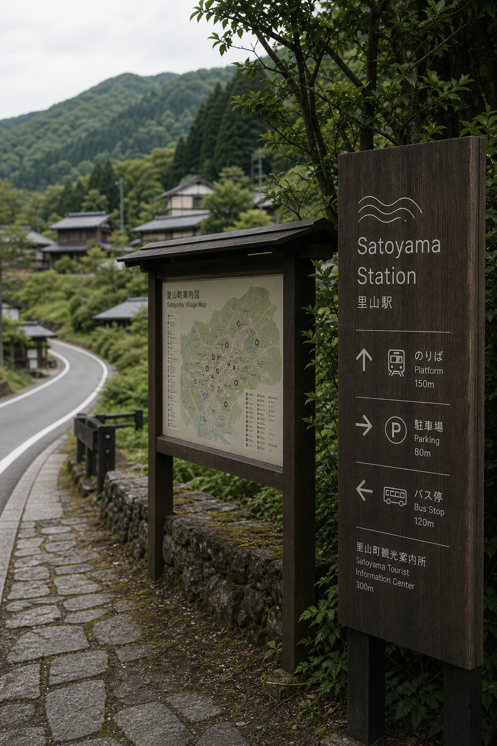
攝影主題以 roadside sign、local package、map card、regional landscape 為主。畫面應保留自然光、低飽和色彩、安靜陰影與可閱讀的材質細節,讓照片同時承擔品牌證據、包裝質感與空間情緒。
設計概念從「包裝、標籤與紙材的觸感」出發,使用乾淨 grotesk 字體、克制色票、細緻比例與少量資訊層級,讓品牌看起來像被整理過的文化檔案,而不是一般商業宣傳頁。
計劃上先完成品牌語氣與核心識別,再建立 Station logo、Road sign、Package label 等交付物,最後以照片序列、品牌應用與網站作品頁整理成完整案例。
Station logo / Road sign / Package label / Map card / Item system
Editorial review
English edition
English edition
Satoyama Station reimagines a station as the beginning of knowing a place. Mountains, rivers, roads, settlements, and produce are integrated across wayfinding, maps, packages, route cards, and souvenirs, connecting transport utility with the warmth of local culture.
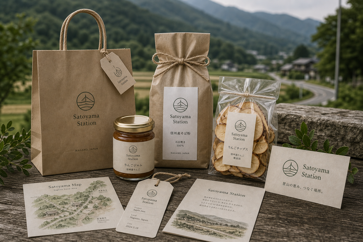
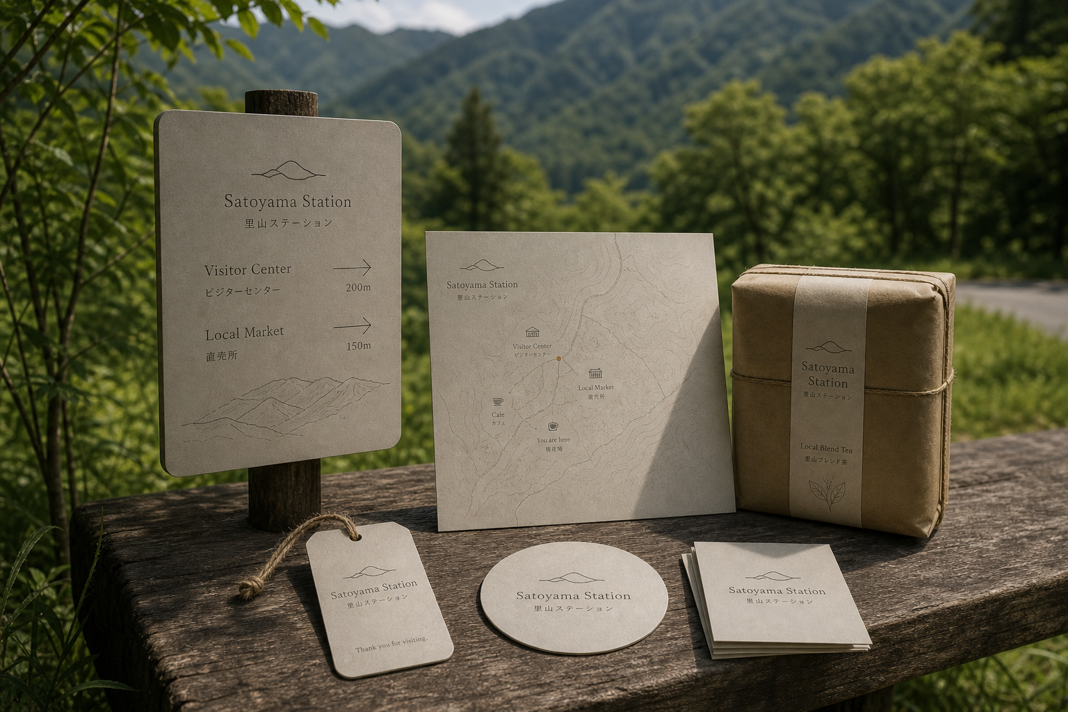
Kraft, warm grey fibrous paper, twine, and clear bags suit jams, dried fruit, and local flour, while rounded tags are easy to hold or tie. Dark timber signs carry clear white information in greenery; pale panels support closer reading. Paper, wood, cord, and produce create a credible local tactility.
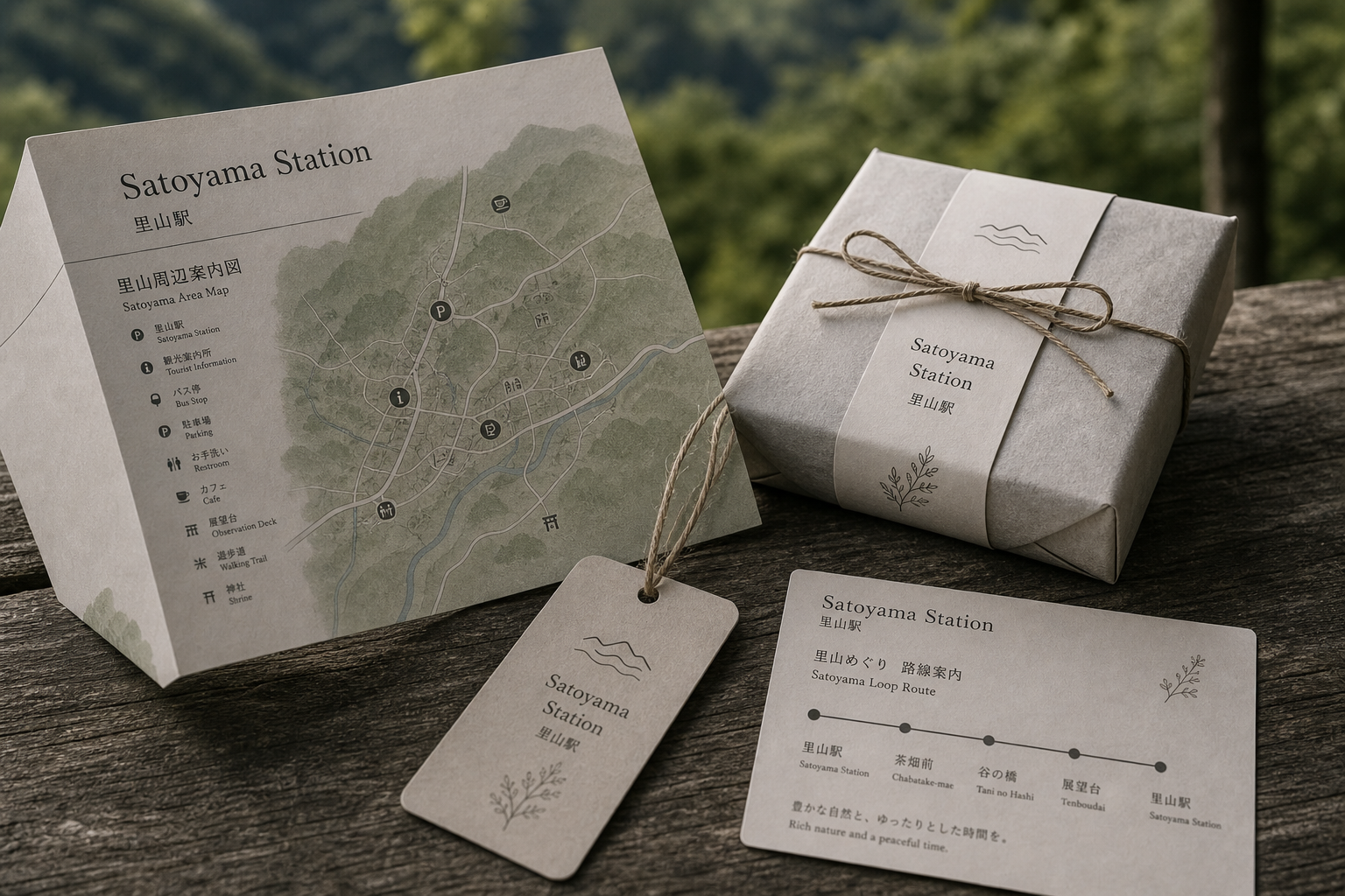
The information system follows the traveller's route. Large signs prioritise destination, direction, and distance; maps combine roads, water, landmarks, and green terrain; folded cards compress stops into nodes and lines. Product labels repeat the same hierarchy from brand to item and origin.
Clear sans serif lettering serves Japanese, English, figures, and distance, while softer serif titles give packages and maps a local editorial voice. Mountains, waves, bridges, and fields share one simple stroke language, shifting between station marker, landscape pattern, and product seal.
Regional identity is tested in real use: signs lead to market and viewpoint, maps support exploration, and packages identify local goods. Hand-drawn landscape brings humanity; functional icons preserve accuracy. Photography of forests, fields, old houses, and winding roads keeps the system rooted in place.
Movement becomes a way to understand Satoyama. Wayfinding offers confidence, maps invite discovery, and packaging extends the journey into the home. The same landscape line can span a roadside sign and a hand-held tag, turning regional scale into personal memory.
日本語版
Satoyama Station は駅を、地域を知る旅の起点として捉え直します。山、川、道路、集落、農産物を導線、地図、包装、路線カード、土産へ統合し、交通の実用性と地方文化の親しさをつなぎます。
クラフト紙、暖灰の繊維紙、麻紐、透明袋がジャム、果物、粉類に合い、角丸タグは持ち運びと結び付けに適します。深色木のサインには白い情報、淡色板には近距離情報を置き、紙、木、紐、農産物が土地の触感をつくります。
情報は旅の経路に沿います。大型サインは目的地、方向、距離を優先し、地図は道路、川、地標、緑地をまとめ、折頁は停留点をノードと線へ縮めます。商品ラベルも名称、品目、産地の同じ順序を保ちます。
明快なサンセリフ体が日英文字、数字、距離を担い、柔らかなセリフ体が包装と地図に地方誌の声を加えます。山、波、橋、田畑は同じ簡潔な線で、駅印、地景模様、商品章へ変化します。
道路のサイン、市場と展望点の地図、物産包装が実際の利用を結びます。手描きの景色は人間味を、機能アイコンは正確さを与え、山林、田、古家、曲がる道の写真が土地との関係を保ちます。
移動そのものが地域を理解する方法になります。導線は安心を、地図は探索を、包装は旅の延長をつくります。同じ山水線が路傍の木札と手の中の紙標に現れ、広い地景を個人の記憶へ縮めます。
繁體中文版
Satoyama Station 的識別把「車站」重新理解為旅人認識地方的起點。山脈、河流、道路、聚落與農產不再是彼此分散的資訊,而被整合進導視、地圖、包裝、路線卡和紀念品之中。深木色指標立在山村道路旁,米灰紙品則與石牆、舊木桌和田野景觀相呼應。整套設計兼具交通節點的實用性與地方文化的親切感,使停留、辨路、採買和帶走伴手禮成為連續的旅行經驗。
材料選擇貼近里山環境。包裝以牛皮紙、暖灰纖維紙、麻繩和透明袋為主,質地樸實,也能清楚呈現果醬、果乾與在地粉類等內容物。吊牌和地圖卡保留微小紙紋,圓角與穿繩孔讓旅人容易拿取或繫在商品上。戶外指標採深色木面,白色文字與圖示在綠意中保持清晰;另一組淺色牌面則與木柱結合,適合近距離閱讀。紙、木、繩與農產共同建立一種可信、溫暖且具有地方手感的材料語言。
資訊編排以旅行路徑為中心。大型導視先呈現目的地、方向與距離,月台、停車場、公車站和旅遊中心各有明確圖示;區域地圖則利用道路、河流、地標和綠色地形建立整體方位。折頁與路線卡把複雜資訊縮成可攜尺度,以節點和連線說明沿途停靠位置。商品標籤延續相同的上下結構,品牌名稱、品項與產地依序排列。從遠距標牌到手掌中的卡片,閱讀邏輯始終一致。
字型系統在導引效率與地方氣質之間取得良好平衡。戶外標示以清楚的無襯線字呈現日文、英文與數字,字級差異讓旅人能先看到目的地,再確認距離;包裝、地圖標題與小卡則採較柔和的襯線體,增加旅遊刊物與地方故事的語氣。山形、波浪、橋與田野線條共享簡潔筆觸,能依應用情境轉換為站點標記、地景圖樣或商品章。這套圖形語彙不只標示地點,也持續提醒人們山、水與聚落的關係。
品牌特色在於將區域識別落實到真正的使用情境。旅人沿道路看見方向牌,在地圖上找到市場與觀景點,再從包裝辨認當地物產;每一步都由同一套色彩、圖示和文字層級連接。手繪地景為系統加入人情味,功能圖示則確保資訊準確。背景攝影保留山林、稻田、老屋與彎曲道路,使 Satoyama Station 不像被搬到鄉間的都市品牌,而像從地方生活本身生長出來的公共入口。
Satoyama Station 的設計理念,是讓移動成為理解一個地方的方法。識別不只協助旅人抵達月台,也鼓勵他們走向聚落、認識農產、停留於步道和商店,最後把一件具有地域記憶的物品帶回家。導視提供安全感,地圖創造探索的可能,包裝則延長旅程。當同一組山水線條出現在路旁木牌與手中紙標上,品牌便把宏觀地景縮進個人經驗,呈現兼顧公共性、地方性與旅行樂趣的完整設計。
- branding: hermetic design
- sign design: hermetic design
- photography: studio archive
- client: satoyama station