Cafe Sanjo
branding + visual identity
Cafe Sanjo
2024 / Kyoto
brand design
logo + visual identity
brand guide
menu design
item design
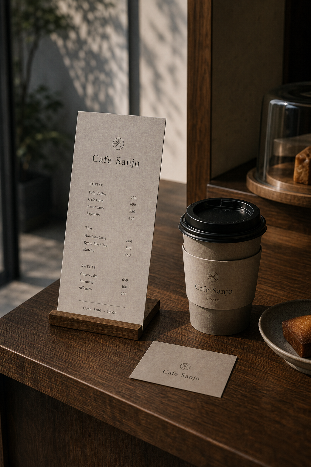
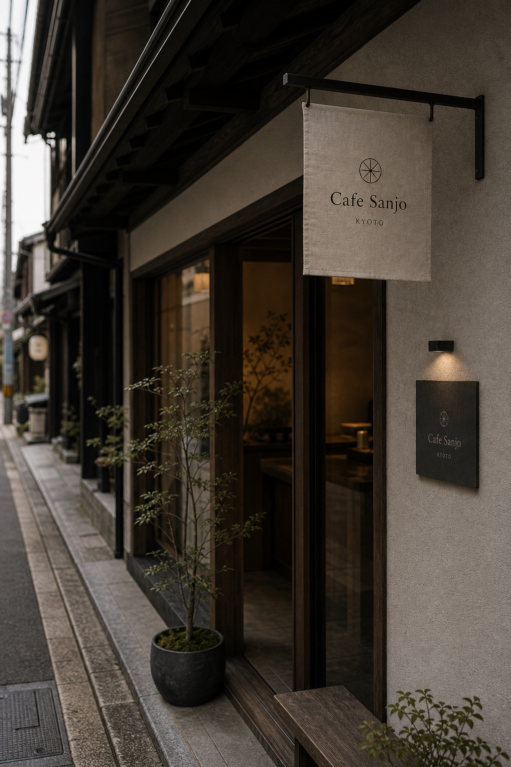
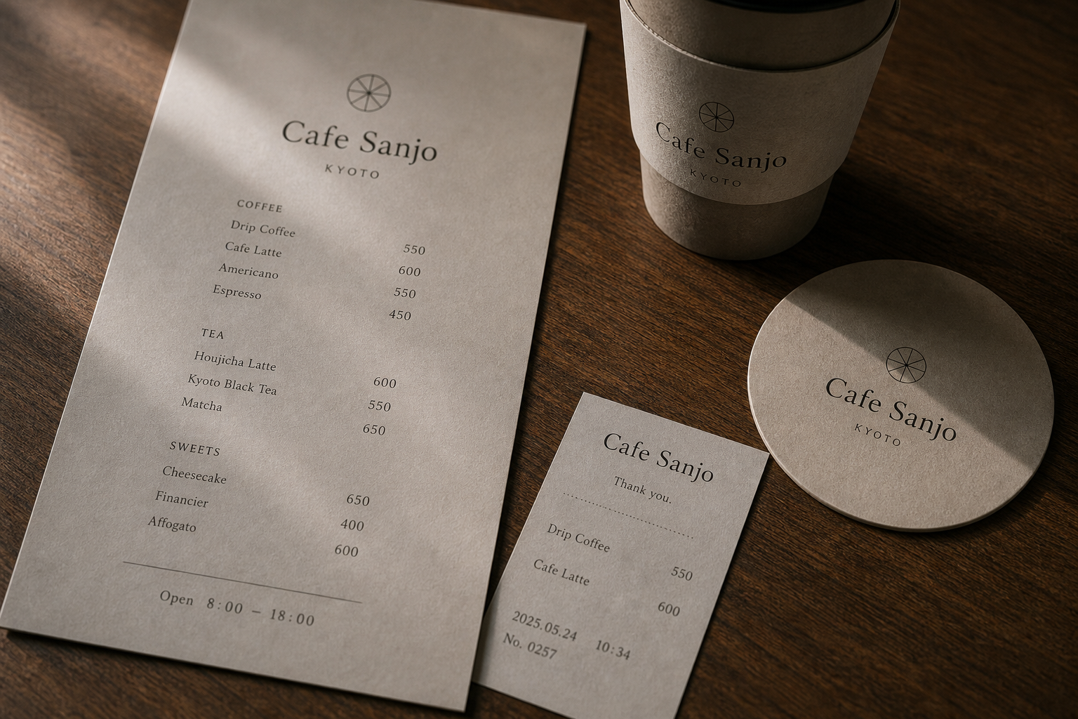
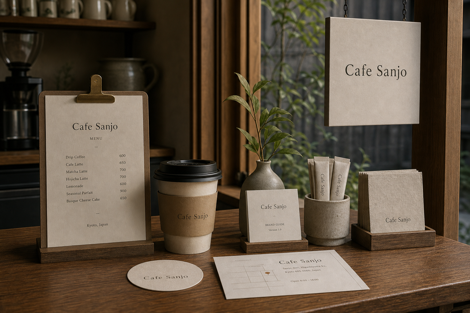
Cafe Sanjo 是為 Cafe Sanjo 建立的 branding + visual identity 專案。作品內容以 brand design、logo + visual identity、brand guide 為核心,將品牌名稱、應用物件、版面規則與影像語氣整合成一套可延展的作品集案例。
攝影主題以 cafe counter、menu card、cup sleeve、shop sign 為主。畫面應保留自然光、低飽和色彩、安靜陰影與可閱讀的材質細節,讓照片同時承擔品牌證據、包裝質感與空間情緒。
設計概念從「空間標示、導視與現場尺度」出發,使用乾淨 grotesk 字體、克制色票、細緻比例與少量資訊層級,讓品牌看起來像被整理過的文化檔案,而不是一般商業宣傳頁。
計劃上先完成品牌語氣與核心識別,再建立 Cafe logo、Menu system、Cup sleeve 等交付物,最後以照片序列、品牌應用與網站作品頁整理成完整案例。
Cafe logo / Menu system / Cup sleeve / Shop sign / Interior item set
Editorial review
English edition
English edition
Cafe Sanjo turns brief pauses, familiar aroma, and street routine into a warm, clear identity. Timber counter, plaster, ceramics, linen, and angled daylight establish the setting; menu, cup, coaster, napkin, receipt, and sign integrate contemporary convenience with the quiet of a Kyoto townhouse.
Warm grey and beige papers show soft fibres on timber. A firm vertical menu sits in a wooden holder; a darker kraft sleeve gives grip and recognition to a pale cup. Coasters, cards, receipts, woven flags, timber frames, and dark metal connect paper, cloth, wood, and ceramics.
A central axis and clear categories make ordering easy. The name and radiant mark lead, followed by Coffee, Tea, and Sweets; products align left and prices right, while hours sit below a rule. Smaller receipts retain the same columns, and cups and napkins reduce information to name or symbol.
A fine, elegant serif gives Cafe Sanjo a subtle hand-made rhythm. KYOTO appears in small, widely spaced capitals, while category, item, and price scales create hierarchy. The circular radiant mark can suggest window lattice, sunlight, a sliced sweet, or spreading coffee aroma.
The system understands the full cafe journey. A street flag attracts attention, the sign confirms entry, the counter menu supports choice, takeaway packaging leaves with the guest, and coasters remain at the table. Each object changes density with viewing distance while keeping one palette and type voice.
Brand identity lives in the small actions around a drink: entering, reading, ordering, waiting, lifting a cup, and returning to the street. It never competes with aroma or daylight. Because sleeve, flag, and menu feel native to the room, an ordinary pause becomes a sincere urban memory worth repeating.
日本語版
Cafe Sanjo は、短い滞在、なじみの香り、街の日常を温かく明快な識別へ整えます。木のカウンター、灰泥、陶器、リネン、斜めの光に、メニュー、紙杯、コースター、ナプキン、レシート、看板が自然に入ります。
暖灰と米褐色の紙は木卓で柔らかな繊維を見せます。硬めの縦メニューは木台に立ち、濃いクラフト色のスリーブは淡色カップに握りやすさと識別を加えます。紙、布、木、陶器が連続します。
中央軸と分類が注文を助けます。名称と放射印の下に Coffee、Tea、Sweets が続き、品名は左、価格は右、営業時間は線の下へ置かれます。小さなレシートも同じ欄を保ち、杯とナプキンは名称だけに絞ります。
繊細なセリフ体は手仕事のようなリズムを持ちます。KYOTO は小型大文字と広い字間で場所を示し、円形放射印は窓格子、日光、菓子の断面、広がる香りを思わせます。
街の布旗、入口看板、カウンターメニュー、持ち帰りカップ、卓上コースターがサービス全体を結びます。各物は距離に応じて情報量を変えながら、同じ色と文字を共有します。
入る、読む、注文する、待つ、杯を持つ、街へ戻るという小さな動作にブランドがあります。香りと光を奪わず、紙の触感と文字の秩序で体験を高めます。空間に元からあったような誠実な日常感です。
繁體中文版
Cafe Sanjo 的品牌識別把咖啡館最迷人的部分——短暫停留、熟悉香氣與街道日常——整理成一套溫和而清楚的視覺語言。暖木櫃台、灰泥牆、陶器、亞麻布與斜入室內的日光共同構成空間基調,菜單、紙杯、杯墊、餐巾、收據與門面標誌則自然融入其中。設計帶有京都街屋般的沉靜,也保有現代咖啡館需要的便利與親切,使內用與外帶都能感受到一致的款待氣氛。
紙材選擇以暖灰和米褐色為主,細微纖維紋理在木桌上呈現柔和層次。直式菜單使用較挺的紙面,能穩定立於木座中;杯套以較深的牛皮色紙包覆淺色杯身,兼顧握持感和視覺辨識。圓形杯墊、方形小卡與收據沿用同一紙色,讓消耗性物件仍保有品牌質感。戶外吊旗採具有織紋的淺色布料,室內標牌則結合木框和暗色金屬,紙、布、木與陶器因此形成連續而溫暖的材料關係。
菜單編排以中央軸線和清楚分類建立閱讀節奏。品牌名稱與放射狀標誌位於上方,Coffee、Tea、Sweets 等品類依序向下展開,品名左對齊、價格右對齊,使顧客在點餐時能迅速比較。營業時間收在底部,以細線和主要內容分隔;較小的收據延續相同欄位邏輯,即使尺寸縮小仍然完整。杯套、杯墊與餐巾只保留名稱或標誌,讓桌面物件有主次之分,也避免資訊彼此競爭。
字型以筆畫纖細、比例優雅的襯線體建立品牌聲音。Cafe Sanjo 的字母帶有手工書寫般的微妙節奏,放在布旗和店面牌上顯得親切,在菜單與杯套上又能維持端正。KYOTO 以小型大寫和寬字距承接地點,增添定位感;品類標題、品名與價格則透過字級和間距形成清楚層級。圓形放射標誌像窗格、日光、甜點切面或咖啡香氣擴散的軌跡,以極少線條為名稱加入明亮而容易記住的識別點。
品牌特色在於對咖啡館服務流程的完整理解。街上的布旗先吸引行人注意,門牌確認入口,櫃台菜單協助選擇,紙杯和杯套陪伴外帶,杯墊與餐巾則留在內用桌面。每一件物品都依觀看距離調整資訊量,卻共享同一色彩與字型。攝影中的木質家具、烘焙點心、咖啡器具和庭院綠意,讓 Cafe Sanjo 呈現介於傳統街屋與當代生活之間的舒適氣質。
Cafe Sanjo 的設計理念,是讓品牌存在於一杯飲品前後的細小動作裡。顧客推門、閱讀、點餐、等待、拿起杯子,再帶著咖啡走回街道,每一步都有低聲量的視覺提示陪伴。識別不需要搶過咖啡香與空間光線,而是用紙張觸感、文字秩序和一致物件提升整體體驗。當杯套、布旗與菜單都像空間原有的一部分時,品牌便建立了耐看而真誠的日常感,使一次普通停留成為願意再次回訪的城市記憶。
- brand design: hermetic design
- menu design: hermetic design
- photography: studio archive
- client: cafe sanjo