Ryoen Press
branding + visual identity
Ryoen Press
2025 / Tokyo
brand design
logo + visual identity
brand guide
stationery design
printed matter
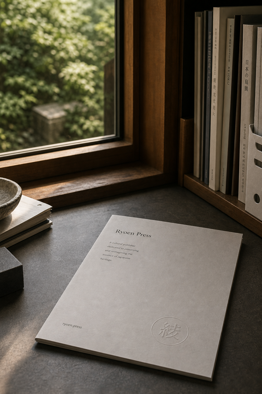
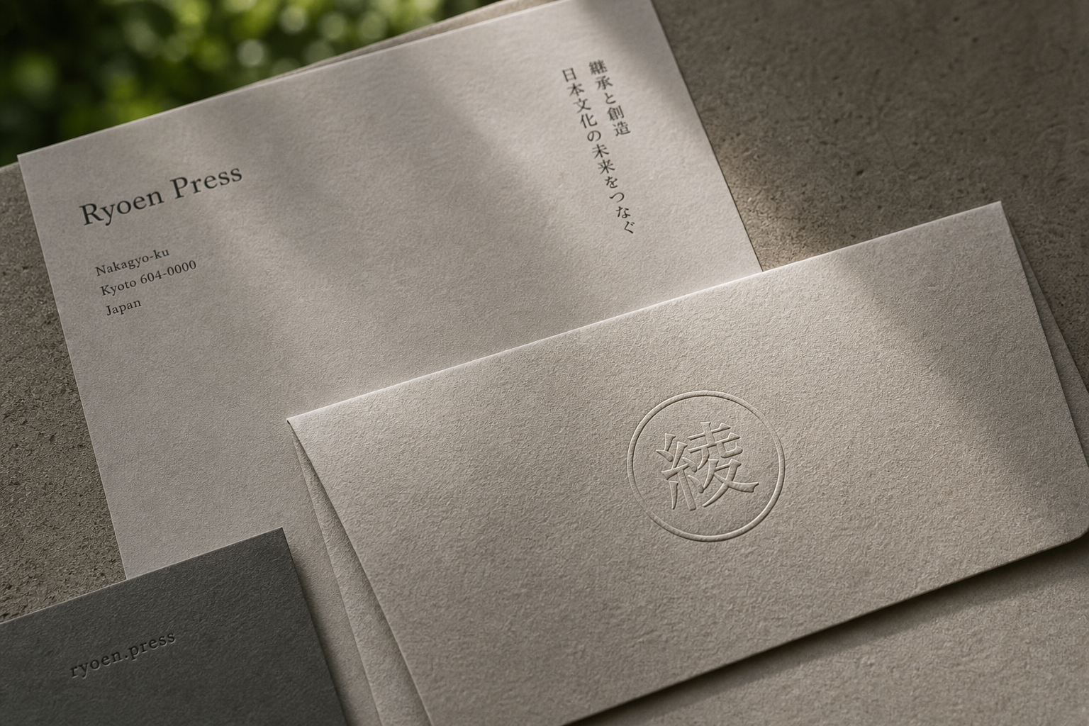
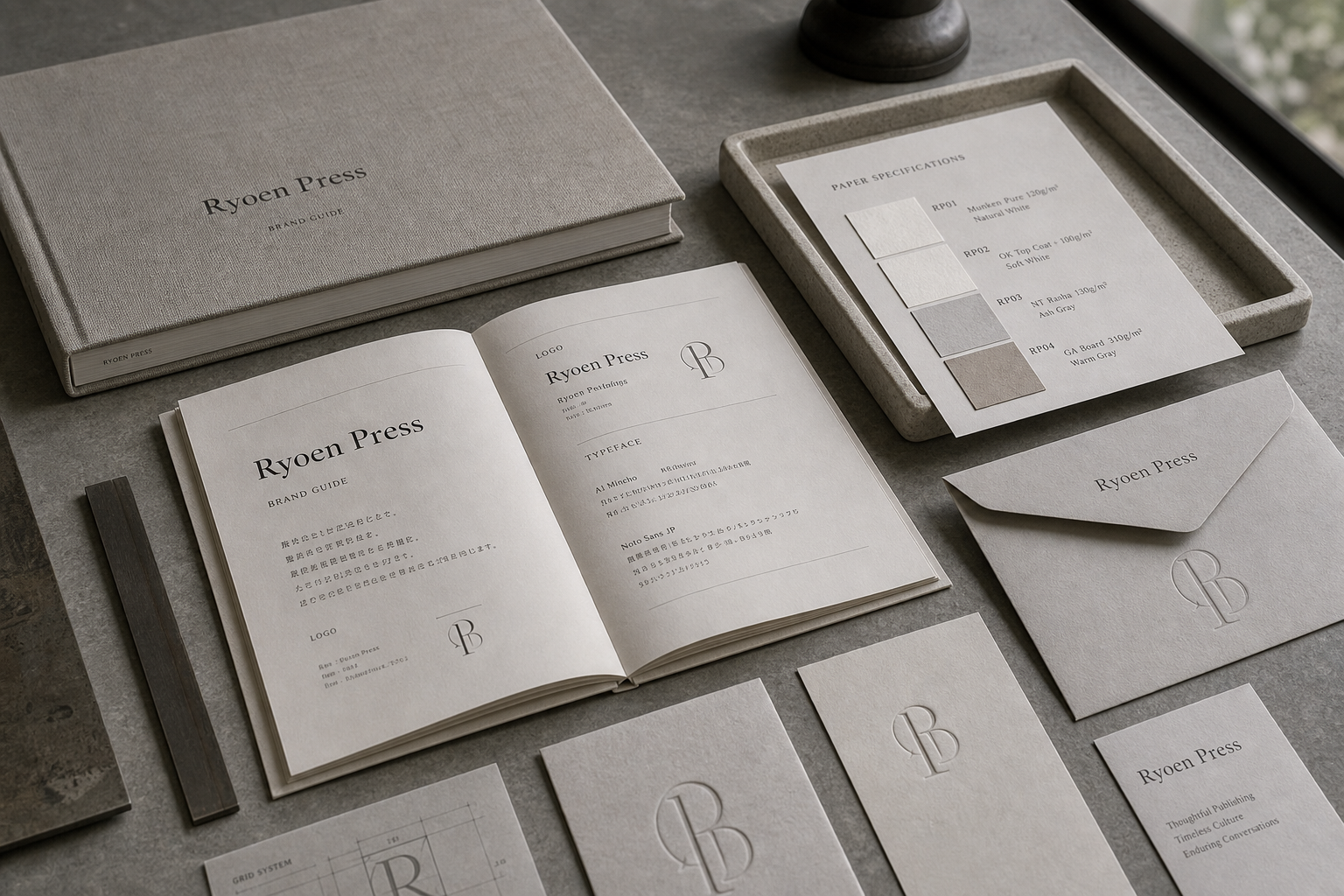
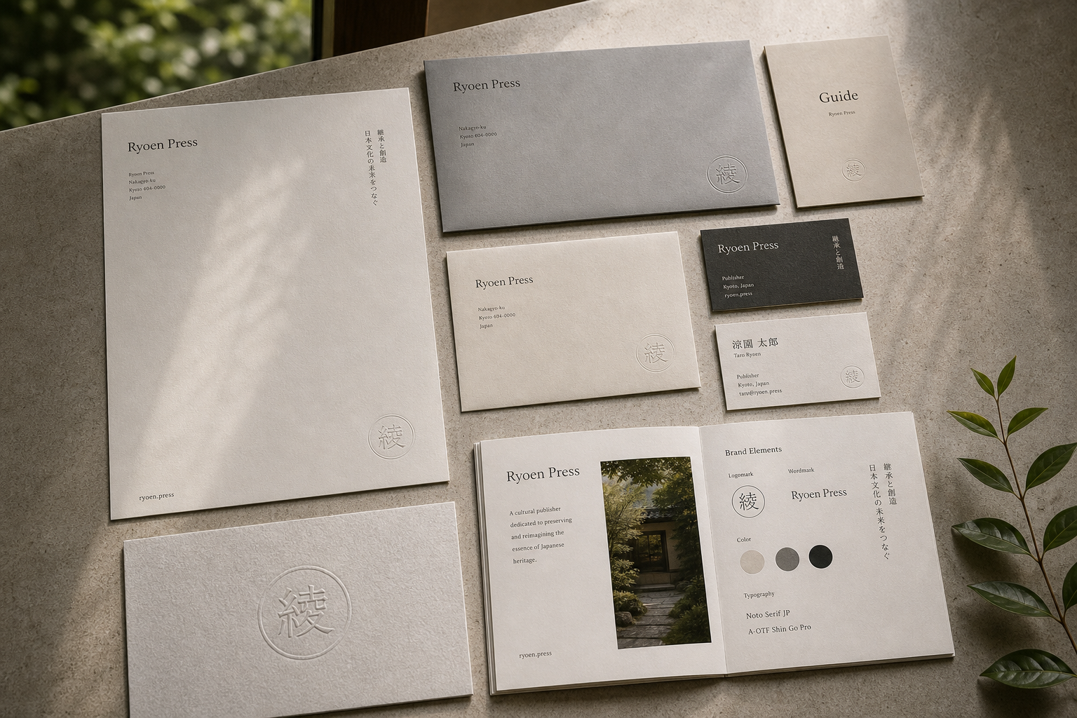
The identity had to feel institutional, quiet, and flexible across letterhead, envelopes, cards, and publication covers. We used a reserved typographic mark, grid-based stationery, embossed papers, and editorial photography of printed matter.
Ryoen Press
branding + visual identity
Ryoen Press
branding + visual identity
Ryoen Press 是為 Ryoen Press 建立的 branding + visual identity 專案。作品內容以 brand design、logo + visual identity、brand guide 為核心,將品牌名稱、應用物件、版面規則與影像語氣整合成一套可延展的作品集案例。
攝影主題以 stationery flat lay、embossed paper、brand guide spread、envelope detail 為主。畫面應保留自然光、低飽和色彩、安靜陰影與可閱讀的材質細節,讓照片同時承擔品牌證據、包裝質感與空間情緒。
設計概念從「空間標示、導視與現場尺度」出發,使用乾淨 grotesk 字體、克制色票、細緻比例與少量資訊層級,讓品牌看起來像被整理過的文化檔案,而不是一般商業宣傳頁。
計劃上先完成品牌語氣與核心識別,再建立 Corporate mark、Stationery set、Envelope system 等交付物,最後以照片序列、品牌應用與網站作品頁整理成完整案例。
Corporate mark / Stationery set / Envelope system / Printed guide / Paper specification
Ryoen Press
branding + visual identity
- brand design: hermetic design
- stationery design: hermetic design
- photography: studio archive
- client: ryoen press