Juuri House
branding + visual identity
Juuri House
2025 / Osaka
brand design
logo + visual identity
brand guide
stationery design
web design
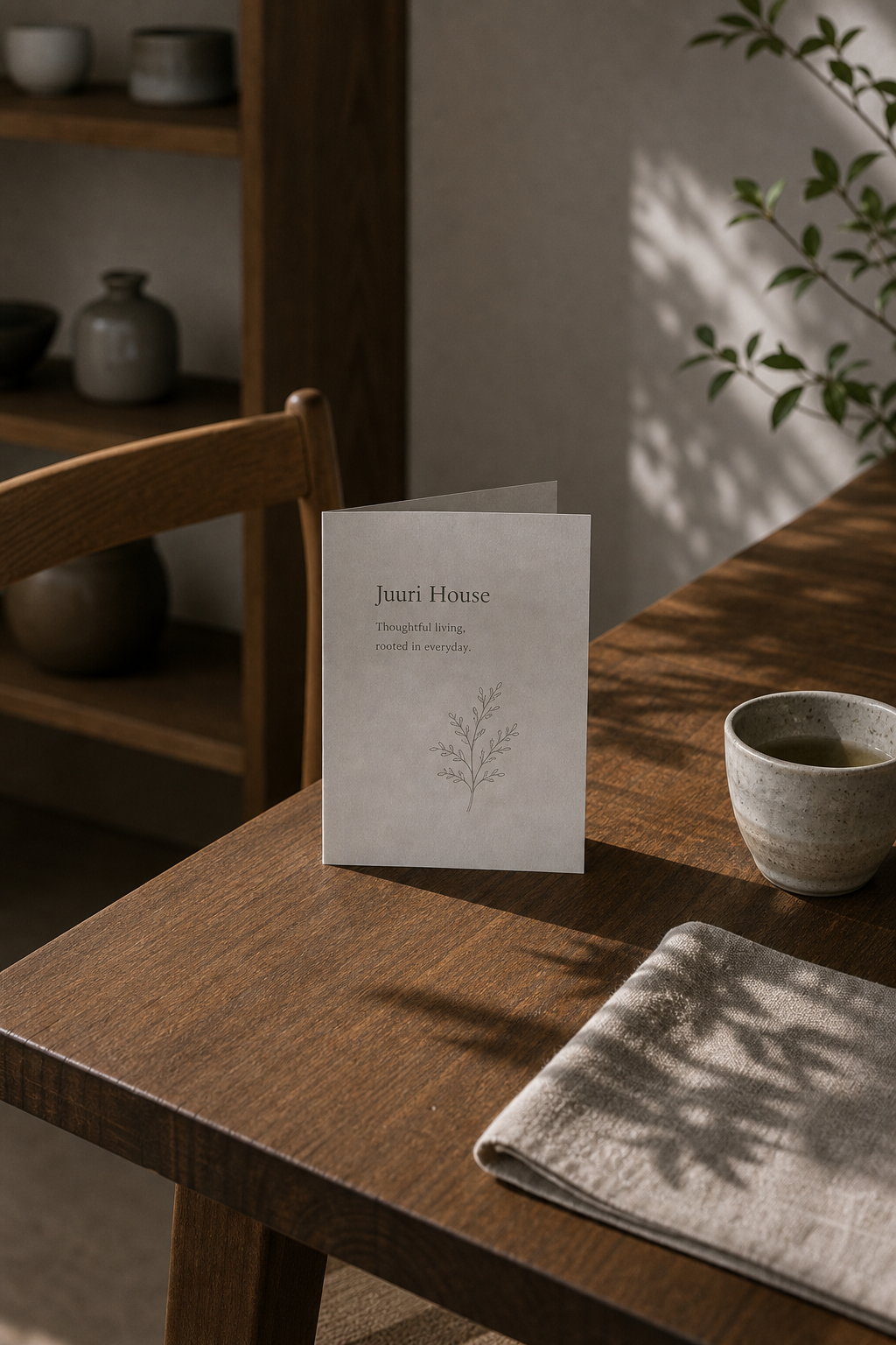
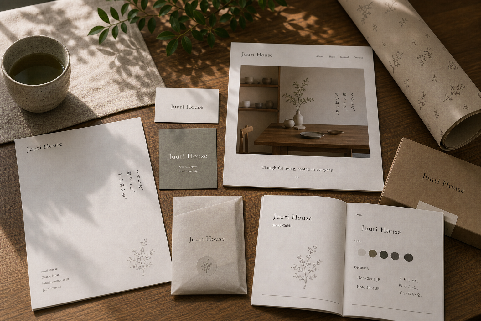
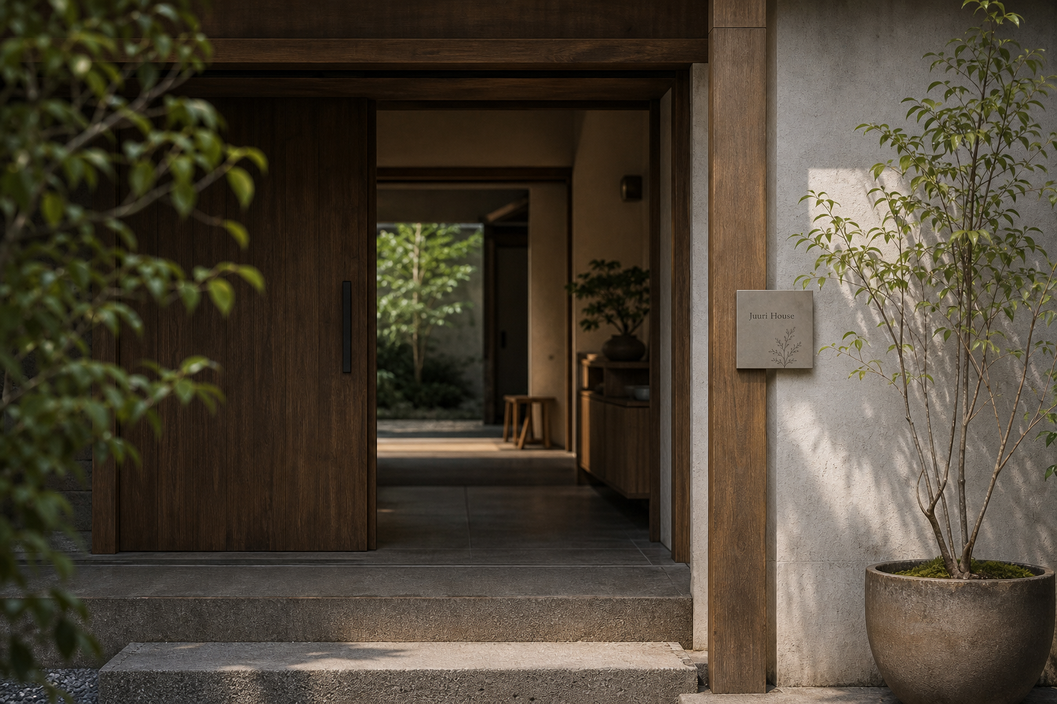
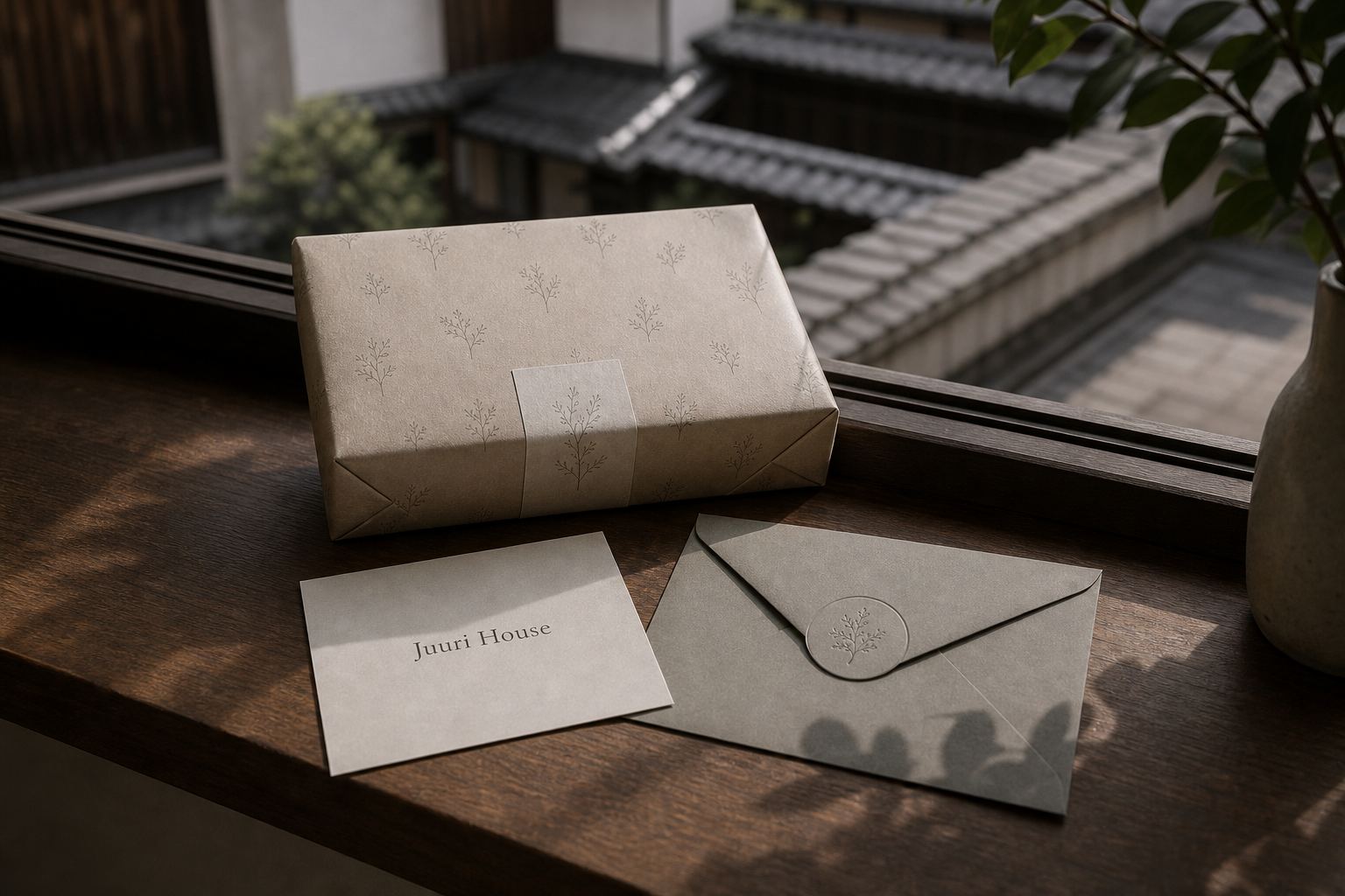
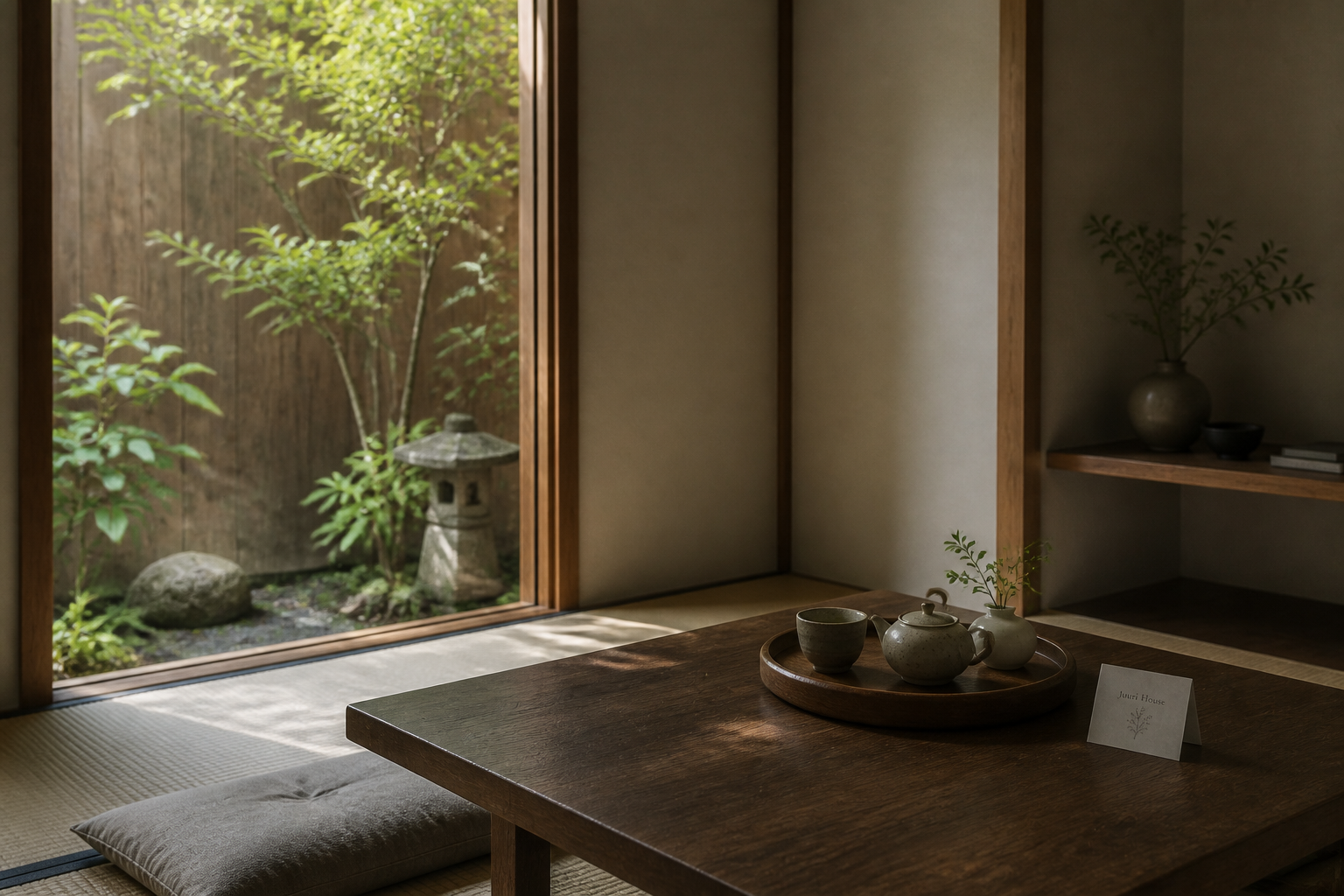
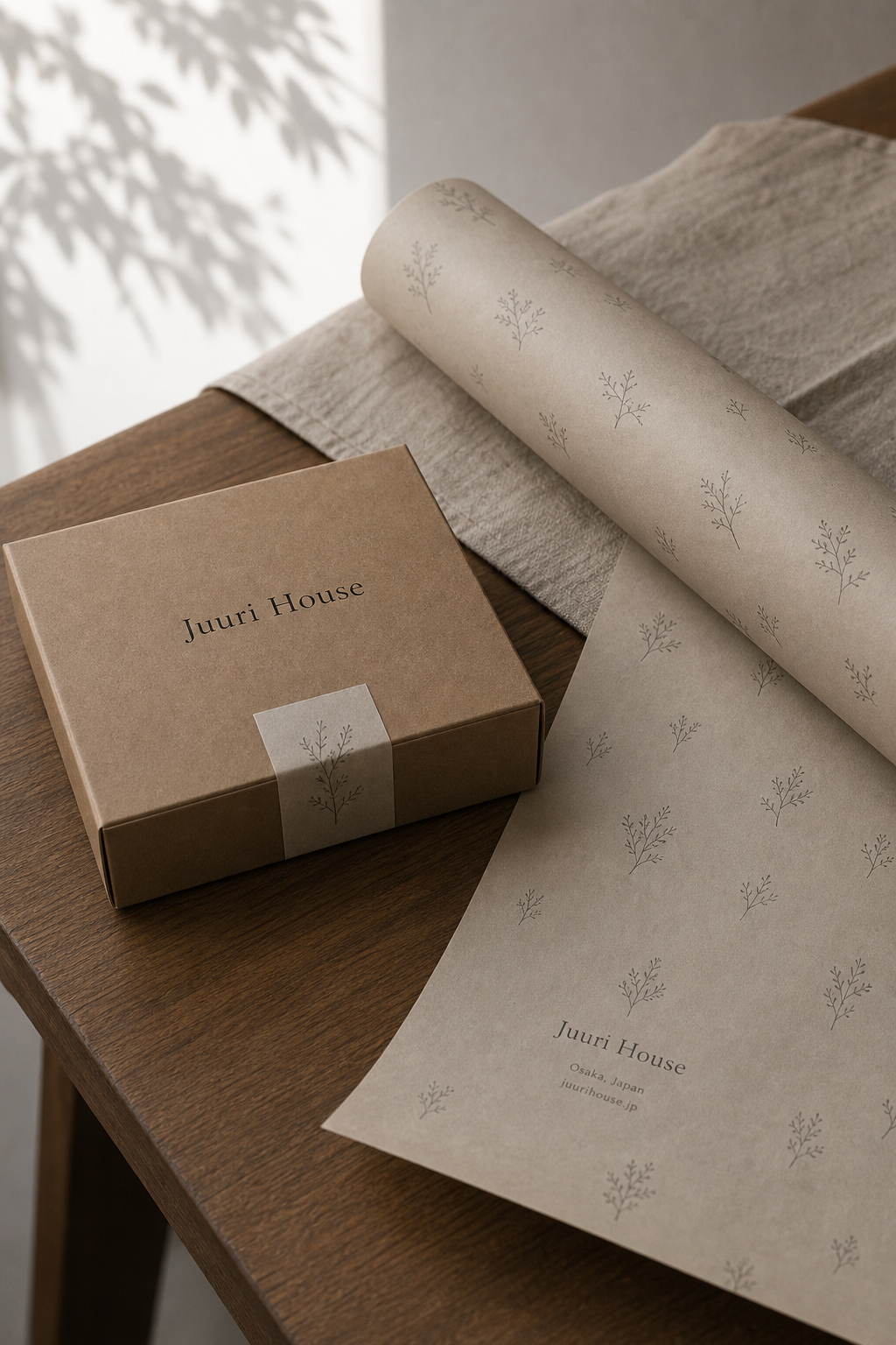
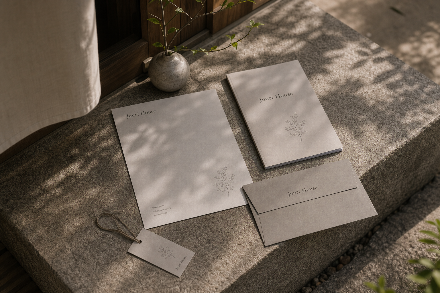
Juuri House 是為 Juuri House 建立的 branding + visual identity 專案。作品內容以 brand design、logo + visual identity、brand guide 為核心,將品牌名稱、應用物件、版面規則與影像語氣整合成一套可延展的作品集案例。
攝影主題以 stationery set、web cover、wrapping paper、lifestyle table 為主。畫面應保留自然光、低飽和色彩、安靜陰影與可閱讀的材質細節,讓照片同時承擔品牌證據、包裝質感與空間情緒。
設計概念從「空間標示、導視與現場尺度」出發,使用乾淨 grotesk 字體、克制色票、細緻比例與少量資訊層級,讓品牌看起來像被整理過的文化檔案,而不是一般商業宣傳頁。
計劃上先完成品牌語氣與核心識別,再建立 Logo system、Stationery、Web design 等交付物,最後以照片序列、品牌應用與網站作品頁整理成完整案例。
Logo system / Stationery / Web design / Wrapping paper / Brand guide
Editorial review
English edition
English edition
Juuri House understands home as an accumulation of daily sensations. Tea cups, linen, leaf shadows, wrapping paper, and cards form a soft but ordered scene. Colour, letterspacing, texture, and light make every touchpoint familiar, expressing thoughtful living rooted in the everyday.
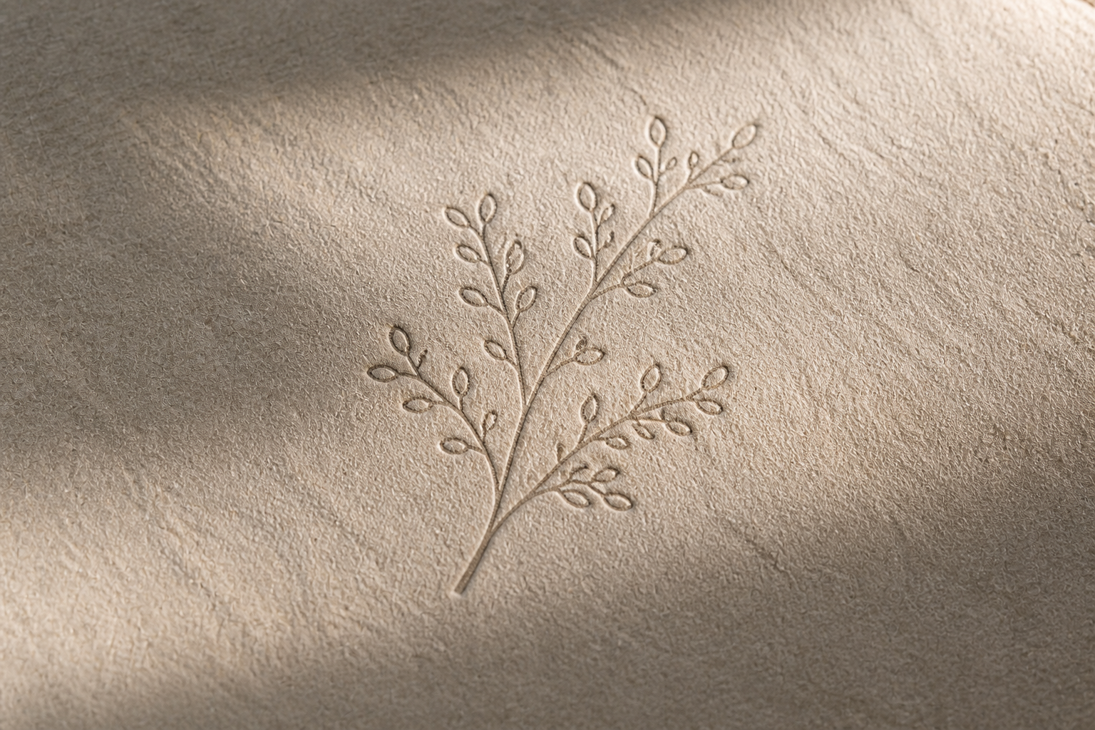
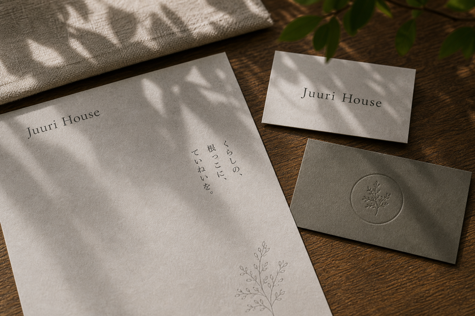
Paper follows the earthy timber tones of the interior. Warm white stationery, taupe cards, kraft boxes, grey wrapping, and translucent bags create depth without heaviness. Fine botanical lines and a subtly raised circular emblem reveal themselves through changing light, making unwrapping, reading, and keeping part of the experience.
Generous space and off-centre placement create room to breathe. English text at the upper left, vertical Japanese at the right, and a plant drawing below form a stable diagonal. The same rhythm moves into cards, package seals, and the website, allowing print and screen to share one viewing speed.
A light serif with open proportions gives the name a composed but informal voice. Japanese Mincho echoes its rhythm and terminals, while smaller information recedes quietly. The rational structure of the letters is balanced by the softness of hand-drawn branches.
The branch becomes a flexible unit: a single seal, a wrapping-paper pattern, or a graphic that overlaps real plant shadows in photography. Off-white, brown-grey, deep olive, and timber form a coherent spectrum that fits naturally among tea ware, textiles, and furniture.
Juuri House places its philosophy in the gradual accumulation of care. Correspondence, introductions, packaging, and the website all follow the same type, colour, and spacing logic at different scales. When morning light and branch shadows move across the mark, identity becomes part of time and daily life.
日本語版
Juuri House は、家を日々の感覚の集積として理解しています。木の卓上の茶器、リネン、枝葉の影、包装紙、小さなカードが、柔らかく秩序ある生活風景をつくります。色、字間、触感、光が、Thoughtful living, rooted in everyday という姿勢を表します。
紙は室内の土色と木の調子を引き継ぎます。暖白の便箋、灰褐色の名刺、クラフト色の箱、米灰の包装、半透明の袋が軽やかな深さをつくります。細線の植物と浅く浮かぶ円形の印が、光の移動によってゆっくり現れます。
広い余白と偏心配置が呼吸を生みます。左上の英文、右側の縦書き、右下の植物画が安定した対角線をつくり、同じ速度が名刺、封緘、ウェブサイトへ続きます。紙と画面の間で個性が失われません。
細く伸びやかなセリフ体は端正でありながら堅くありません。日本語の明朝体が収筆と黒白のリズムで応え、小さな補助情報は静かに後退します。文字の理性的な骨格と、手描きのような枝葉が均衡します。
枝葉は柔軟な視覚単位です。一つの印、包装紙の模様、写真の植物影と重なる図形へ展開します。生成り、褐灰、深いオリーブ、木色の色譜が、茶器、布、家具と自然に共存します。
Juuri House は、丁寧な暮らしの積み重ねにデザイン思想を置きます。手紙、名刺、包装、ウェブサイトは同じ書体、色、余白を用途に応じた尺度で使います。朝の光と枝葉の影が印を通過するとき、識別も日常の時間の一部になります。
繁體中文版
Juuri House 的識別把「家」理解為日常感受的集合。木桌上的茶杯、亞麻布、枝葉投影、包裝紙與小卡,共同建立柔和而有秩序的生活景象。設計藏進紙張色澤、字距、觸感和光線裡,讓每個接觸點都像居家物件般容易親近。從印刷品到網站,整套系統維持溫暖、樸實且具有編輯感的語氣,也回應「Thoughtful living, rooted in everyday」所描述的生活態度。
紙材選擇延續室內的土色與木質調性。暖白信紙帶有細微顆粒,灰褐名片、牛皮色盒裝與米灰包裝紙則建立深淺層次;半透明紙袋讓內部物件若隱若現,使包裝兼具輕盈感和手作氣息。枝葉圖案以細線印在紙面上,灰色卡片則透過壓紋呈現圓框植物標誌,光影移動時才慢慢顯出輪廓。這些材料沒有離開生活場景單獨表演,而是與陶杯、織物及木紋互相襯托,使拆封、閱讀和保存都成為品牌體驗的一部分。
版面編排採用寬廣留白與偏心配置,營造可呼吸的空間。信紙左上放置英文名稱,日文短句直排於右側,植物插圖停在右下,三者形成安定對角線。名片以名稱作為主角,包裝封條則讓枝葉跨越盒蓋與盒身。網站首頁延續相同節奏:輕巧導覽、室內照片和品牌語句都保有充足邊界。紙本與數位因此使用同一種觀看速度,轉換媒介後仍能辨認 Juuri House 的個性。
字型以纖細、比例舒展的襯線體建立主聲音。Juuri House 的字母筆畫帶有柔和對比,寬鬆字距使名稱顯得端正而不拘謹,放在名片、盒蓋或網頁頂端都保有恰當存在感。日文明朝體與英文襯線在收筆和黑白節奏上互相呼應,直排形式則增加內斂的文化層次。輔助資訊使用尺寸較小的字級,讓地址、網址與說明安靜退居其後。搭配手繪般的枝葉圖形後,文字的理性骨架與植物線條的柔軟感形成平衡。
品牌特色來自對生活片刻的珍視。枝葉是一個可反覆延伸的視覺單位:它能獨立成章、散布為包裝紙紋樣,也能在攝影中與植物影子重疊。米白、褐灰、深橄欖與木色構成一致色譜,使品牌與茶器、布料及家具自然相容。這種低聲量識別不需要大型標誌,仍能透過觸感和氣氛留下清楚記憶。
Juuri House 將設計理念落在生活的逐步累積。信件提供溝通的禮貌,名片建立相識的起點,包裝延長收到物件的喜悅,網站則把空間與理念帶到螢幕上。每件應用都遵循相同的字型、色彩和留白邏輯,卻能依用途調整尺度。當晨光落在紙面、枝葉影子經過標誌時,視覺識別也成為時間的一部分。這套作品最動人的地方,正是它以設計提醒人們:品牌的深度,往往根植於那些被細心對待的日常細節。
- branding: hermetic design
- web design: hermetic design
- photography: studio archive
- client: juuri house