Northfield Village
branding + visual identity
Northfield Village
2026 / Hokkaido
brand design
logo + visual identity
design system
sign design
stationery design
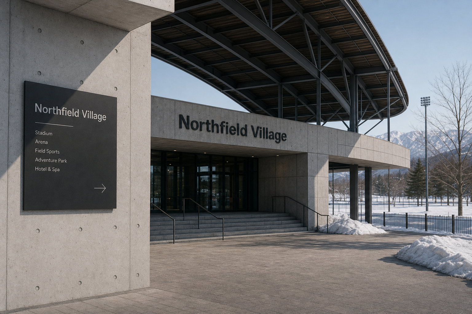
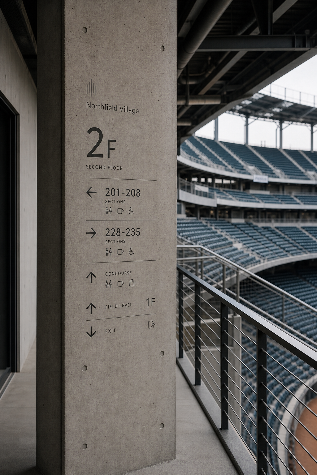
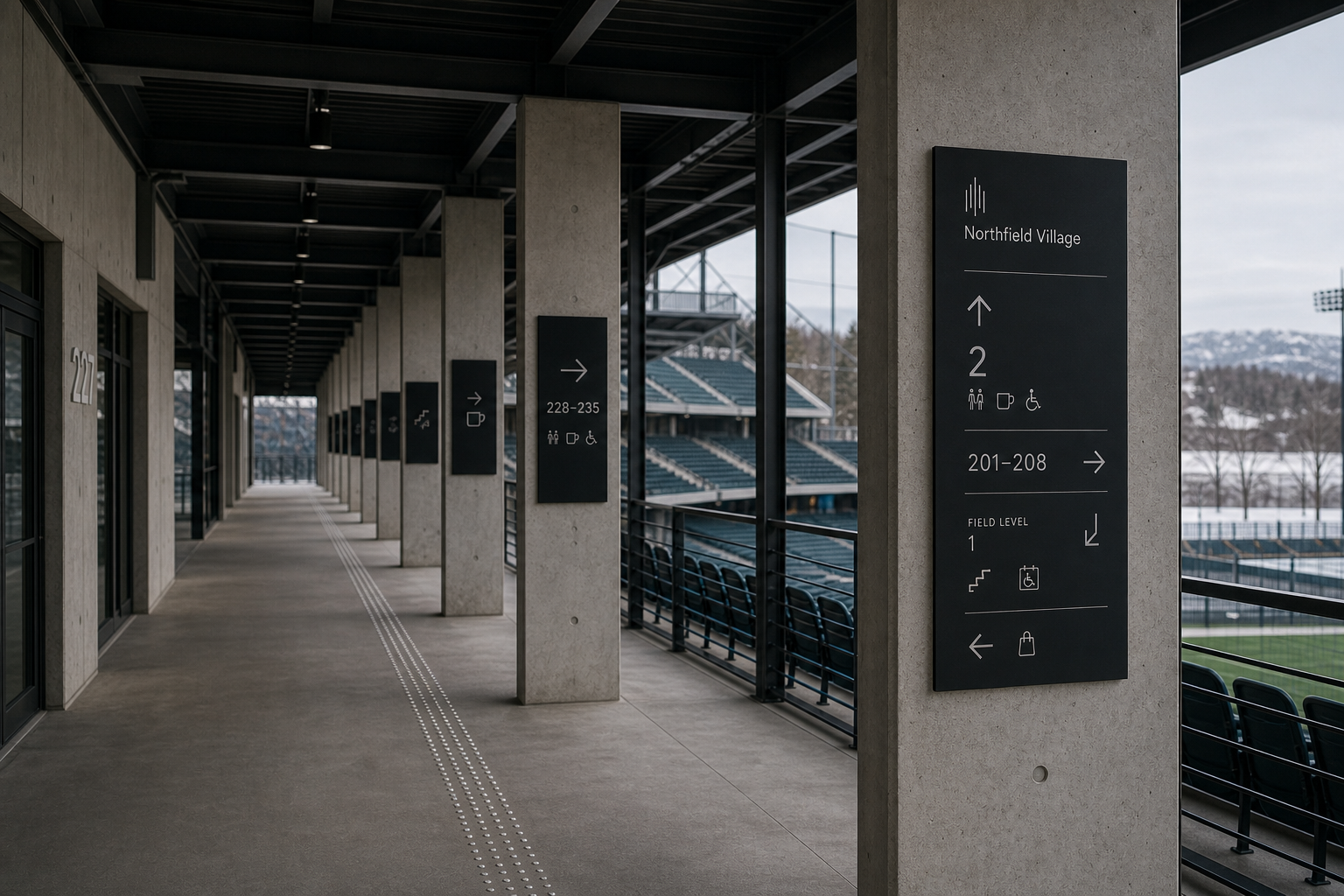
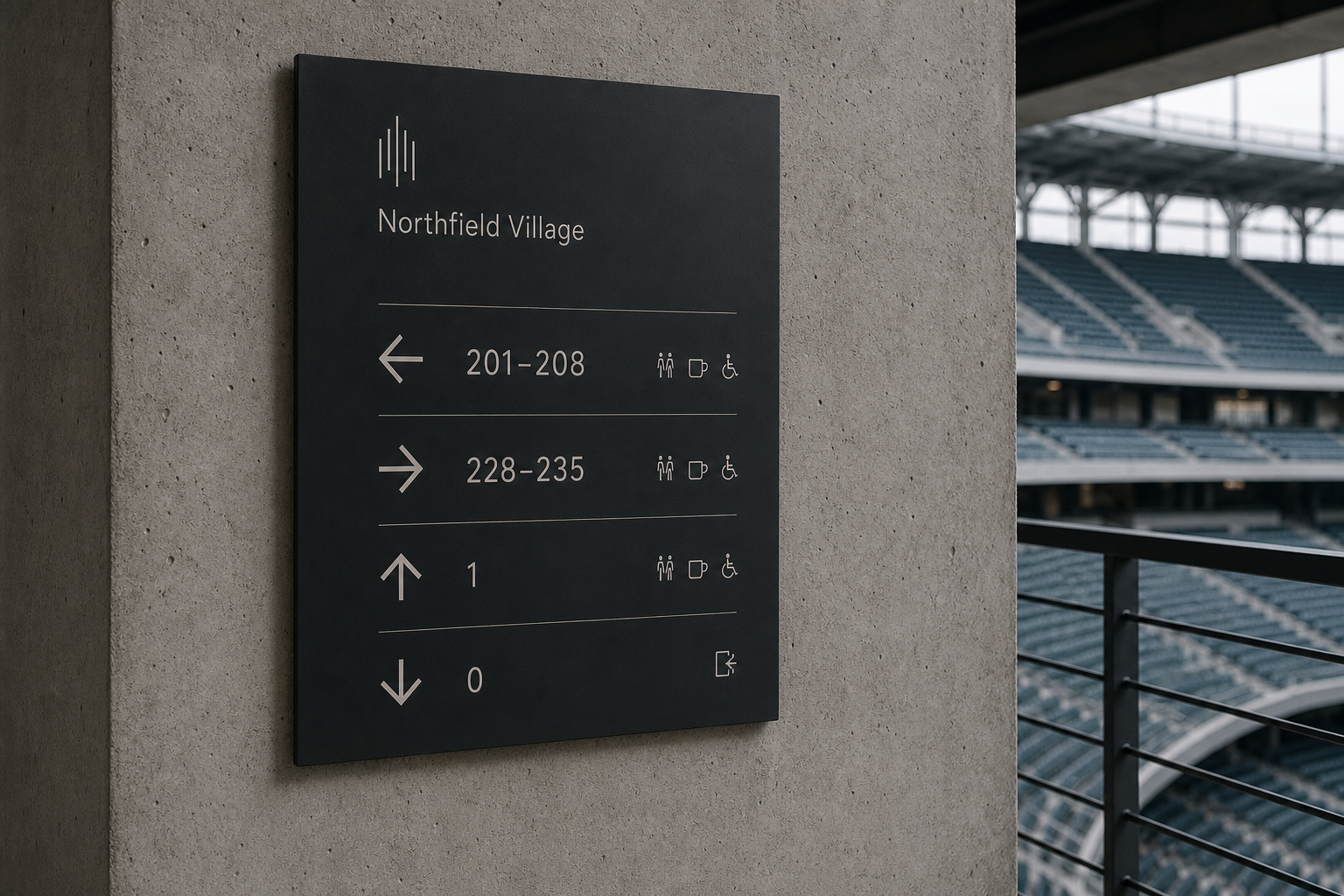
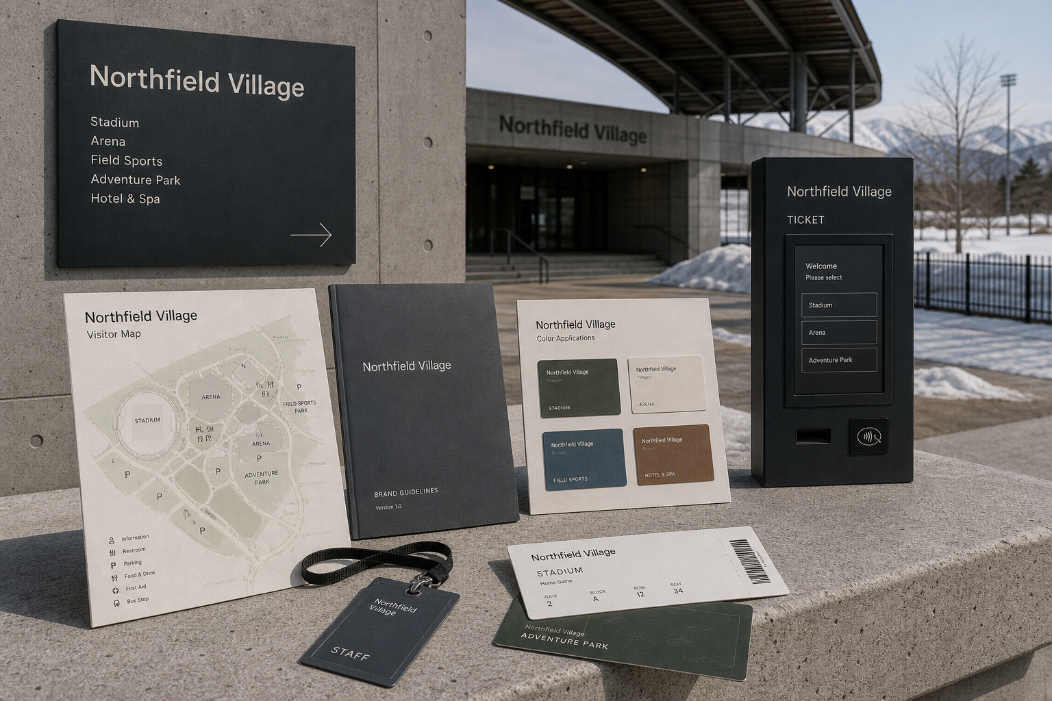
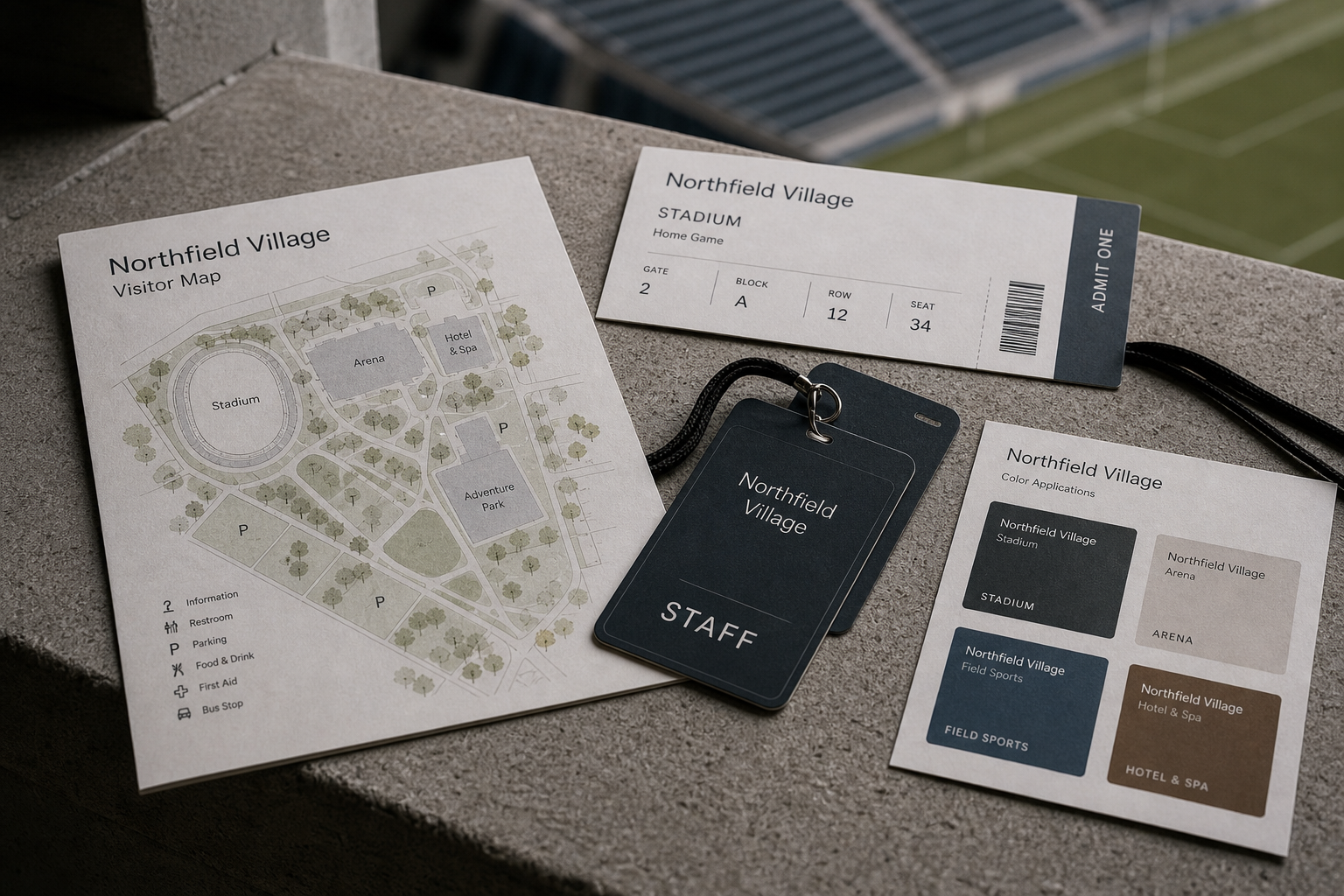
Northfield Village 是為 Northfield Village 建立的 branding + visual identity 專案。作品內容以 brand design、logo + visual identity、design system 為核心,將品牌名稱、應用物件、版面規則與影像語氣整合成一套可延展的作品集案例。
攝影主題以 stadium entrance、signage family、ticket and map、brand color application 為主。畫面應保留自然光、低飽和色彩、安靜陰影與可閱讀的材質細節,讓照片同時承擔品牌證據、包裝質感與空間情緒。
設計概念從「空間標示、導視與現場尺度」出發,使用乾淨 grotesk 字體、克制色票、細緻比例與少量資訊層級,讓品牌看起來像被整理過的文化檔案,而不是一般商業宣傳頁。
計劃上先完成品牌語氣與核心識別,再建立 Logo system、Design guideline、Signage family 等交付物,最後以照片序列、品牌應用與網站作品頁整理成完整案例。
Logo system / Design guideline / Signage family / Ticket system / Visitor map
Editorial review
English edition
English edition
Northfield Village is a public identity system able to move from monumental venue scale to personal hand-held objects. Serving sport, leisure, accommodation, and outdoor activity, it unifies architecture, wayfinding, tickets, maps, and staff passes so a complex destination feels legible and civic.
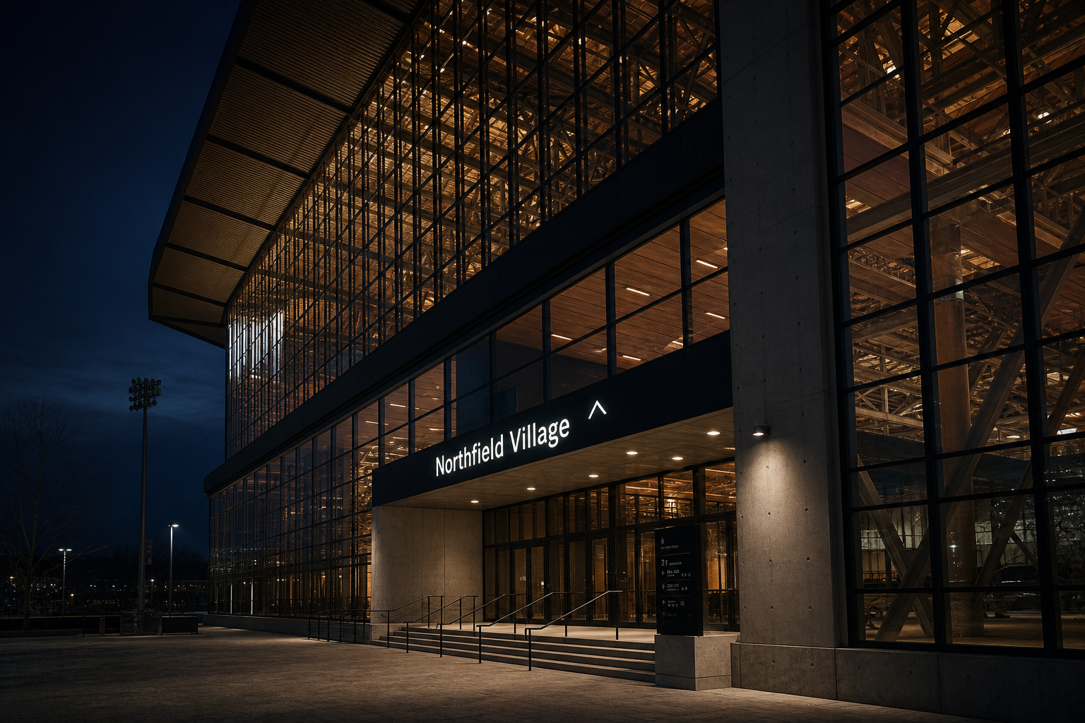
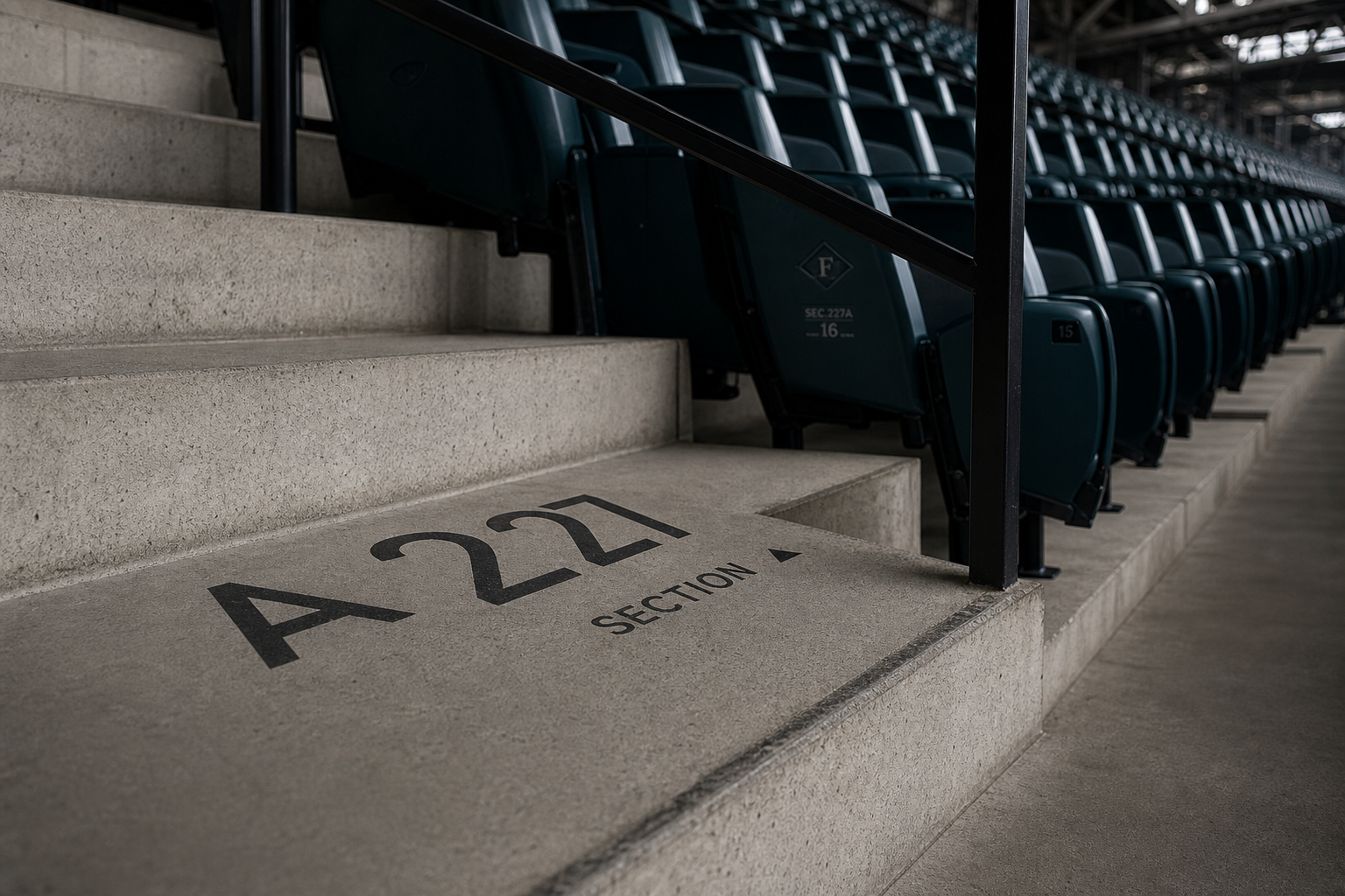
Dark grey and black signs sit naturally among exposed concrete, metal rails, and steel structure. Information applied directly to columns and steps becomes part of the architecture, while bright lettering in dark entrance bands remains visible at night. The low-colour material strategy is durable and clear across snow, cloud, and interior shadow.
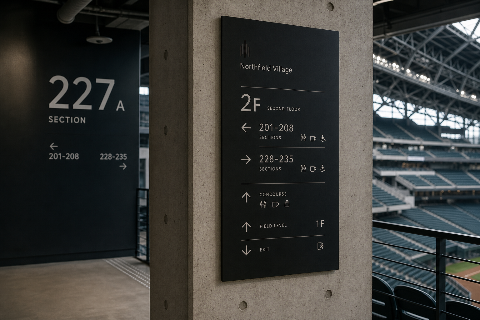
The wayfinding understands how crowds read while moving. Floors, zones, and seat numbers occupy the strongest level; arrows, English labels, and service icons follow a fixed grid. Large figures such as 2F, 227A, and 201–208 can be scanned quickly, turning movement, pause, and change of direction into visual rhythm.
A narrow, upright sans serif supports both large façades and small ticket information. The friendlier wordmark is balanced by more geometric numerals, while the abstract vertical-line symbol can suggest sound, seating, structural columns, or a gathering crowd. Its openness lets it travel across many activities without becoming sport-specific.
Printed matter continues the same precision. A soft grey-green visitor map organises roads, buildings, and planting; tickets separate Gate, Block, Row, and Seat into a direct sequence. Muted colour families distinguish venue roles and services as navigation, not decoration.
The project succeeds by treating brand identity as public infrastructure. Entrance, corridor, seat, map, and ticket all share one proportional and typographic logic. Northfield Village becomes easier to understand and remember, expressing openness, reliability, and collective energy at both architectural and human scale.
日本語版
Northfield Village は、巨大な施設から手の中の印刷物まで自在に移動できる公共的なブランドシステムです。競技、余暇、宿泊、アウトドアを含む目的地に対し、建築、導線、チケット、地図、スタッフ証を一つの言語へ統合しています。
濃いグレーと黒のサインは、打放しコンクリート、金属手すり、鉄骨と自然につながります。柱や階段へ直接置かれた情報は建築の一部となり、夜間入口の明るい文字は暗色帯の中で明確です。低彩度の素材戦略は雪、曇天、室内の影にも対応します。
導線計画は、人が移動しながら読む方法を理解しています。階、区画、座席番号が最上位となり、矢印、英語表記、サービスアイコンが固定グリッドに続きます。2F、227A、201–208 の大きな数字は短時間で読め、移動と方向転換を視覚のリズムへ変えます。
細身で直立したサンセリフ体は、大型外装文字にも小さなチケット情報にも対応します。親しみのあるロゴタイプと幾何学的な数字が層をつくり、垂直線のシンボルは音、客席、柱、人の集まりを想起させます。特定競技に限定されない抽象性があります。
印刷物も空間と同じ精度を保ちます。柔らかな灰緑の地図は道路、建物、植栽を整理し、チケットは Gate、Block、Row、Seat を順番に分けます。低彩度の色は装飾ではなく、施設とサービスを理解するための分類です。
この識別はブランドを公共体験のインフラとして捉えています。入口、廊下、座席、地図、チケットが同じ比率と書体の論理で結ばれ、Northfield Village を理解しやすく、記憶しやすい場所へ変えています。建築スケールと人の細部を両立した設計です。
繁體中文版
Northfield Village 展現的是一套能在巨大場館與個人手持物之間自由切換的公共品牌系統。它服務的不只是單一體育場,而是由競賽、休閒、住宿與戶外活動共同構成的目的地,因此設計必須同時回應遠距辨識、快速移動、多人聚集與近距閱讀。作品把建築、導視、票券、地圖與工作證整合成一致語言,讓複雜場域呈現出清楚而具有秩序的公共性格。
空間中的材質選擇首先建立了可信度。深灰與黑色標牌被安置在裸露混凝土、金屬欄杆及鋼構之間,與場館本身的結構語彙自然連接。部分資訊直接施作於混凝土柱面與階梯上,使文字不再像後來附加的指示,而成為建築構件的一部分。夜間入口則以明亮字樣嵌入深色水平帶,在玻璃帷幕與暖色室內光線之間形成清楚焦點。這套低彩度材料策略兼具耐久、理性與現代感,也能在北海道雪景、陰天與室內陰影等不同光線下維持辨識。
導視編排充分理解大型場館的閱讀方式。樓層、區段與席次編號被放在最醒目的位置,箭頭、英文說明及服務圖示按照固定網格排列;粗細不同的水平線把資訊切分成可迅速掃讀的區塊。2F、227A、201–208 等數字具有足夠尺度,即使觀眾正在行走,也能在短時間內完成判讀。柱面導視利用建築的垂直比例安排閱讀順序,階梯標示則把區號直接放在視線與腳步交會的位置。這種編排不是追求形式上的華麗,而是把人的移動、停頓與轉向轉化為清楚的視覺節奏。
字型系統以結構清晰的無襯線字為核心,字面窄而挺拔,既能承受大型立面字樣,也適合票券與地圖上的小尺寸資訊。Northfield Village 字標保留親和的圓潤感,與數字系統較強的幾何輪廓形成適度層次。由多條垂直線構成的識別符號,讓人聯想到聲浪、座席、建築立柱或群體聚集;它保持抽象,因此能從入口招牌延伸至地圖、證件與導視頂部,而不受特定運動項目限制。
平面物料延續空間系統的精準。訪客地圖以柔和灰綠描繪道路、建築與植栽,資訊豐富卻不顯壓迫;票券把 Gate、Block、Row、Seat 依序分欄,讓入場流程一目了然。深色工作證與淺色紙張形成角色區分,場館、競技場、戶外運動與旅宿也各自取得低飽和色彩。這些色彩不是裝飾性的分類,而是協助使用者理解整個 Village 的組成。
Northfield Village 最值得肯定的,是它把品牌視為公共經驗的基礎設施。從遠處看見入口、在廊道尋找區段、確認座位,到閱讀地圖與保存票券,每一次接觸都使用同一套比例、字型與色彩邏輯。設計因此不只建立一個名稱,而是讓龐大的目的地容易理解並形成記憶。這是一種兼具建築尺度與人本細節的識別方法,也讓 Northfield Village 呈現出開放、可靠而充滿集體能量的品牌形象。
- brand design: hermetic design
- signage design: hermetic design
- photography: studio archive
- client: northfield village