Villa Lunaro
branding + visual identity
Villa Lunaro
2026 / Nara
brand design
logo + visual identity
brand guide
sign design
item design
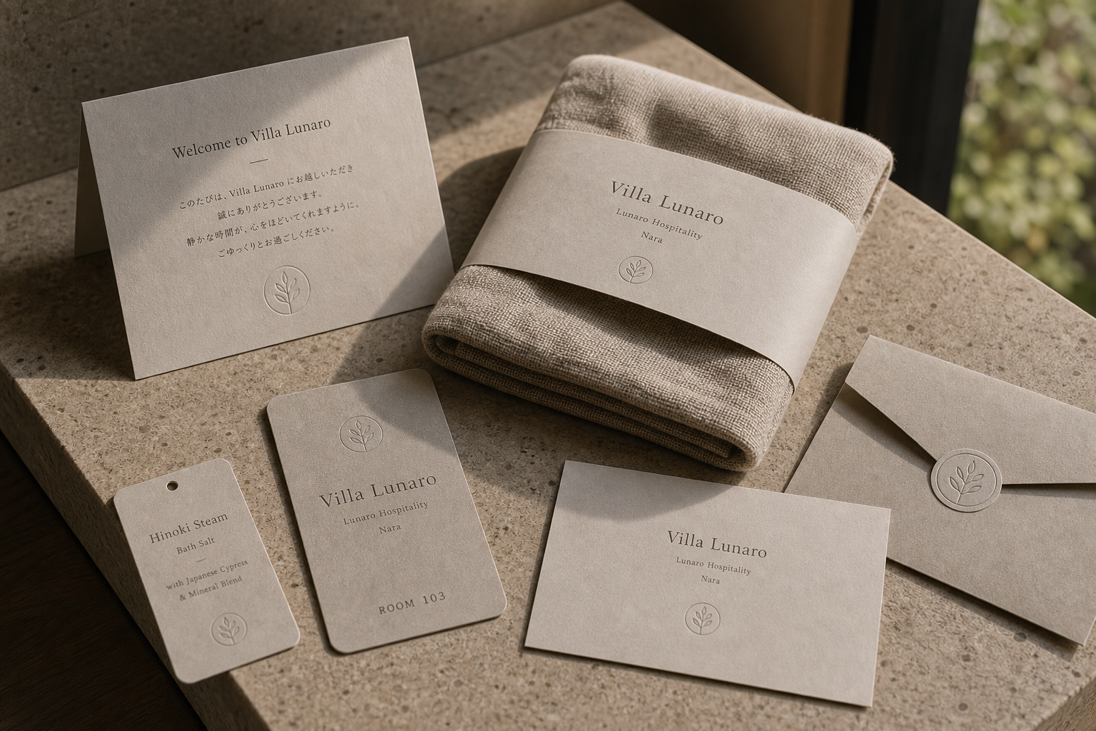
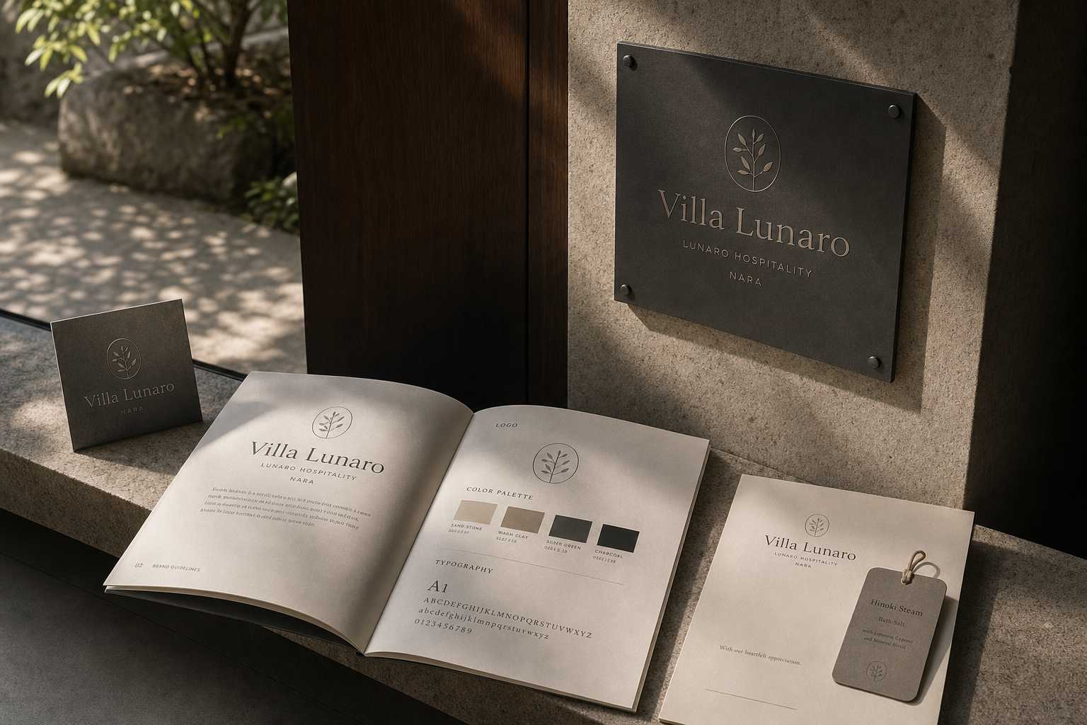
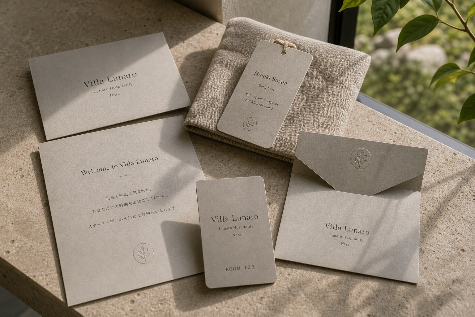
Villa Lunaro 是為 Villa Lunaro 建立的 branding + visual identity 專案。作品內容以 brand design、logo + visual identity、brand guide 為核心,將品牌名稱、應用物件、版面規則與影像語氣整合成一套可延展的作品集案例。
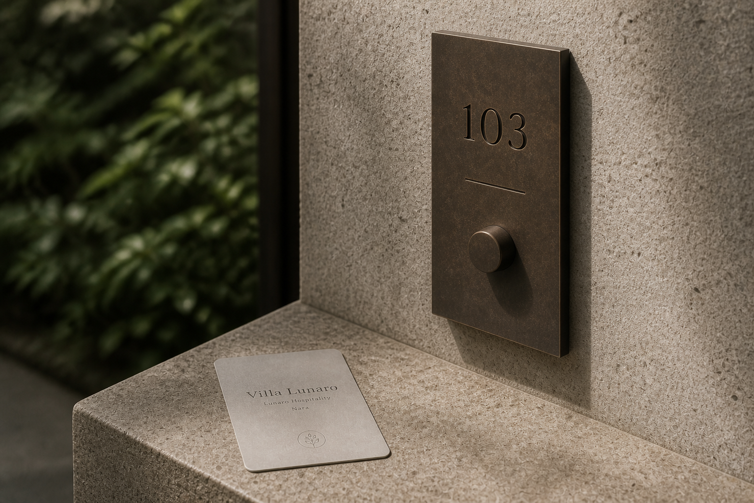
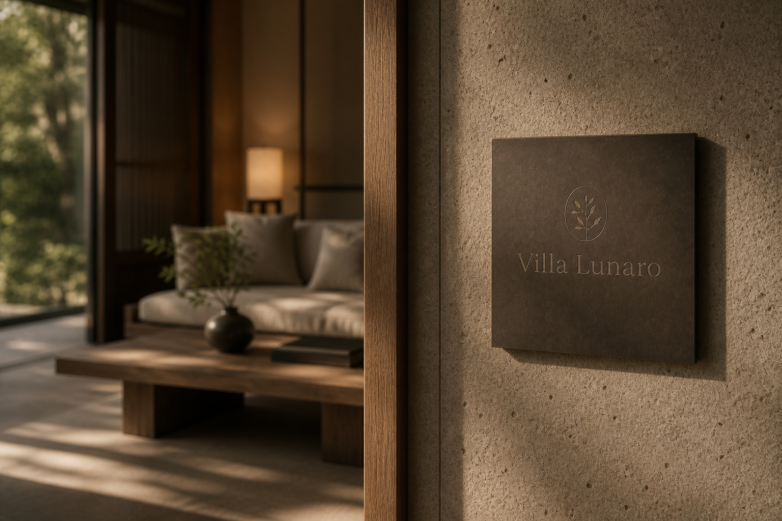
攝影主題以 villa exterior、room key card、amenity package、sign plaque 為主。畫面應保留自然光、低飽和色彩、安靜陰影與可閱讀的材質細節,讓照片同時承擔品牌證據、包裝質感與空間情緒。
設計概念從「空間標示、導視與現場尺度」出發,使用乾淨 grotesk 字體、克制色票、細緻比例與少量資訊層級,讓品牌看起來像被整理過的文化檔案,而不是一般商業宣傳頁。
計劃上先完成品牌語氣與核心識別,再建立 Brand guide、Room key card、Amenity label 等交付物,最後以照片序列、品牌應用與網站作品頁整理成完整案例。
Brand guide / Room key card / Amenity label / Exterior sign / Guest stationery
Editorial review
English edition
English edition
Villa Lunaro builds its identity through privacy and small gestures of welcome. Arrival, key collection, a welcome letter, amenities, and movement between courtyard and room gradually reveal the brand. The experience feels like a quietly opened invitation, gentle in tone yet consistent at every touchpoint.
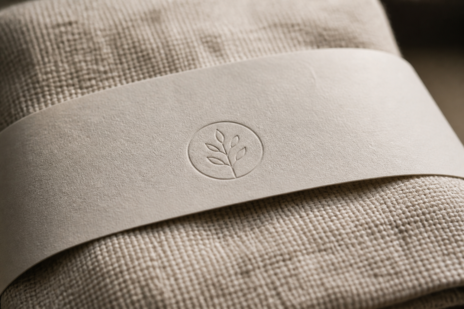
Paper and textiles define its warmth. Welcome cards, envelopes, room keys, and amenity tags use papers between warm grey and brown, set beside coarse cloth, stone, and garden planting. Leaf seals, tied tags, and broad paper bands bring identity into opening, taking, and arranging, so design accompanies the guest's hands.
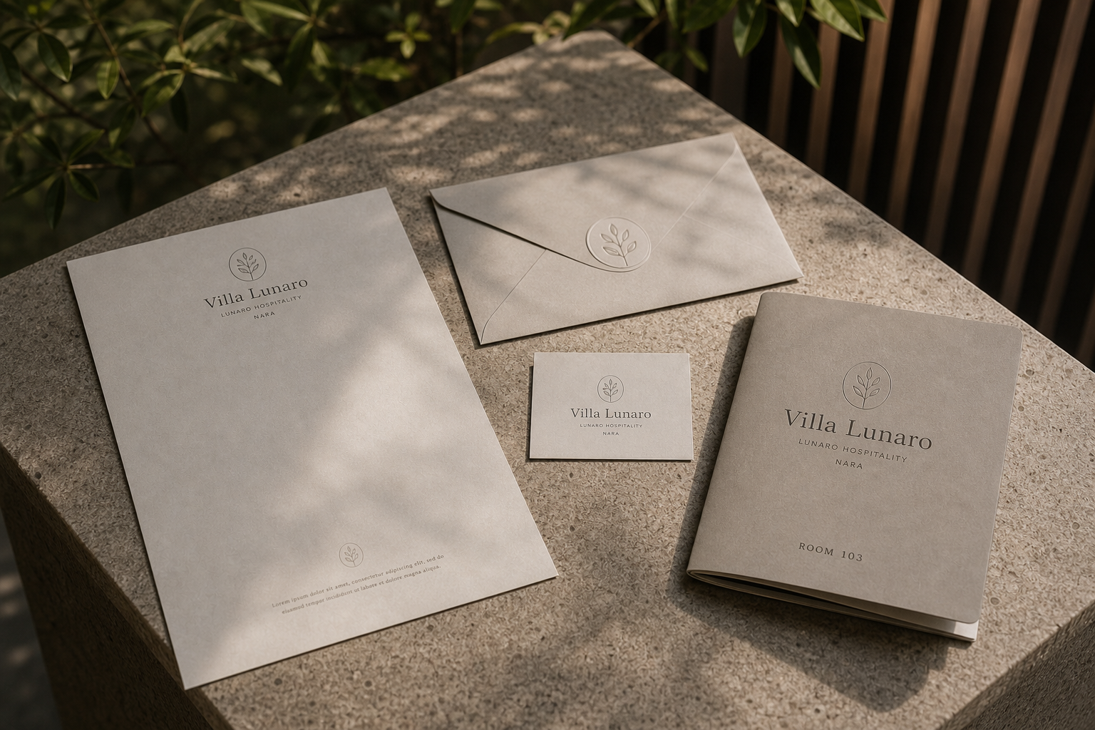
The layouts favour a central axis and generous space. The name, subtitle, location, and room number descend in a calm order; open leading lets welcome messages pause. Clear hierarchy keeps the room key functional while preserving ceremony, and the brand guide organises colour, type, and mark rules with an approachable grid.
A slender serif gives Villa Lunaro a classical hospitality voice without heaviness. Smaller details recede through size and spacing, while a circular branch emblem offers a softer entry into the identity. Repeated across cards, envelopes, tags, and signs, it suggests garden growth, rest, and the movement of seasons.
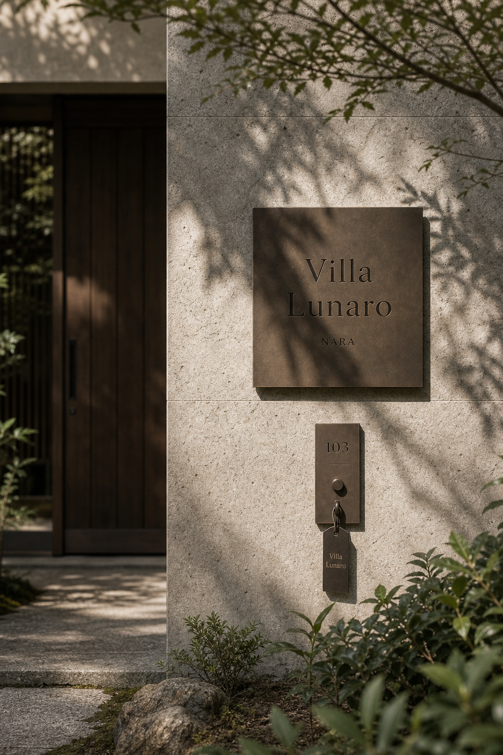
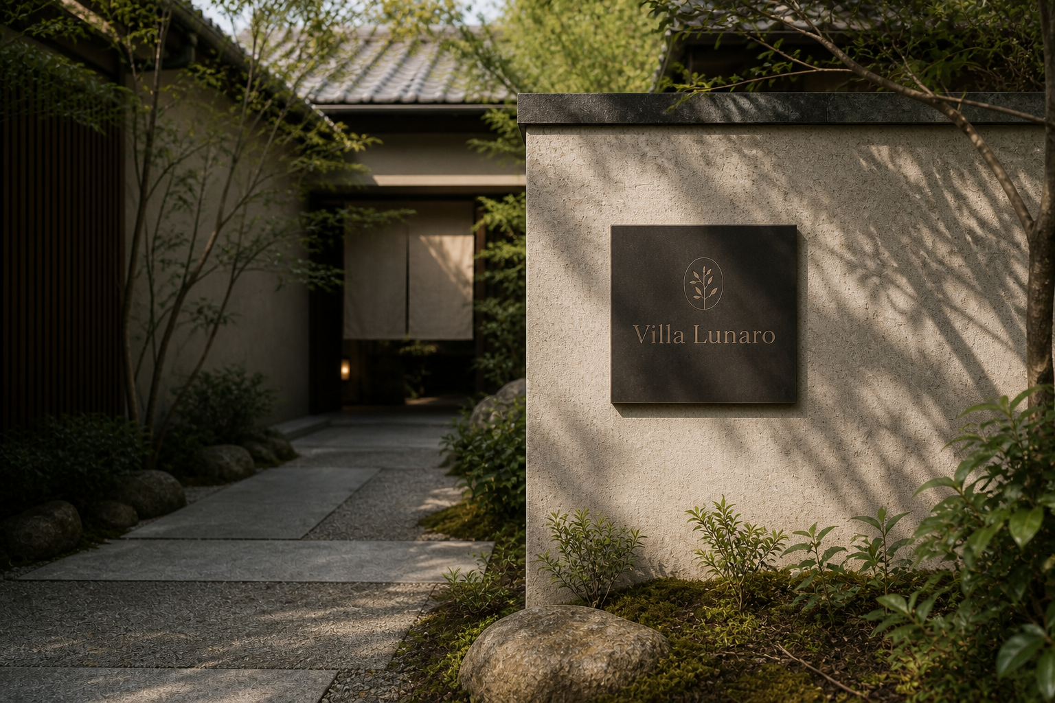
Spatial signs translate the same language into stronger contrast. Dark metal against pale stone remains legible through daylight and shadow, while room numbers, keys, and hanging tags form composed vertical objects. Sand, earth, sage, and charcoal connect the graphic system to masonry, timber, gardens, and shade.
Villa Lunaro turns one night's stay into a sequence of memorable details. Paper texture, card weight, letter spacing, doorway light, and the returning branch emblem form a continuous narrative. Its refinement comes from understanding material, scale, and use, allowing every small object to make a guest feel properly received.
日本語版
Villa Lunaro は、親密さと小さなもてなしの動作からブランドを築きます。到着、鍵の受け取り、ウェルカムレター、アメニティ、中庭と客室の移動を通して、静かに開かれる招待状のように姿を現します。
紙と布が温度を決めています。カード、封筒、ルームキー、タグには暖かなグレーと褐色の紙が使われ、粗い布、石、庭の植物と並びます。葉の封印、結び紐、幅広い紙帯が、開ける、取る、整えるという手の動きに識別を加えます。
版面は中央軸と広い余白を重視します。名称、副題、場所、客室番号が落ち着いて下へ続き、ゆったりした行間が歓迎の言葉に間を与えます。用途をすぐ読める階層と、旅宿文具らしい儀式性が共存しています。
細身のセリフ体は、重くならずに古典的な宿の声をつくります。小さな情報は字間とサイズで後退し、円の中の枝葉が柔らかな入口となります。カード、封筒、タグ、サインに現れるこの印は、庭の成長、休息、季節を想起させます。
空間サインでは同じ言語がより強い対比へ変わります。淡い石壁に置かれた濃色金属は光と影の中でも読みやすく、客室番号、鍵、下げ札は垂直の構成をつくります。砂岩、土、セージ、炭の色が建築と庭へつながります。
Villa Lunaro は一泊を、記憶に残る細部の連続へ変えています。紙の触感、カードの重さ、文字の距離、入口の光、枝葉の反復が一つの物語となります。華やかさではなく、素材、尺度、使用場面への理解から生まれる上質さです。
繁體中文版
Villa Lunaro 的品牌識別帶有私密感。它不把旅宿塑造成華麗場所,而是從客人抵達、領取房卡、閱讀迎賓信、使用備品,到在庭院與房門之間行走的細小時刻,逐步建立細緻的款待經驗。整套設計像一封被安靜展開的邀請函,語氣溫和,卻在每一個接觸點保持完整的品牌面貌。
紙材與織品共同定義了這份溫度。迎賓卡、信封、房卡及備品吊牌都使用介於米灰與暖褐之間的紙色,細微紋理在日光下呈現柔和起伏。它們與粗織布品、石材檯面及庭院植栽並置時,形成由乾燥紙面、柔軟纖維與礦物構成的觸覺層次。信封封口上的圓形枝葉標記、浴鹽吊牌的繩結,以及包覆織品的寬紙環,都讓平面識別進入開啟、取用與整理的動作之中。設計不只是印在物件表面,而是陪伴客人與物件互動。
版面編排特別重視中央軸線與留白。Villa Lunaro 字標位於畫面上方或正中,副標、地名與房號依序向下展開,形成平靜而莊重的閱讀順序。迎賓文字使用寬鬆行距,四周保留大量空間,使卡片在資訊之外仍傳達出停頓與從容。房卡將枝葉符號、品牌名稱與 ROOM 103 分置於不同高度,既能立即辨識用途,也保持旅宿文具應有的儀式感。品牌指南同樣採用寬裕頁邊與規律網格,色票、字型及標誌規範被整理得清晰而親切。
字型以優雅的襯線字建立主要聲音。字母比例修長,筆畫帶有適度對比,讓 Villa Lunaro 具有古典旅宿的文化感,卻不顯沉重。較小的副標與地名透過字距和尺寸變化退居第二層,使主品牌保持明確焦點。圓框中的枝葉符號則提供更柔和的識別入口:線條簡單、姿態向上,既可以被理解為庭園植物,也像一個關於生長、休息與季節流動的象徵。它被反覆使用於紙卡、信封、吊牌及牆面標牌,成為串聯所有物件的安靜印記。
空間標示把同一語言轉化得更為沉穩。深色金屬牌與淺色石牆形成清楚對比,細緻字樣及枝葉圖形在日光與樹影之間保持可讀。房號牌、鑰匙與垂掛標籤被整合成一組垂直構圖,讓入住所需的功能資訊也具有物件美感。品牌所選用的沙岩色、暖土色、鼠尾草綠與炭黑,分別呼應建築、木作、庭園和陰影,使視覺系統融入環境,而不是覆蓋環境。
Villa Lunaro 最迷人的設計理念,是把「居住一晚」轉化為一連串值得被記住的細節。紙張的觸感、房卡的重量、迎賓文字的距離、門牌上的光影與枝葉符號的反覆出現,共同建立了溫柔而連續的品牌敘事。它所傳遞的高級感並不來自張揚,而來自對尺度、材料與使用情境的充分理解。當每件小物都讓客人感到被妥善迎接,品牌便真正成為空間服務的一部分,也使 Villa Lunaro 呈現出內斂、從容且富有人情的旅宿性格。
- brand design: hermetic design
- item design: hermetic design
- photography: studio archive
- client: villa lunaro