Aura Island Resort
signage design + visual identity
Aura Island Resort
2026 / Miyakojima
signage design & consulting
concept design
typeface design
original icon design
visual identity
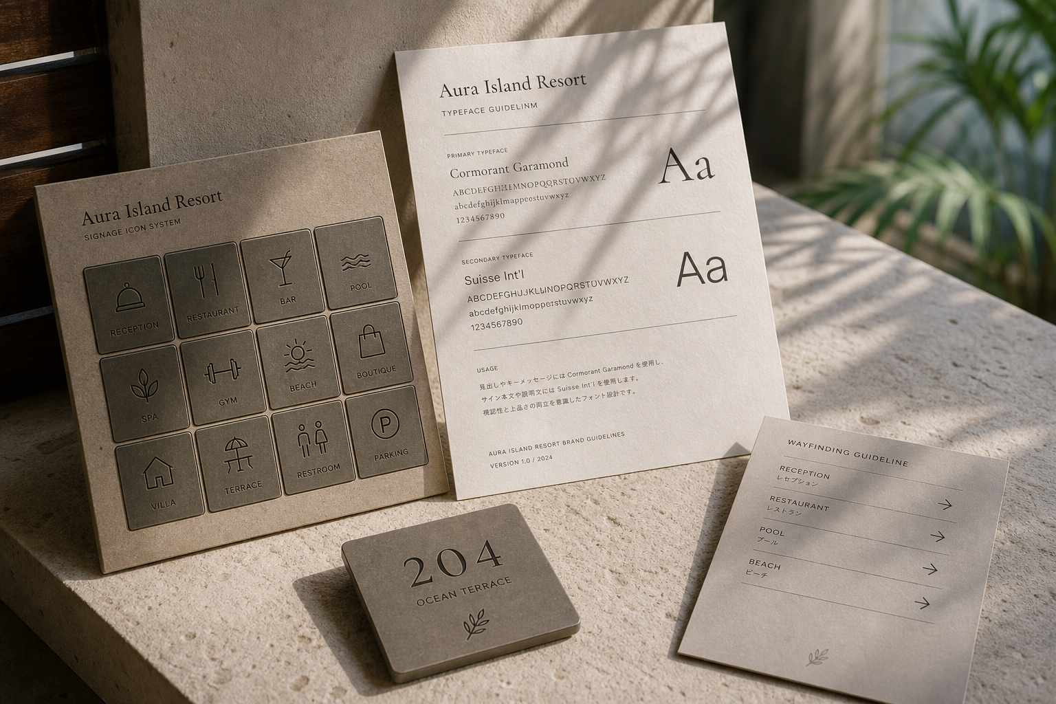
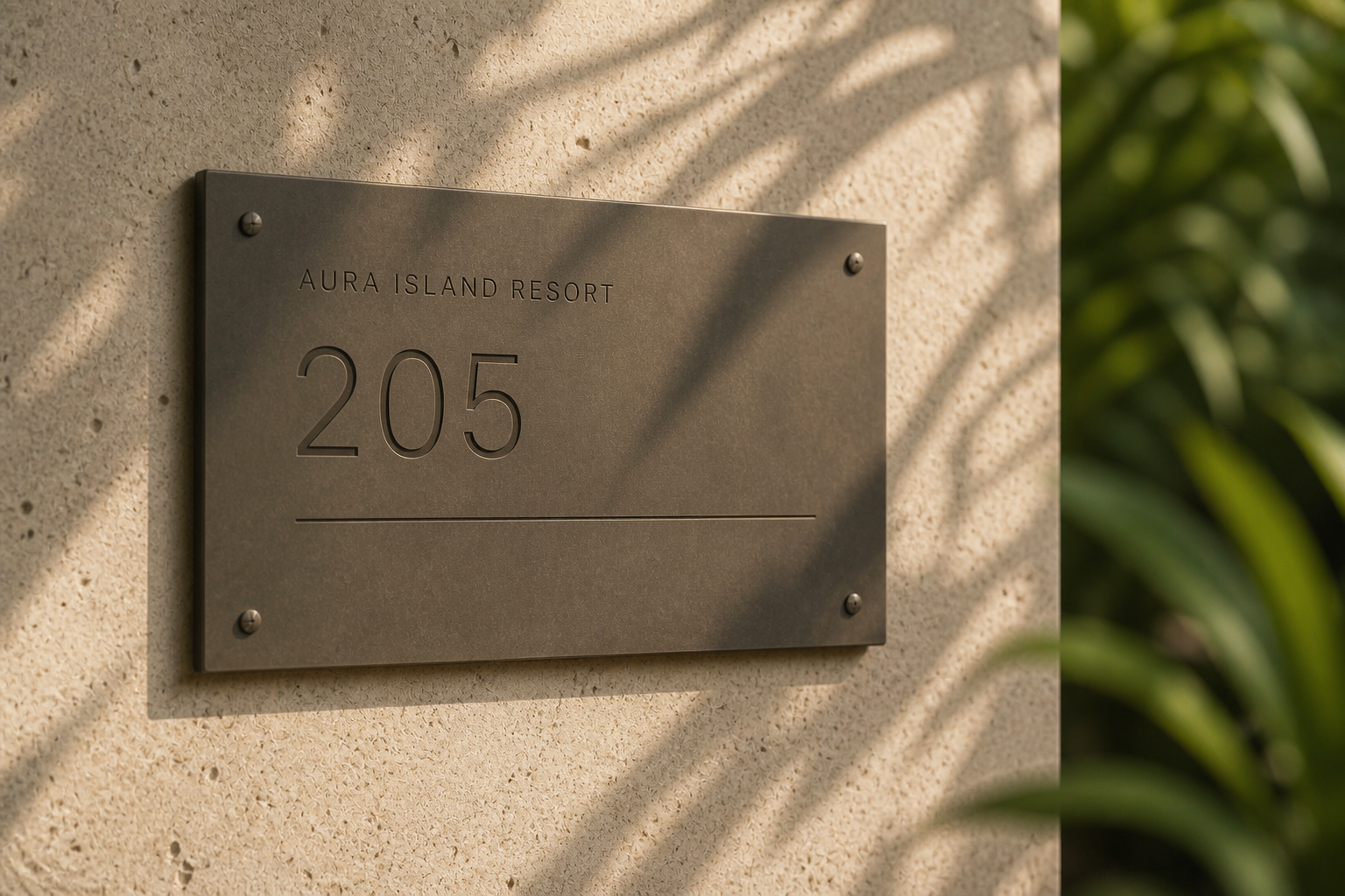
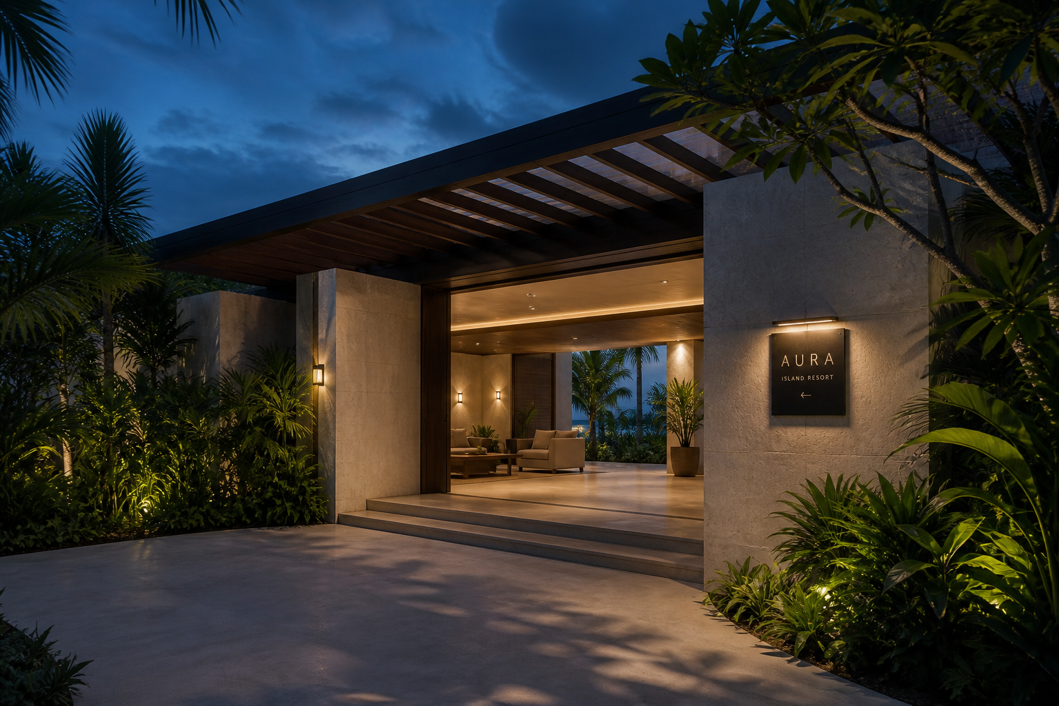
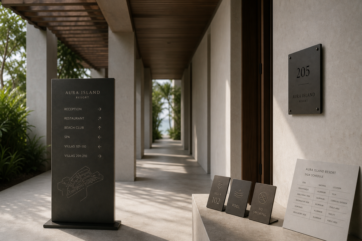
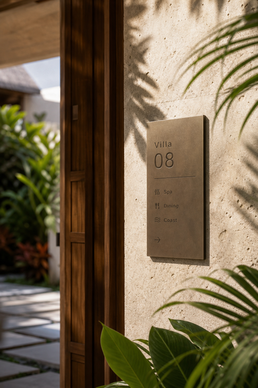
Aura Island Resort 是為 Aura Island Resort 建立的 signage design + visual identity 專案。作品內容以 signage design & consulting、concept design、typeface design 為核心,將品牌名稱、應用物件、版面規則與影像語氣整合成一套可延展的作品集案例。
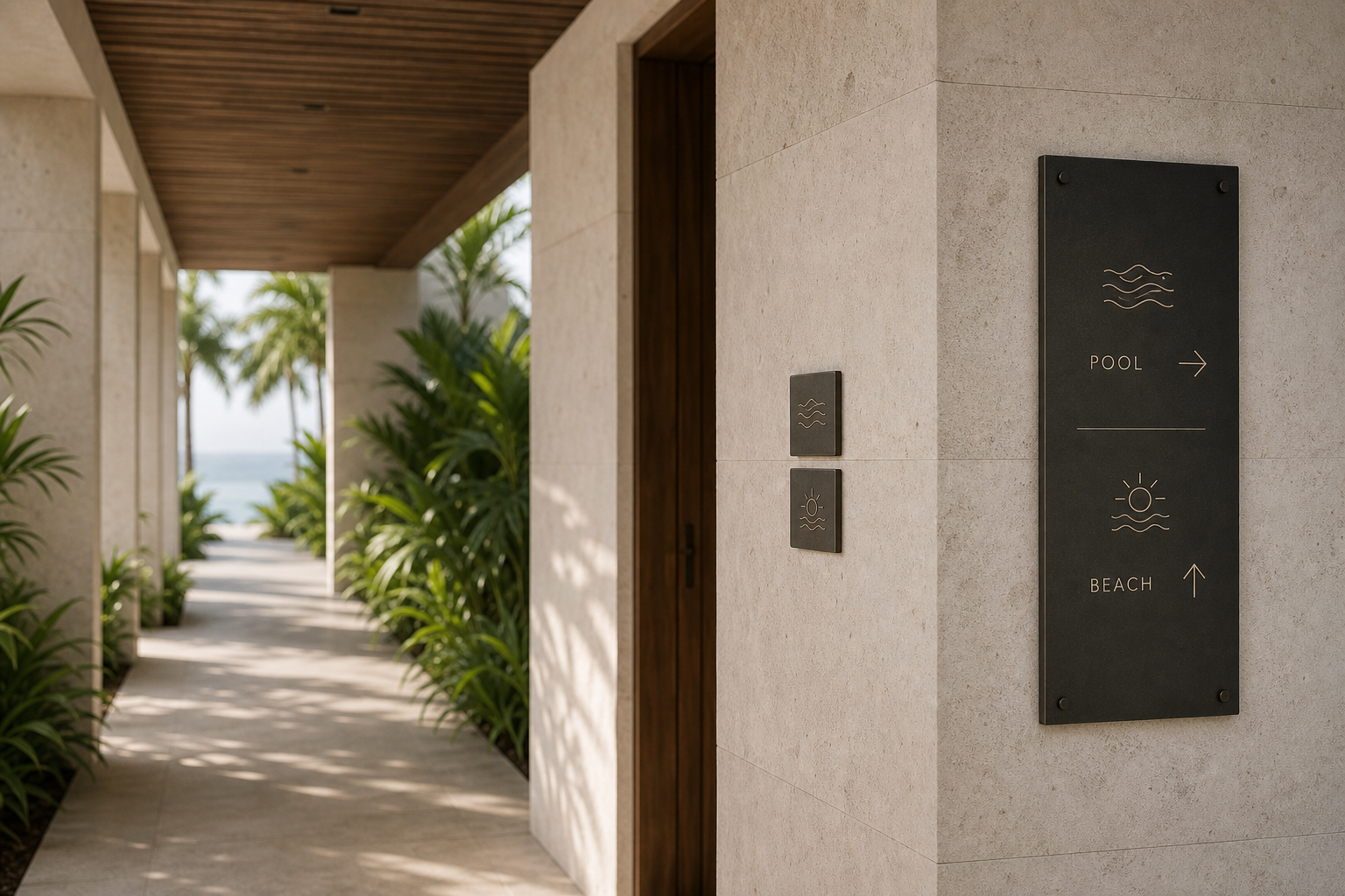
攝影主題以 resort exterior、room sign、custom icon plate、architectural corridor 為主。畫面應保留自然光、低飽和色彩、安靜陰影與可閱讀的材質細節,讓照片同時承擔品牌證據、包裝質感與空間情緒。
設計概念從「空間標示、導視與現場尺度」出發,使用乾淨 grotesk 字體、克制色票、細緻比例與少量資訊層級,讓品牌看起來像被整理過的文化檔案,而不是一般商業宣傳頁。
計劃上先完成品牌語氣與核心識別,再建立 Sign concept、Original icons、Typeface notes 等交付物,最後以照片序列、品牌應用與網站作品頁整理成完整案例。
Sign concept / Original icons / Typeface notes / Room signage / Wayfinding guideline
Editorial review
English edition
English edition
Aura Island Resort begins with a thoughtful understanding of arrival. Identity is not applied as decoration, but accompanies guests from the entrance through corridors, rooms, and amenities, offering direction without interrupting the island's light, planting, and architectural rhythm.
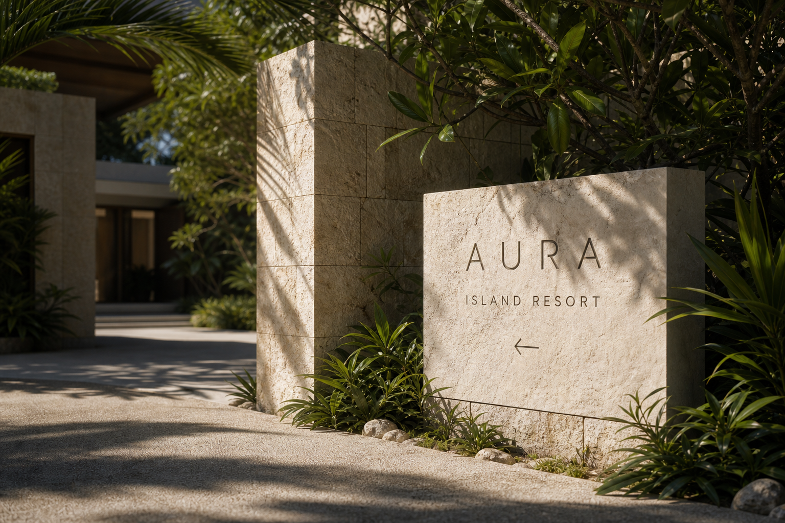
Dark metal, warm brown signs, pale stone walls, and timber frames define the material language. Letters set directly into porous stone appear to grow from the building, while low-reflection dark panels keep fine information legible under strong sun. The contrast between precise metal and textured masonry balances clarity with warmth.
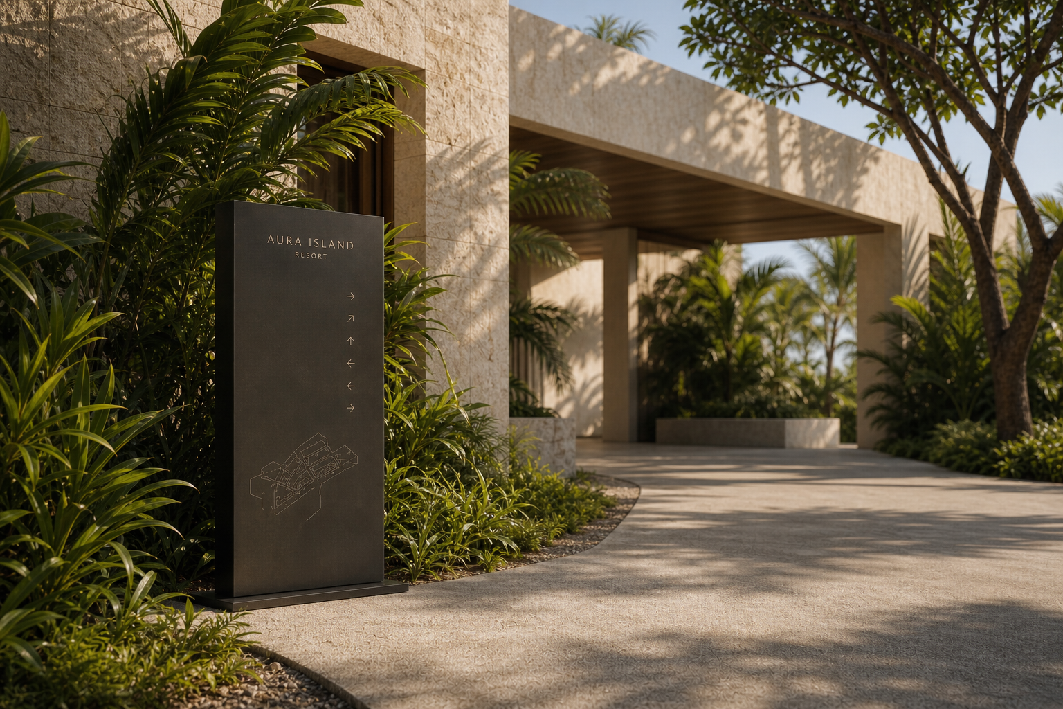
A consistent modular grid organises room numbers, amenity names, icons, arrows, and dividing rules. Large vertical signs retain generous spacing even when listing reception, dining, beach, spa, and villas. Information density changes intelligently from the entrance to the room door, responding to distance and movement rather than simply scaling one template.
Typography separates atmosphere from function. Cormorant Garamond gives the identity an elegant, humanist resort voice, while Suisse Int'l carries directions and service information with efficient sans-serif clarity. Open spacing makes AURA feel light on stone, and slender room numbers become immediate landmarks.
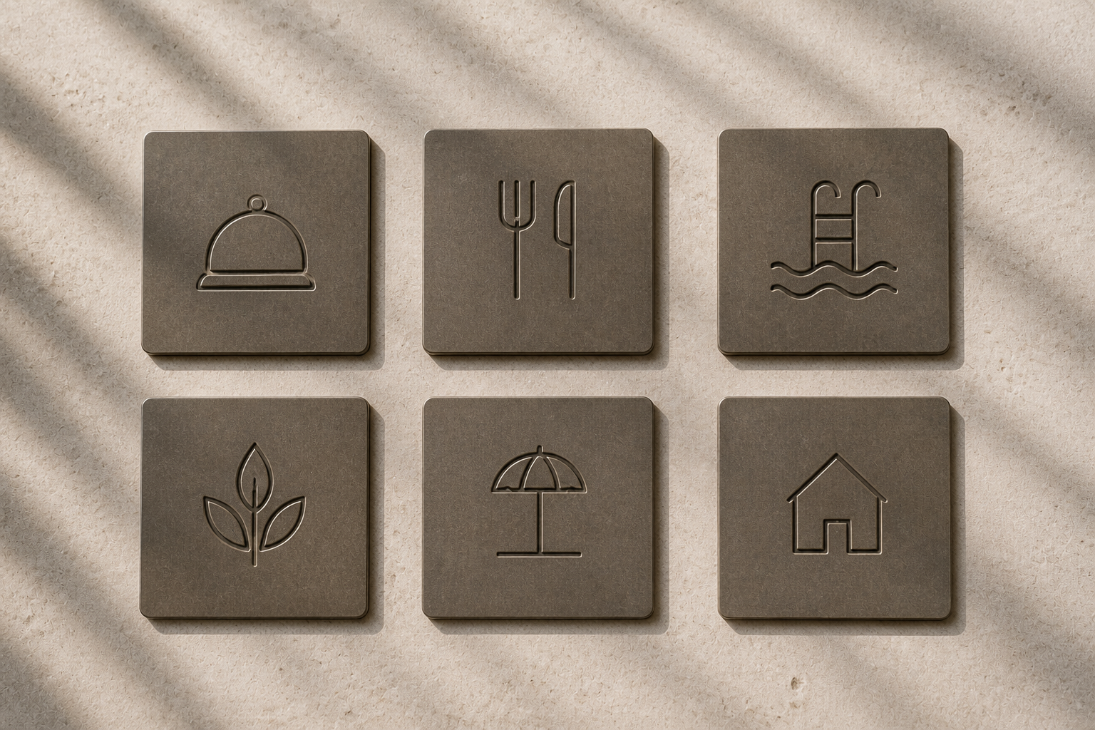
The icon family extends the same discipline. Reception, dining, pool, spa, gym, beach, and villa symbols are reduced to consistent fine-line gestures that remain recognisable without competing with the setting. Like good hospitality, the system places an answer where it is needed without raising its voice.
Aura Island Resort ultimately creates welcome through the cooperation of architecture, nature, and information. Each sign understands when to be visible and when to recede. Wayfinding becomes a narrative thread through the stay, allowing guests to feel secure, unhurried, and willing to explore.
日本語版
Aura Island Resort の設計は、「到着」への深い理解から始まります。識別は建築に後から加える装飾ではなく、入口、廊下、客室、各施設までゲストに寄り添い、島の光、植栽、建築のリズムを妨げずに方向と期待を与えます。
濃色の金属、温かな茶色のサイン、淡い石壁、木の枠が素材の言語をつくります。多孔質の石に直接置かれた文字は建築から生まれたように見え、反射を抑えた暗色パネルは強い日差しの下でも細かな情報を保ちます。精密な金属と粗い石の対比が、明快さと温度を両立させています。
客室番号、施設名、アイコン、矢印、区切り線は一貫したモジュールで整理されています。受付、レストラン、ビーチ、スパ、ヴィラを含む大型サインにも十分な間隔があります。入口から客室ドアまで、単純な拡大縮小ではなく、距離と移動に応じて情報量が変化します。
書体は雰囲気と機能を分担します。Cormorant Garamond は人間味のある優雅さを、Suisse Int'l は方向やサービス情報に効率的な明快さを与えます。広い字間の AURA は石と光の間で軽やかに見え、細長い客室番号は即座に焦点となります。
アイコンも同じ規律を保っています。受付、飲食、プール、スパ、ジム、ビーチ、ヴィラの記号は、環境と競合しない細線へ簡潔に整理されています。良いサービスのように、必要になる前に答えが適切な場所へ置かれています。
Aura Island Resort は、建築、自然、情報の協働によって歓迎を形にします。各サインは見えるべき強さと、背景へ戻るタイミングを理解しています。導線は滞在を結ぶ物語となり、ゲストに安心、余裕、探索への意欲を与えます。
繁體中文版
Aura Island Resort 的設計價值,首先體現在它對「抵達」這件事的理解。度假村的識別並不是附加在建築表面的裝飾,而是從入口、廊道、房門到各項設施之間,持續為旅客建立方向感與期待感。這套系統最成熟之處,是讓導視同時具備功能與氣氛:它清楚地告訴人應該往哪裡走,卻不打斷島嶼環境原有的光線、植物與建築節奏。
材質語言以深色金屬、暖棕色標牌、淺色石牆與木質門框構成。入口標誌直接將字樣嵌入帶有天然孔隙感的石材,讓品牌像是從建築本身生長出來;房號與方向牌則以低反光的深色表面承接細緻文字,在強烈日照下依然保持沉穩。金屬標牌與粗獷石牆之間的對比十分精準:前者提供資訊所需要的銳利度,後者保留島嶼建築的溫度。
編排採用高度一致的模組秩序。房號被放大成第一閱讀層級,設施名稱、圖示與箭頭依序排列,細線則負責切分區域與穩定視線。大型立式方向牌在狹長比例中保留充足間距,即使包含接待、餐廳、海灘、水療與別墅區等多項資訊,仍能快速辨讀。從入口尺度到房門尺度,資訊密度會隨觀看距離自然調整,顯示這套系統並非單一版型放大縮小,而是理解人在空間中移動時的閱讀需求。
字型搭配清楚建立了品牌與功能之間的分工。識別指南中以 Cormorant Garamond 承擔主要品牌語氣,其高低筆畫對比與優雅比例,為海島度假帶來從容、帶有人文感的氣質;Suisse Int’l 則負責方向、設施名稱與說明文字,以乾淨的無襯線結構確保辨識效率。入口字樣採用寬鬆字距,使 AURA 在石牆與陽光之間顯得開放而輕盈;房號數字則以修長輪廓形成清楚焦點。兩套字型各司其職,卻透過克制的線條、相近的色彩與穩定留白,被整合成同一種安靜語調。
圖示系統同樣展現出良好的控制力。接待、餐飲、泳池、水療、健身、海灘與別墅等符號都由細線構成,細節經過簡化,仍保留足以辨識的姿態。它們沒有追求強烈的圖像個性,而是以一致筆畫成為空間文字的延伸。這種選擇非常符合度假品牌的本質:真正良好的服務並不需要高聲宣告,而是在旅客需要資訊之前,已經把答案放在適當的位置。
Aura Island Resort 最終建立的,是一種由建築、自然與資訊共同完成的款待感。每一面標牌都知道自己應該被看見到什麼程度,也知道何時應該退回環境之中。當品牌能夠從入口一路陪伴旅客走向房間、泳池、海岸與水療空間,導視便不只是管理路徑的工具,而成為度假經驗的敘事線索。這套設計證明,優雅的空間識別不在於留下最多符號,而在於以最恰當的尺度、材質與語言,讓人自然地感到安心、從容,並願意繼續向前探索。
- signage design: hermetic design
- typeface design: hermetic design
- photography: studio archive
- client: aura island resort