Mori Jujo
branding + visual identity
Mori Jujo
2024 / Matsumoto
branding
logo + visual identity
brand guide
sign design
item design
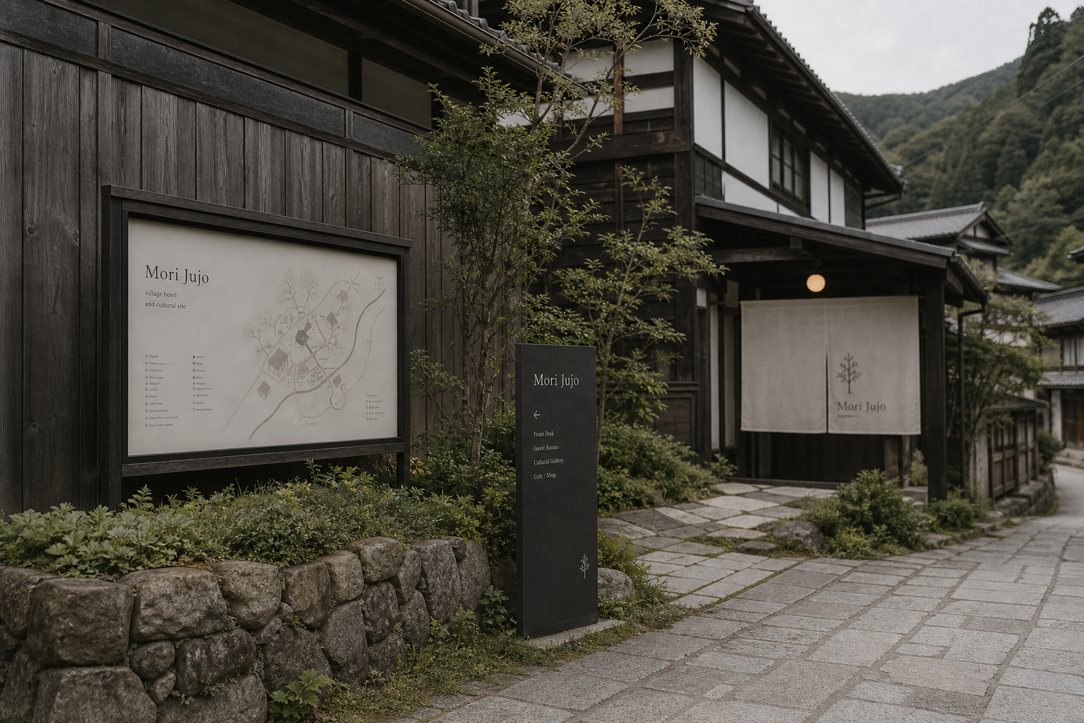
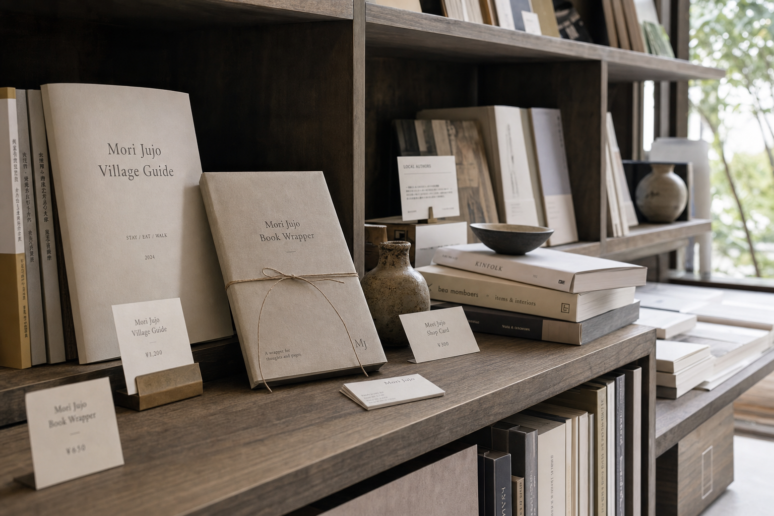
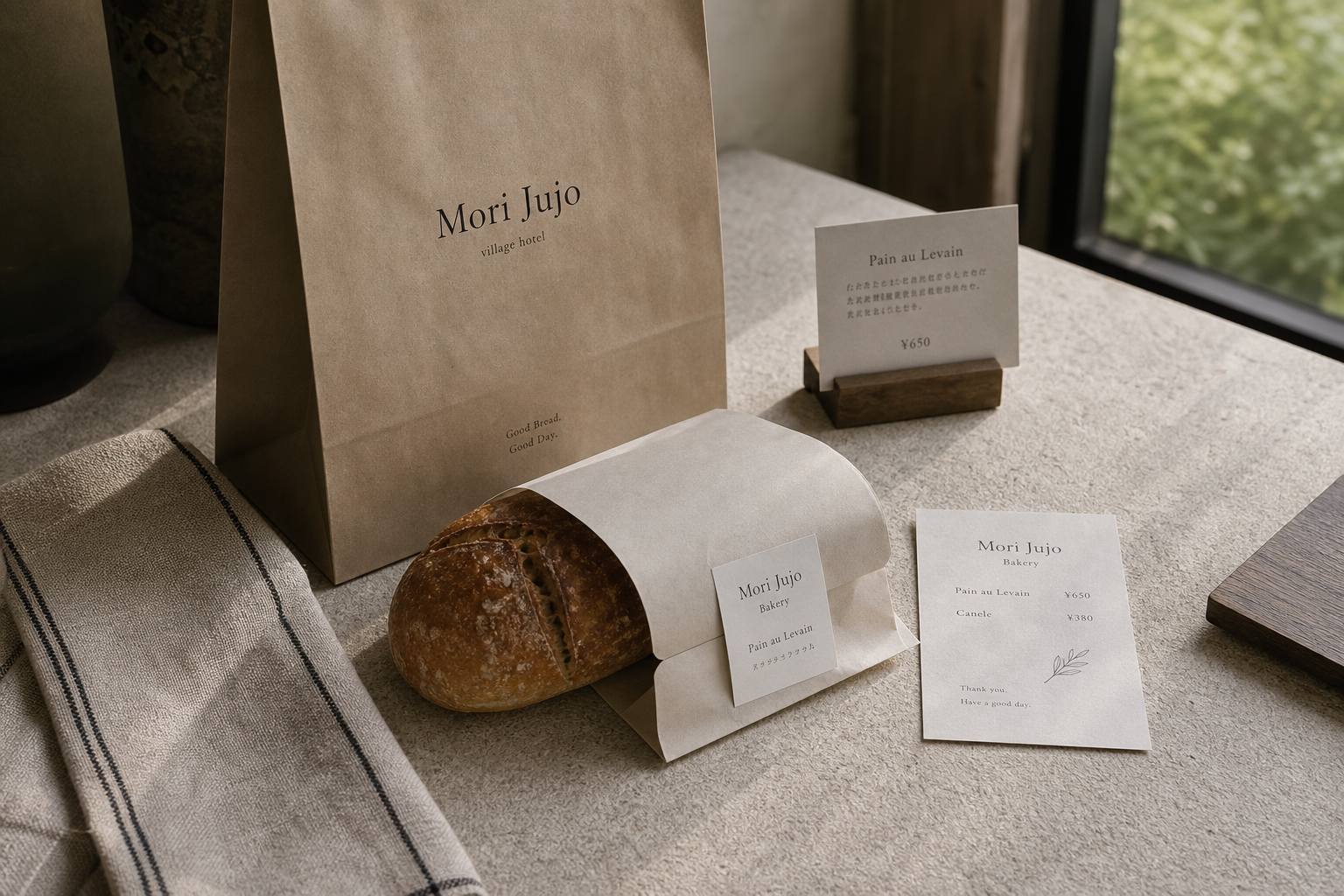
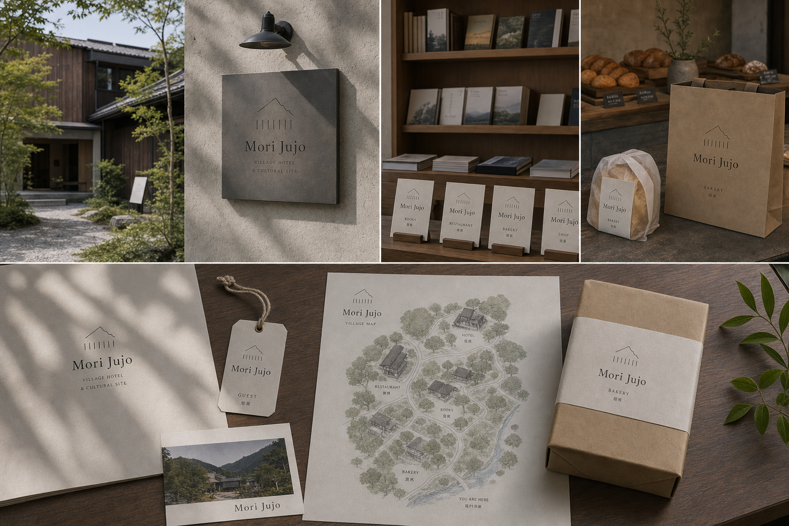
Mori Jujo 是為 Mori Jujo 建立的 branding + visual identity 專案。作品內容以 branding、logo + visual identity、brand guide 為核心,將品牌名稱、應用物件、版面規則與影像語氣整合成一套可延展的作品集案例。
攝影主題以 hotel exterior、bookstore shelf、bakery package、village sign 為主。畫面應保留自然光、低飽和色彩、安靜陰影與可閱讀的材質細節,讓照片同時承擔品牌證據、包裝質感與空間情緒。
設計概念從「空間標示、導視與現場尺度」出發,使用乾淨 grotesk 字體、克制色票、細緻比例與少量資訊層級,讓品牌看起來像被整理過的文化檔案,而不是一般商業宣傳頁。
計劃上先完成品牌語氣與核心識別,再建立 Village logo、Sub-brand system、Shop label 等交付物,最後以照片序列、品牌應用與網站作品頁整理成完整案例。
Village logo / Sub-brand system / Shop label / Site map / Guest item
Editorial review
English edition
English edition
Mori Jujo organises lodging, books, bakery, restaurant, and shop into a cultural village made for walking. A shared house mark, paper palette, typography, and wayfinding keep the services related, extending the atmosphere of dark timber, stone paths, planting, and warm light into maps, curtains, bags, book covers, tags, and guest items.
Materials begin with aged wood, stone, and cloth. Warm fibrous paper suits guides and book covers; kraft paper brings direct warmth to bread bags and tags; pale woven entrance curtains become soft points against timber; charcoal signs provide distance legibility. Each surface retains the honest quality of something improved by use.
Information follows a parent-and-sub-brand hierarchy. Mori Jujo remains central while Books, Restaurant, Bakery, Shop, and Guest appear below. Maps connect buildings, roads, trees, and water; signs reduce this world to arrow and destination; retail and room labels repeat the same simple order.
A humanist serif gives the name both hospitality warmth and editorial culture. Small capitals and Japanese names clarify function. The sloping roof and vertical-line mark can be read as façade, trees, or adjacent spaces, adapting to each service while preserving one shared roof.
The system makes one place and many experiences coexist. Guests may sleep, buy bread, browse books, dine, and take products home without losing the whole. Hand-drawn maps, shelves, wrapping, and garden signs create a slow rhythm of discovery and help visitors plan their stay.
The brand is composed like the village itself: through relationships. A common mark shelters distinct programmes, and the map reconnects separated spaces. Contemporary clarity respects the buildings' accumulated time, making Mori Jujo a destination for lodging, reading, food, and cultural exchange.
日本語版
Mori Jujo は宿、書店、ベーカリー、レストラン、ショップを、歩いて巡る文化集落へまとめます。共通の家形、紙色、書体、導線が各サービスを家族にし、濃い木、石路、植栽、暖光の雰囲気を地図、暖簾、袋、書衣、札、客室用品へ広げます。
素材は古い木、石、布から始まります。繊維のある暖白紙は案内と書衣に、クラフト紙はパン袋と商品札に適し、淡い織物の暖簾は木立面の柔らかな焦点になります。炭色サインは遠距離の明快さを担います。
Mori Jujo を中心に、Books、Restaurant、Bakery、Shop、Guest を下位へ置く二層構造です。地図は建物、道、森、川を結び、方向板は矢印と目的地だけへ縮め、商品と客室の札も同じ順序を使います。
人間味のあるセリフ体は宿の温かさと出版文化を併せ持ちます。小型大文字と日本語が機能を補い、傾いた屋根線と垂直線の印は、建物、木立、並ぶ空間として各サービスへ適応します。
泊まり、パンを買い、本を選び、食事し、商品を持ち帰る体験が一つの場所に共存します。手描き地図、書棚、包装、庭の導線がゆっくりした探索の速度をつくり、滞在を組み立てやすくします。
ブランドは村と同じく関係から成ります。共通の屋根の下で各機能が育ち、地図が分散した場所を再接続します。建築の時間を尊重しながら現代的な明快さを加え、宿泊、読書、食、文化交流を結びます。
繁體中文版
Mori Jujo 的識別把旅宿、書店、烘焙坊、餐廳與商店組織成一座可以漫步的文化聚落。品牌沒有讓不同服務各自競爭,而是以共同的屋形標誌、紙色、字型與導視層級建立家族關係。深色木造建築、石徑、庭院植栽和暖光構成場所的基調,地圖、門簾、紙袋、書衣、價卡與住宿用品則把這份氣氛延伸到每一次接觸。整套設計兼具村落的親密感和文化場域的編輯深度。
材料語言從舊建築的木、石與布出發。村落指南和書衣使用帶有纖維感的暖白紙,色澤接近未漂白書頁,與書架及陶器並置時格外協調;烘焙紙袋、麵包包紙和商品吊牌則轉為牛皮色,讓食物顯得溫暖直接。入口門簾使用淺色織物,在深木立面上形成柔和焦點;戶外導視採炭黑面板,確保遠距辨識。紙、布、木與石材各有觸感,也共同傳達經過時間使用後仍會保持魅力的質樸品質。
資訊編排採主品牌與子品牌雙層結構。Mori Jujo 始終位於視覺核心,Books、Restaurant、Bakery、Shop 和 Guest 等功能則以較小文字附於下方,使訪客一眼看出彼此關係。村落地圖以建築、道路、樹林與河流建立完整方位,再用名稱標示各處空間;方向牌則縮減為箭頭和必要目的地。書店價卡、烘焙品標籤與住宿吊牌沿用相同上下秩序,從場域導覽到商品說明都保持容易理解的閱讀方式。
字型以帶有人文氣息的襯線體為主。Mori Jujo 的字母比例溫和,既像旅宿招牌,也具有出版社與書店所需的文化感;較小的大寫字和日文名稱補充場所功能,形成細膩但清楚的層級。屋形圖案以一條傾斜屋頂線和數道垂直線構成,可被理解為建築立面、林木或聚落中的並列空間。它能依不同服務搭配文字,也能縮小到紙袋、吊牌與桌牌上,成為串連整個場域的共同印記。
品牌特色在於讓「一個地方、多種體驗」真正成立。訪客可能先住宿,再到烘焙坊買麵包、走進書店挑選刊物、於餐廳用餐,最後把包裝商品帶走;每個空間都有自己的內容,卻不會失去 Mori Jujo 的整體身分。手繪地圖、書架攝影、麵包包裝和庭院導視共同呈現一種緩慢探索的節奏。識別因此不只是標示店名,更協助訪客理解場所、安排停留並建立對聚落的記憶。
Mori Jujo 的設計理念,是讓品牌像村落本身一樣由關係構成。主標誌提供共同屋頂,子品牌在其下發展各自功能,地圖則把分散空間重新連接。人們從入口閱讀方向,在書店與烘焙坊接觸紙品,再把指南、書衣或食品包裝帶回生活;品牌隨行程逐步展開。這套系統尊重建築原有的時間感,也以當代方法提升服務清晰度,使 Mori Jujo 成為既能住宿、閱讀與用餐,也能持續發生文化交流的完整目的地。
- branding: hermetic design
- art direction: hermetic design
- photography: studio archive
- client: mori jujo