Kanra Kyoto Renewal
branding + sign system
Kanra Kyoto Renewal
2014 / Kyoto
branding
visual identity
sign system
design consultation
graphic design
Kanra Kyoto Renewal 是為 Kanra Kyoto Renewal 建立的 branding + sign system 專案。作品內容以 branding、visual identity、sign system 為核心,將品牌名稱、應用物件、版面規則與影像語氣整合成一套可延展的作品集案例。
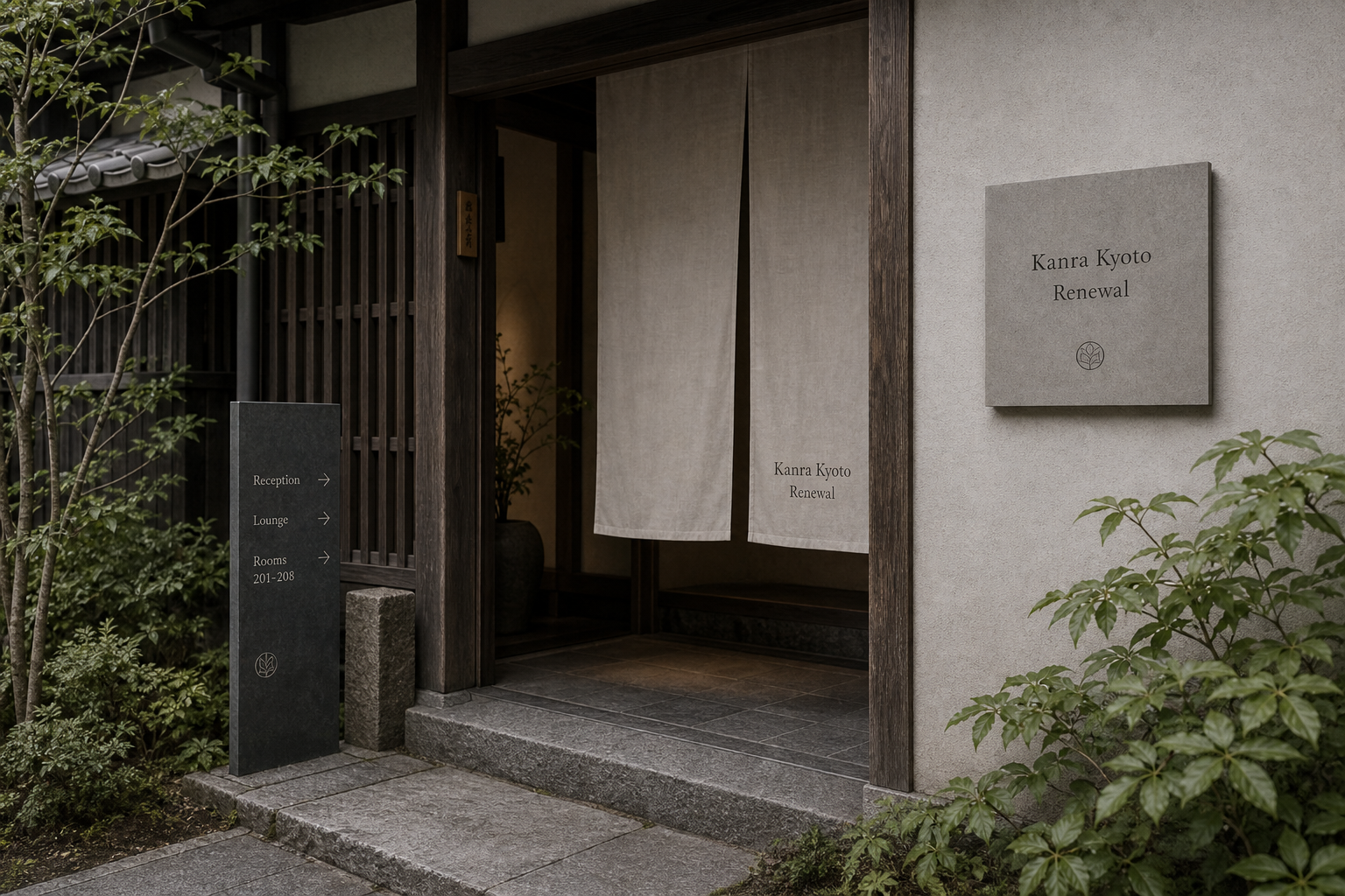
攝影主題以 hotel entrance、sign system、guest collateral、room detail 為主。畫面應保留自然光、低飽和色彩、安靜陰影與可閱讀的材質細節,讓照片同時承擔品牌證據、包裝質感與空間情緒。
設計概念從「空間標示、導視與現場尺度」出發,使用乾淨 grotesk 字體、克制色票、細緻比例與少量資訊層級,讓品牌看起來像被整理過的文化檔案,而不是一般商業宣傳頁。
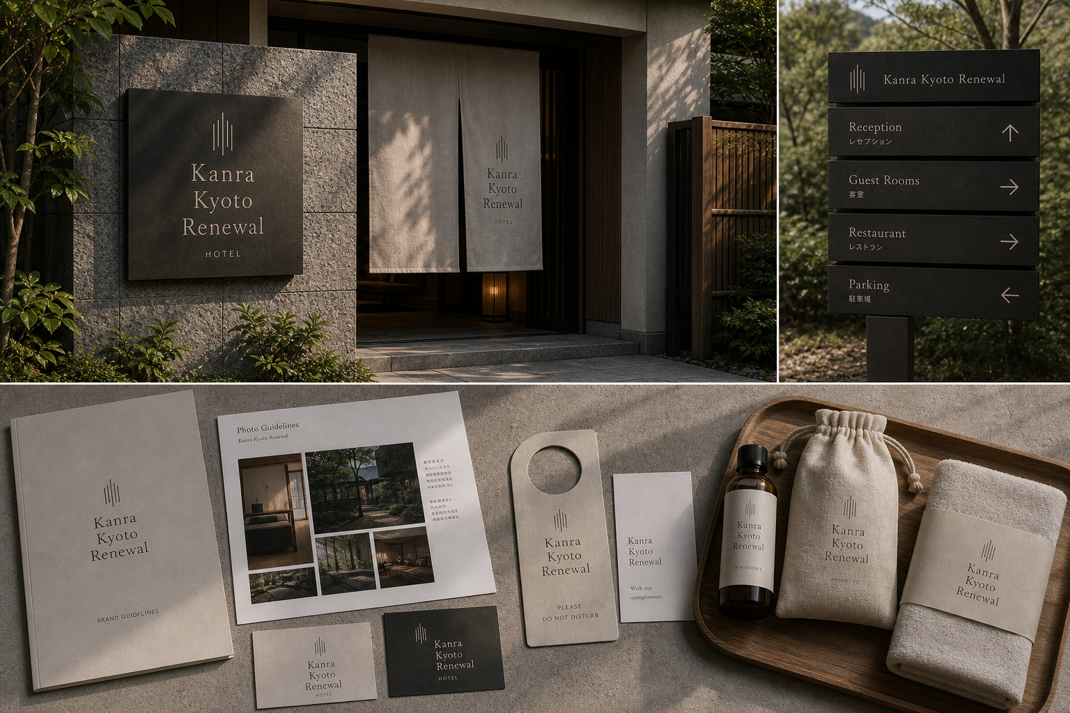
計劃上先完成品牌語氣與核心識別,再建立 Renewed identity、Sign system、Guest collateral 等交付物,最後以照片序列、品牌應用與網站作品頁整理成完整案例。
Renewed identity / Sign system / Guest collateral / Room item / Photo guideline
Editorial review
English edition
English edition
Kanra Kyoto Renewal is built around renewal without cutting the memory of Kyoto. Timber, stone, garden, and noren retain their time, while a clearer identity enters wall plaques, curtains, and floor signs at a respectful distance. The result is a newly ordered sequence of hospitality rather than a visual replacement.
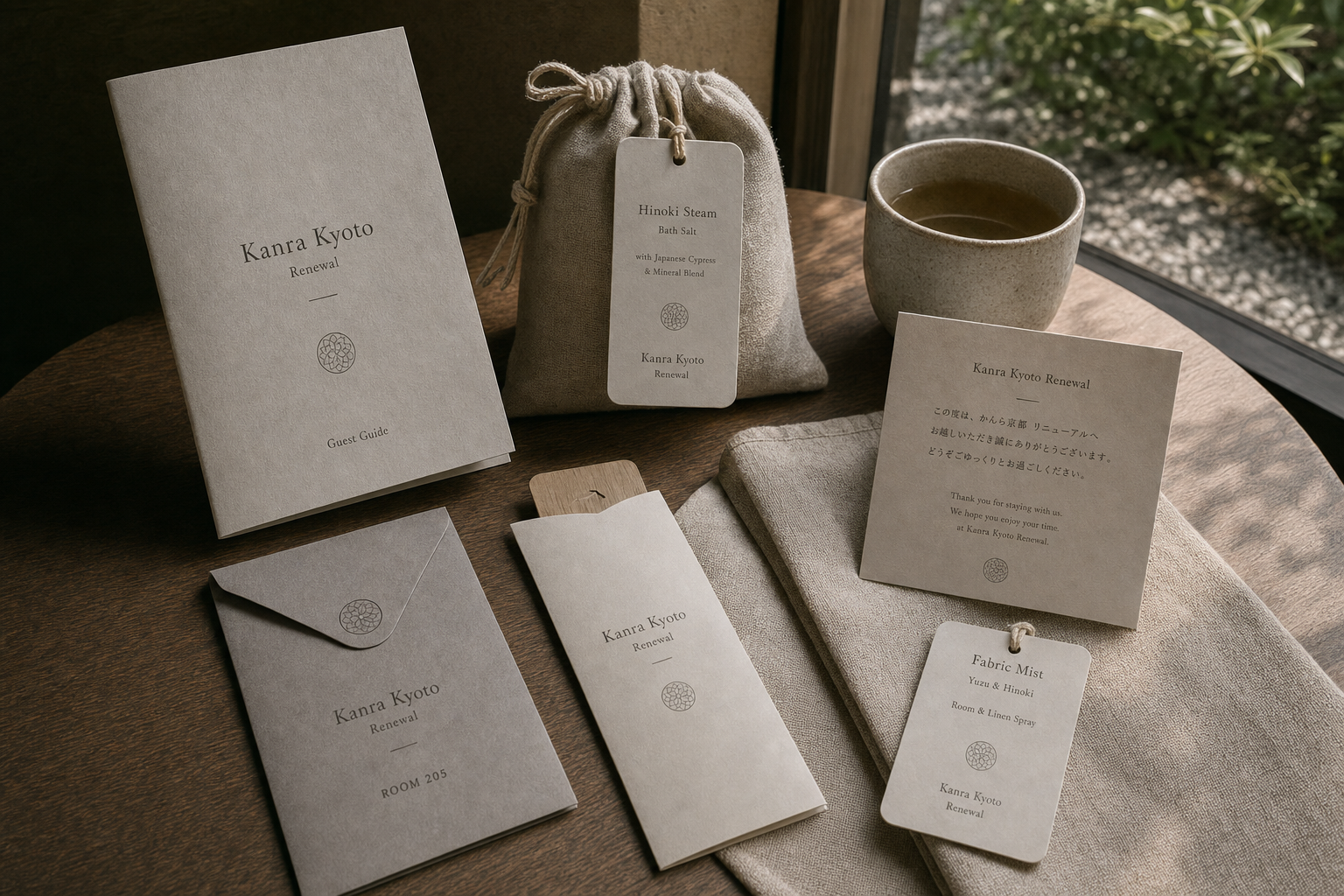
Dark stone, warm timber, plaster, warm grey paper, linen, and ceramics form the material set. A charcoal entrance sign steadies green and stone; a pale wall plaque almost enters the architecture; fibrous guides, envelopes, cards, bags, towels, and trays shift tactility from public direction to private use.
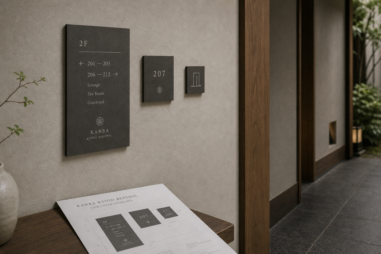
Vertical rhythm and broad margins guide composition. Stacked entrance names answer hanging curtains; 2F leads before room directions, tea room, and garden; room numbers centre for fast recognition; exterior directional bars keep arrows fixed. Guest paper follows a ceremonial central axis.
A tall serif brings cultural character, its fine strokes responding to timber lattice, leaves, and stone. Open letterspacing keeps the long name composed, while enlarged room and floor numbers serve orientation. English leads functions with Japanese below; botanical crests and vertical marks suggest garden, window, and lattice.
Identity enters hospitality itself. Bilingual welcome, key sleeve, door hanger, guide, and labels explain the room; bath salt, fabric mist, towel, and bag add scent and touch. Public information is direct, private communication softer, with one system changing volume by distance.
Tradition continues to participate in contemporary travel rather than becoming a display object. Stone defines entry, timber leads movement, signs explain direction, and paper and textile accompany rest. Fine lines, muted colour, and touch connect Kyoto architecture with modern service in a form made for long use.
日本語版
Kanra Kyoto Renewal は「京都の記憶を切らずに更新する」ことを中心にします。木、石、庭、暖簾の時間を保ちながら、壁板、暖簾、階導視へ明確な識別を適切な距離で加えます。置き換えではなく、もてなしの秩序を整えます。
濃石、暖木、灰泥、暖灰紙、麻布、陶器が素材をつくります。炭色入口板が緑と石階を安定させ、淡灰壁板は建築へ溶け、繊維のある案内、封筒、カード、布袋、タオル、木盆が公共から私室への触感を変えます。
垂直リズムと広い境界を重視します。入口名称は暖簾に応じて積み、2F の下に房号方向、茶室、庭を置き、客室番号は中央、外部方向板は固定矢印の横条を使います。客室紙品は儀式的な中央軸です。
細長いセリフ体は木格子、植物、石紋へ響く文化性を持ちます。広い字間は長い名称を端正に保ち、大きな房号と階数は方向を支えます。英語の機能名と日本語、植物紋、垂直線が庭、花窓、格子を想起させます。
二言語の迎賓カード、房卡套、門掛、案内、用品札が客室を説明し、浴塩、布用ミスト、タオル、袋が香りと触感を加えます。公共部は明確、私室部は柔らかく、距離で声量を変えます。
伝統を展示物にせず、現代旅行の日常へ参加させます。石が入口、木が歩み、導視が方向、紙と布が滞在を支えます。細線、低彩度、素材感が京都建築と現代サービスを長く使える形で結びます。
繁體中文版
Kanra Kyoto Renewal 以「更新而不切斷京都記憶」為核心,讓既有旅館在保留木構、石材、庭園與布簾氣質的同時,獲得更清楚的品牌輪廓。名稱被安排在入口牆牌、暖簾與各層導視上,與建築保持適當距離,沒有遮蓋空間本身的時間感。識別因此像一套重新整理過的待客秩序:旅客從街道進入、尋找接待處、辨認房號,再接觸房內用品,每一步都能感受新舊元素自然銜接。
材料組合以深色石面、溫潤木材、灰泥牆、暖灰紙張、亞麻布與陶器構成。入口的深灰立牌在綠意和石階之間穩定視線,牆面標牌則選用接近建築底色的淺灰,使名稱像嵌入牆體。客房指南、信封、迎賓卡和吊牌保留紙面纖維,與布袋、毛巾及木托盤形成柔和觸感。深色導視負責遠距辨認,淺色用品陪伴近距使用,材質的轉換也對應旅客由公共區域走入私人房間的過程。
編排重視垂直節奏與寬裕邊界。入口名稱依序分行,呼應暖簾下垂比例;樓層牌先放大 2F,再以水平線區隔房號方向、茶室與庭園資訊。房牌將數字置於中央,讓旅客經過走廊時迅速確認;戶外方向牌則把 Reception、Guest Rooms、Restaurant 和 Parking 分成獨立橫條,箭頭保持固定位置。客房紙品採中央軸線,文字、短線與紋章由上而下展開,閱讀節奏平穩而有儀式感。
字型系統以修長襯線體建立文化氣質,細筆畫與木格柵、植物枝葉及石面紋理互相呼應。英文字母保留舒展字距,使 Kanra Kyoto Renewal 即使分成多行仍顯得端正;房號與樓層數字則提高尺寸,兼顧美感和方向辨識。導視中的英文先標示主要功能,日文置於下方補充,中英日資訊能在同一牌面維持清楚層級。細線植物紋章和垂直線符號分別聯想到庭園、花窗與格柵,為不同尺度的物件提供精巧記號。
品牌更新的特色,是把視覺識別直接放進住宿服務,而非只停留在入口。迎賓卡以雙語文字建立親切開場,房卡套、門掛、客房指南與用品標籤協助旅客理解房間;浴鹽、織物噴霧、毛巾和布袋則讓氣味與觸感加入整體體驗。公共區域的箭頭和房號處理明確,客房端的色彩與文字更柔和,同一系統依使用距離調整聲量,呈現對空間節奏與待客細節的完整考量。
Kanra Kyoto Renewal 的設計理念,是讓傳統不被當成展示品,而能繼續參與當代旅人的日常。石材界定入口,木構引導步伐,導視說明方向,紙品與織物則陪伴停留。旅客由庭園旁看見名稱,穿過暖簾、沿走廊找到房間,閱讀迎賓資訊並使用客房用品,品牌在每個動作中持續出現。這套更新以細線、低彩度和材料觸感連接京都建築與現代服務,使旅館保有沉靜歷史感,也展現清楚、舒適且可被長久使用的新面貌。
- branding: hermetic design
- sign system: hermetic design
- photography: studio archive
- client: kanra kyoto renewal