Sky Cafe Line
branding + interior design + furniture design
Sky Cafe Line
2016 / Shanghai
branding
visual identity
interior design
furniture design
art direction
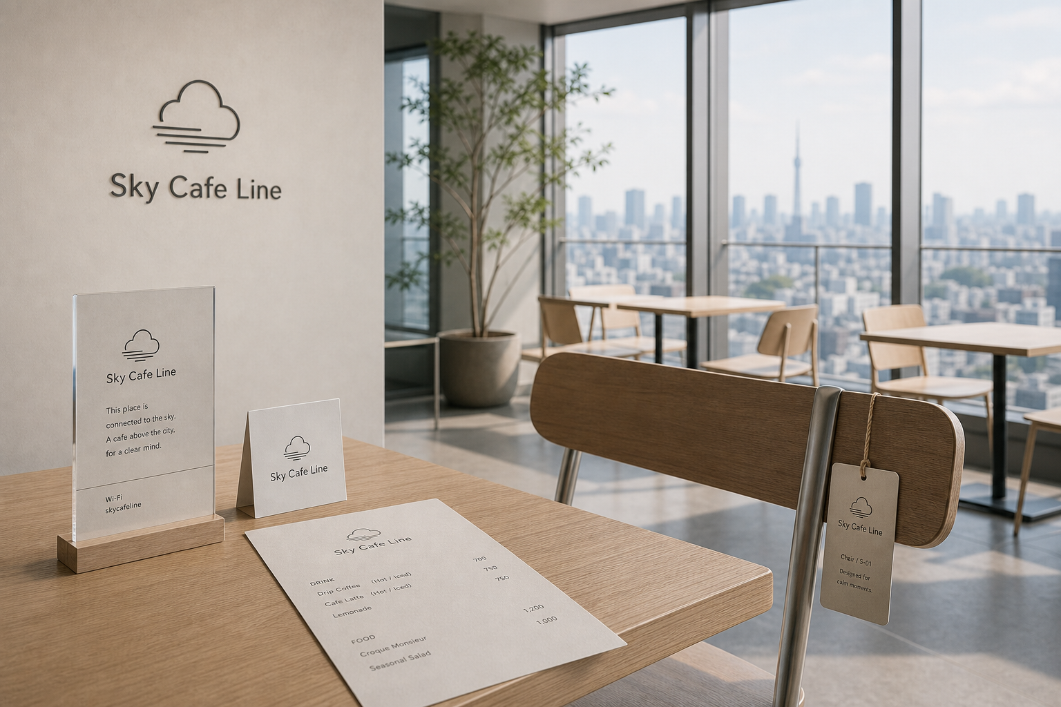
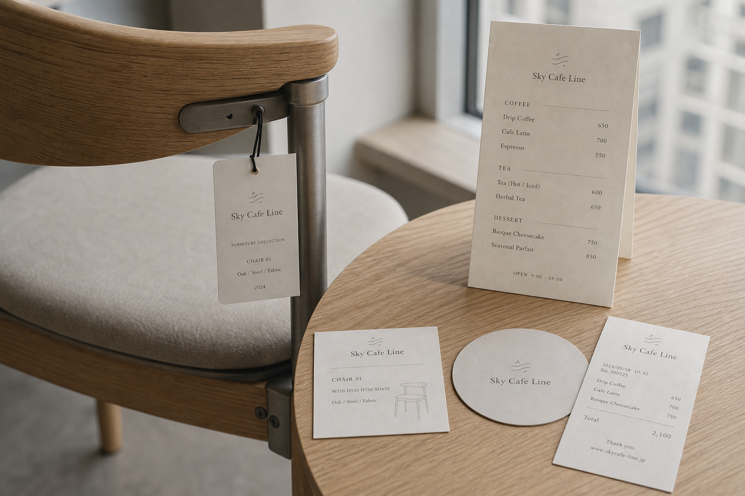
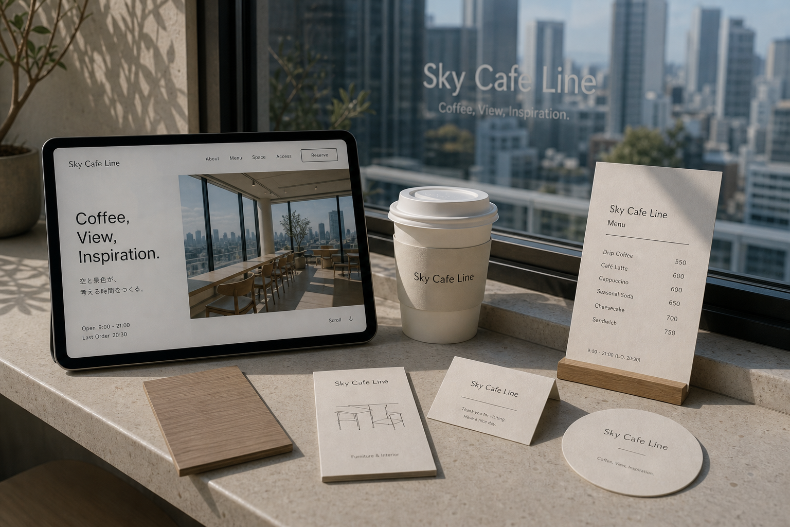
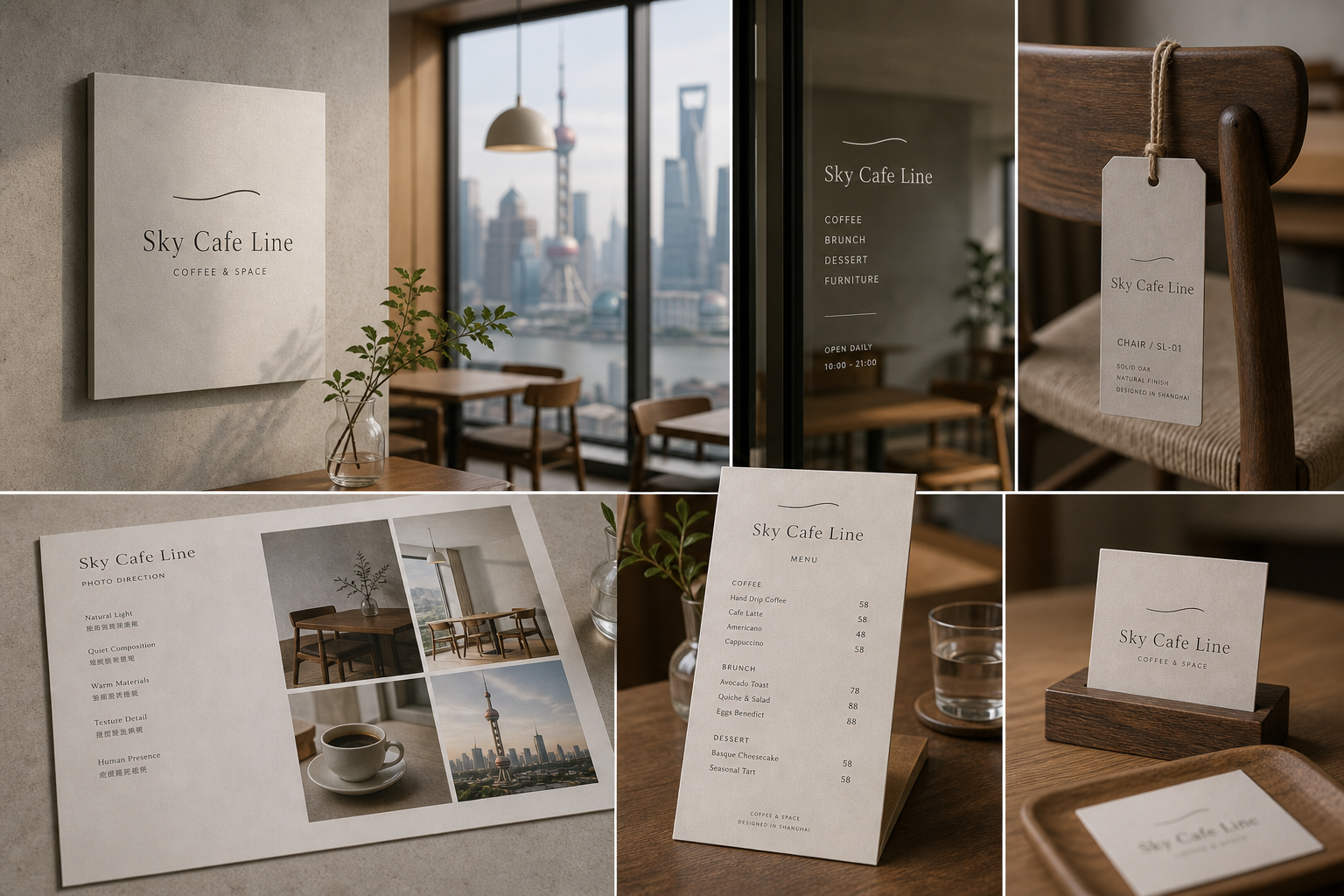
Sky Cafe Line 是為 Sky Cafe Line 建立的 branding + interior design + furniture design 專案。作品內容以 branding、visual identity、interior design 為核心,將品牌名稱、應用物件、版面規則與影像語氣整合成一套可延展的作品集案例。
攝影主題以 cafe interior、furniture detail、menu card、window view 為主。畫面應保留自然光、低飽和色彩、安靜陰影與可閱讀的材質細節,讓照片同時承擔品牌證據、包裝質感與空間情緒。
設計概念從「空間標示、導視與現場尺度」出發,使用乾淨 grotesk 字體、克制色票、細緻比例與少量資訊層級,讓品牌看起來像被整理過的文化檔案,而不是一般商業宣傳頁。
計劃上先完成品牌語氣與核心識別,再建立 Cafe logo、Interior graphics、Furniture tag 等交付物,最後以照片序列、品牌應用與網站作品頁整理成完整案例。
Cafe logo / Interior graphics / Furniture tag / Menu card / Photo direction
Editorial review
English edition
English edition
Sky Cafe Line begins with looking over the city and condenses skyline, tabletop horizon, and furniture profile into one gentle curve. It can be cloud, distant horizon, or coffee steam, giving identity, interior, and furniture the same horizontal extension and stretching city speed into a calmer rhythm.
Pale timber, matte metal, grey-beige textile, warm paper, and light stone create the materials. Wood grain, rounded chair backs, precise joints, and soft seats support long stays; menus, furniture tags, coasters, receipts, and cards blend with timber and daylight. Fibre, cool edge, and warm surface stay balanced.
Large empty fields, fine dividers, and vertical information columns create order. Menus separate Coffee, Tea, and Dessert with names left and prices right; furniture cards give name, dimensions, material, and drawing; the website sets title left and panorama right, extending the window into page space.
A fine serif and clean sans serif alternate by role. The serif's tall proportions answer the city's verticals, while sans serif supports signs, navigation, and service. The curve answers Line in both meaning and form; small capitals and fine furniture drawings give type and product one precision.
The cafe becomes a platform for looking, thinking, and resting. The window is the primary visual content, with interior colour receding so sky, light, and buildings change over time. Furniture dimensions, planting, and card height preserve the view and reveal every object as part of the design.
One line connects identity, interior scale, furniture, and distant city. Curve provides memory, timber and cloth receive the body, menu organises choice, and website builds anticipation. The result is a bright place where space and objects lower urban noise and help reorder thought.
日本語版
Sky Cafe Line は高所から都市を見る体験から、空際、卓上水平線、家具輪郭を一つの柔らかな曲線へ凝縮します。雲、地平、珈琲の湯気にも見え、識別、室内、家具に同じ水平の伸びを与え、都市の速度を緩めます。
淡木、霧面金属、灰米の布、暖白紙、明石が素材をつくります。木目、丸い椅背、精密な接合、柔らかな座面が長い滞在を支え、メニュー、家具札、コースター、レシート、卓上カードが木と日光に溶けます。
大きな空白、細い区切り、垂直情報欄が秩序をつくります。メニューは Coffee、Tea、Dessert、家具札は名称、寸法、素材、図、ウェブは左に大題、右に全景を置き、窓景と頁余白を連続させます。
細いセリフ体と簡潔なサンセリフ体を役割で切り替えます。セリフの高い比率は都市の垂直線に応え、サンセリフは標識とサービスを担います。曲線は Line の意味と形を結び、細線家具図と同じ精度を持ちます。
カフェを眺め、考え、休む都市のプラットフォームとして位置づけます。大窓を主役に、室内色は退き、空、光、遠景が時間で変わります。家具尺度と植物、卓上物の高さも視線を開きます。
一つの線が識別、室内尺度、家具、遠景を結びます。曲線が記憶、木と布が身体、メニューが選択、ウェブが期待を支えます。空間と物が都市の雑音を下げ、思考を整える明るい場所です。
繁體中文版
Sky Cafe Line 的設計從高處觀看城市的經驗出發,把窗外天際線、桌面水平線與家具輪廓凝聚成一條輕柔曲線。這條線既能成為雲層、遠方地平線或咖啡熱氣,也能作為名稱上方最安靜的視覺提示。品牌標誌、室內空間和家具設計因此共享同一種水平延伸感;訪客坐下、抬頭看景、閱讀菜單或端起咖啡時,都能感受到城市速度被重新拉成舒展節奏。
材料組合以淺色木材、霧面金屬、米灰織物、暖白紙張和淡色石面為主。桌椅保留木紋,圓角椅背與金屬接件呈現精準而柔和的結構;布面座墊增加長時間停留所需的舒適觸感。菜單、家具吊牌、杯墊、收據與桌卡使用低彩度紙面,與木桌及日光自然融合。紙張的細微纖維、金屬的冷靜邊緣和木材的溫潤表面彼此平衡,使咖啡館既輕盈,也具備可被細看和觸摸的質感。
編排以大量空白、細線分隔和垂直資訊欄建立秩序。菜單將 Coffee、Tea、Dessert 分段,品名靠左、價格靠右,讓顧客快速瀏覽;家具卡則依名稱、尺寸、材料和簡圖排列,把椅子視為空間作品而非背景物件。桌牌只保留品牌、簡短說明與網路資訊,閱讀負擔很低。網站將大標題放在左側,室內全景置於右方,窗景和頁面空白互相延伸,使數位瀏覽也保有高空視野的寬闊感。
字型在纖細襯線字與簡潔無襯線字之間靈活切換。Sky Cafe Line 使用襯線體時,字母比例修長,與城市建築的垂直線形成優雅對照;使用無襯線體時,則更適合牆面標誌、網站導覽與日常服務資訊。名稱中的 Line 在語意和造形上都由上方曲線回應,形成容易記憶的組合。小型大寫用於飲品分類與家具規格,細線圖則描繪桌椅結構,讓文字、標誌和產品設計共享一致精度。
品牌特色是把咖啡館定位為觀看、思考與休息的城市平台。大面窗景成為最重要的視覺內容,室內配色主動退後,讓天空、光線與遠方建築隨時間變化。桌椅尺度、靠背弧度、植栽位置和桌卡高度都維持開放視線,家具吊牌則讓訪客理解每件物件也是整體設計的一部分。咖啡、甜點、座位與景觀因此形成同一服務情境,呈現清楚而從容的生活方式。
Sky Cafe Line 的設計理念,是用一條線連接品牌識別、室內尺度、家具細節與城市遠景。曲線提供記憶點,木材和布料承接身體,菜單整理選擇,網站則在到訪前先建立觀看期待。訪客由入口辨認名稱,挑選座位、閱讀菜單、接觸桌椅,再把視線越過玻璃投向城市,每一步都自然延續。這個專案最終創造的不是只有漂亮景觀的咖啡館,而是一個讓空間、物件與視覺語言共同降低城市噪音、重新整理思緒的明亮所在。
- branding: hermetic design
- interior graphics: hermetic design
- photography: studio archive
- client: sky cafe line