Renga Residence
branding + visual identity
Renga Residence
2025 / Tokyo
brand design
logo + visual identity
brand guide
web design
book design
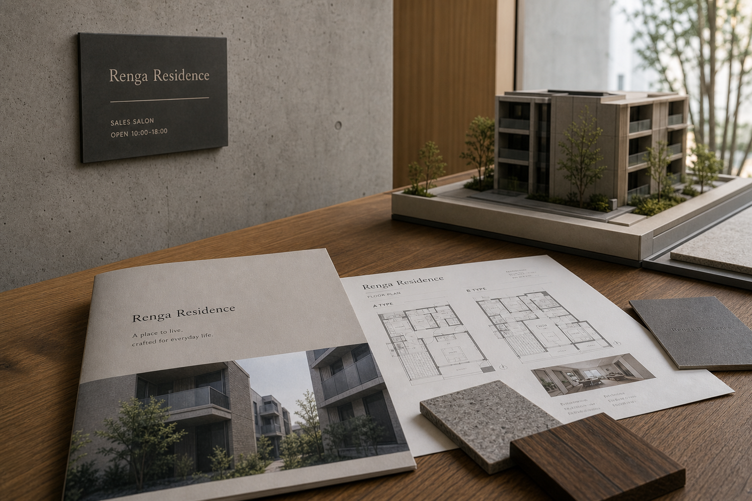
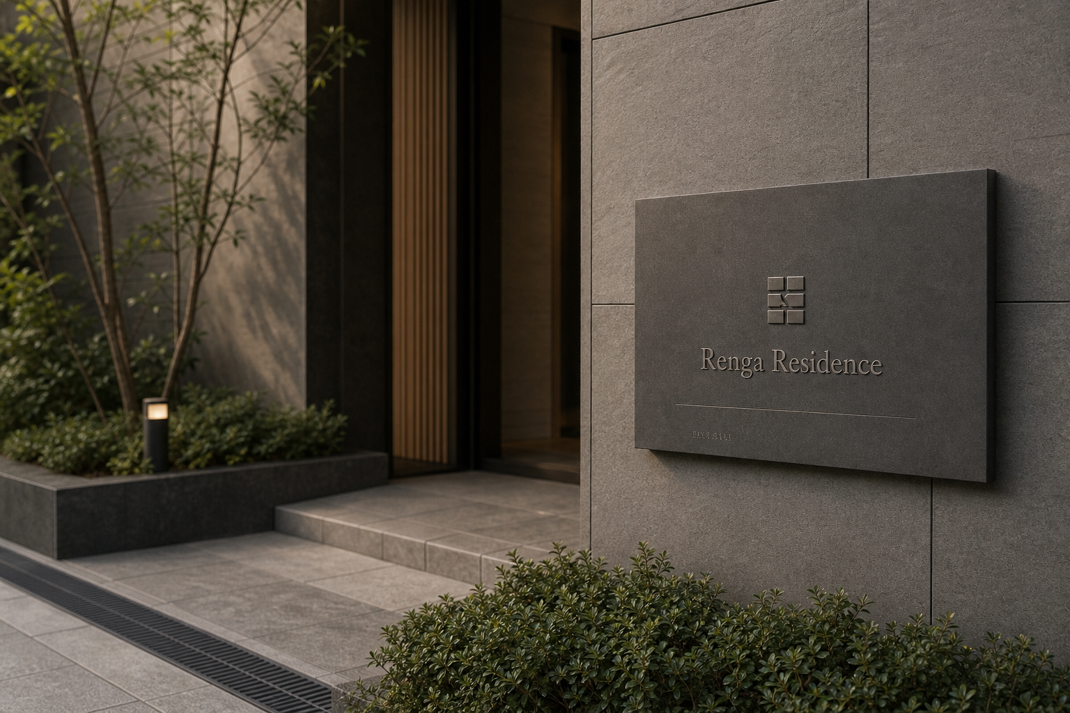
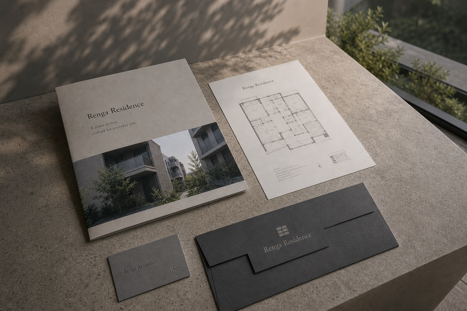
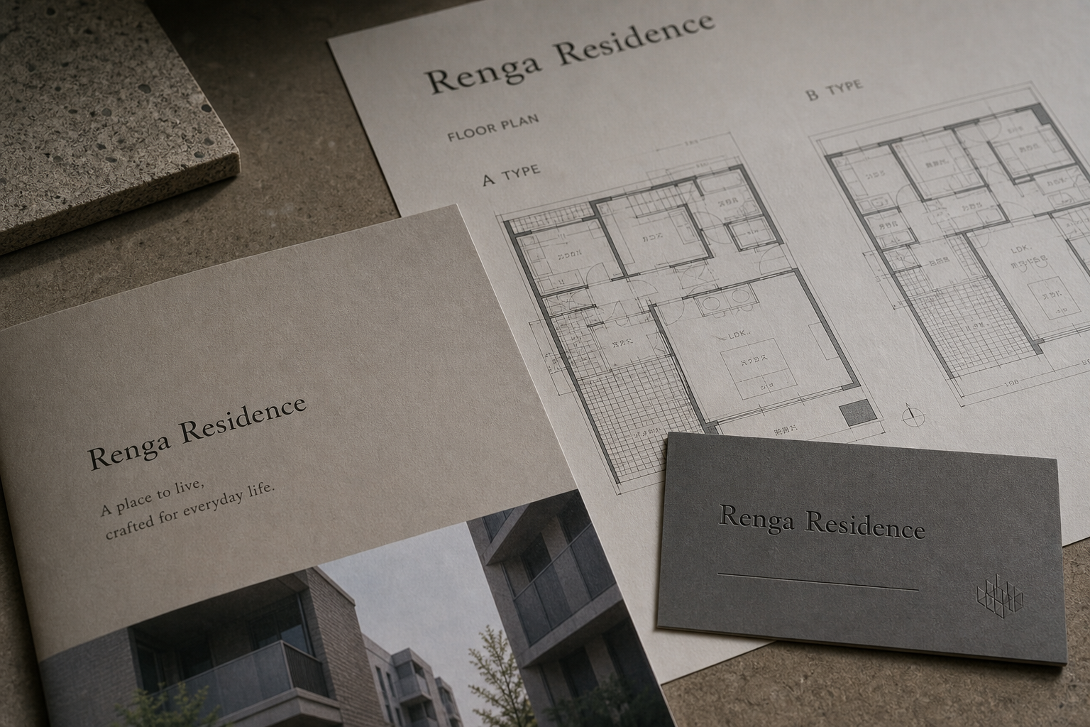
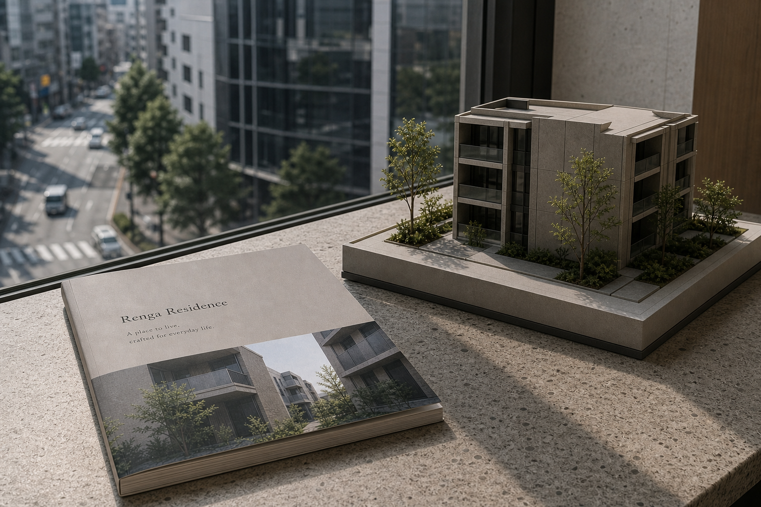
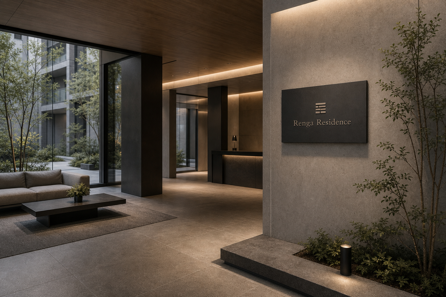
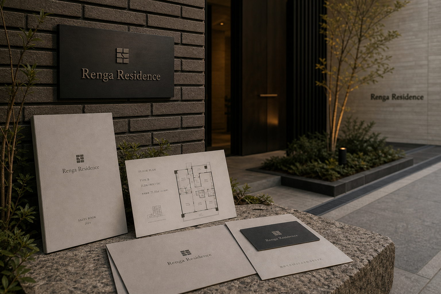
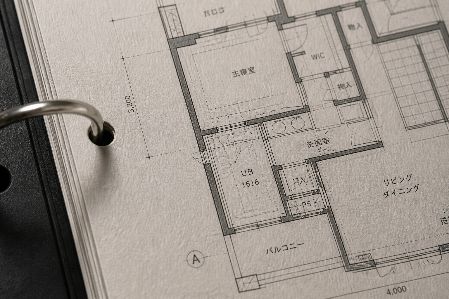
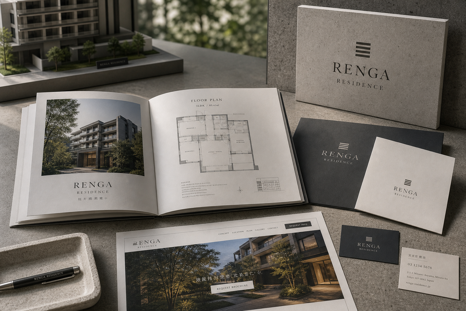
Renga Residence 是為 Renga Residence 建立的 branding + visual identity 專案。作品內容以 brand design、logo + visual identity、brand guide 為核心,將品牌名稱、應用物件、版面規則與影像語氣整合成一套可延展的作品集案例。
攝影主題以 building exterior、sales book spread、stationery、interior detail 為主。畫面應保留自然光、低飽和色彩、安靜陰影與可閱讀的材質細節,讓照片同時承擔品牌證據、包裝質感與空間情緒。
設計概念從「空間標示、導視與現場尺度」出發,使用乾淨 grotesk 字體、克制色票、細緻比例與少量資訊層級,讓品牌看起來像被整理過的文化檔案,而不是一般商業宣傳頁。
計劃上先完成品牌語氣與核心識別,再建立 Sales book、Web design、Stationery 等交付物,最後以照片序列、品牌應用與網站作品頁整理成完整案例。
Sales book / Web design / Stationery / Floor-plan system / Sign plaque
Editorial review
English edition
English edition
Renga Residence builds a stable and credible voice from architecture, plan, and everyday living. Brick, stone, dark metal, timber, and garden green form the visual base; brochures, floor plans, website, cards, and site signs organise those materials into one readable residential identity.
Warm grey fibrous papers echo the brick façade and interior wood. Charcoal cards and folders add depth, with shallow lettering appearing in angled light; site signs translate the palette into dark metal and stone. Readers encounter the building's material character before visiting it.
An architectural grid organises exterior photography, plans, area, unit type, and material information. Large images create spatial imagination while fine drawings support comparison. Covers and the website establish a measured path from name to building, retaining generous margins even around dense data.
A clear serif gives the residence formal permanence, especially in capitals on signage. Smaller sans-serif type supports plans, dimensions, and service information. A rectangular mark recalls brick modules, openings, and floor-plan units, remaining structurally clear across cards, covers, walls, and stone plaques.
Property communication becomes editorial design rather than vague aspiration. Models, samples, plans, and photography are given equal evidence value; dusk light, garden shadow, and entrance scale help viewers imagine the path home. Precision and warmth support long-term trust.
The identity organises a complex housing choice from understanding to confidence. Website, brochure, plan, material, and site each provide the next needed piece while sharing one order. Once the name enters walls and address documents, it becomes part of residence rather than only a sales device.
日本語版
Renga Residence は、建築素材、平面、日常の住み心地から安定した信頼感を築きます。煉瓦、石、濃色金属、木、庭の緑を基礎に、販売冊子、間取り、ウェブ、名刺、現地サインを一つの読解システムへまとめています。
繊維のある暖灰の紙は煉瓦外壁と室内木部へ響きます。炭色の名刺と資料入れが深さを加え、斜光で浅い文字が現れます。現地では濃色金属と石へ変換され、訪問前から建築の素材性に触れられます。
建築グリッドが外観写真、間取り、面積、住戸、素材情報を整理します。大きな写真は空間を想像させ、細線図は比較を助けます。情報が多くても余白を保ち、名称から実景へ計画された建築のように進みます。
明快なセリフ体は住宅名に恒久性を与え、サインの大文字でさらに強まります。小さなサンセリフ体は寸法と機能を担います。矩形の印は煉瓦、開口、平面モジュールを想起させ、紙から壁まで構造を保ちます。
不動産の伝達を編集デザインへ変えている点が特徴です。模型、素材見本、図面、写真を同じ証拠として扱い、夕暮れ、庭の影、入口の尺度が帰宅の経路を想像させます。精度と温度が長期的な信頼をつくります。
ウェブで知り、冊子で比較し、素材に触れ、現地で同じサインを見る流れが、理解から信頼へ続きます。名称が壁、書冊、住所文書へ入るとき、識別は販売道具を越え、住まいの一部になります。
繁體中文版
Renga Residence 從建築材料、平面尺度與日常居住感出發,建立安定而可信的品牌語氣。磚牆、石材、深色金屬、木質與庭園綠意成為視覺基礎,銷售書、戶型圖、網站、名片和現場標牌則把這些元素整理成一致的閱讀系統。設計讓建築本身成為主角,同時為購屋者提供清楚資訊與想像空間,呈現成熟、理性且具有生活溫度的住宅形象。
紙材延續建築外觀的灰褐色階。銷售書與信封採用暖灰、帶有細微纖維感的紙面,觸感沉著,與立面磚材及室內木紋形成呼應;炭灰名片和資料夾增加深度,壓印文字在斜光下浮現低調層次。現場標牌則轉換為深色金屬與石質基座,讓紙本上的色彩真正進入空間。紙張、金屬、石材和木樣被同時呈現,品牌因此不只描述建築質感,而是讓使用者在翻閱資料時提前接觸住宅的材料性格。
編排以建築網格為核心。銷售書將外觀攝影、戶型圖、面積、房型與材料資訊分配在清楚欄位中,大幅照片負責建立空間感,細線平面圖則提供理性比較。封面以名稱、短句和建築影像形成上下分區,視線從品牌進入實景;網站沿用相同比例,把導覽、主視覺和索取資料入口安排得簡潔明確。不同頁面雖承載攝影、圖面與大量數據,仍維持充足邊界,使閱讀像參觀一棟規劃周密的建築般有序。
字型設計以清晰襯線體建立住宅名稱的正式感。Renga Residence 的字母筆畫端正,字距舒展,在暖灰封面上顯得安靜,在深色招牌上則具有穩定辨識;全大寫版本進一步強化建築銘牌般的永久性。房型、面積和營業資訊使用尺度較小的無襯線字,與平面圖的技術線條相互配合。由數個矩形構成的標誌讓人聯想到磚塊、立面開口與平面模組,能在名片、封面、牆牌和石材銘牌上保持清楚結構。
品牌特色在於把房地產溝通轉化為一套編輯設計。模型、材質樣本、戶型圖與建築攝影被放在同一視覺層級中,讓空間價值來自可閱讀的證據,而非空泛形容。影像選擇黃昏燈光、庭園樹影和入口尺度,既呈現建築外觀,也讓人感受到回家時的路徑。深灰與暖白的對照、精準圖面和克制標誌,共同塑造重視細節、品質與長期居住的品牌個性。
Renga Residence 的設計理念,是把選擇住宅的複雜過程整理成從理解到信任的體驗。人們先由網站與外觀影像認識建築,再從銷售書比較房型、閱讀平面配置、接觸材料,最後在現場看見同一套標誌與導視。每個媒介都提供下一步所需資訊,也維持相同視覺秩序。當品牌名稱被刻入牆面、印在書冊並出現在住址文件上,識別便從銷售工具轉化為住居的一部分,為建築建立耐久而有分量的身分。
- brand design: hermetic design
- book design: hermetic design
- photography: studio archive
- client: renga residence