Koe Hotel Shibuya
brand design
Koe Hotel Shibuya
2015 / Tokyo
brand design
logo + visual identity
sign design
hotel item design
graphic design
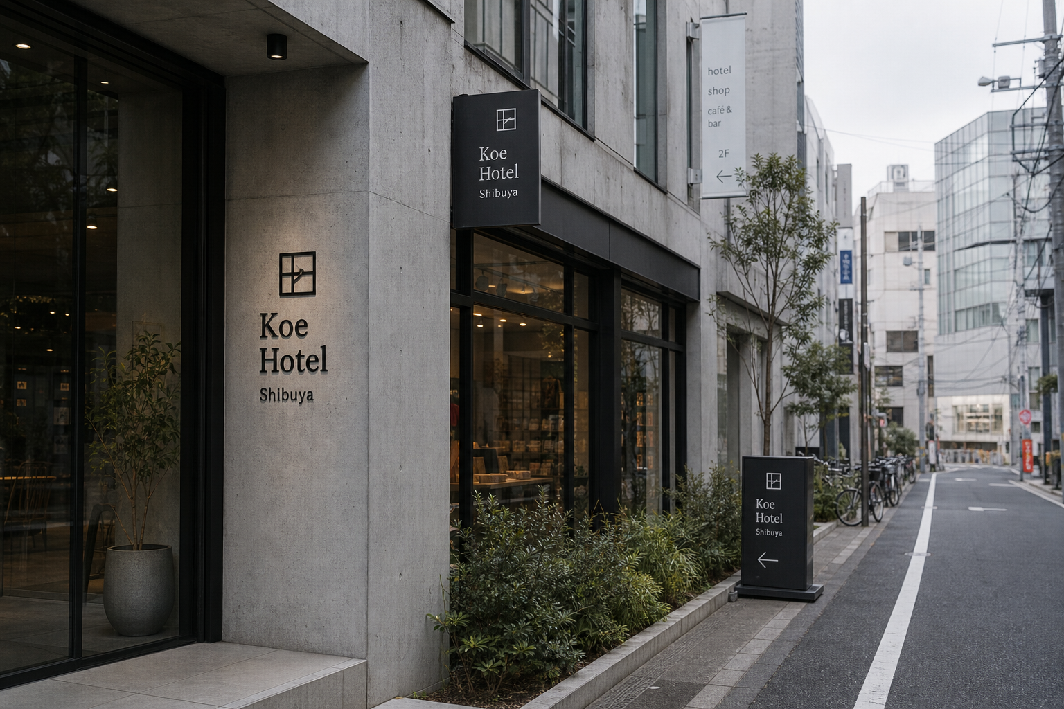
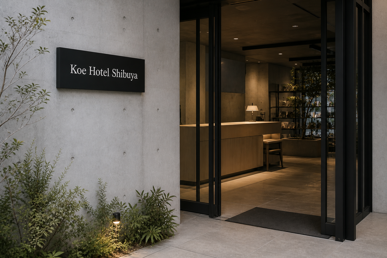
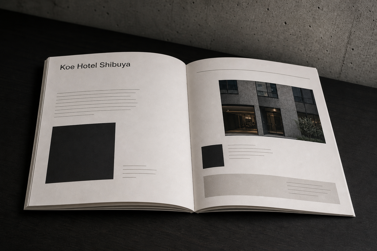
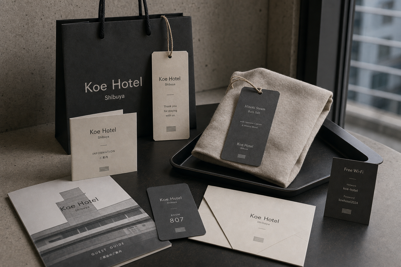
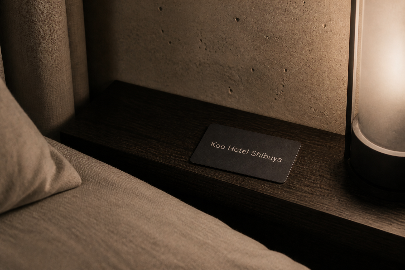
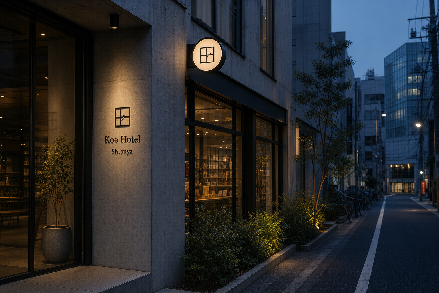
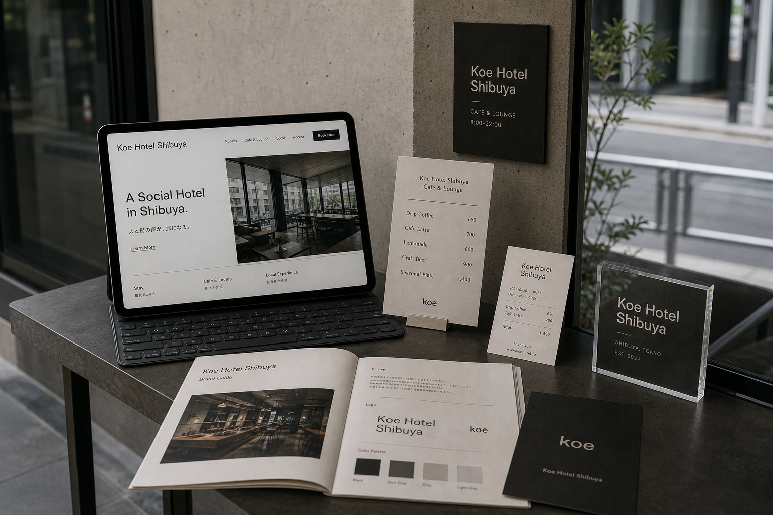
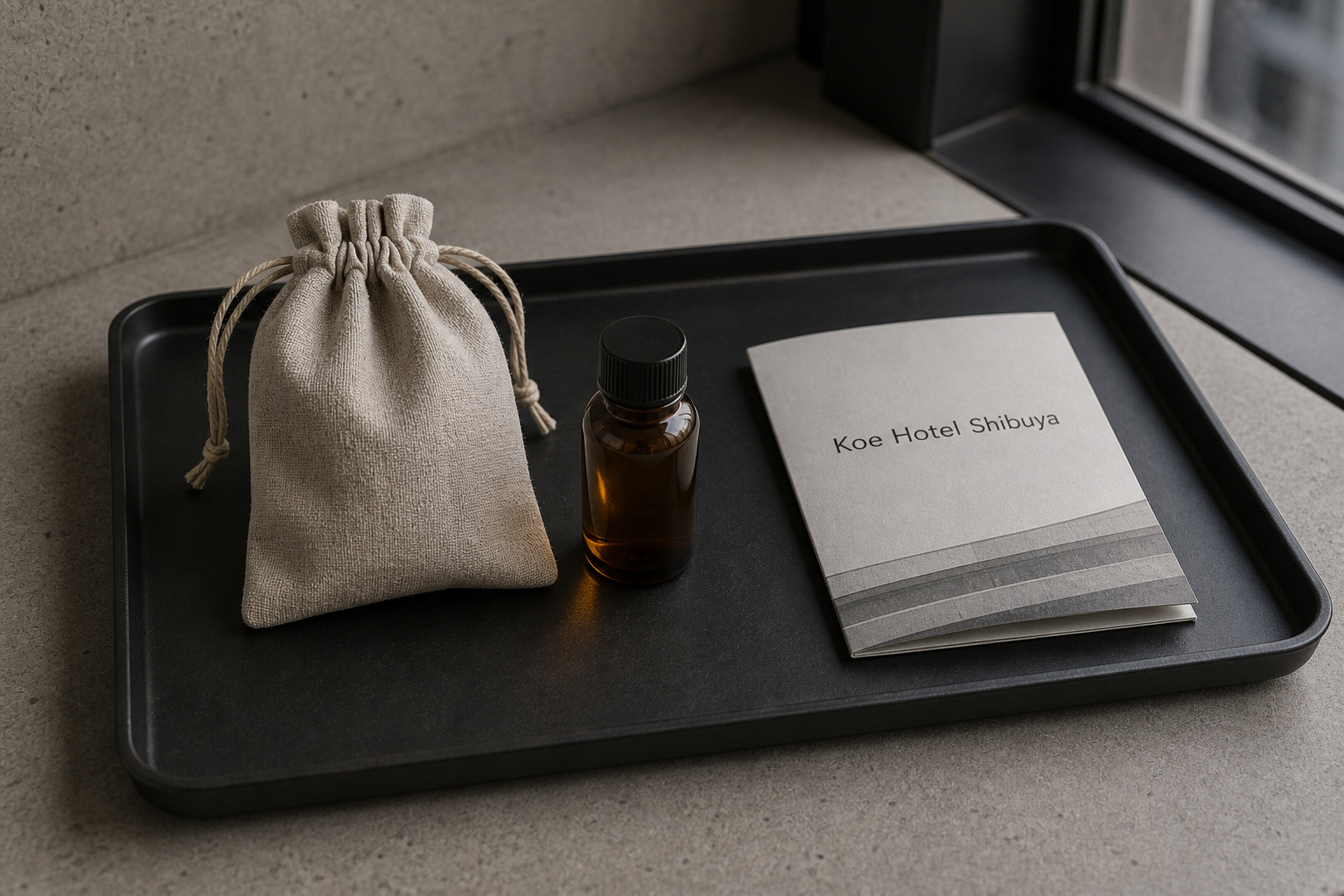
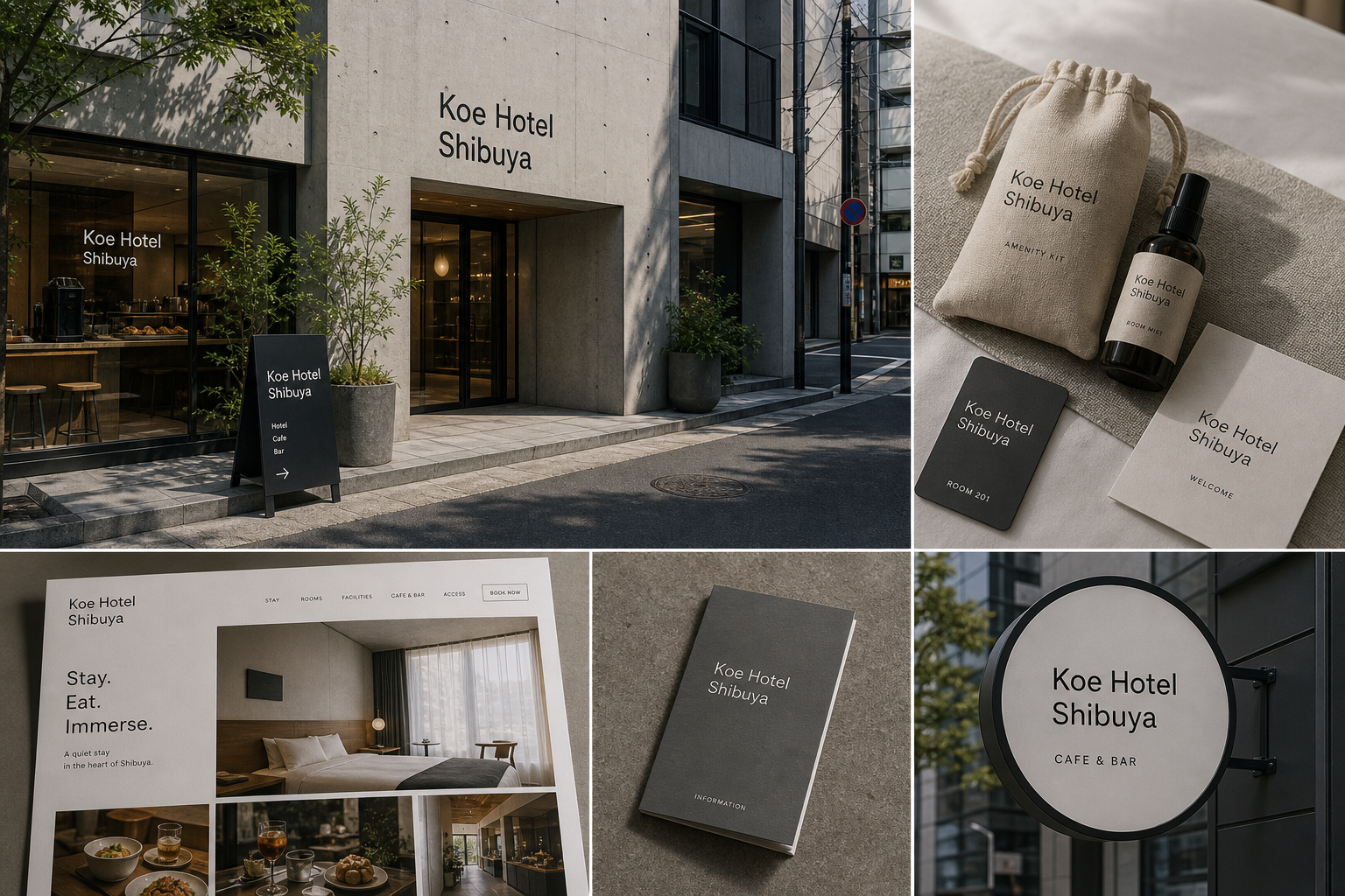
Koe Hotel Shibuya 是為 Koe Hotel Shibuya 建立的 brand design 專案。作品內容以 brand design、logo + visual identity、sign design 為核心,將品牌名稱、應用物件、版面規則與影像語氣整合成一套可延展的作品集案例。
攝影主題以 hotel facade、key card、room item、street sign 為主。畫面應保留自然光、低飽和色彩、安靜陰影與可閱讀的材質細節,讓照片同時承擔品牌證據、包裝質感與空間情緒。
設計概念從「空間標示、導視與現場尺度」出發,使用乾淨 grotesk 字體、克制色票、細緻比例與少量資訊層級,讓品牌看起來像被整理過的文化檔案,而不是一般商業宣傳頁。
計劃上先完成品牌語氣與核心識別,再建立 Hotel logo、Key card、Room item 等交付物,最後以照片序列、品牌應用與網站作品頁整理成完整案例。
Hotel logo / Key card / Room item / Store sign / Web design
Editorial review
English edition
English edition
Koe Hotel Shibuya uses a clear, open identity to answer the multiple roles of lodging, cafe and bar, shop, and urban exchange. The name itself becomes the street message, holding a strong coordinate among concrete, glass, and Tokyo streets from entrance through room and service.
Exposed concrete, black metal, dark grey card, warm white paper, linen bags, and soft textile define the material language. Matte street signs remain clear between daylight and warm interiors; guides, envelopes, cards, and Wi-Fi pieces alternate grey and off-white; amenity tags and labels bring graphic order into the hand.
Large empty areas, short rules, and stable left alignment organise information. The exterior name stacks for narrow street proportions; cafe menus divide items and prices; receipt, room, and network each own a field. The website's A Social Hotel in Shibuya. connects rooms, cafe, local experience, and booking.
An open, even sans serif adapts from architecture to key card and screen. Koe Hotel and Shibuya separate through line break, scale, and spacing, while occasional humanist text softens menus and room pieces. Short horizontal rules and fine stripes create pauses and family recognition.
Hospitality is placed back into a real neighbourhood. Hotel, shop, and cafe & bar are stated together; signs and arrows explain the building; cafe and website support everyday visits; cards, welcome book, and amenities support the guest. Concrete, planting, roads, food, and rooms remain in one city context.
A low-key reliable language connects many urban activities. Black and grey give direction, warm white and textile offer comfort, text organises service, and photography preserves the street. The hotel becomes a public node for staying, meeting, eating, and exploring rather than a world isolated from the city.
日本語版
Koe Hotel Shibuya は宿泊、カフェバー、ショップ、都市交流という複数の役割へ、明快で開かれた識別で応えます。名称そのものが街路の主要情報となり、コンクリート、ガラス、東京の街の中で入口から客室まで座標を保ちます。
打放しコンクリート、黒金属、濃灰カード、暖白紙、麻袋、柔布が素材をつくります。霧黒サインは昼光と室内暖光の間で明確で、案内、封筒、房卡、Wi-Fi 札は灰と生成りを交互に使い、用品札と瓶標が秩序を手元へ運びます。
大きな空白、短線、安定した左揃えが情報を整理します。外壁名称は狭い街面に合う三行、メニューは品名と価格、レシート、房号、ネット情報は独立した領域を持ちます。ウェブの A Social Hotel in Shibuya. が各サービスを結びます。
開かれた均一なサンセリフ体は建築からカードと画面まで対応します。Koe Hotel と Shibuya は改行、尺度、間隔で分かれ、少量の人間的な文字がメニューと客室物に生活感を加えます。短横線と細縞が停止記号になります。
hotel、shop、café & bar を入口で同時に示し、サインと矢印が建物を説明します。カフェとウェブは日常の滞在を、房卡、迎賓冊、備品は宿泊を支えます。水泥、植栽、道路、食、客室が同じ街区に残ります。
黒灰が方向、暖白と布が快適さ、文字がサービス、写真が街路文脈を担います。Koe Hotel Shibuya は都市から隔離された宿ではなく、泊まり、会い、食べ、探索する公共節点になります。
繁體中文版
Koe Hotel Shibuya 以清楚而開放的識別,回應旅館同時容納住宿、咖啡吧、商店與城市交流的多重角色。Koe Hotel Shibuya 這組名稱直接成為街道上的主要訊息,不靠繁複裝飾,也能在混凝土立面、玻璃窗與東京街景之間建立鮮明座標。標誌、招牌、房卡、客房用品和網站都延續相同語氣,讓旅客從遠處辨認入口,到進入房間與使用服務,始終感受到一致而親近的城市節奏。
材料語言由裸露混凝土、黑色金屬、深灰卡面、暖白紙張、亞麻布袋與柔軟織物共同構成。街面招牌以霧黑表面對照灰色牆體,文字在日光與室內暖光之間保持清楚;客房中的資訊冊、信封、門卡和 Wi-Fi 桌牌則使用灰黑與米白交替,形成容易分類的層次。浴鹽吊牌、備品袋與瓶身標籤把紙面語言帶到觸覺用品上,使旅館的視覺秩序能被拿取、閱讀與使用。
編排採用大面空白、短線分隔與穩定的左對齊。外牆名稱分成三行,適合狹長街面與直立招牌;咖啡吧菜單把品名與價格分置兩側,收據、房號和網路資訊各自保留明確區域。網站首頁以「A Social Hotel in Shibuya.」建立定位,房間、咖啡吧、在地體驗與訂房入口沿同一水平動線排列。紙本、空間與數位介面雖然尺寸不同,資訊順序都先說明所在場景,再引導下一個行動。
字型系統以簡潔無襯線體為主,字面開放、筆畫均勻,能適應建築招牌、房卡小字與螢幕導覽等多種觀看距離。Koe Hotel 與 Shibuya 的層級透過換行、字級和間距區分,既保留名稱完整性,也讓地點迅速被讀到。少量較具人文氣息的文字用於菜單與客房用品,替俐落骨架加入生活感。重複出現的短水平線和細條紋符號像停頓記號,協助切分資訊,也讓各項物件形成安定的家族辨識。
品牌特色在於把飯店服務放回真實街區,而不是建立與城市隔離的封閉世界。入口同時標示 hotel、shop、café & bar,落地牌和箭頭讓行人理解空間內容;咖啡吧的菜單、桌牌與網站畫面延伸到日常停留,客房端則以房卡、迎賓冊、備品和資訊指南照顧住宿細節。攝影讓水泥、植栽、道路、餐飲和房內物件一同出現,使品牌既有設計秩序,也保留澀谷生活持續流動的背景。
Koe Hotel Shibuya 的設計理念,是以一套低調而可靠的視覺語言串連城市中的多種活動。黑灰色建立方向,暖白與織物帶來舒適感,文字整理服務,攝影則把空間放進街道脈絡。旅客從招牌辨認入口,進入咖啡吧或商店,再取得房卡、閱讀客房資訊並於網站安排停留,每個接觸點都清楚延續。這套識別最終塑造的是一個可住宿、相遇、飲食與探索城市的公共節點,讓品牌成為生活自然展開的框架。
- brand design: hermetic design
- art direction: hermetic design
- photography: studio archive
- client: koe hotel shibuya