Koe Donuts Nova
branding + visual identity
Koe Donuts Nova
2018 / Kyoto
branding
logo & visual identity
brand guideline
art direction
graphic design
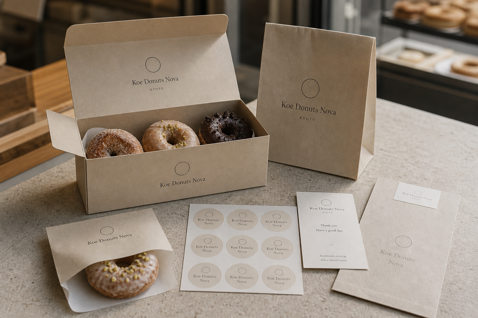
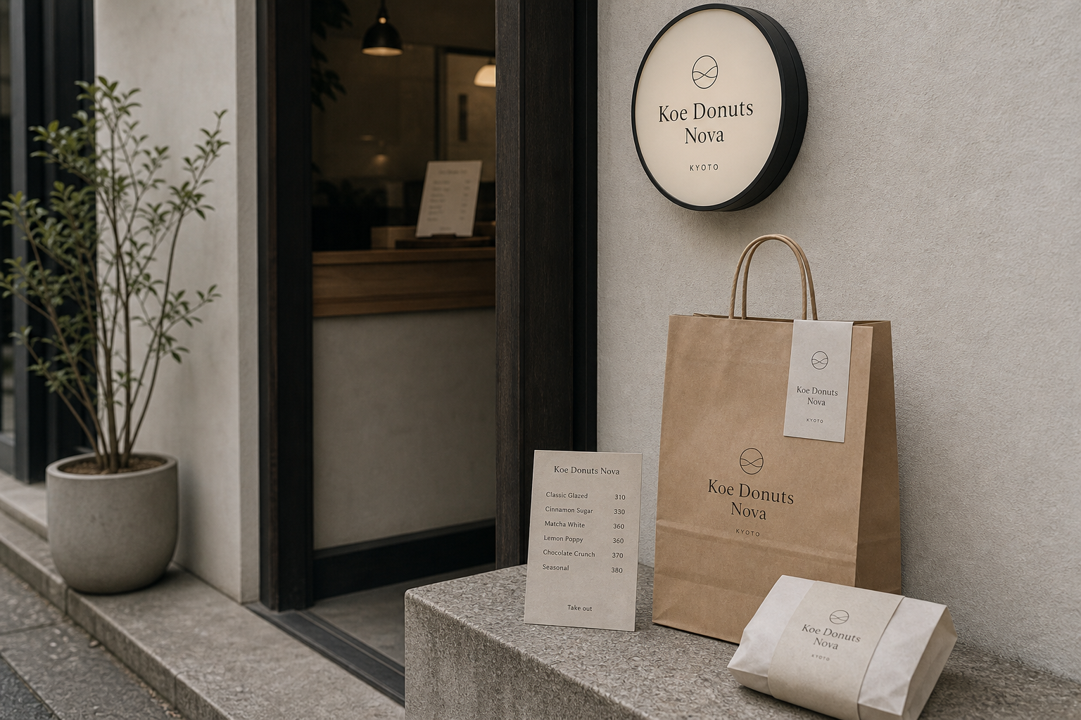
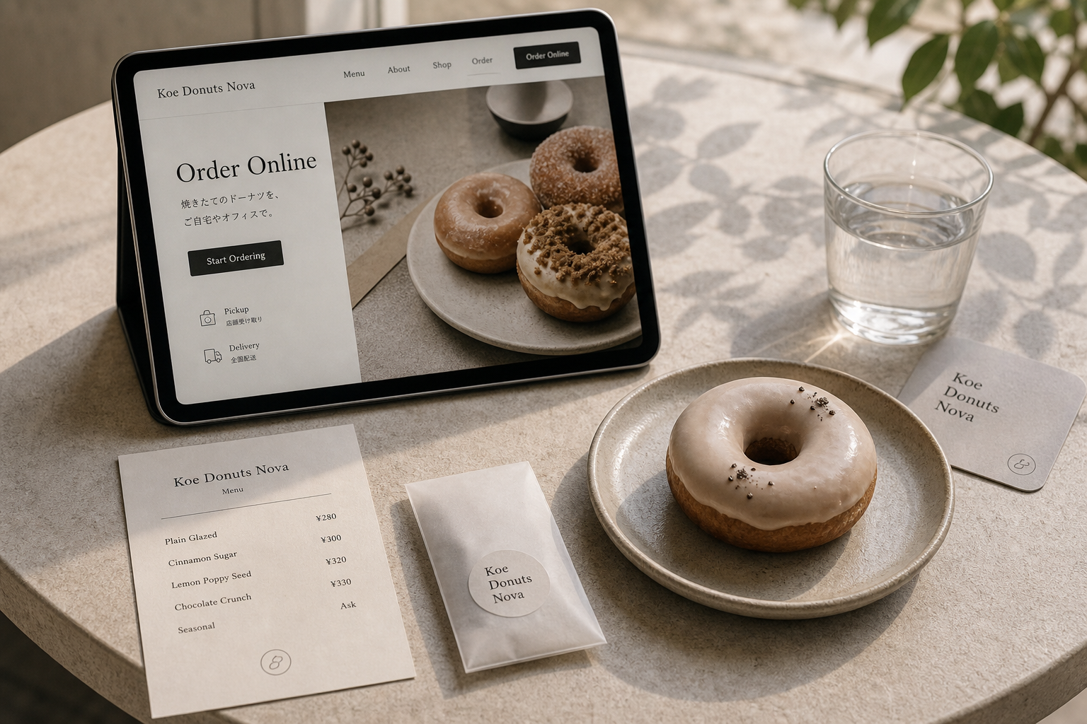
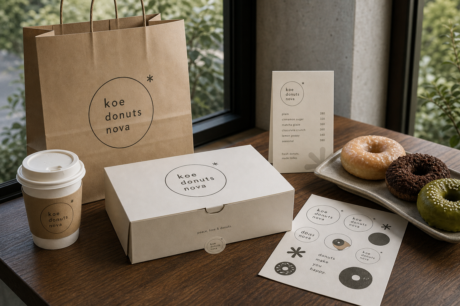
Koe Donuts Nova 是為 Koe Donuts Nova 建立的 branding + visual identity 專案。作品內容以 branding、logo & visual identity、brand guideline 為核心,將品牌名稱、應用物件、版面規則與影像語氣整合成一套可延展的作品集案例。
攝影主題以 donut box、paper bag、store sign、food still life 為主。畫面應保留自然光、低飽和色彩、安靜陰影與可閱讀的材質細節,讓照片同時承擔品牌證據、包裝質感與空間情緒。
設計概念從「空間標示、導視與現場尺度」出發,使用乾淨 grotesk 字體、克制色票、細緻比例與少量資訊層級,讓品牌看起來像被整理過的文化檔案,而不是一般商業宣傳頁。
計劃上先完成品牌語氣與核心識別,再建立 Shop logo、Donut box、Paper bag 等交付物,最後以照片序列、品牌應用與網站作品頁整理成完整案例。
Shop logo / Donut box / Paper bag / Store sign / Web ordering page
Editorial review
English edition
English edition
Koe Donuts Nova begins with the doughnut's direct circle and develops a simple, friendly, extensible food identity. Fine rings appear alone or contain name, flavour, and small drawings, moving from round storefront sign to box, bag, sleeve, sticker, menu, and online order.
Warm white board, kraft bags, and translucent pouches recall flour, bread, and baked colour. Clean box interiors let glaze, chocolate, and nuts lead; fibrous bags, cord handles, white bands, seals, and cards add layers through folding, wrapping, opening, and sharing rather than luxurious surface.
Central compositions grow from the circle. Boxes and bags leave the ring in broad space; single wraps hold the product so package and doughnut answer each other. Menus align item and price, while the website separates ordering text, product image, pickup, and delivery for efficient use.
An elegant serif balances rounded lower-case lettering. The serif version brings Kyoto-shop refinement, while words placed inside a ring feel more playful. Spaced KYOTO, fine stars, circles, and doughnut drawings make a light family that scales from sticker set to cup sleeve.
Neutral packaging lets the food supply colour: pale glaze, matcha green, dark chocolate, and nut texture. Soft daylight makes surfaces and crumb feel real, and clear menu, storefront, and digital information make selection easy for one breakfast or a shared box.
One circle becomes the grammar of purchase. It refers to product, enclosing, sharing, and cycle; box holds variety, seal completes opening, bag carries it away, and interface extends choice beyond the shop. Seeing, selecting, opening, and tasting become one gentle memory.
日本語版
Koe Donuts Nova はドーナツの円から、簡潔で親しみやすく拡張可能な食品ブランドをつくります。細い輪は単独でも、名称、味、小図形を包んでも使え、店の円形看板から箱、袋、帯、シール、メニュー、注文画面へ伸びます。
暖白紙板、クラフト袋、半透明袋は小麦粉、パン、焼色に近い色です。箱の内外を清潔に保ち、糖衣、チョコ、ナッツを主役にします。繊維、紐、帯、封貼、カードが折る、包む、開ける、分ける触感をつくります。
円を中心に構図を変えます。箱と袋は広い余白に輪を置き、単品包装は弧で商品を固定して円同士を応答させます。メニューは品名と価格、ウェブは説明、写真、受取、配送を明確に分けます。
優雅なセリフ体と丸い小文字が均衡します。セリフ版は京都の店らしい繊細さを、輪内の小文字は日常の活発さを示します。字間のある KYOTO、細い星と円、小さなドーナツ画が軽い家族をつくります。
中性色包装により、糖衣、抹茶、チョコ、ナッツが色になります。柔らかな日光が釉面と生地を実在的に見せ、店頭、メニュー、オンラインの明確な情報が一人分から共有箱まで選びやすくします。
一つの円が購入体験の文法になります。商品形、包むこと、共有、循環を示し、箱、封貼、袋、画面が見る、選ぶ、開ける、味わうことを同じ柔らかな記憶へ結びます。
繁體中文版
Koe Donuts Nova 從甜甜圈最直接的圓形出發,建立一套簡單、親切又具延展性的食品品牌。細線圓環有時單獨出現,有時包住名稱、口味或小型圖案,像產品本身一樣容易理解,也保留重新組合的空間。它從店面圓形招牌延伸至紙盒、提袋、杯套、貼紙、菜單和線上訂購頁,讓顧客從街上辨認店鋪、挑選口味到把甜點帶回家,都能感受到一致的輕盈節奏。
包裝材料以暖白紙板、牛皮色紙袋和半透明小袋為主,色澤接近麵粉、麵包與烘焙後的自然顏色。盒身保留細緻紙面,開蓋時內外都維持乾淨印象,使糖霜、巧克力與堅果等不同表面成為視覺焦點。紙袋的纖維感和繩把帶出日常手作氣息,白色束帶、圓形封貼與小卡則增加包裝層次。這些物件不靠華麗表面建立價值,而以摺疊、包裹、開啟與分享的觸感傳達新鮮親近。
版面圍繞圓形建立中央構圖,再依媒介調整資訊密度。紙盒和提袋把圓環置於大面積空白中,品牌名稱獲得明確焦點;單顆包裝以弧形紙套包住產品,既固定甜甜圈,也讓圓與圓產生呼應。菜單採品名與價格左右排列,閱讀快速,底部小圖形收束頁面。網站則把訂購說明放在左側,產品照片置於右側,取貨與配送圖示清楚分開,使品牌的安靜氣質不影響操作效率。
字型系統在優雅襯線字與圓潤小寫字之間取得平衡。Koe Donuts Nova 以襯線體呈現時,帶有京都店鋪所需的細緻感;改用分行小寫時,字母被收進圓環,顯得更活潑而貼近日常。KYOTO 採疏朗字距置於名稱下方,補充地點與節奏。極細圓線、星形符號和甜甜圈小圖案都保持手繪般的輕巧比例,能排列成貼紙組,也能縮小到杯套與名片,為極簡系統增加表情。
品牌特色在於讓食物與設計互相成就。包裝大多採中性色,因此原味糖霜、抹茶綠、巧克力深棕和堅果顆粒自然成為色彩來源;攝影以柔和日光照亮釉面、麵包孔隙和陶盤,使產品看來真實可口。店外招牌、櫃檯菜單和線上頁面都維持清楚品項與價格資訊,顧客能輕鬆做出選擇。視覺語氣既適合單人早餐,也適合整盒分享,呈現溫暖而不造作的甜點文化。
整套設計把「一個圓」發展成購買體驗的共同語法。圓環指向產品形狀,也象徵包覆、分享與循環;紙盒容納多種口味,封貼完成開合,提袋帶走商品,數位介面則把選購延伸到店外。每個接觸點都保留相似比例和足夠呼吸空間,讓品牌在不同尺寸中仍然容易辨認。Koe Donuts Nova 因而不只是替甜甜圈加上一枚標誌,而是讓看見、選擇、打開與品嚐都成為同一段柔和而愉快的品牌記憶。
- branding: hermetic design
- package design: hermetic design
- photography: studio archive
- client: koe donuts nova