J18 Urban Center
visual identity + signage design
J18 Urban Center
2016 / Zhengzhou
visual identity
art direction
graphic design
sign design
signage design
J18 Urban Center 是為 J18 Urban Center 建立的 visual identity + signage design 專案。作品內容以 visual identity、art direction、graphic design 為核心,將品牌名稱、應用物件、版面規則與影像語氣整合成一套可延展的作品集案例。
攝影主題以 sales center interior、wall graphic、direction sign、map system 為主。畫面應保留自然光、低飽和色彩、安靜陰影與可閱讀的材質細節,讓照片同時承擔品牌證據、包裝質感與空間情緒。
設計概念從「空間標示、導視與現場尺度」出發,使用乾淨 grotesk 字體、克制色票、細緻比例與少量資訊層級,讓品牌看起來像被整理過的文化檔案,而不是一般商業宣傳頁。
計劃上先完成品牌語氣與核心識別,再建立 Sales center logo、Wall graphic、Signage system 等交付物,最後以照片序列、品牌應用與網站作品頁整理成完整案例。
Sales center logo / Wall graphic / Signage system / Map graphic / Visitor route
Editorial review
English edition
English edition
J18 Urban Center demonstrates the essential communication skill of a large mixed-use development: turning a vast urban proposition into a path visitors can understand step by step. J18 feels like project code and coordinate, while Urban Center adds public scale; diagrams, grids, floors, and visit order create credibility.
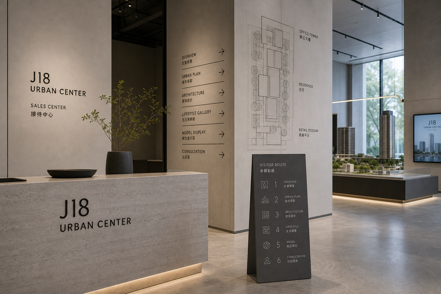
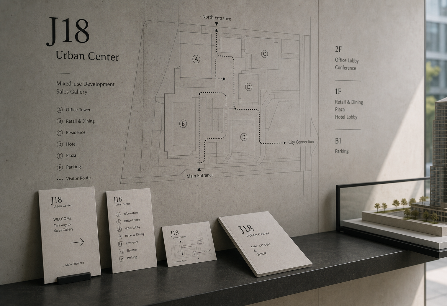
Pale concrete, beige stone, charcoal signs, clear display covers, and warm grey paper continue the sales centre's architecture. Wall diagrams surface like building layers, weighted black floor signs steady open space, and pale handbooks and route cards offer a portable, close-reading contrast.
The sequence begins with understanding the whole, then visiting in order. Overview, Urban Plan, Architecture, Lifestyle Gallery, Model Display, and Consultation show the full route; steps one to six make it memorable. Master plans use building letters, dashed paths, entrances, and a separate floor column.
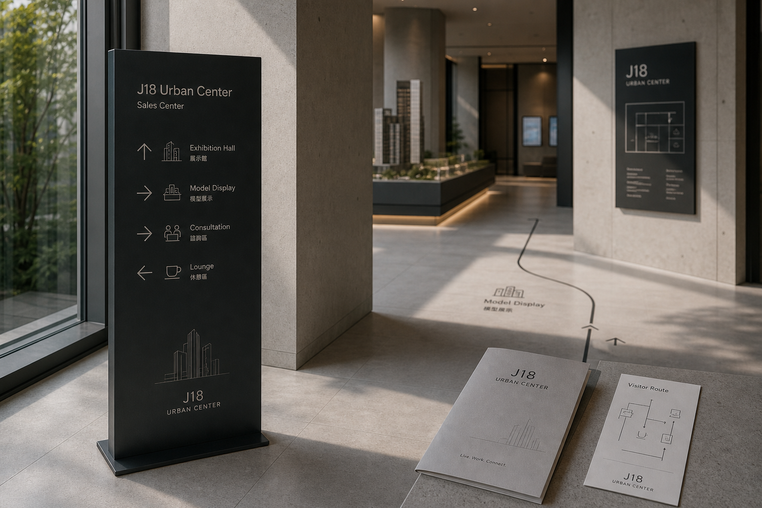
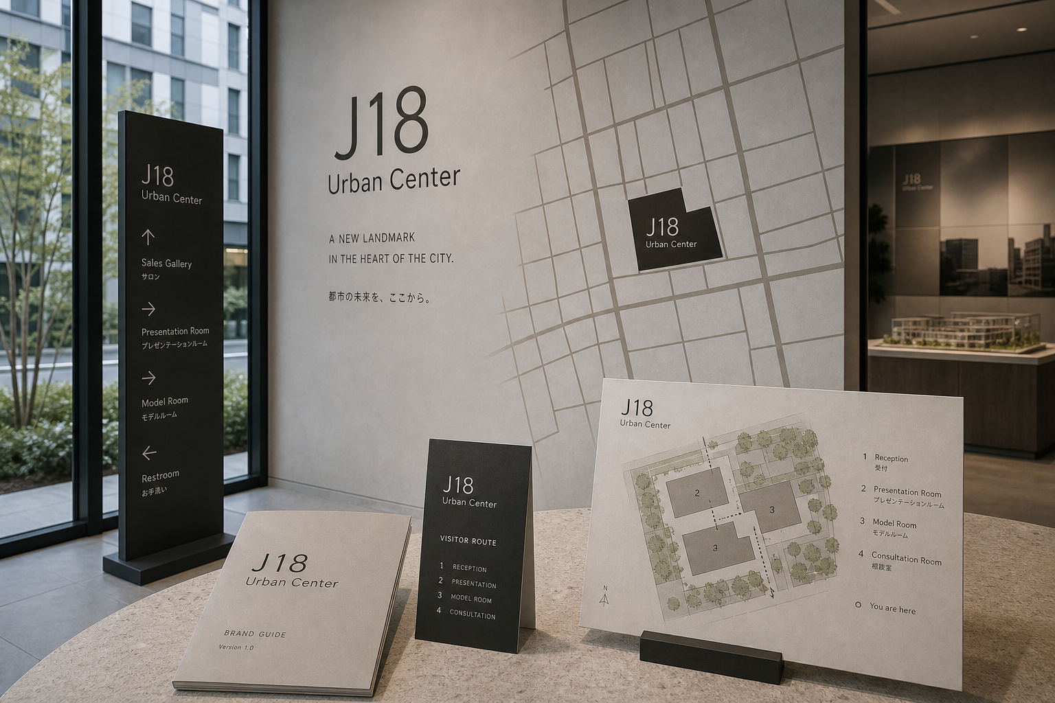
A clean sans serif and narrow architectural face divide roles. Broad J18 anchors reception walls, while Urban Center, Sales Center, and functions descend in scale. English classifies space before Chinese explains it; arrows, building icons, people, lounge, and models share the plan's fine-line language.
Visiting becomes understanding. Floor lines, wall diagrams, and standing signs guide visitors through planning, architecture, lifestyle, and model. Glass, daylight, planting, and grey space remain balanced, while the identity changes with viewing distance rather than existing only frontally.
The name establishes coordinates, grid describes blocks, map explains space, numbering organises time, and arrows turn comprehension into movement. J18 integrates visual design, architectural content, and service flow, making the sales centre a public interface for reading and imagining the city.
日本語版
J18 Urban Center は大規模複合開発に必要な伝達力を示します。巨大な都市構想を、来訪者が段階的に理解できる経路へ変えます。J18 は計画コードと座標、Urban Center は公共尺度を示し、図面、街区網、階情報、見学順が信頼をつくります。
淡灰コンクリート、米色石、炭色板、透明罩、暖灰紙が販売センターの建築を引き継ぎます。壁図は建築層のように浮かび、重い黒の立板が広い空間を安定させ、手冊と路線卡が持ち運べる近距離情報になります。
全体を理解してから順に見る構成です。Overview、Urban Plan、Architecture、Lifestyle Gallery、Model Display、Consultation が全路程を示し、一から六の番号が記憶しやすくします。総図は建物字母、点線、出入口、階欄を使います。
明快なサンセリフ体と建築的な狭幅字が役割を分けます。大きな J18 が受付壁の焦点となり、Urban Center と機能名が縮小します。英語分類の下に中国語を置き、矢印と細線図が同じ語彙を共有します。
床線、壁図、立板に沿って、都市計画、建築、生活、模型を理解します。ガラス、日光、植栽、灰色空間の中で導視が距離に応じて変化し、正面だけでない使用を証明します。
名称が座標、グリッドが街区、地図が空間、番号が時間、矢印が理解を移動へ変えます。視覚、建築内容、サービスを統合し、未来を展示するだけでなく、都市を読み、参加を想像する公共介面になります。
繁體中文版
J18 Urban Center 的識別展現了大型複合開發最重要的溝通能力:把龐大的城市想像,轉化成訪客能逐步理解的空間路徑。J18 短而有力,既像專案代號,也像城市座標;Urban Center 則補足其公共尺度。品牌沒有依賴華麗意象描繪未來,而是以建築線圖、街廓網格、樓層資訊和參觀順序建立可信度,讓人從接待台開始,就能掌握辦公、住宅、商業與展示空間之間的關係。
材料語言延續銷售中心的建築基調,以淺灰混凝土、米色石材、炭黑牌面、透明展示罩和暖灰紙張為主。大型牆面圖直接融入灰泥表面,線條像建築圖層自然浮現;黑色落地牌具有足夠厚度和重量,能在開闊空間中穩定視線。訪客手冊、路線卡與品牌指南使用柔和淺色卡紙,與石質檯面形成細緻差異。硬質空間材料負責定位,紙本則便於攜帶和近距閱讀,建立清楚的觸覺層級。
編排以「先理解全貌,再依序參觀」為主要邏輯。入口牆列出 Overview、Urban Plan、Architecture、Lifestyle Gallery、Model Display 與 Consultation,讓訪客先看見完整流程;獨立路線牌再以一至六的編號搭配圖示,將行程拆成容易記憶的步驟。總平面圖以建築字母、虛線路徑和出入口箭頭說明移動關係,樓層資訊則置於右側獨立欄位。不同資訊層次各有位置,複雜內容因此顯得有序而可親近。
字型系統結合俐落無襯線字與較具建築感的窄體字。J18 的字面寬大,適合在接待牆和立柱上形成遠距焦點;Urban Center、Sales Center 及功能名稱依序縮小,維持清楚主從。中英文並列時,英文先建立空間分類,中文緊接其下補充理解,行距和對齊保持一致。箭頭線條簡明,圖示以細線描繪建築、人物、休息區與展示模型,與牆上的平面圖使用同一視覺語彙。
品牌特色來自「參觀即理解」的體驗設計。訪客不是被動觀看模型,而是沿著地面線條、牆面圖與落地指示逐站認識城市規劃、建築構成、生活場景和展示內容。大面玻璃引入日光,模型、植栽與灰色空間保持平衡;導視則以黑白對比在背景中清楚出現。攝影從入口、轉角、模型區和牆面地圖多個視角呈現系統,證明識別能隨觀看距離調整,而不只存在於單一正面。
J18 Urban Center 的設計理念,是讓複雜城市資訊獲得可行走的秩序。品牌名稱建立座標,網格描述街區,地圖說明空間,編號安排時間,箭頭則把理解轉化為實際移動。當訪客從總覽前往模型展示,再進入諮詢區,每一步都能確認所在位置及下一個目的地。這套識別把視覺設計、建築內容與服務流程整合在一起,使銷售中心不只是展示未來的場所,更成為一個能讓人清楚閱讀城市、建立方向感並產生參與想像的公共介面。
- visual identity: hermetic design
- signage design: hermetic design
- photography: studio archive
- client: j18 urban center