Hakone Retreat Ori
branding + visual identity
Hakone Retreat Ori
2018 / Hakone
creative direction
art direction
logo & visual identity
graphic design
sign design
Hakone Retreat Ori 是為 Hakone Retreat Ori 建立的 branding + visual identity 專案。作品內容以 creative direction、art direction、logo & visual identity 為核心,將品牌名稱、應用物件、版面規則與影像語氣整合成一套可延展的作品集案例。
攝影主題以 retreat landscape、sign family、guest booklet、room item 為主。畫面應保留自然光、低飽和色彩、安靜陰影與可閱讀的材質細節,讓照片同時承擔品牌證據、包裝質感與空間情緒。
設計概念從「空間標示、導視與現場尺度」出發,使用乾淨 grotesk 字體、克制色票、細緻比例與少量資訊層級,讓品牌看起來像被整理過的文化檔案,而不是一般商業宣傳頁。
計劃上先完成品牌語氣與核心識別,再建立 Retreat logo、Sign family、Guest booklet 等交付物,最後以照片序列、品牌應用與網站作品頁整理成完整案例。
Retreat logo / Sign family / Guest booklet / Room item / Landscape photo set
Editorial review
English edition
English edition
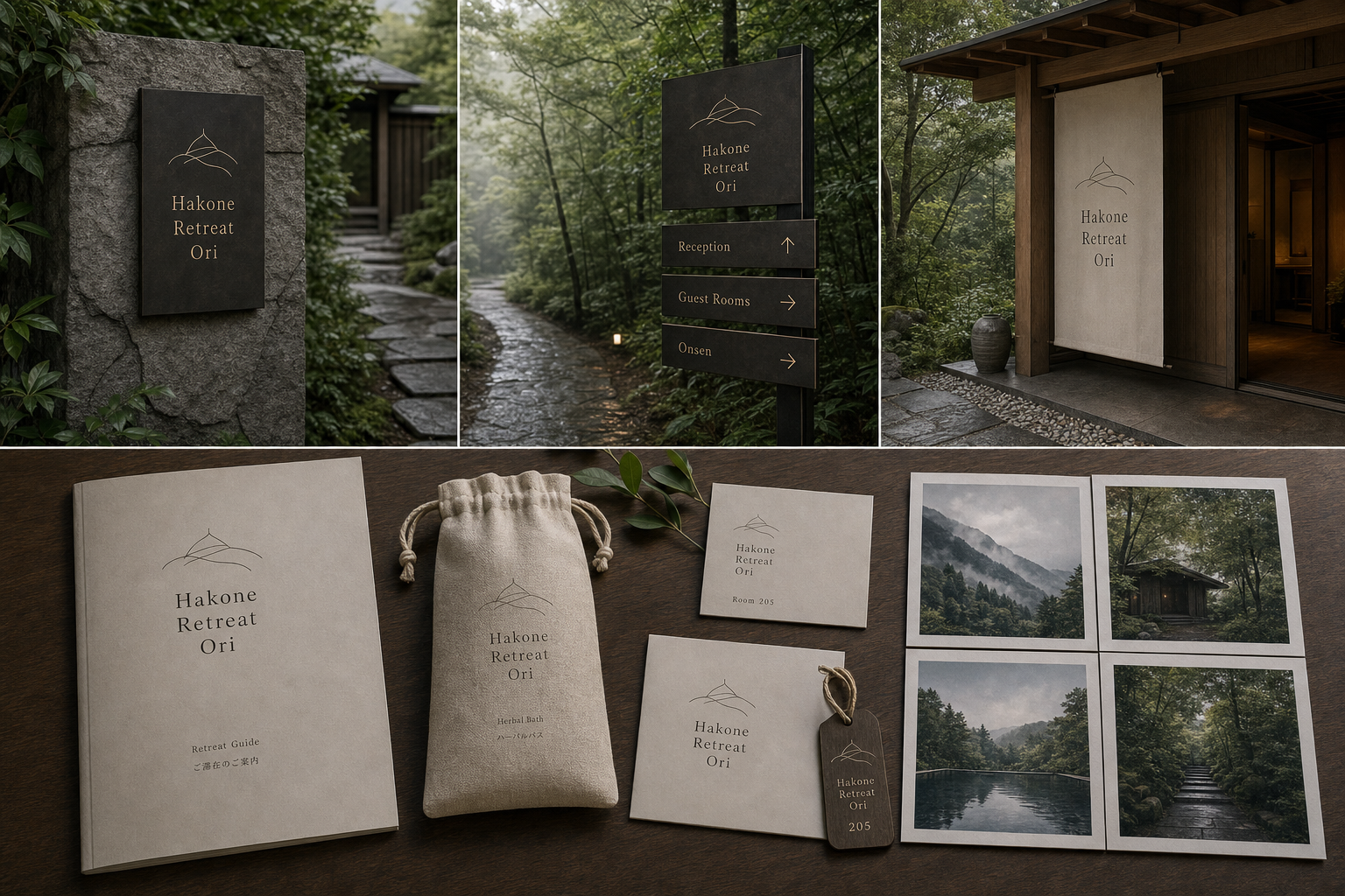
Hakone Retreat Ori is most mature when the brand recedes into forest, mountain, and architecture rather than using nature as decoration. Its fine-line mark can be layered ridges, eaves, paths, or folded terrain, remaining memorable without competing with rain, mist, leaves, and stone.
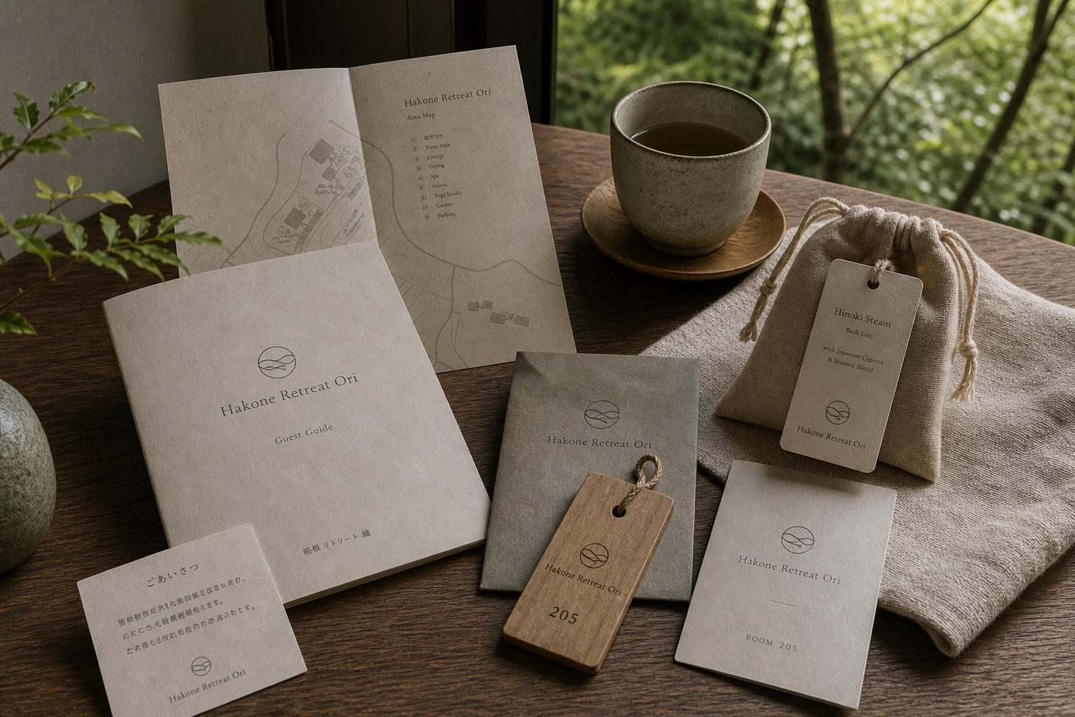
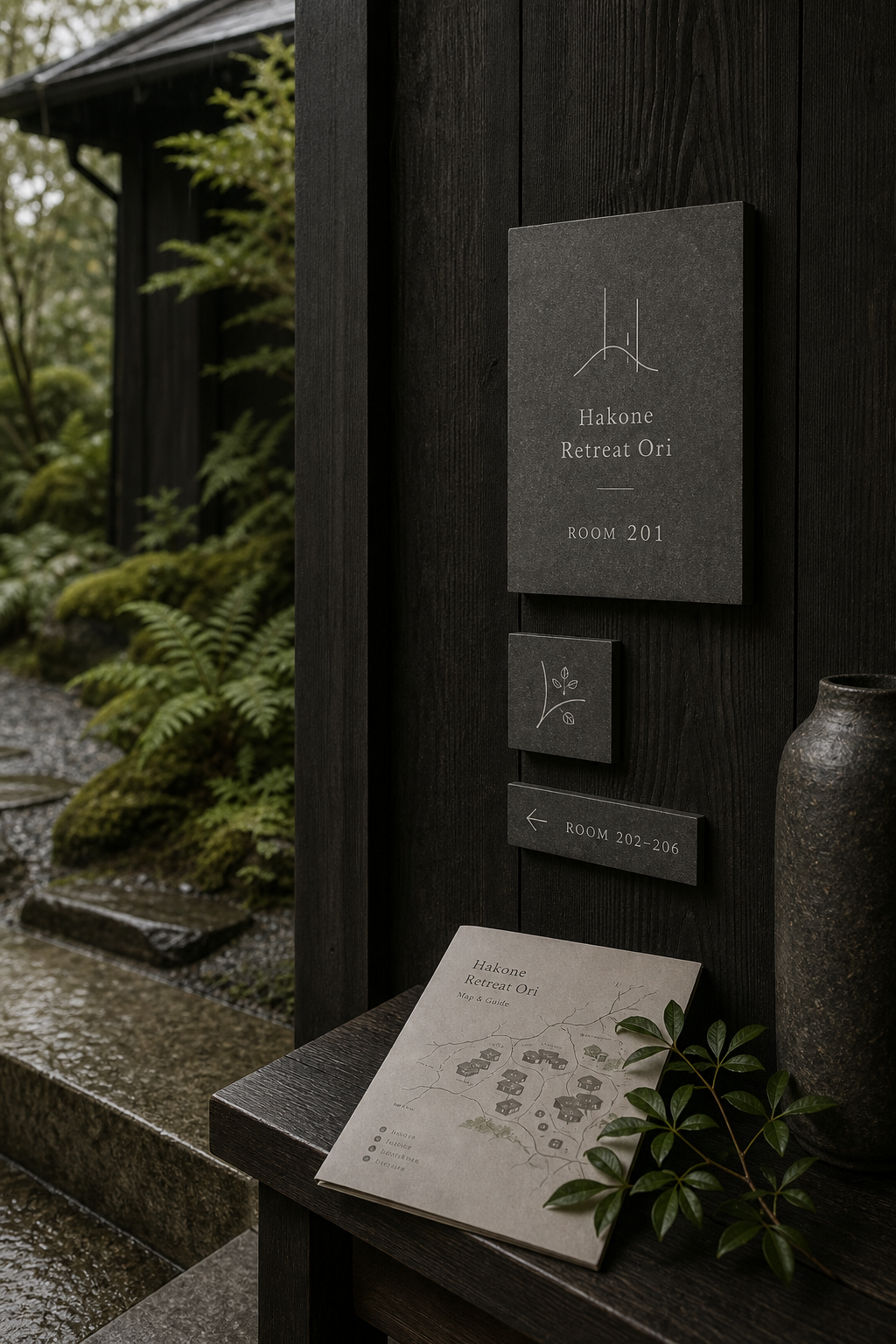
Dark timber, rough stone, warm grey paper, and natural textile form a coordinated material system. Wooden signposts hold their grain among moss and fern; matte room plaques rely on subtle contrast; fibrous guides, maps, cards, keys, and bags continue the building's tactility into portable objects.
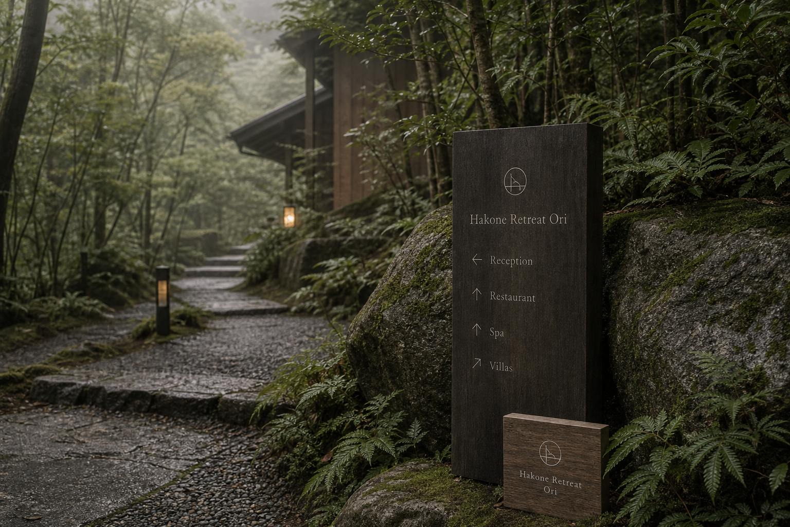
The layout answers two speeds: wayfinding and slow reading. Signs list Reception, Restaurant, Spa, and Villas with ample leading and direct arrows; branched boards give each destination its own bar; pale maps organise dispersed buildings; room pieces return to centred axes and broad margins.
A tall humanist serif descends naturally on narrow signs and curtains, then opens horizontally on guide covers. Widely spaced capitals support rooms and facilities. Intersecting curves and lines suggest ridge through mist and columns through roof, connecting nature and construction.
Arrival through the landscape is carefully composed. Wet stone paths, timber signs, room maps, guide, and key each support action while leaving the environment dominant. Reflected rain, forest mist, dark buildings, warm interiors, herbs, and textiles allow season and weather to enter the identity.
Direction and immersion coexist. Arrows, numbers, and maps reduce uncertainty, while fine marks and muted materials protect the forest atmosphere. Across wood, paper, fabric, and architecture, one symbol reminds guests of ridge, shelter, and path as they move deeper into Hakone.
日本語版
Hakone Retreat Ori は自然を装飾にせず、ブランド自体を森、山、建築へ退かせます。細線の印は重なる山、軒、道、折られた地形に見え、雨、霧、葉、石を邪魔せずに記憶を残します。
濃木、粗い石、暖灰紙、天然布が素材システムをつくります。木の導視柱は苔と羊歯の中で木目を保ち、霧面の客室札は微差で読ませ、繊維紙の案内、地図、カード、木鍵、袋が建築の触感を手元へ延ばします。
導線とゆっくり読むことの二つの速度に応えます。Reception、Restaurant、Spa、Villas は十分な行間と矢印で並び、分岐板は各目的地に独立した横条を与え、淡色地図が分散建物を整理します。
人間味のある細長いセリフ体は狭い標牌と暖簾で山坡のように下り、案内表紙では横へ広がります。房号と施設は字間のある大文字が担います。曲線と直線の交差が山稜、霧、柱、屋根を結びます。
湿った石路、木導視、部屋地図、案内、鍵が行動を支えながら景観を主役に残します。雨の反射、林霧、濃木建築、暖光、草本、布が、季節と天候をブランドへ入れます。
矢印、番号、地図は迷いを減らし、細線印と低彩度素材は森林の没入を守ります。木、紙、布、建築に置かれた同じ印が、山、軒、道の関係を異なる距離で思い出させます。
繁體中文版
Hakone Retreat Ori 的識別最成熟之處,是沒有把自然景觀當成裝飾,而是讓品牌本身退入森林、山勢與建築之間。細線標誌同時讓人聯想到重疊山巒、屋簷、路徑與被折起的地景,輪廓輕盈,卻能在濃密植栽和深木空間裡留下清楚記憶。從林間導視、入口暖簾到房門牌與客房指南,識別始終維持低聲量,使旅客注意的不只是名稱,更是雨、霧、樹葉和腳下石徑的變化。
材質系統建立在深色木材、粗面石材、暖灰紙張和天然織物的協調上。林間指示柱保留木紋與厚度,置於苔石和蕨類之間顯得穩固;房門牌採深灰霧面,在黑木牆上以細緻色差提供辨識。客房指南、地圖、迎賓卡和房號套使用帶有柔和纖維感的淺色紙面,與陶杯、木托盤及亞麻布形成親近觸感。木質鑰匙牌和束口袋則讓可攜物件延續空間材料,使入住過程保持一致。
編排以緩慢閱讀和實際尋路兩種需求為基礎。導視牌先呈現名稱,再以充足行距排列 Reception、Restaurant、Spa 和 Villas,方向箭頭簡潔醒目;分支式指示牌則讓各目的地擁有獨立橫條,適合林間不同角度觀看。區域地圖使用淡色路徑、建築輪廓和編號標示,把分散的住宿設施整理成容易理解的關係。客房指南與迎賓卡採中央軸線和寬闊邊界,使旅客回到房內後能以更安定的節奏閱讀。
字型以修長而具人文比例的襯線體為主。Hakone Retreat Ori 分行排列時,文字像沿山坡逐層落下,也能配合窄長標牌和暖簾的垂直尺度;用於指南封面時改為橫向排列,則呈現更舒展的閱讀感。房號和設施名稱改用字距疏朗的精簡大寫,線條輕但輪廓明確。標誌中的弧線與直線相互交會,像山脊被雨霧分層,也像建築立柱穿過屋頂,圖形因此同時連接自然與人造環境。
品牌個性來自對「抵達景觀」的細心安排。旅客沿濕潤石路前進,在岔路讀取木質導視,抵達房間後拿起地圖、客房指南和鑰匙牌;每一項訊息都協助行動,卻保留周遭環境的主導地位。攝影把雨水反光、林間霧氣、深木建築與溫暖室內燈光納入品牌敘事,讓四季和天候都成為識別的一部分。草本浴包、布袋與房內紙品則把戶外感受帶進休息時刻。
這個專案的設計理念,是讓方向感與沉浸感同時成立。清楚的箭頭、房號和區域圖降低尋路負擔,細線標誌與低彩度材料則維持森林的完整氣氛;旅客既不會失去位置,也不會被過量訊息打斷觀看。當相同圖形分別落在木牌、紙張、織物和建築表面上,它不只是重複品牌名稱,而是在不同距離提醒山勢、屋簷與路徑的關係。Hakone Retreat Ori 因而把住宿設計成一段真正進入箱根地景的過程,留下深沉而長久的休憩記憶。
- creative direction: hermetic design
- sign design: hermetic design
- photography: studio archive
- client: hakone retreat ori