Aporia Fine Dining
branding + visual identity
Aporia Fine Dining
2025 / Paris
brand design
logo + visual identity
brand guide
graphic design
menu design
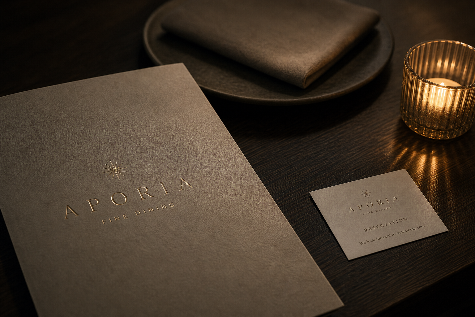
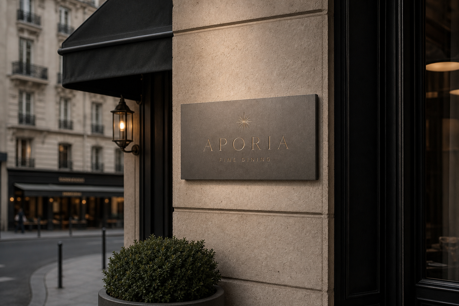
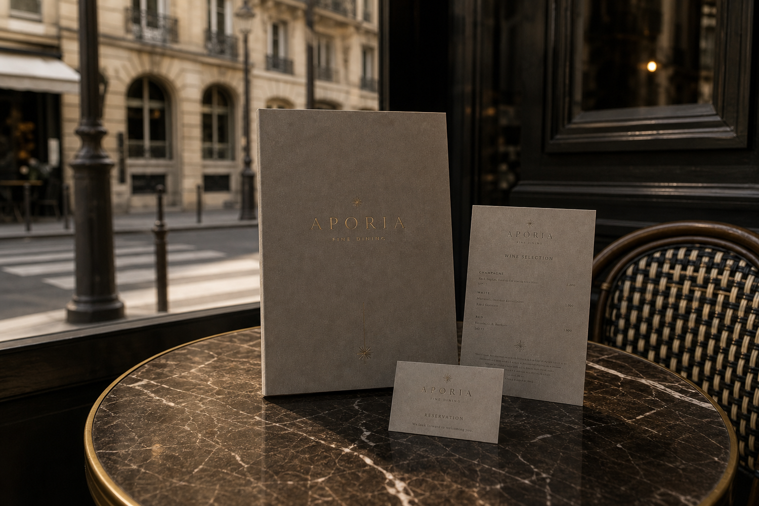
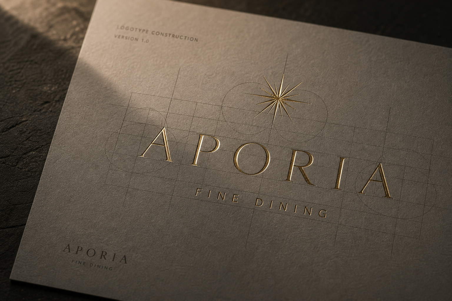
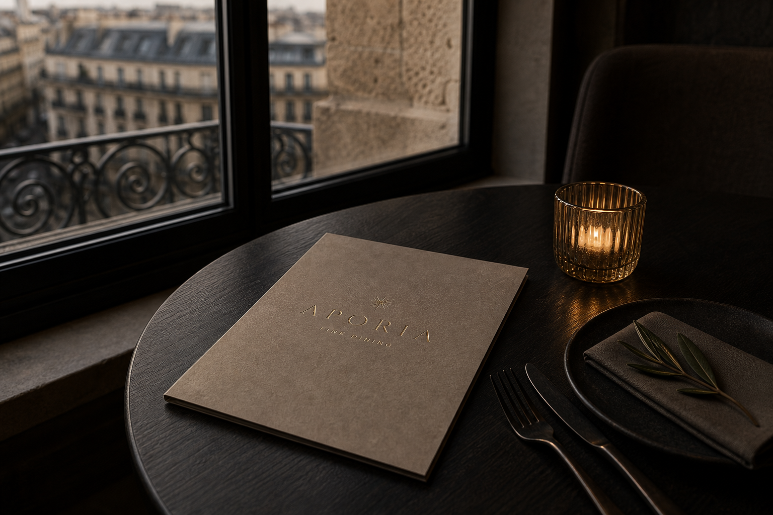
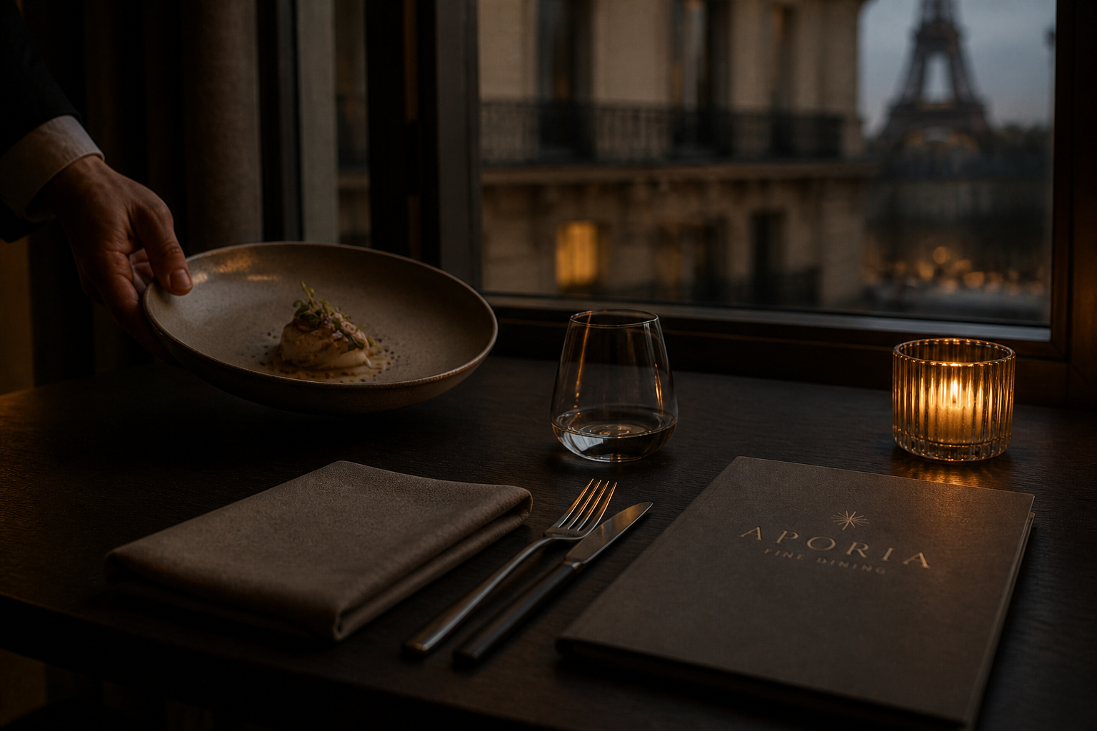
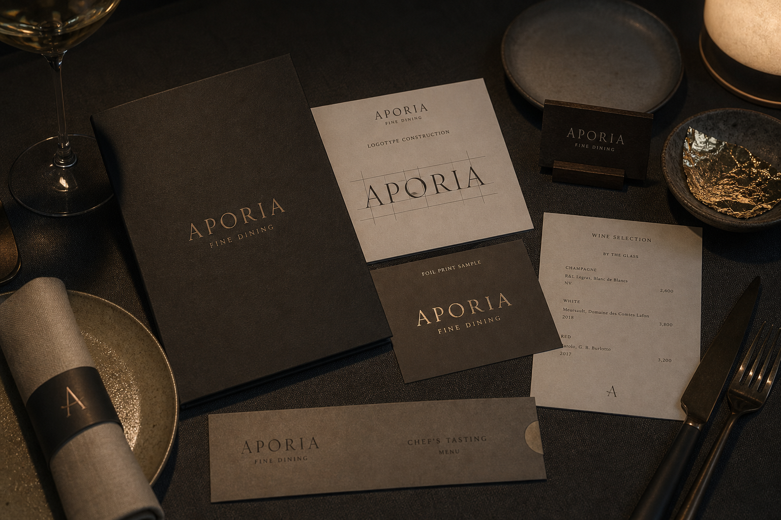
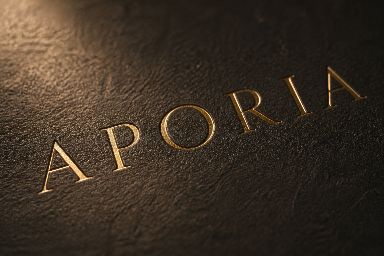
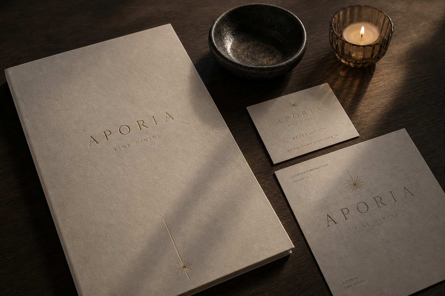
Aporia Fine Dining 是為 Aporia Fine Dining 建立的 branding + visual identity 專案。作品內容以 brand design、logo + visual identity、brand guide 為核心,將品牌名稱、應用物件、版面規則與影像語氣整合成一套可延展的作品集案例。
攝影主題以 logotype metrics、menu cover、foil print detail、dining still life 為主。畫面應保留自然光、低飽和色彩、安靜陰影與可閱讀的材質細節,讓照片同時承擔品牌證據、包裝質感與空間情緒。
設計概念從「空間標示、導視與現場尺度」出發,使用乾淨 grotesk 字體、克制色票、細緻比例與少量資訊層級,讓品牌看起來像被整理過的文化檔案,而不是一般商業宣傳頁。
計劃上先完成品牌語氣與核心識別,再建立 Logotype construction、Brand guide、Menu cover 等交付物,最後以照片序列、品牌應用與網站作品頁整理成完整案例。
Logotype construction / Brand guide / Menu cover / Foil card / Photo direction
Editorial review
English edition
English edition
Aporia Fine Dining composes precise typography, dark materials, and candlelight into the prelude of a meal. Rather than relying on ornament, it calibrates letterforms, paper, metallic reflection, and tableware into a rational, contemplative, nocturnal identity that slows the guest before the first course.
Warm grey paper shows visible fibres against deep charcoal covers. Fine gold-toned lettering catches only a small amount of light, adding ceremony without obscuring the material. Black ceramics, dark textiles, clear glass, timber, and an amber candle point feel like tactile movements within the same evening composition.
A central axis, generous letterspacing, and deliberate empty space organise the menus. Covers retain only the name, radiant mark, and essential information; inside, dishes, descriptions, prices, and sections receive stable positions. Rules and intervals act like pauses in the dining sequence.
Typography is the identity's clearest core. The high-contrast serif wordmark has open proportions and architectural stability, supported by measured baselines and optical spacing. Small capitals carry secondary information, while the radiant star becomes a light punctuation mark on covers, cards, and napkin bands.
Aporia balances thought and sensation. Its name suggests a question or pause, translated through dark fields, exact structure, and local sheen. Formality arrives without status-heavy decoration; restrained metallic detail instead gives paper, vessels, and food a more defined place.
The design is an arrangement of attention: reservation, cover, course sequence, wine selection, and candlelight are connected by one visual rule. Identity prepares the stage rather than performing ahead of the cuisine. Aporia becomes a complete ritual for slowing down, observing detail, and anticipating what comes next.
日本語版
Aporia Fine Dining は、精密な文字、暗色の素材、蝋燭の光を食事の序章へ編み込みます。装飾の多さではなく、字形、紙面、金色の反射、卓上の器を調整し、理性的で内省的な夜のアイデンティティをつくっています。
繊維の見える暖灰の紙が深い炭色の表紙と対比し、細い金色の文字は角度によってわずかに光ります。黒い陶器、濃色の布、透明なグラス、木の卓、琥珀色の蝋燭が、一つの晩餐における異なる触感の段落となります。
中央軸、広い字間、明確な余白がメニューを整理します。表紙には名称、放射状の印、必要情報だけを残し、内頁では料理名、説明、価格、章に安定した場所を与えます。水平線と間隔は、食事の進行における休止のように働きます。
文字が最も強い識別要素です。高コントラストのセリフ体は開いた比率と建築的な安定を持ち、基準線と光学的な字間で整えられています。小型大文字が副情報を担い、星芒は表紙、カード、ナプキン帯に一瞬の光を加えます。
Aporia は思考と感覚を均衡させます。問いや停止を思わせる名称が、暗い背景、精密な構造、局所的な光沢へ変換されています。誇示的な記号を使わず、紙、器、料理がより明確に見える正式さです。
予約、表紙、コース、ワイン、杯の縁に映る光が、同じ視覚規則で結ばれています。識別は料理より先に演じるのではなく、味覚のための舞台を整えます。速度を落とし、細部を感じ、次の皿を待つための完全な儀式です。
繁體中文版
Aporia Fine Dining 的品牌識別把精密字型、深色材質與燭光共同編入用餐的序曲。整套設計沒有以繁複裝飾訴說高級,而是讓字母比例、紙面觸感、金色反光和桌上器物彼此校準,形成理性、沉靜又帶有夜間氛圍的餐飲性格。從預約卡到菜單、酒單與餐巾紙環,品牌始終維持清楚而克制的聲音,使賓客在料理出現之前,便進入一種專注觀看與緩慢閱讀的狀態。
材料運用建立了最直接的感官層次。暖灰紙張保留可見的纖維紋理,與深炭色菜單封面形成柔和對比;金色文字和細線落在霧面紙面上,隨角度呈現細微亮度,既增加儀式感,也沒有掩蓋材料本身。黑色陶器、深色織品、透明酒杯與木質桌面延續同一組低彩度語彙,燭火則提供恰到好處的琥珀色焦點。紙品與餐具因此不像兩套分離系統,而像同一場晚宴裡不同觸感的段落。
編排以中央軸線、寬裕字距和明確留白建立秩序。菜單封面只保留品牌名稱、星芒符號與必要資訊,視線自然集中於中央;內頁則讓菜名、說明、價格與章節各自擁有穩定位置,使閱讀速度從容而準確。酒單與品飲菜單在資訊較多時仍保持疏朗,預約卡和小型紙件則運用尺寸差異建立焦點。每一道水平線、每一段間距都像餐序中的停頓,讓資訊層級與服務節奏彼此呼應。
字型是 Aporia 最鮮明的識別核心。高對比襯線字標擁有細緻筆畫與開闊字面,字母之間的距離使 APORIA 呈現近似建築立面的穩定感。設計圖中的基準線、字幅與光學間距,說明這個字標並非單純選用現成字體,而是經過比例整理,讓每個字母在並列時維持一致張力。小型大寫文字以更克制的尺度承接副標與品項資訊;放射狀星芒則成為輕巧的標點,在封面、卡片與紙環上為嚴謹文字加入一瞬光線。
品牌特色建立在思考與感官之間的平衡。Aporia 聽來帶有提問與停頓的氣質,設計便以深色背景、精準結構和局部光澤,將這份內省感轉化為可以觸摸的餐桌經驗。它有巴黎精緻餐飲所需要的正式度,卻不以炫耀性的符號堆砌身分;金色細節在暗調空間裡保持節制,反而讓紙張、器皿與食物獲得更清晰的位置。這種安靜自信,使品牌顯得成熟、神祕而具有記憶點。
Aporia Fine Dining 的設計理念,可以理解為對注意力的細緻編排:收到預約資訊、翻開封面、閱讀餐序、挑選酒款,再到燭光映在杯緣上的片刻,每一步都由同一套視覺規則連接。識別不搶在料理之前表演,而是以精確比例和材料溫度替味覺建立舞台。當字型結構、資訊秩序與空間光線彼此吻合,品牌便不只是一個名稱,而成為一種讓人放慢速度、感受細節並期待下一道料理的完整儀式。
- creative direction: hermetic design
- graphic design: hermetic design
- photography: studio archive
- client: aporia fine dining