Abysse Blue
branding + visual identity
Abysse Blue
2017 / Tokyo
branding
logo + visual identity
graphic design
signage
website
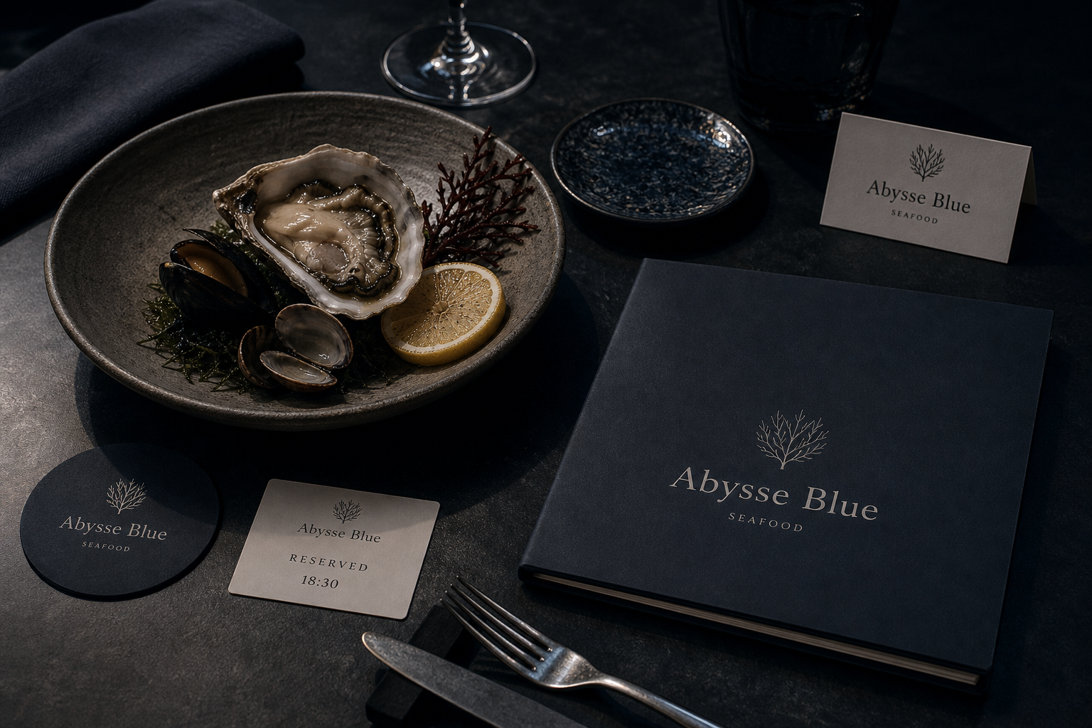
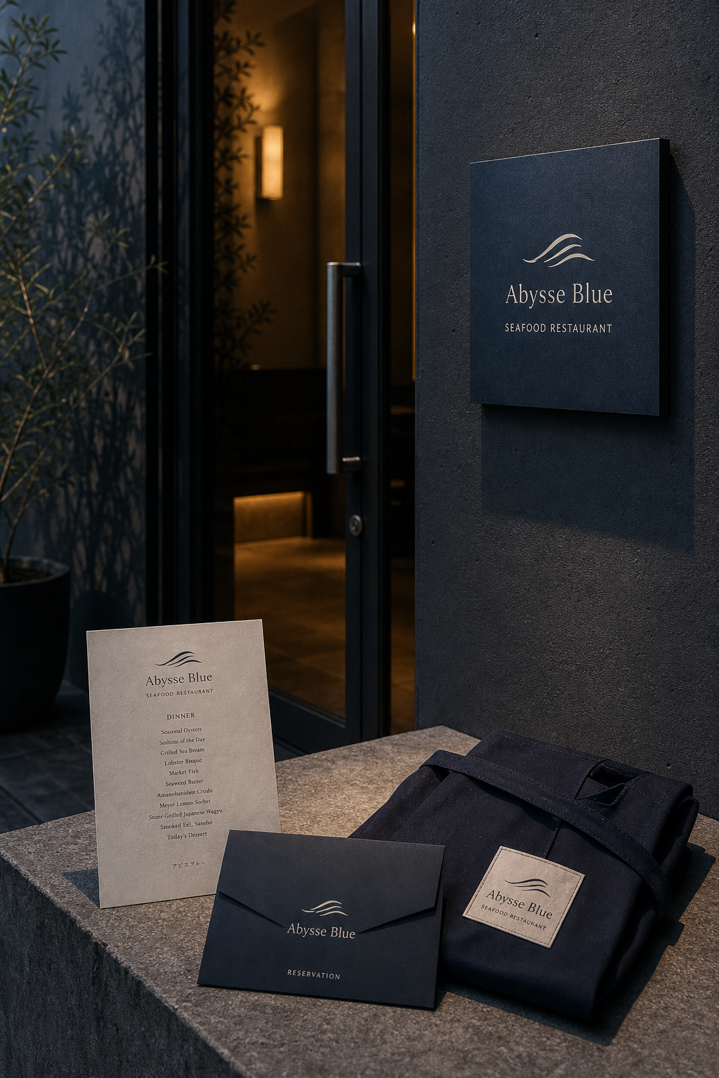
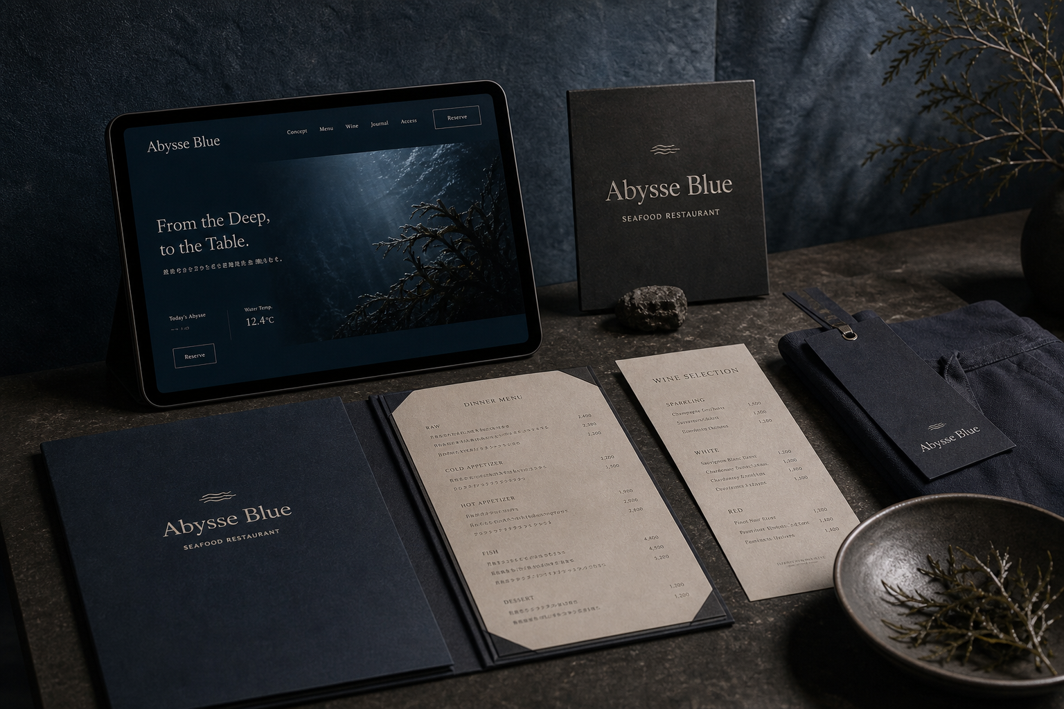
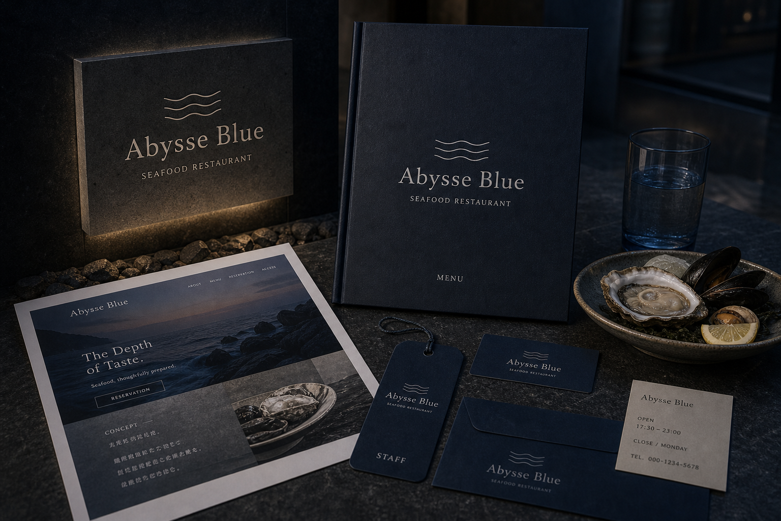
Abysse Blue 是為 Abysse Blue 建立的 branding + visual identity 專案。作品內容以 branding、logo + visual identity、graphic design 為核心,將品牌名稱、應用物件、版面規則與影像語氣整合成一套可延展的作品集案例。
攝影主題以 seafood still life、menu cover、uniform tag、restaurant sign 為主。畫面應保留自然光、低飽和色彩、安靜陰影與可閱讀的材質細節,讓照片同時承擔品牌證據、包裝質感與空間情緒。
設計概念從「空間標示、導視與現場尺度」出發,使用乾淨 grotesk 字體、克制色票、細緻比例與少量資訊層級,讓品牌看起來像被整理過的文化檔案,而不是一般商業宣傳頁。
計劃上先完成品牌語氣與核心識別,再建立 Restaurant logo、Menu system、Uniform tag 等交付物,最後以照片序列、品牌應用與網站作品頁整理成完整案例。
Restaurant logo / Menu system / Uniform tag / Website / Signage
Editorial review
English edition
English edition
Abysse Blue moves seafood identity beyond marine illustration into an idea of depth, light, and taste. Deep ocean blue leads, while three waves and a coral-like branch give only necessary clues. From night entrance through menu, reservation, uniform, and website, quieter graphics make ingredients and table atmosphere more vivid.
Navy paper, warm grey card, dark cloth, rough stone, and ceramics create material depth. Textured covers absorb light so pale marks emerge; grey-white interiors keep dishes and prices readable. Envelope, coaster, tag, and woven label extend dry-wet, rough-smooth, and dark-light contrasts into service.
Central axes and narrow columns suggest descent. Cover retains mark, name, and SEAFOOD; inner pages divide Raw, Cold Appetizer, Hot Appetizer, Fish, and Dessert with prices aligned at right. Wine list, reservation time, and the wide website keep information clean and booking direct.
A slender serif gives Abysse Blue formality and the softness of current. Widely spaced SEAFOOD RESTAURANT clarifies category; smaller menu type lets dishes lead. Wave lines remain clear on cards and tags, while the branching motif brings the ecology of the sea floor closer.
Food, service, and environment share the same depth. Oyster, shellfish, seaweed, lemon, thick ceramics, dark tables, uniforms, envelopes, and signs are held in one colour and hierarchy. Small reflections in glass, metal, and wet ingredients read like underwater beams.
Restraint creates sensory depth. Wave gives direction, blue creates immersion, pale pages protect readability, and digital booking keeps service clear. Sign, reservation, menu, wine, and cuisine proceed at one visual concentration, building a focused marine table culture rather than decorative luxury.
日本語版
Abysse Blue は海鮮料理の識別を、海産図像から深さ、光、味覚の想像へ高めます。深海青を主に、三本の波線と珊瑚状の枝を必要な暗示だけに使います。静かな視覚ほど食材、器、空間が鮮明になります。
紺紙、暖灰カード、濃色布、粗石、陶器が素材の深さをつくります。表紙は光を吸収し淡色印を浮かせ、内頁は灰白で料理名と価格を読みやすくします。封筒、コースター、札、布標が乾湿、粗細、明暗をサービスへ広げます。
中央軸と細い欄は深部へ下る感覚をつくります。表紙は印、名称、SEAFOOD、内頁は Raw、Cold、Hot、Fish、Dessert と右揃え価格を使います。酒單、予約時間、ウェブも情報を清潔に保ちます。
細長いセリフ体は正式さと水流の柔らかさを持ちます。字間のある SEAFOOD RESTAURANT が分類を示し、小文字情報は料理を先に見せます。波は小型でも明確で、枝形は海底生態の細部を加えます。
牡蠣、貝、海藻、檸檬、厚い陶皿、濃卓、制服、封筒、標識が同じ色と階層に入ります。ガラス、金属、濡れた食材の小さな反射が、水中の光線のような鑑賞をつくります。
節制が感覚の深さを生みます。波が方向、青が没入、淡色頁が可読性、予約画面がサービスを支えます。入口から料理まで同じ濃度で進み、装飾的な高級感ではなく、静かで集中した海の食卓文化をつくります。
繁體中文版
Abysse Blue 把海鮮餐廳的識別從「海產圖像」提升為對深度、光線與味覺的完整想像。深海藍成為主導色,三道波線和珊瑚般的枝狀圖形只提供必要暗示,沒有搶先替料理下結論。顧客從夜色中的入口招牌進入,沿著菜單、訂位卡、制服標籤與網站逐步接觸品牌,如同從水面向下探索;視覺越安靜,食材的光澤、器皿的質地和用餐空間的氣氛越顯鮮明。
材料表現以海軍藍紙張、暖灰卡紙、深色布料、粗面石材和陶器構成。菜單封面的細微紋理吸收光線,只讓淺色標誌和文字浮現;內頁轉為柔和灰白,確保品名與價格容易閱讀。深藍信封、圓形杯墊和吊牌延續相同色調,制服布標則以淺底深字在布面上形成清楚層次。紙、布、石、金屬餐具和海鮮外殼共同呈現乾濕、粗細與明暗差異,讓品牌觸感與餐桌體驗自然連接。
版面採中央軸線與窄長資訊欄,營造向深處延伸的視覺感。封面只留下圖形、名稱與 SEAFOOD,內容頁則依 Raw、Cold Appetizer、Hot Appetizer、Fish 和 Dessert 分段,價格沿右側整齊對齊。酒單用類別和品項形成另一套垂直節奏,訂位牌僅保留時間,使餐桌資訊維持清爽。網站以左側標題和右側深海影像構成寬幅畫面,訂位按鈕清楚可見,紙本的克制秩序因此順利轉入數位操作。
主字型選用比例優雅的襯線體,Abysse Blue 的字母筆畫細長,既有餐飲所需的正式感,也帶著水流般的柔軟曲線。SEAFOOD RESTAURANT 以字距疏朗的大寫置於下方,說明類別並拉開呼吸空間;菜單分類與價格則使用較小字級,讓視線先看料理名稱,再取得細節。波線標誌能被理解為海面、洋流或食材層次,縮小至名片和吊牌仍然清楚;枝狀圖形則為桌牌增添更接近海底生態的細節。
品牌個性建立在料理、服務與環境的共同深度。牡蠣、貝類、海藻與檸檬被安排在厚實陶盤中,局部光線突出濕潤表面,深色桌面讓色澤集中而不浮誇。制服、訂位信封、桌牌與營業資訊都遵循相同色彩和文字層級,使服務人員、餐桌與入口成為同一情境。攝影保留陰影,也讓玻璃、金屬與海鮮反射細小亮點,形成像水下光束般的觀看經驗。
Abysse Blue 的設計理念,是以節制創造感官的深度。波線提供海的方向,深藍建立空間沉浸感,暖灰內頁維持閱讀舒適,網站與訂位物件則確保實際服務清楚流暢。顧客看見招牌、確認預約、翻閱菜單、選擇酒款再品嚐料理,每一步都在同一視覺濃度中推進。這套識別沒有把「高級」停留在表面裝飾,而是讓材料、編排、文字與食物共同建立一種沉靜、專注且值得慢慢探索的海洋餐桌文化。
- branding: hermetic design
- art direction: hermetic design
- photography: studio archive
- client: abysse blue